How to use form components in Mobile framework
This time I will show you how to use form components in the Mobile framework. What are the precautions for using form components in the Mobile framework? Here are practical cases. Let’s take a look. .
1. Form component basics
1. Component introductionThe form component in jQuery Mobile is based on standard HTML, and then enhances the style on this basis, so even if the browser does not support jQuery Mobile forms still work fine. It should be noted that jQuery Mobile will enhance form elements into a form that is easy to use on touch devices, so using web forms for iPhone/iPad and Android will become very convenient.
The form components of jQuery Mobile include the following:
(1) Text input box, the input element marked with type="text" will be automatically enhanced to jQuery Mobile style, without adding additional data-role attributes .
(2) Text input field, the textarea element will be automatically enhanced without adding additional data-role attributes. For multi-line input text, jQuery Mobile will automatically increase the height of the text field to avoid difficulty in mobile devices. Find the scrollbar situation.
(3) Search input box, the input element marked with type="search" will be automatically enhanced without adding additional data-role attributes. This is a new HTML element. There is a magnifying glass icon on the left side of the enhanced input box. Click to trigger the search. After entering the content, a cross icon will appear on the right side of the input box. Click to clear the entered content, which is very convenient.
(4)Radio button, the input element marked with type="radio" will be automatically enhanced without adding additional data-role attributes.
(5) Check button, input element marked with type="checkbox" will be automatically enhanced without adding additional data-role attribute.
(6) Select list, select element will be automatically enhanced, no need to add additional data-role attribute.
(7) When you draw the bar, the input element marked with type="range" will be automatically enhanced without adding additional data-role attributes.
(8) Switch, after adding the data-role="slider" attribute to the select element, it will be enhanced to become the switch component of jQuery Mobile. There can only be two options in the select.
2. Component usage specificationsAll form components, as long as they need to transmit data to the server, should be wrapped in a form tag, and the action and method attributes of the form should be specified. Of course, if you are using local storage such as Web SQL Database, that is, the data does not need to be transmitted to the server, you can submit it without the form tag and sumbit. In addition, the form id needs to be unique in the entire site. Since jQuery Mobile uses Ajax navigation, different pages can be loaded into a DOM at the same time. Therefore, the form id must be unique in the entire site to ensure that the form id of each DOM is different.
Each form element should have a corresponding label. The for value of the label should be the same as the id of the element to make it semantically related, and you can use an attribute with data-role="fieldcontain" Wrapped in a p or fieldset container, jQuery Mobile will automatically add a thin border at the bottom of the container as a separation.
2. Detailed explanation of form components
1. Text input boxIn jQuery Mobile, text input boxes and text input fields are marked using standard HTML and support some HTML5 There are many input types, such as password, email, tel, number, range, and more. For some types (range, serach), jQuery Mobile will convert them to text input types and standardize their styles. The following is text input The calling code and diagram of the frame.
<p data-role="fieldcontain">
  <label for="text">文本输入框</label>
  <input type="text" name="text" id="text" value="" />
</p>

2. Text input field
<p data-role="fieldcontain">
  <label for="textarea">文本输入域</label>
  <textarea cols="40" rows="8" name="textarea" id="textarea"></textarea>
</p>

3. Search input Box As mentioned above, there is a magnifying glass icon on the left side of the enhanced input box. Click to trigger the search. After entering the content, a cross icon will appear on the right side of the input box. Click to clear the entered content.
<p data-role="fieldcontain">
  <label for="search">搜索输入框</label>
  <input type="search" name="search" id="search" value="" />
</p>

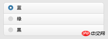
4.单选框单选框组件用于在页面中提供一组选项,并且只能选择其中一个选项。在 jQuery Mobile 中,单选框组件不但在外观上美化了,还增加了一些图标用于增强视觉反馈。 type="radio" 标记的 input 元素会自动增强为单选框组件,但 jQuery Mobile 建议开发者使用一个带 data-role="controlgroup" 属性的 fieldset 标签包括选项,并且在 fieldset 内增加一个 legend 元素,用于表示该单选框的标题。
<p data-role="fieldcontain">
  <fieldset data-role="controlgroup">
    <legend>单选框:</legend>
    <input type="radio" name="radio-choice-1" id="radio-choice-1" value="choice-1" />
    <label for="radio-choice-1">蓝</label>
    <input type="radio" name="radio-choice-1" id="radio-choice-2" value="choice-2" />
    <label for="radio-choice-2">绿</label>
    <input type="radio" name="radio-choice-1" id="radio-choice-3" value="choice-3" />
    <label for="radio-choice-3">黑</label>
  </fieldset>
</p>
5.复选框复选框也是用于在页面中提供一组选项的,但可以同时选择多个选项。与单选框相同,复选框组件也无需额外调用 data-role 属性, type="checkbox" 标记的 input 元素会自动增强为 jQuery Mobile 样式,当然 jQuery Mobile 也建议开发者使用一个带 data-role="controlgroup" 属性的 fieldset 标签包括选项,并且在 fieldset 内增加一个 legend 元素,用于表示该复选框的标题。
<p data-role="fieldcontain">
  <fieldset data-role="controlgroup">
    <legend>复选框</legend>
    <input type="checkbox" name="blue" id="effect1" class="custom" />
    <label for="effect1">效果1</label>
    <input type="checkbox" name="green" id="effect2" class="custom" />
    <label for="effect2">效果2</label>
    <input type="checkbox" name="pink" id="effect2" class="custom" />
    <label for="effect2">效果3</label>
  </fieldset>
</p>
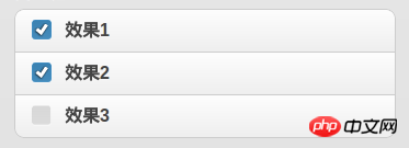
默认的复选框组件是垂直排列选项的,我们可以在 fieldset 上添加 data-type="horizontal" 使其样式改为水平按钮组的样式, jQuery Mobile 会使选项元素浮动并去掉图标。

6.选择列表选择列表是基于 HTML select 元素的,具有原生菜单和自定义菜单两种形式,原生菜单与自定义菜单都有一个样式美化了的选择按钮,不同的是在自定义菜单中原生的 option 元素将被隐藏, jQuery Mobile 会生成一个由 CSS3 和 HTML5 构成的菜单代替,并且这个菜单是 ARIA 的。
关于 ARIA ,这里小科普一下: ARIA, 即 Accessible Rich Internet Application ( 加强无障碍网页应用程序 ),它是 W3C 的无障碍网页倡议(WAI)工作小组在倡导大家使用的无障碍网页应用技术。它是一套独立的规范,可以帮助 Web 程序,尤其是使运用了大量前端技巧( Ajax )的网页更具备可访问性,通俗点说,读屏设备等不大能理解前端语义的设备将可以了解到页面的内容,这样残疾人士不仅可以浏览网页甚至与页面进行交互。
HTML select 元素会被自动增强为原生的选择列表组件,若需要自定义样式菜单,可以在 select 上添加 data-native-menu="false" 属性。
若需要禁止选择某一个选项,可以在选项的 option 标签上添加 disabled="disabled"。
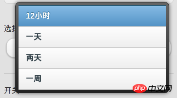
下面给出一个自定义菜单的例子:
<p data-role="fieldcontain">
  <label for="select-choice-1" class="select">选择列表</label>
  <select data-native-menu="false" name="select-choice-1" id="select-choice-1">
    <option value="12h">12小时</option>
    <option value="1d">一天</option>
    <option value="2d">两天</option>
    <option value="week">一周</option>
  </select>
</p>
选择按钮

自定义菜单
若需要多项选择,则可以在 select 标签上添加 multiple="multiple" ,但原生的选择菜单不支持该功能。对于多项选择菜单,还有几点要注意的:
(1)jQuery Mobile 会在菜单里创建一个 jQuery Mobile header ,并在 header 的左边添加一个关闭菜单按钮。
(2)当用户选择两个或以上选项时选择按钮右侧会出现一个小图标,图标内显示已选择选项的个数。
(3)所有选择的选项文本会显示在选择按钮上,如果文字超出按钮长度,会以省略号代替多余的内容。
(4)如果选项过多,菜单会以新页面的形式显示。
多项选择列表实例
<p data-role="fieldcontain">
  <label for="select-choice-2" class="select">多项选择列表</label>
  <select data-native-menu="false" multiple="multiple" name="select-choice-2" id="select-choice-2">
    <option value="12h">12小时</option>
    <option value="1d">一天</option>
    <option value="2d">两天</option>
    <option value="week">一周</option>
  </select>
</p>

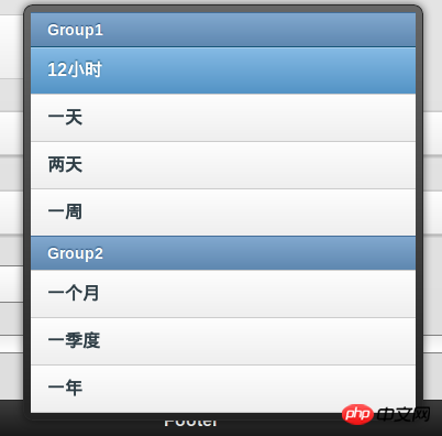
另外我们还可以对选项进行分组,使用以下标签标签把同一组的选项包裹起来,其中 label 的值为该分组的标题。
<optgroup label="Group1"></optgroup>
分组选择列表实例
<p data-role="fieldcontain">
  <label for="select-choice-3" class="select">分组选择列表</label>
  <select data-native-menu="false" name="select-choice-3" id="select-choice-3">
    <optgroup label="Group1">
      <option value="12h">12小时</option>
      <option value="1d">一天</option>
      <option value="2d">两天</option>
      <option value="week">一周</option>
    </optgroup>
    <optgroup label="Group2">
      <option value="1m">一个月</option>
      <option value="1q">一季度</option>
      <option value="1y">一年</option>
    </optgroup>
  </select>
</p>
7.滑杆在 jQuery Mobile 中,type="range" ( HTML5 属性值 ) 的 input 元素会被增强为划杆组件,该组件可以通过一些属性值配置,value 设置滑杆的初始值, min 和 max 分别设置滑杆的下限和上限。另外滑杆组件还支持键盘响应,键盘的右箭头,上箭头,Page Up 键都可以增加滑杆的当前值,相应的,左键头,下箭头, Page Down 键可以减少滑杆的当前值,使用 Home 键和 End 键则可以设置当前值为最小值(下限)和最大值(上限)。
<p data-role="fieldcontain">
  <label for="slider">滑杆</label>
  <input type="range" name="slider" id="slider" value="0" min="0" max="100" />
</p>

8.开关具有两个 option 的 select 元素添加 data-role="slider" 属性后会被增强为 jQuery Mobile 的开关组件,用于表示布尔型数据( ture or false ),拖动滑动条可以在“开”与“关”之间选择,其中第一个 option 会被渲染成“开”的样式。
<p data-role="fieldcontain">
  <label for="slider">开关</label>
  <select name="slider" id="slider" data-role="slider">
    <option value="off">关闭</option>
    <option value="on">开启</option>
  </select>
</p>

三.提交表单jQuery Mobile 自动采用 Ajax 的方式提交表单,默认的 method 为 get ,action 为当前页面的相对路径,在表单页面和结果页面之间会有平滑的转场过渡,并且可以在表单上使用 data-transition 指定转场效果。如果不想使用 Ajax 的方式提交表单,可以在全局事件禁用 Ajax (如何全局禁止 Ajax 并不在本文讨论范围,但会在本系列的后续文章中作详细说明)或是在 form 上添加 data-ajax="false" 属性,下面是 data-transition 的所有可取值。
slide 滑动(默认值,从左至右滑出), slideup(从下至上滑出), slidedown(从上至下滑出), pop(从中心渐显展开), fade(渐显), flip(翻转)。
四.主题样式关于主题样式,在上一文中已经介绍过了,这里引用一下:
“data-theme=“” 属性, 所有的 jQuery Mobile 组件均支持该属性,用于设置组件的颜色, 该属性默认有五个值 a, b, c, d, e,分别代表由深到浅五种颜色,另外开发者还可以通过在 CSS 里添加相应的 Class 来自定义颜色。”
五.刷新表单组件由于 jQuery Mobile 对原生的 HTML 表单元素进行了渲染和追加元素,所以开发者想通过 js 直接控制表单组件会比较麻烦(如使用了 Web SQL Database 储存了数据在本地,在打开网页时希望通过 js 获取数据并给表单组件赋值的情况),因此 jQuery Mobile 设计了用 js 给表单组件赋值的 API ,下面逐一举例介绍:
1.单选按钮选择第一个选项
$("input[type='radio']:first").attr("checked",true).checkboxradio("refresh");2.复选按钮选择第一个选项
$("input[type='checkbox']:first").attr("checked",true).checkboxradio("refresh");3.选择列表选择第一个选项,注意选项的索引是从1开始
var myselect = $('select#select-choice-1');
myselect[0].selectedIndex = 1;
myselect.selectmenu('refresh');4.滑杆设置值为40
$("input[type=range]").val(40).slider("refresh");5.开关选择第一个选项
var myswitch = $('select#shakeToClear');
myswitch[0].selectedIndex = 1;
myswitch.slider('refresh');注: refresh 方法不能直接使用在 Ajax 获取的内容上,例如 js 要操纵的表单组件在另一个 Page, js 只在首页加载时载入,这样 jQuery Mobile 会出错(不会有直接报错,只是该段 js 会失效),我们可以使用 live('pagebeforeshow', function(){}) 方法使到该段 js 在过场到表单组件所在页面时才载入( pagebeforeshow 是 jQuery Mobile 事件之一,此外还有 pagebeforehide, pageshow, pagehide 三种方法)。下面给出一个例子:
$('#setting').live('pagebeforeshow', function(){
    // 在页面显示时选择菜单中第一个选项
    var myselect = $('select#select-choice-1');
    myselect[0].selectedIndex = 1;
    myselect.selectmenu('refresh');
});相信看了本文案例你已经掌握了方法,更多精彩请关注php中文网其它相关文章!
推荐阅读:
The above is the detailed content of How to use form components in Mobile framework. For more information, please follow other related articles on the PHP Chinese website!

Hot AI Tools

Undresser.AI Undress
AI-powered app for creating realistic nude photos

AI Clothes Remover
Online AI tool for removing clothes from photos.

Undress AI Tool
Undress images for free

Clothoff.io
AI clothes remover

AI Hentai Generator
Generate AI Hentai for free.

Hot Article

Hot Tools

Notepad++7.3.1
Easy-to-use and free code editor

SublimeText3 Chinese version
Chinese version, very easy to use

Zend Studio 13.0.1
Powerful PHP integrated development environment

Dreamweaver CS6
Visual web development tools

SublimeText3 Mac version
God-level code editing software (SublimeText3)

Hot Topics
 1376
1376
 52
52
 How to use magnet links
Feb 18, 2024 am 10:02 AM
Magnet link is a link method for downloading resources, which is more convenient and efficient than traditional download methods. Magnet links allow you to download resources in a peer-to-peer manner without relying on an intermediary server. This article will introduce how to use magnet links and what to pay attention to. 1. What is a magnet link? A magnet link is a download method based on the P2P (Peer-to-Peer) protocol. Through magnet links, users can directly connect to the publisher of the resource to complete resource sharing and downloading. Compared with traditional downloading methods, magnetic
 How to use mdf and mds files
Feb 19, 2024 pm 05:36 PM
How to use mdf files and mds files With the continuous advancement of computer technology, we can store and share data in a variety of ways. In the field of digital media, we often encounter some special file formats. In this article, we will discuss a common file format - mdf and mds files, and introduce how to use them. First, we need to understand the meaning of mdf files and mds files. mdf is the extension of the CD/DVD image file, and the mds file is the metadata file of the mdf file.
 What software is crystaldiskmark? -How to use crystaldiskmark?
Mar 18, 2024 pm 02:58 PM
CrystalDiskMark is a small HDD benchmark tool for hard drives that quickly measures sequential and random read/write speeds. Next, let the editor introduce CrystalDiskMark to you and how to use crystaldiskmark~ 1. Introduction to CrystalDiskMark CrystalDiskMark is a widely used disk performance testing tool used to evaluate the read and write speed and performance of mechanical hard drives and solid-state drives (SSD). Random I/O performance. It is a free Windows application and provides a user-friendly interface and various test modes to evaluate different aspects of hard drive performance and is widely used in hardware reviews
 How to download foobar2000? -How to use foobar2000
Mar 18, 2024 am 10:58 AM
foobar2000 is a software that can listen to music resources at any time. It brings you all kinds of music with lossless sound quality. The enhanced version of the music player allows you to get a more comprehensive and comfortable music experience. Its design concept is to play the advanced audio on the computer The device is transplanted to mobile phones to provide a more convenient and efficient music playback experience. The interface design is simple, clear and easy to use. It adopts a minimalist design style without too many decorations and cumbersome operations to get started quickly. It also supports a variety of skins and Theme, personalize settings according to your own preferences, and create an exclusive music player that supports the playback of multiple audio formats. It also supports the audio gain function to adjust the volume according to your own hearing conditions to avoid hearing damage caused by excessive volume. Next, let me help you
 How to use Baidu Netdisk app
Mar 27, 2024 pm 06:46 PM
Cloud storage has become an indispensable part of our daily life and work nowadays. As one of the leading cloud storage services in China, Baidu Netdisk has won the favor of a large number of users with its powerful storage functions, efficient transmission speed and convenient operation experience. And whether you want to back up important files, share information, watch videos online, or listen to music, Baidu Cloud Disk can meet your needs. However, many users may not understand the specific use method of Baidu Netdisk app, so this tutorial will introduce in detail how to use Baidu Netdisk app. Users who are still confused can follow this article to learn more. ! How to use Baidu Cloud Network Disk: 1. Installation First, when downloading and installing Baidu Cloud software, please select the custom installation option.
 How to use NetEase Mailbox Master
Mar 27, 2024 pm 05:32 PM
NetEase Mailbox, as an email address widely used by Chinese netizens, has always won the trust of users with its stable and efficient services. NetEase Mailbox Master is an email software specially created for mobile phone users. It greatly simplifies the process of sending and receiving emails and makes our email processing more convenient. So how to use NetEase Mailbox Master, and what specific functions it has. Below, the editor of this site will give you a detailed introduction, hoping to help you! First, you can search and download the NetEase Mailbox Master app in the mobile app store. Search for "NetEase Mailbox Master" in App Store or Baidu Mobile Assistant, and then follow the prompts to install it. After the download and installation is completed, we open the NetEase email account and log in. The login interface is as shown below
 BTCC tutorial: How to bind and use MetaMask wallet on BTCC exchange?
Apr 26, 2024 am 09:40 AM
MetaMask (also called Little Fox Wallet in Chinese) is a free and well-received encryption wallet software. Currently, BTCC supports binding to the MetaMask wallet. After binding, you can use the MetaMask wallet to quickly log in, store value, buy coins, etc., and you can also get 20 USDT trial bonus for the first time binding. In the BTCCMetaMask wallet tutorial, we will introduce in detail how to register and use MetaMask, and how to bind and use the Little Fox wallet in BTCC. What is MetaMask wallet? With over 30 million users, MetaMask Little Fox Wallet is one of the most popular cryptocurrency wallets today. It is free to use and can be installed on the network as an extension
 How to use Xiaoai Speaker How to connect Xiaoai Speaker to mobile phone
Feb 22, 2024 pm 05:19 PM
After long pressing the play button of the speaker, connect to wifi in the software and you can use it. Tutorial Applicable Model: Xiaomi 12 System: EMUI11.0 Version: Xiaoai Classmate 2.4.21 Analysis 1 First find the play button of the speaker, and press and hold to enter the network distribution mode. 2 Log in to your Xiaomi account in the Xiaoai Speaker software on your phone and click to add a new Xiaoai Speaker. 3. After entering the name and password of the wifi, you can call Xiao Ai to use it. Supplement: What functions does Xiaoai Speaker have? 1 Xiaoai Speaker has system functions, social functions, entertainment functions, knowledge functions, life functions, smart home, and training plans. Summary/Notes: The Xiao Ai App must be installed on your mobile phone in advance for easy connection and use.


