
 Web Front-end
JS Tutorial
Detailed explanation of the steps to use the react-native package plug-in swiper
Web Front-end
JS Tutorial
Detailed explanation of the steps to use the react-native package plug-in swiper
Detailed explanation of the steps to use the react-native package plug-in swiper
This time I will bring you a detailed explanation of the steps for using the react-native packaging plug-in swiper. What are the precautions when using the react-native packaging plug-in swiper? Here are actual cases, let’s take a look.
First create a simple react-native project and create a folder. Then use the command line to enter
react-native init swiper
. After creating the development project, I use vs
to open the console and install the swiper dependency.
Installation: npm i react-native-swiper --save
View: npm view react-native-swiper
Delete: npm rm react-native-swiper --save
Here also Need to update the local dependency library under npm i
Start the app project
ios: react-native run-ios
android: react-native run-android
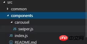
Start coding, create a components folder in src, create a swiper.js file, and index.js, and add the documentation
import PropTypes from 'prop-types';
import React, { Component } from 'react';
import { StyleSheet, TouchableWithoutFeedback, View } from 'react-native';
import RNSwiper from 'react-native-swiper';
const styles = StyleSheet.create({
activeDotWrapperStyle: {
//圆点样式
},
activeDotStyle: {
//圆点样式
},
dotStyle: {
//圆点样式
}
});
const activeDot = (
<View style={styles.activeDotWrapperStyle}>
<View style={styles.activeDotStyle} />
</View>
);
const dot = <View style={styles.dotStyle} />;
export class Carousel extends Component {
// Define component prop list
static propTypes = {
data: PropTypes.array,
height: PropTypes.number,
onPressItem: PropTypes.func,
renderItem: PropTypes.func.isRequired,
autoplay: PropTypes.bool,
autoplayTimeout: PropTypes.number
};
// Define props default value
static defaultProps = {
data: [],
height: 150,
autoplay: true,
autoplayTimeout: 2.5,
onPressItem: () => {},
renderItem: () => {}
};
// Define inner state
state = {
showSwiper: false
};
constructor(props) {
super(props);
this.handleItemPress = this.handleItemPress.bind(this);
}
componentDidMount() {
setTimeout(() => {
this.setState({ showSwiper: true });
});
}
handleItemPress(item) {
this.props.onPressItem(item);
}
_renderSwiperItem(item, index) {
return (
<TouchableWithoutFeedback key={index} onPress={() => this.handleItemPress(item)}>
<View style={[{ flex: 1 }]}>{this.props.renderItem(item)}</View>
</TouchableWithoutFeedback>
);
}
render() {
return this.props.data.length === 0 || !this.state.showSwiper ? null : (
<RNSwiper
height={this.props.height} //图片高度
activeDot={activeDot}
dot={dot}
style={{ backgroundColor: '#fff' }}
autoplay={this.props.autoplay} //是否自动轮播
autoplayTimeout={this.props.autoplayTimeout} //轮播秒数
>
{this.props.data.map((item, idx) => this._renderSwiperItem(item, idx))} //如果数据是个对象里面的数组加一个循环
</RNSwiper>
);
}
}This is the index.js file
import { Carousel } from './carousel/Carousel';
export { Carousel };Public component library
This is used to place public components that have nothing to do with business. Component implementation must consider flexibility and scalability, and cannot contain specific business logic.
The component must be prefixed by the name of the business you do, such as TryCarousel.js. Each component must be placed in a separate directory, and the directory must be all lowercase (separated by dashes), such as carousel/TryCarousel.js.
A basic component structure:
import PropTypes from 'prop-types';
import React, { Component } from 'react';
export class TryCarousel extends Component {
 // Define component prop list
 static propTypes = {};
 // Define props default value
 static defaultProps = {};
 // Define inner state
 state = {};
 constructor(props) {
  super(props);
 }
 // LifeCycle Hooks
 // Prototype Functions
 // Ensure the latest function is render
 render() {}
}Component list
carousel (carousel component)
Mainly used for general image carousel, able to provide click event response.
Usage:
Props:
| Properties | Description | Type | Default value |
|---|---|---|---|
| Carousel data source | Array | - | |
| Height of Carousel | number | 150 | |
| Triggered when Carousel Item is clicked | fn | - | |
| For specific methods of rendering Item, please refer to FlatList | fn | - | |
| Whether to switch automatically | bool | true | |
| Item automatic switching time interval (unit s) | number | 2.5 |
import { HigoCarousel } from '../../components';
<Carousel
      data={} //接受的数据
      onPressItem={} //点击事件
      height={} //图片高度
      autoplay={} //是否自动播放
      autoplayTimeout={} //过渡时间
      renderItem={item => {
       return <Image source={{ uri: item.imageSource }} style={{ flex: 1 }} />;
      }} //图片
/>How to deal with the local development environment cannot be accessed by IP
vue processes the data obtained by storejs
The above is the detailed content of Detailed explanation of the steps to use the react-native package plug-in swiper. For more information, please follow other related articles on the PHP Chinese website!

Hot AI Tools

Undresser.AI Undress
AI-powered app for creating realistic nude photos

AI Clothes Remover
Online AI tool for removing clothes from photos.

Undress AI Tool
Undress images for free

Clothoff.io
AI clothes remover

AI Hentai Generator
Generate AI Hentai for free.

Hot Article
Hot Tools

Notepad++7.3.1
Easy-to-use and free code editor

SublimeText3 Chinese version
Chinese version, very easy to use

Zend Studio 13.0.1
Powerful PHP integrated development environment

Dreamweaver CS6
Visual web development tools

SublimeText3 Mac version
God-level code editing software (SublimeText3)
Hot Topics
 1385
1385
 52
52

 How to use magnet links
Feb 18, 2024 am 10:02 AM
How to use magnet links
Feb 18, 2024 am 10:02 AM
Magnet link is a link method for downloading resources, which is more convenient and efficient than traditional download methods. Magnet links allow you to download resources in a peer-to-peer manner without relying on an intermediary server. This article will introduce how to use magnet links and what to pay attention to. 1. What is a magnet link? A magnet link is a download method based on the P2P (Peer-to-Peer) protocol. Through magnet links, users can directly connect to the publisher of the resource to complete resource sharing and downloading. Compared with traditional downloading methods, magnetic
 How to use mdf and mds files
Feb 19, 2024 pm 05:36 PM
How to use mdf and mds files
Feb 19, 2024 pm 05:36 PM
How to use mdf files and mds files With the continuous advancement of computer technology, we can store and share data in a variety of ways. In the field of digital media, we often encounter some special file formats. In this article, we will discuss a common file format - mdf and mds files, and introduce how to use them. First, we need to understand the meaning of mdf files and mds files. mdf is the extension of the CD/DVD image file, and the mds file is the metadata file of the mdf file.
 What software is crystaldiskmark? -How to use crystaldiskmark?
Mar 18, 2024 pm 02:58 PM
What software is crystaldiskmark? -How to use crystaldiskmark?
Mar 18, 2024 pm 02:58 PM
CrystalDiskMark is a small HDD benchmark tool for hard drives that quickly measures sequential and random read/write speeds. Next, let the editor introduce CrystalDiskMark to you and how to use crystaldiskmark~ 1. Introduction to CrystalDiskMark CrystalDiskMark is a widely used disk performance testing tool used to evaluate the read and write speed and performance of mechanical hard drives and solid-state drives (SSD). Random I/O performance. It is a free Windows application and provides a user-friendly interface and various test modes to evaluate different aspects of hard drive performance and is widely used in hardware reviews
 How to download foobar2000? -How to use foobar2000
Mar 18, 2024 am 10:58 AM
How to download foobar2000? -How to use foobar2000
Mar 18, 2024 am 10:58 AM
foobar2000 is a software that can listen to music resources at any time. It brings you all kinds of music with lossless sound quality. The enhanced version of the music player allows you to get a more comprehensive and comfortable music experience. Its design concept is to play the advanced audio on the computer The device is transplanted to mobile phones to provide a more convenient and efficient music playback experience. The interface design is simple, clear and easy to use. It adopts a minimalist design style without too many decorations and cumbersome operations to get started quickly. It also supports a variety of skins and Theme, personalize settings according to your own preferences, and create an exclusive music player that supports the playback of multiple audio formats. It also supports the audio gain function to adjust the volume according to your own hearing conditions to avoid hearing damage caused by excessive volume. Next, let me help you
 How to use NetEase Mailbox Master
Mar 27, 2024 pm 05:32 PM
How to use NetEase Mailbox Master
Mar 27, 2024 pm 05:32 PM
NetEase Mailbox, as an email address widely used by Chinese netizens, has always won the trust of users with its stable and efficient services. NetEase Mailbox Master is an email software specially created for mobile phone users. It greatly simplifies the process of sending and receiving emails and makes our email processing more convenient. So how to use NetEase Mailbox Master, and what specific functions it has. Below, the editor of this site will give you a detailed introduction, hoping to help you! First, you can search and download the NetEase Mailbox Master app in the mobile app store. Search for "NetEase Mailbox Master" in App Store or Baidu Mobile Assistant, and then follow the prompts to install it. After the download and installation is completed, we open the NetEase email account and log in. The login interface is as shown below
 How to use Baidu Netdisk app
Mar 27, 2024 pm 06:46 PM
How to use Baidu Netdisk app
Mar 27, 2024 pm 06:46 PM
Cloud storage has become an indispensable part of our daily life and work nowadays. As one of the leading cloud storage services in China, Baidu Netdisk has won the favor of a large number of users with its powerful storage functions, efficient transmission speed and convenient operation experience. And whether you want to back up important files, share information, watch videos online, or listen to music, Baidu Cloud Disk can meet your needs. However, many users may not understand the specific use method of Baidu Netdisk app, so this tutorial will introduce in detail how to use Baidu Netdisk app. Users who are still confused can follow this article to learn more. ! How to use Baidu Cloud Network Disk: 1. Installation First, when downloading and installing Baidu Cloud software, please select the custom installation option.
 BTCC tutorial: How to bind and use MetaMask wallet on BTCC exchange?
Apr 26, 2024 am 09:40 AM
BTCC tutorial: How to bind and use MetaMask wallet on BTCC exchange?
Apr 26, 2024 am 09:40 AM
MetaMask (also called Little Fox Wallet in Chinese) is a free and well-received encryption wallet software. Currently, BTCC supports binding to the MetaMask wallet. After binding, you can use the MetaMask wallet to quickly log in, store value, buy coins, etc., and you can also get 20 USDT trial bonus for the first time binding. In the BTCCMetaMask wallet tutorial, we will introduce in detail how to register and use MetaMask, and how to bind and use the Little Fox wallet in BTCC. What is MetaMask wallet? With over 30 million users, MetaMask Little Fox Wallet is one of the most popular cryptocurrency wallets today. It is free to use and can be installed on the network as an extension
 Simple guide to pip mirror source: easily master how to use it
Jan 16, 2024 am 10:18 AM
Simple guide to pip mirror source: easily master how to use it
Jan 16, 2024 am 10:18 AM
Get started easily: How to use pip mirror source With the popularity of Python around the world, pip has become a standard tool for Python package management. However, a common problem that many developers face when using pip to install packages is slowness. This is because by default, pip downloads packages from Python official sources or other external sources, and these sources may be located on overseas servers, resulting in slow download speeds. In order to improve download speed, we can use pip mirror source. What is a pip mirror source? To put it simply, just
