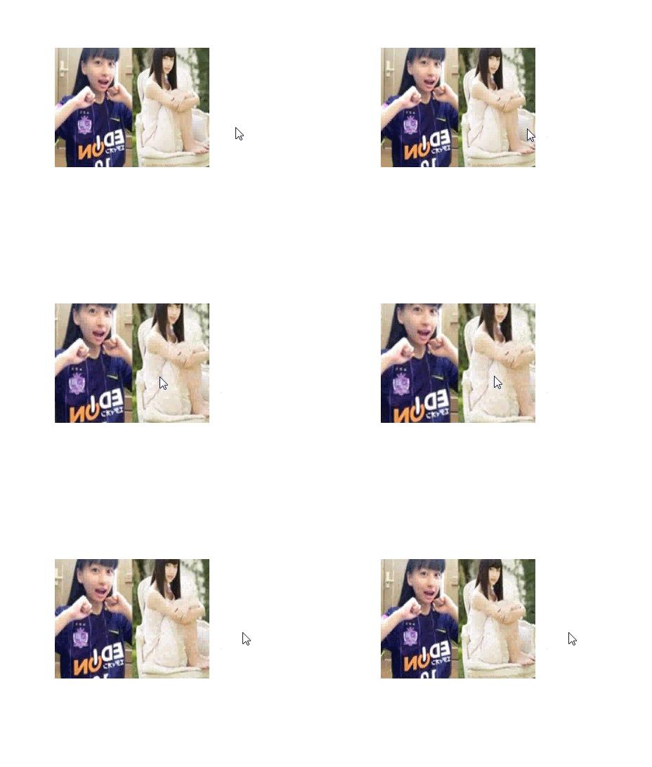
This time I will bring you JS CSS3 to realize the interactive magnification effect of the mouse and the picture. What are the precautions for JS CSS3 to realize the interactive magnification effect of the mouse and the picture. The following is a practical case, let's take a look.
I was looking at the NetEase website today. When I put the mouse on it, I found that the picture was enlarged, and when I moved the mouse, the picture was reduced, so I tried it myself. The results are as follows.
Method 1: Using js and css3
The effect is as shown:

This implementation is very simple, just use the mouseover and mouseout events of js, but I don’t know how to enlarge the picture from the middle. Let’s try again in the future. The code is as follows:
<!DOCTYPE html>
<html>
<head>
  <title>网易图片动画</title>
  <style>
    p.img {
      width: 220px;
      height: 170px;
      margin: 200px auto;
      overflow: hidden;
    }
    img.bigger {
      width: 100%;
      height:100%;
    }
    @keyframes bigger {
      from {width: 100%;height: 100%;}
      to {width: 110%; height: 110%;}
    }
    @keyframes smaller {
      from {width: 110%;height: 110%;}
      to {width: 100%; height: 100%;}
    }
  </style>
</head>
<body>
  <p class="img">
    <img class="bigger" src="http://cms-bucket.nosdn.127.net/d9b6afa0bad743f88c1780c3a064202c20170218074455.jpeg?imageView&thumbnail=185y116&quality=85" alt="">
  </p>
  <script>
    var img = document.querySelector("img");
    img.onmouseover = function () {
      img.style.cssText = "animation: bigger 2s;width:110%; height:110%;";
    }
    img.onmouseout = function () {
      img.style.cssText = "animation: smaller 2s";
    }
  </script>
</body>
</html>Method 2: Use css3 method
css3 has indeed brought us many benefits, making it easier for us to deal with problems. This can be achieved by using transform:scale();, but this must be used in combination with hover, and the duration of the transition must be set to achieve better results. Without further ado, the effect is as follows:

Isn’t this effect much better? You can see that it expands from the center.
But as long as we add the transform-origin attribute, we can well control the center point of the change, such as:
transform-origin: 0 0;
transform-origin: 100% 0;
transform-origin: 0 100%;
transform-origin: 100% 100%;
means respectively from the upper left corner, upper right corner, lower left corner, The lower right corner expands. As you can imagine, the default transform-origin is 50% 50%.
The source code is as follows:
<!DOCTYPE html>
<html>
<head>
  <title>网易图片动画</title>
  <style>
    p.img {
      width: 220px;
      height: 170px;
      margin: 200px auto;
      overflow: hidden;
    }
    img.bigger {
      width: 100%;
      height:100%;
      transition:transform 2s;
    }
    img.bigger:hover{
      transform: scale(1.2,1.2);
    }
  </style>
</head>
<body>
  <p class="img">
    <img class="bigger" src="http://cms-bucket.nosdn.127.net/d9b6afa0bad743f88c1780c3a064202c20170218074455.jpeg?imageView&thumbnail=185y116&quality=85" alt="">
  </p>
</body>
</html>I believe you have mastered it after reading the case in this article For more exciting methods, please pay attention to other related articles on the php Chinese website!
Recommended reading:
Vue project global configuration WeChat sharing step instructions
The above is the detailed content of JS+CSS3 realizes the interactive magnification effect between mouse and picture. For more information, please follow other related articles on the PHP Chinese website!


