

Media objects that Bootstrap must learn every day_javascript skills

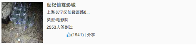
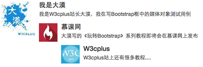
In the production of web pages or mobile pages, we often see this effect, with the left side on the left (or right) and the content on the right (or left), as shown in the figure below:
We often call such effects media objects. It can be said that it is an abstract style that can be used to build different types of components. These components all have the style mentioned at the beginning. Then some parts are specially extracted from the Bootstrap framework to introduce a component. Its corresponding version file:
☑ LESS version: The corresponding source file is media.less
☑ Sass version: The corresponding source file is _media.scss
☑ Compiled version: corresponds to lines 4792 ~ 4819 of the bootstrap.css file
1. Media object – default media object
Media objects generally appear in groups, and a group of media objects often includes the following parts:
☑ Container of media objects: often represented by the "media" class name, used to accommodate all contents of media objects
☑ The object of the media object: often expressed by "media-object", it is the object in the media object, often a picture
☑ The body of the media object: often expressed as "media-body", it is the main content in the media object, which can be any element, often the side content of the image
☑ The title of the media object: often expressed by "media-heading", which is a title used to describe the object. This part is optional
As shown below:
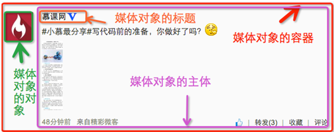
In addition to the above four parts, "pull-left" or "pull-right" are often used in the Bootstrap framework to control the floating mode of objects in media objects.
In specific use, it is as follows:
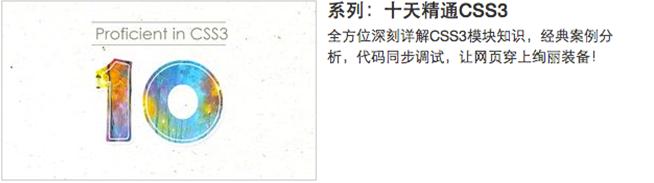
<div class="media">
  <a class="pull-left" href="#">
    <img class="media-object lazy"  src="/static/imghw/default1.png"  data-src="imgs/1.jpg"  alt="Media objects that Bootstrap must learn every day_javascript skills">
  </a>
  <div class="media-body">
    <h4 id="系列-十天精通CSS">系列:十天精通CSS3</h4>
    <div>全方位深刻详解CSS3模块知识,经典案例分析,代码同步调试,让网页穿上绚丽装备!</div>
  </div>
</div>
The operation effect is as follows:
Principle analysis:
Media object styles are relatively simple, just set the spacing between them, as shown below:
/Line 4792~Line 4815 of the bootstrap.css file/
.media,
.media-body {
 overflow: hidden;
 zoom: 1;
}
.media,
.media .media {
 margin-top: 15px;
}
.media:first-child {
 margin-top: 0;
}
.media-object {
 display: block;
}
.media-heading {
 margin: 0 0 5px;
}
.media > .pull-left {
 margin-right: 10px;
}
.media > .pull-right {
 margin-left: 10px;
}
2. Media objects – nesting of media objects
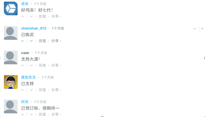
In the comment system, you can often see the following effect:
Looking from the outside in, there are three media objects here, but one is nested inside the other. Then the media object in the Bootstrap framework also has such a function. You only need to place another media object structure within the body of the media object "media-body", as shown below:
<div class="media">
  <a class="pull-left" href="#">
    <img class="media-object lazy"  src="/static/imghw/default1.png"  data-src="…"  alt="Media objects that Bootstrap must learn every day_javascript skills">
  </a>
  <div class="media-body">
    <h4 id="Media-Heading">Media Heading</h4>
    <div>…</div>
    <div class="media">
      <a class="pull-left" href="#">
        <img class="media-object lazy"  src="/static/imghw/default1.png"  data-src="…"  alt="Media objects that Bootstrap must learn every day_javascript skills">
      </a>
      <div class="media-body">
        <h4 id="Media-Heading">Media Heading</h4>
        <div>…</div>
        <div class="media">
          <a class="pull-left" href="#">
            <img class="media-object lazy"  src="/static/imghw/default1.png"  data-src="…"  alt="Media objects that Bootstrap must learn every day_javascript skills">
          </a>
          <div class="media-body">
            <h4 id="Media-Heading">Media Heading</h4>
            <div>Media objects that Bootstrap must learn every day_javascript skills</div>
          </div>
        </div>
      </div>
    </div>
  </div>
</div>When ensuring that your structure is not nested incorrectly, you can directly see the effect as shown below:
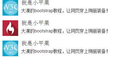
3. Media objects – media object list
The nesting of media objects is only one of the simple application effects in media objects. In many cases, we will also encounter a list, and each list item looks similar to the media object. The same is said in the comment system. Thing:
Usage:
For the media object list effect in the above picture, the Bootstrap framework provides a list display effect. You can use ul when writing the structure, and add the class name "media-list" to ul, and use " media", the sample code is as follows:
<ul class="media-list">
<li class="media">
<a class="pull-left" href="#">
<img class="media-object lazy" src="/static/imghw/default1.png" data-src="http://files.jb51.net/file_images/article/201511/20151130100003233.jpg?2015103010012" alt="Media objects that Bootstrap must learn every day_javascript skills">
</a>
<div>
<h4 id="Media-Header">Media Header</h4>
<div>…</div>
</div>
</li>
<li>…</li>
<li>…</li>
</ul>
The operation effect is as follows:
Principle analysis:
The media object list does not have too much special processing in terms of style. It just sets the left spacing of the list to 0 and removes the bullet list symbol:
/Line 4816~Line 4819 of the bootstrap.css file/
.media-list {
 padding-left: 0;
 list-style: none;
}
The above is the entire content of this article to help you learn Bootstrap media objects. I hope it will be helpful to your learning.

Hot AI Tools

Undresser.AI Undress
AI-powered app for creating realistic nude photos

AI Clothes Remover
Online AI tool for removing clothes from photos.

Undress AI Tool
Undress images for free

Clothoff.io
AI clothes remover

Video Face Swap
Swap faces in any video effortlessly with our completely free AI face swap tool!

Hot Article
Hot Tools

Notepad++7.3.1
Easy-to-use and free code editor

SublimeText3 Chinese version
Chinese version, very easy to use

Zend Studio 13.0.1
Powerful PHP integrated development environment

Dreamweaver CS6
Visual web development tools

SublimeText3 Mac version
God-level code editing software (SublimeText3)
Hot Topics
 1391
1391
 52
52

 How to get the bootstrap search bar
Apr 07, 2025 pm 03:33 PM
How to get the bootstrap search bar
Apr 07, 2025 pm 03:33 PM
How to use Bootstrap to get the value of the search bar: Determines the ID or name of the search bar. Use JavaScript to get DOM elements. Gets the value of the element. Perform the required actions.
 How to use bootstrap in vue
Apr 07, 2025 pm 11:33 PM
How to use bootstrap in vue
Apr 07, 2025 pm 11:33 PM
Using Bootstrap in Vue.js is divided into five steps: Install Bootstrap. Import Bootstrap in main.js. Use the Bootstrap component directly in the template. Optional: Custom style. Optional: Use plug-ins.
 How to do vertical centering of bootstrap
Apr 07, 2025 pm 03:21 PM
How to do vertical centering of bootstrap
Apr 07, 2025 pm 03:21 PM
Use Bootstrap to implement vertical centering: flexbox method: Use the d-flex, justify-content-center, and align-items-center classes to place elements in the flexbox container. align-items-center class method: For browsers that do not support flexbox, use the align-items-center class, provided that the parent element has a defined height.
 How to write split lines on bootstrap
Apr 07, 2025 pm 03:12 PM
How to write split lines on bootstrap
Apr 07, 2025 pm 03:12 PM
There are two ways to create a Bootstrap split line: using the tag, which creates a horizontal split line. Use the CSS border property to create custom style split lines.
 How to use bootstrap button
Apr 07, 2025 pm 03:09 PM
How to use bootstrap button
Apr 07, 2025 pm 03:09 PM
How to use the Bootstrap button? Introduce Bootstrap CSS to create button elements and add Bootstrap button class to add button text
 How to resize bootstrap
Apr 07, 2025 pm 03:18 PM
How to resize bootstrap
Apr 07, 2025 pm 03:18 PM
To adjust the size of elements in Bootstrap, you can use the dimension class, which includes: adjusting width: .col-, .w-, .mw-adjust height: .h-, .min-h-, .max-h-
 How to set up the framework for bootstrap
Apr 07, 2025 pm 03:27 PM
How to set up the framework for bootstrap
Apr 07, 2025 pm 03:27 PM
To set up the Bootstrap framework, you need to follow these steps: 1. Reference the Bootstrap file via CDN; 2. Download and host the file on your own server; 3. Include the Bootstrap file in HTML; 4. Compile Sass/Less as needed; 5. Import a custom file (optional). Once setup is complete, you can use Bootstrap's grid systems, components, and styles to create responsive websites and applications.
 How to insert pictures on bootstrap
Apr 07, 2025 pm 03:30 PM
How to insert pictures on bootstrap
Apr 07, 2025 pm 03:30 PM
There are several ways to insert images in Bootstrap: insert images directly, using the HTML img tag. With the Bootstrap image component, you can provide responsive images and more styles. Set the image size, use the img-fluid class to make the image adaptable. Set the border, using the img-bordered class. Set the rounded corners and use the img-rounded class. Set the shadow, use the shadow class. Resize and position the image, using CSS style. Using the background image, use the background-image CSS property.
