
This time I will bring you JS CSS3 to make a picture bound to a mouse move event to amplify. JS CSS3 to make a picture bound to a mouse move event to amplify. What are the precautions? . The following is a practical case. One Get up and take a look.
I was looking at the NetEase website today. When I put the mouse on it, I found that the picture was enlarged, and when I moved the mouse, the picture was reduced, so I tried it myself. The results are as follows.
Method 1: Using js and css3
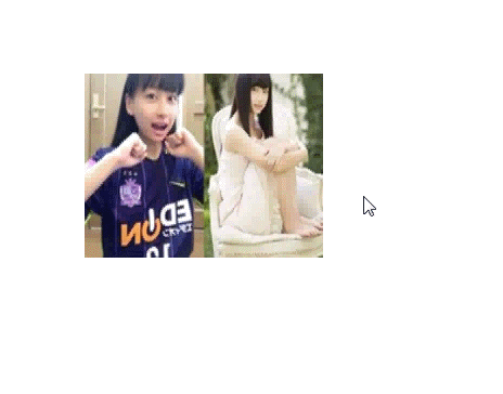
The effect is as shown:

This implementation is very simple, just use the mouseover and mouseout events of js, but I don’t know how to enlarge the picture from the middle. Let’s try again in the future. The code is as follows:
<!DOCTYPE html>
<html>
<head>
  <title>网易图片动画</title>
  <style>
    p.img {
      width: 220px;
      height: 170px;
      margin: 200px auto;
      overflow: hidden;
    }
    img.bigger {
      width: 100%;
      height:100%;
    }
    @keyframes bigger {
      from {width: 100%;height: 100%;}
      to {width: 110%; height: 110%;}
    }
    @keyframes smaller {
      from {width: 110%;height: 110%;}
      to {width: 100%; height: 100%;}
    }
  </style>
</head>
<body>
  <p class="img">
    <img class="bigger" src="http://cms-bucket.nosdn.127.net/d9b6afa0bad743f88c1780c3a064202c20170218074455.jpeg?imageView&thumbnail=185y116&quality=85" alt="">
  </p>
  <script>
    var img = document.querySelector("img");
    img.onmouseover = function () {
      img.style.cssText = "animation: bigger 2s;width:110%; height:110%;";
    }
    img.onmouseout = function () {
      img.style.cssText = "animation: smaller 2s";
    }
  </script>
</body>
</html>Method 2: Use css3 method
css3 has indeed brought us many benefits, making it easier for us to deal with problems. This can be achieved by using transform:scale();, but this must be used in combination with hover, and the duration of the transition must be set to achieve better results. Without further ado, the effect is as follows:
Isn’t this effect much better? You can see that it expands from the center.
But as long as we add the transform-origin attribute, we can well control the center point of the change, such as:
transform-origin: 0 0;
transform-origin: 100% 0;
transform-origin: 0 100%;
transform-origin: 100% 100%;
means respectively from the upper left corner, upper right corner, lower left corner, The lower right corner expands. As you can imagine, the default transform-origin is 50% 50%.
The source code is as follows:
<!DOCTYPE html>
<html>
<head>
  <title>网易图片动画</title>
  <style>
    p.img {
      width: 220px;
      height: 170px;
      margin: 200px auto;
      overflow: hidden;
    }
    img.bigger {
      width: 100%;
      height:100%;
      transition:transform 2s;
    }
    img.bigger:hover{
      transform: scale(1.2,1.2);
    }
  </style>
</head>
<body>
  <p class="img">
    <img class="bigger" src="http://cms-bucket.nosdn.127.net/d9b6afa0bad743f88c1780c3a064202c20170218074455.jpeg?imageView&thumbnail=185y116&quality=85" alt="">
  </p>
</body>
</html>I believe you have mastered it after reading the case in this article For more exciting methods, please pay attention to other related articles on the php Chinese website!
Recommended reading:
How to use Vue.js calculated properties and listeners
How to dynamically introduce JS files
The above is the detailed content of JS+CSS3 makes image binding mouse movement event amplification. For more information, please follow other related articles on the PHP Chinese website!


![[Web front-end] Node.js quick start](https://img.php.cn/upload/course/000/000/067/662b5d34ba7c0227.png)


