Chart.js lightweight chart library use case analysis
This time I will bring you an analysis of the use cases of Chart.js lightweight chart library. What are the precautions when using Chart.js lightweight chart library? The following is a practical case. Let’s take a look. one time.
Preface
In a recent project, I encountered a need to draw a chart on the page. It requires a fan chart and a bar chart. Although it can Drawing using svg or canvas is not necessarily easy, so we researched and connected mainstream third-party chart libraries for project use. The following mainly records some of my experiences and solutions during use. Please refer to the official documentation for specific tutorials.
Technical Selection
Studyed Highcharts, Baidu’s ECharts, Alibaba’s G2 and Charts.js Chart library, since the project has little demand for charts and the charts are not complex, the lightweight Charts.js is introduced. Chart.js is easy to get started. You only need to reference the script file in the page and create a
GitHub source code: https://github.com/nnnick/Chart.js
Chart.js documentation: http://www.bootcss.com/p/chart. js/
Introduction
Download the source code on GitHUb and introduce the dist/Chart.bundle.js file into the project to use; view Source code and found that it is compatible with multiple module loading methods, so I used requireJs to load it on the page.
Usage experience
①The number of chart color values does not need to be equal to the number of data, such as
var pieConfig = {
   type: 'pie',
   data: {
     datasets: [{
      data: [10, 20],
      backgroundColor: ['#debd5a', '#ff6d4a', '#3cc9bf', '#7599e9',]
     }]
  }
}②Yes Cancel responsive options: {responsive: false} to facilitate controlling the size of the chart. The chart will be as large as the canvas. The canvas will not automatically fill up the outer container.
③Cancel the click event of the legend, because clicking the legend will hide the proportion of the data by default, so I need to remove the click event, set legend: {onClick: function () {}}, and modify the click event.
④Change the legend from the default rectangle to a square, and set the font size and color value of the legend
options: {
  legend: {
   position: 'right',
   labels: {
    boxWidth: 14,// 修改宽度
    fontSize: 14,
    fontColor: '#666666'
   }
}The effect is as follows
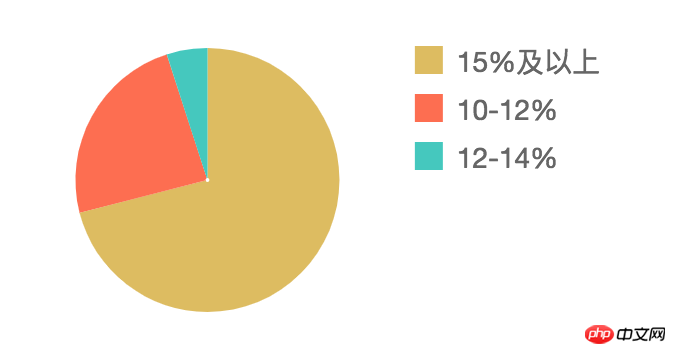
⑤ Remove the grid lines from the histogram, set the axis color, the width of the rectangle, and display the y-axis data starting from 0. Since Chart.js 2.0 is used, the configuration parameters have changed a lot, so many examples on the Internet have become invalid. Here is the effective configuration code
options: {
  scales: {
   xAxes: [{
    gridLines: {
     color: 'rgba(0, 0, 0, 0)',// 隐藏x轴方向轴线
     zeroLineColor: '#666666'// 设置轴颜色
    },
    barPercentage: 0.2,// 设置柱宽度
    ticks: {// 设置轴文字字号和色值
     fontSize: 12,
     fontColor: '#666666'
    }
   }],
   yAxes: [{
    gridLines: {
     color: 'rgba(0, 0, 0, 0)',// 隐藏要y轴轴线
     zeroLineColor: '#666666'
     },
     ticks: {
      fontSize: 12,
      beginAtZero: true,// y轴数据从0开始展示
      fontColor: '#666666'
      }
   }]
  }
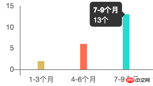
}The effect is as follows

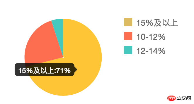
⑥To add units to the data of chart tooltips, you can use the callback function of tooltips to set
tooltips: {
 callbacks: {
  label: function (tooltipItem, data) {
   var value = data.datasets[tooltipItem.datasetIndex].data[tooltipItem.index] + '%';
   var title = data.labels[tooltipItem.index] + ':';
   return title + value;
   }
  }
}The effect is as follows
 ##
##
tooltips: {
  callbacks: {
   label: function (tooptipItem) {
    return tooptipItem.yLabel + '个' ;
   }
  }
}
Sharing the steps to build a ghost blog in centos
The above is the detailed content of Chart.js lightweight chart library use case analysis. For more information, please follow other related articles on the PHP Chinese website!

Hot AI Tools

Undresser.AI Undress
AI-powered app for creating realistic nude photos

AI Clothes Remover
Online AI tool for removing clothes from photos.

Undress AI Tool
Undress images for free

Clothoff.io
AI clothes remover

Video Face Swap
Swap faces in any video effortlessly with our completely free AI face swap tool!

Hot Article

Hot Tools

Notepad++7.3.1
Easy-to-use and free code editor

SublimeText3 Chinese version
Chinese version, very easy to use

Zend Studio 13.0.1
Powerful PHP integrated development environment

Dreamweaver CS6
Visual web development tools

SublimeText3 Mac version
God-level code editing software (SublimeText3)

Hot Topics
 1386
1386
 52
52
 How to implement an online speech recognition system using WebSocket and JavaScript
Dec 17, 2023 pm 02:54 PM
How to use WebSocket and JavaScript to implement an online speech recognition system Introduction: With the continuous development of technology, speech recognition technology has become an important part of the field of artificial intelligence. The online speech recognition system based on WebSocket and JavaScript has the characteristics of low latency, real-time and cross-platform, and has become a widely used solution. This article will introduce how to use WebSocket and JavaScript to implement an online speech recognition system.
 Best lightweight Linux distributions for low-end or older computers
Mar 06, 2024 am 09:49 AM
Looking for the perfect Linux distribution to breathe new life into your old or low-end computer? If yes, then you have come to the right place. In this article, we'll explore some of our top picks for lightweight Linux distributions that are specifically tailored for older or less powerful hardware. Whether the motivation behind this is to revive an aging device or simply maximize performance on a budget, these lightweight options are sure to fit the bill. Why choose a lightweight Linux distribution? There are several advantages to choosing a lightweight Linux distribution, the first of which is getting the best performance on the least system resources, which makes them ideal for older hardware with limited processing power, RAM, and storage space. Beyond that, with heavier resource intensive
 WebSocket and JavaScript: key technologies for implementing real-time monitoring systems
Dec 17, 2023 pm 05:30 PM
WebSocket and JavaScript: Key technologies for realizing real-time monitoring systems Introduction: With the rapid development of Internet technology, real-time monitoring systems have been widely used in various fields. One of the key technologies to achieve real-time monitoring is the combination of WebSocket and JavaScript. This article will introduce the application of WebSocket and JavaScript in real-time monitoring systems, give code examples, and explain their implementation principles in detail. 1. WebSocket technology
 How to use JavaScript and WebSocket to implement a real-time online ordering system
Dec 17, 2023 pm 12:09 PM
Introduction to how to use JavaScript and WebSocket to implement a real-time online ordering system: With the popularity of the Internet and the advancement of technology, more and more restaurants have begun to provide online ordering services. In order to implement a real-time online ordering system, we can use JavaScript and WebSocket technology. WebSocket is a full-duplex communication protocol based on the TCP protocol, which can realize real-time two-way communication between the client and the server. In the real-time online ordering system, when the user selects dishes and places an order
 How to implement an online reservation system using WebSocket and JavaScript
Dec 17, 2023 am 09:39 AM
How to use WebSocket and JavaScript to implement an online reservation system. In today's digital era, more and more businesses and services need to provide online reservation functions. It is crucial to implement an efficient and real-time online reservation system. This article will introduce how to use WebSocket and JavaScript to implement an online reservation system, and provide specific code examples. 1. What is WebSocket? WebSocket is a full-duplex method on a single TCP connection.
 JavaScript and WebSocket: Building an efficient real-time weather forecasting system
Dec 17, 2023 pm 05:13 PM
JavaScript and WebSocket: Building an efficient real-time weather forecast system Introduction: Today, the accuracy of weather forecasts is of great significance to daily life and decision-making. As technology develops, we can provide more accurate and reliable weather forecasts by obtaining weather data in real time. In this article, we will learn how to use JavaScript and WebSocket technology to build an efficient real-time weather forecast system. This article will demonstrate the implementation process through specific code examples. We
 Simple JavaScript Tutorial: How to Get HTTP Status Code
Jan 05, 2024 pm 06:08 PM
JavaScript tutorial: How to get HTTP status code, specific code examples are required. Preface: In web development, data interaction with the server is often involved. When communicating with the server, we often need to obtain the returned HTTP status code to determine whether the operation is successful, and perform corresponding processing based on different status codes. This article will teach you how to use JavaScript to obtain HTTP status codes and provide some practical code examples. Using XMLHttpRequest
 Analyze why Golang is suitable for high concurrency processing?
Feb 29, 2024 pm 01:12 PM
Golang (Go language) is a programming language developed by Google, aiming to provide an efficient, concise, concurrent and lightweight programming experience. It has built-in concurrency features and provides developers with powerful tools to perform well in high-concurrency situations. This article will delve into the reasons why Golang is suitable for high-concurrency processing and provide specific code examples to illustrate. Golang concurrency model Golang adopts a concurrency model based on goroutine and channel. goro


