

How to use react-native package plug-in swiper
This article mainly introduces how to use the react-native packaging plug-in swiper. Now I will share it with you and give you a reference.
First create a simple react-native project and create a folder. Then use the command line to enter
react-native init swiper
. After creating the development project, I use vs

to open it. Console, install swiper dependencies.
Installation: npm i react-native-swiper --save
View: npm view react-native-swiper
Delete: npm rm react-native-swiper --save
Here also Need to update the local dependency library under npm i
Start the app project
ios: react-native run-ios
android: react-native run-android
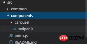
Start coding, create a components folder in src and create a swiper.js file under it, as well as index.js, and add the documentation
import PropTypes from 'prop-types';
import React, { Component } from 'react';
import { StyleSheet, TouchableWithoutFeedback, View } from 'react-native';
import RNSwiper from 'react-native-swiper';
const styles = StyleSheet.create({
activeDotWrapperStyle: {
//圆点样式
},
activeDotStyle: {
//圆点样式
},
dotStyle: {
//圆点样式
}
});
const activeDot = (
<View style={styles.activeDotWrapperStyle}>
<View style={styles.activeDotStyle} />
</View>
);
const dot = <View style={styles.dotStyle} />;
export class Carousel extends Component {
// Define component prop list
static propTypes = {
data: PropTypes.array,
height: PropTypes.number,
onPressItem: PropTypes.func,
renderItem: PropTypes.func.isRequired,
autoplay: PropTypes.bool,
autoplayTimeout: PropTypes.number
};
// Define props default value
static defaultProps = {
data: [],
height: 150,
autoplay: true,
autoplayTimeout: 2.5,
onPressItem: () => {},
renderItem: () => {}
};
// Define inner state
state = {
showSwiper: false
};
constructor(props) {
super(props);
this.handleItemPress = this.handleItemPress.bind(this);
}
componentDidMount() {
setTimeout(() => {
this.setState({ showSwiper: true });
});
}
handleItemPress(item) {
this.props.onPressItem(item);
}
_renderSwiperItem(item, index) {
return (
<TouchableWithoutFeedback key={index} onPress={() => this.handleItemPress(item)}>
<View style={[{ flex: 1 }]}>{this.props.renderItem(item)}</View>
</TouchableWithoutFeedback>
);
}
render() {
return this.props.data.length === 0 || !this.state.showSwiper ? null : (
<RNSwiper
height={this.props.height} //图片高度
activeDot={activeDot}
dot={dot}
style={{ backgroundColor: '#fff' }}
autoplay={this.props.autoplay} //是否自动轮播
autoplayTimeout={this.props.autoplayTimeout} //轮播秒数
>
{this.props.data.map((item, idx) => this._renderSwiperItem(item, idx))} //如果数据是个对象里面的数组加一个循环
</RNSwiper>
);
}
}This is the index.js file
import { Carousel } from './carousel/Carousel';

export { Carousel };Public component library
This is used to place public components that have nothing to do with the business. Component implementation must consider flexibility and scalability, and cannot contain specific business logic.
The component must be prefixed by the name of the business you do, such as TryCarousel.js. Each component must be placed in a separate directory, and the directory must be all lowercase (separated by dashes), such as carousel/TryCarousel.js.
A basic component structure:
import PropTypes from 'prop-types';
import React, { Component } from 'react';

export class TryCarousel extends Component {
 // Define component prop list
 static propTypes = {};

 // Define props default value
 static defaultProps = {};

 // Define inner state
 state = {};

 constructor(props) {
  super(props);
 }

 // LifeCycle Hooks

 // Prototype Functions

 // Ensure the latest function is render
 render() {}
}Component list
carousel( Carousel component)
is mainly used for general image carousel and can provide click event response.
Usage:
Props:
| Description | Type | Default value | |
|---|---|---|---|
| Carousel data source | Array | - | |
| Height of Carousel | number | 150 | |
| Triggered when Carousel Item is clicked | fn | - | |
| Specific For the method of rendering Item, please refer to FlatList | fn | - | |
| Whether to automatically switch | bool | true | |
| Item automatic switching time interval (unit s) | number | 2.5 |
import { HigoCarousel } from '../../components';
<Carousel
      data={} //接受的数据
      onPressItem={} //点击事件
      height={} //图片高度
      autoplay={} //是否自动播放
      autoplayTimeout={} //过渡时间
      renderItem={item => {
       return <Image source={{ uri: item.imageSource }} style={{ flex: 1 }} />;
      }} //图片
/>Ajax asynchronous loading analysis
Ajax technology composition and core principle analysis
About the output stream at the end of the servlet in Ajax technology
The above is the detailed content of How to use react-native package plug-in swiper. For more information, please follow other related articles on the PHP Chinese website!

Hot AI Tools

Undresser.AI Undress
AI-powered app for creating realistic nude photos

AI Clothes Remover
Online AI tool for removing clothes from photos.

Undress AI Tool
Undress images for free

Clothoff.io
AI clothes remover

AI Hentai Generator
Generate AI Hentai for free.

Hot Article
Hot Tools

Notepad++7.3.1
Easy-to-use and free code editor

SublimeText3 Chinese version
Chinese version, very easy to use

Zend Studio 13.0.1
Powerful PHP integrated development environment

Dreamweaver CS6
Visual web development tools

SublimeText3 Mac version
God-level code editing software (SublimeText3)
Hot Topics
 1385
1385
 52
52

 How to use DirectX repair tool? Detailed usage of DirectX repair tool
Mar 15, 2024 am 08:31 AM
How to use DirectX repair tool? Detailed usage of DirectX repair tool
Mar 15, 2024 am 08:31 AM
The DirectX repair tool is a professional system tool. Its main function is to detect the DirectX status of the current system. If an abnormality is found, it can be repaired directly. There may be many users who don’t know how to use the DirectX repair tool. Let’s take a look at the detailed tutorial below. 1. Use repair tool software to perform repair detection. 2. If it prompts that there is an abnormal problem in the C++ component after the repair is completed, please click the Cancel button, and then click the Tools menu bar. 3. Click the Options button, select the extension, and click the Start Extension button. 4. After the expansion is completed, re-detect and repair it. 5. If the problem is still not solved after the repair tool operation is completed, you can try to uninstall and reinstall the program that reported the error.
 Introduction to HTTP 525 status code: explore its definition and application
Feb 18, 2024 pm 10:12 PM
Introduction to HTTP 525 status code: explore its definition and application
Feb 18, 2024 pm 10:12 PM
Introduction to HTTP 525 status code: Understand its definition and usage HTTP (HypertextTransferProtocol) 525 status code means that an error occurred on the server during the SSL handshake, resulting in the inability to establish a secure connection. The server returns this status code when an error occurs during the Transport Layer Security (TLS) handshake. This status code falls into the server error category and usually indicates a server configuration or setup problem. When the client tries to connect to the server via HTTPS, the server has no
 How to use Baidu Netdisk-How to use Baidu Netdisk
Mar 04, 2024 pm 09:28 PM
How to use Baidu Netdisk-How to use Baidu Netdisk
Mar 04, 2024 pm 09:28 PM
Many friends still don’t know how to use Baidu Netdisk, so the editor will explain how to use Baidu Netdisk below. If you are in need, hurry up and take a look. I believe it will be helpful to everyone. Step 1: Log in directly after installing Baidu Netdisk (as shown in the picture); Step 2: Then select "My Sharing" and "Transfer List" according to the page prompts (as shown in the picture); Step 3: In "Friend Sharing", you can share pictures and files directly with friends (as shown in the picture); Step 4: Then select "Share" and then select computer files or network disk files (as shown in the picture); Fifth Step 1: Then you can find friends (as shown in the picture); Step 6: You can also find the functions you need in the "Function Treasure Box" (as shown in the picture). The above is the editor’s opinion
 Learn to copy and paste quickly
Feb 18, 2024 pm 03:25 PM
Learn to copy and paste quickly
Feb 18, 2024 pm 03:25 PM
How to use the copy-paste shortcut keys Copy-paste is an operation we often encounter when using computers every day. In order to improve work efficiency, it is very important to master the copy and paste shortcut keys. This article will introduce some commonly used copy and paste shortcut keys to help readers perform copy and paste operations more conveniently. Copy shortcut key: Ctrl+CCtrl+C is the shortcut key for copying. By holding down the Ctrl key and then pressing the C key, you can copy the selected text, files, pictures, etc. to the clipboard. To use this shortcut key,
 How to correctly use the win10 command prompt for automatic repair operations
Dec 30, 2023 pm 03:17 PM
How to correctly use the win10 command prompt for automatic repair operations
Dec 30, 2023 pm 03:17 PM
The longer the computer is used, the more likely it is to malfunction. At this time, friends need to use their own methods to repair it. So what is the easiest way to do it? Today I will bring you a tutorial on how to repair using the command prompt. How to use win10 automatic repair command prompt: 1. Press "Win+R" and enter cmd to open the "command prompt" 2. Enter chkdsk to view the repair command 3. If you need to view other places, you can also add other partitions such as "d" 4. Enter the execution command chkdskd:/F. 5. If it is occupied during the modification process, you can enter Y to continue.
 What is the KMS activation tool? How to use the KMS activation tool? How to use KMS activation tool?
Mar 18, 2024 am 11:07 AM
What is the KMS activation tool? How to use the KMS activation tool? How to use KMS activation tool?
Mar 18, 2024 am 11:07 AM
The KMS Activation Tool is a software tool used to activate Microsoft Windows and Office products. KMS is the abbreviation of KeyManagementService, which is key management service. The KMS activation tool simulates the functions of the KMS server so that the computer can connect to the virtual KMS server to activate Windows and Office products. The KMS activation tool is small in size and powerful in function. It can be permanently activated with one click. It can activate any version of the window system and any version of Office software without being connected to the Internet. It is currently the most successful and frequently updated Windows activation tool. Today I will introduce it Let me introduce to you the kms activation work
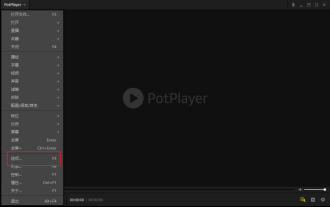 How to use potplayer-How to use potplayer
Mar 04, 2024 pm 06:10 PM
How to use potplayer-How to use potplayer
Mar 04, 2024 pm 06:10 PM
Potplayer is a very powerful media player, but many friends still don’t know how to use potplayer. Today I will introduce how to use potplayer in detail, hoping to help everyone. 1. PotPlayer shortcut keys. The default common shortcut keys for PotPlayer player are as follows: (1) Play/pause: space (2) Volume: mouse wheel, up and down arrow keys (3) forward/backward: left and right arrow keys (4) bookmark: P- Add bookmarks, H-view bookmarks (5) full screen/restore: Enter (6) multiple speeds: C-accelerate, 7) Previous/next frame: D/
 How to merge cells using shortcut keys
Feb 26, 2024 am 10:27 AM
How to merge cells using shortcut keys
Feb 26, 2024 am 10:27 AM
How to use the shortcut keys for merging cells In daily work, we often need to edit and format tables. Merging cells is a common operation that can merge multiple adjacent cells into one cell to improve the beauty of the table and the information display effect. In mainstream spreadsheet software such as Microsoft Excel and Google Sheets, the operation of merging cells is very simple and can be achieved through shortcut keys. The following will introduce the shortcut key usage for merging cells in these two software. exist
