

Sample code for React Native floating button component
This article mainly introduces the sample code of the React Native floating button component. The article introduces the sample code in very detail. It has certain reference learning value for everyone's study or work. Friends who need it can take a look together. .
React Native floating button component: react-native-action-button, a pure JS component, supports Android and IOS dual platforms, supports setting sub-buttons, and supports custom positions, styles and icons.
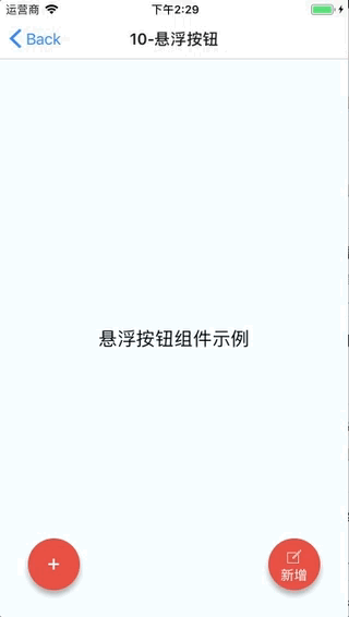
Rendering
##Installation method
npm i react-native-action-button --save
react-native link react-native-vector-icons
Sample code
<View style={styles.container}>
<Text style={styles.welcome}>
悬浮按钮组件示例
</Text>
<ActionButton buttonColor="rgba(231,76,60,1)" position='left' verticalOrientation='up'>
<ActionButton.Item buttonColor='#9b59b6' title="New Task" onPress={() => console.log("notes tapped!")}>
<Icon name="ios-create-outline" style={styles.actionButtonIcon} />
</ActionButton.Item>
<ActionButton.Item buttonColor='#3498db' title="Notifications" onPress={() => {}}>
<Icon name="ios-notifications-off" style={styles.actionButtonIcon} />
</ActionButton.Item>
<ActionButton.Item buttonColor='#1abc9c' onPress={() => {}}>
<Icon name="ios-done-all-outline" style={styles.actionButtonIcon} />
</ActionButton.Item>
</ActionButton>
<ActionButton
buttonColor="rgba(231,76,60,1)"
onPress={() => { alert('你点了我!')}}
renderIcon={() => (<View style={styles.actionButtonView}><Icon name="ios-create-outline" style={styles.actionButtonIcon} />
<Text style={styles.actionButtonText}>新增</Text>
</View>)}
/>
</View>Main parameters Description
ActionButton
- size: The size of the button, the default is 56
- active: Whether to display the button
- position: The position of the button, which can be left center right
- offsetX: Offset position on the X axis
- offsetY: Offset position on the Y axis
- onPress: Click event
- onLongPress: Long press event
- buttonText: Button title
- verticalOrientation: The direction of the popup button, up or down
- renderIcon: You can customize the style of button display. The default is a plus sign
ActionButton.Item
- size: The size of the button, the default is 56
- title: The button title ## buttonColor: Button color
- onPress: Click event
- The above is what I compiled for everyone. I hope it will be helpful to everyone in the future.
Related articles:
Analysis and solutions to the reasons why the data obtained by Ajax is not displayed in echartsUsage Object encapsulates the method of ajax repeated callsImplements ajax cross-domain request based on iframe to obtain ajax data in the web pageThe above is the detailed content of Sample code for React Native floating button component. For more information, please follow other related articles on the PHP Chinese website!

Hot AI Tools

Undresser.AI Undress
AI-powered app for creating realistic nude photos

AI Clothes Remover
Online AI tool for removing clothes from photos.

Undress AI Tool
Undress images for free

Clothoff.io
AI clothes remover

AI Hentai Generator
Generate AI Hentai for free.

Hot Article
Hot Tools

Notepad++7.3.1
Easy-to-use and free code editor

SublimeText3 Chinese version
Chinese version, very easy to use

Zend Studio 13.0.1
Powerful PHP integrated development environment

Dreamweaver CS6
Visual web development tools

SublimeText3 Mac version
God-level code editing software (SublimeText3)
Hot Topics
 1384
1384
 52
52

 How to build a real-time chat app with React and WebSocket
Sep 26, 2023 pm 07:46 PM
How to build a real-time chat app with React and WebSocket
Sep 26, 2023 pm 07:46 PM
How to build a real-time chat application using React and WebSocket Introduction: With the rapid development of the Internet, real-time communication has attracted more and more attention. Live chat apps have become an integral part of modern social and work life. This article will introduce how to build a simple real-time chat application using React and WebSocket, and provide specific code examples. 1. Technical preparation Before starting to build a real-time chat application, we need to prepare the following technologies and tools: React: one for building
 Guide to React front-end and back-end separation: How to achieve decoupling and independent deployment of front-end and back-end
Sep 28, 2023 am 10:48 AM
Guide to React front-end and back-end separation: How to achieve decoupling and independent deployment of front-end and back-end
Sep 28, 2023 am 10:48 AM
React front-end and back-end separation guide: How to achieve front-end and back-end decoupling and independent deployment, specific code examples are required In today's web development environment, front-end and back-end separation has become a trend. By separating front-end and back-end code, development work can be made more flexible, efficient, and facilitate team collaboration. This article will introduce how to use React to achieve front-end and back-end separation, thereby achieving the goals of decoupling and independent deployment. First, we need to understand what front-end and back-end separation is. In the traditional web development model, the front-end and back-end are coupled
 How to build simple and easy-to-use web applications with React and Flask
Sep 27, 2023 am 11:09 AM
How to build simple and easy-to-use web applications with React and Flask
Sep 27, 2023 am 11:09 AM
How to use React and Flask to build simple and easy-to-use web applications Introduction: With the development of the Internet, the needs of web applications are becoming more and more diverse and complex. In order to meet user requirements for ease of use and performance, it is becoming increasingly important to use modern technology stacks to build network applications. React and Flask are two very popular frameworks for front-end and back-end development, and they work well together to build simple and easy-to-use web applications. This article will detail how to leverage React and Flask
 How to install the Windows 10 old version component DirectPlay
Dec 28, 2023 pm 03:43 PM
How to install the Windows 10 old version component DirectPlay
Dec 28, 2023 pm 03:43 PM
Many users always encounter some problems when playing some games on win10, such as screen freezes and blurred screens. At this time, we can solve the problem by turning on the directplay function, and the operation method of the function is also Very simple. How to install directplay, the old component of win10 1. Enter "Control Panel" in the search box and open it 2. Select large icons as the viewing method 3. Find "Programs and Features" 4. Click on the left to enable or turn off win functions 5. Select the old version here Just check the box
 How to build a reliable messaging app with React and RabbitMQ
Sep 28, 2023 pm 08:24 PM
How to build a reliable messaging app with React and RabbitMQ
Sep 28, 2023 pm 08:24 PM
How to build a reliable messaging application with React and RabbitMQ Introduction: Modern applications need to support reliable messaging to achieve features such as real-time updates and data synchronization. React is a popular JavaScript library for building user interfaces, while RabbitMQ is a reliable messaging middleware. This article will introduce how to combine React and RabbitMQ to build a reliable messaging application, and provide specific code examples. RabbitMQ overview:
 React Router User Guide: How to implement front-end routing control
Sep 29, 2023 pm 05:45 PM
React Router User Guide: How to implement front-end routing control
Sep 29, 2023 pm 05:45 PM
ReactRouter User Guide: How to Implement Front-End Routing Control With the popularity of single-page applications, front-end routing has become an important part that cannot be ignored. As the most popular routing library in the React ecosystem, ReactRouter provides rich functions and easy-to-use APIs, making the implementation of front-end routing very simple and flexible. This article will introduce how to use ReactRouter and provide some specific code examples. To install ReactRouter first, we need
 How to build real-time data processing applications using React and Apache Kafka
Sep 27, 2023 pm 02:25 PM
How to build real-time data processing applications using React and Apache Kafka
Sep 27, 2023 pm 02:25 PM
How to use React and Apache Kafka to build real-time data processing applications Introduction: With the rise of big data and real-time data processing, building real-time data processing applications has become the pursuit of many developers. The combination of React, a popular front-end framework, and Apache Kafka, a high-performance distributed messaging system, can help us build real-time data processing applications. This article will introduce how to use React and Apache Kafka to build real-time data processing applications, and
 PHP, Vue and React: How to choose the most suitable front-end framework?
Mar 15, 2024 pm 05:48 PM
PHP, Vue and React: How to choose the most suitable front-end framework?
Mar 15, 2024 pm 05:48 PM
PHP, Vue and React: How to choose the most suitable front-end framework? With the continuous development of Internet technology, front-end frameworks play a vital role in Web development. PHP, Vue and React are three representative front-end frameworks, each with its own unique characteristics and advantages. When choosing which front-end framework to use, developers need to make an informed decision based on project needs, team skills, and personal preferences. This article will compare the characteristics and uses of the three front-end frameworks PHP, Vue and React.
