

What are the ways to introduce highcharts charts into vue projects?
Below I will share with you a method (detailed explanation) of introducing highcharts charts into the vue project. It has a good reference value and I hope it will be helpful to everyone.
Npm imports highchars and imports After completion, you can develop the visual component of highchars
npm install highcharts --save
1. Create a new chart.vue component in the components directory
<template>
<p class="x-bar">
<p :id="id"
:option="option"></p>
</p>
</template>
<script>
import HighCharts from 'highcharts'
export default {
// 验证类型
props: {
id: {
type: String
},
option: {
type: Object
}
},
mounted() {
HighCharts.chart(this.id,this.option)
}
}
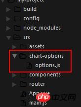
</script>2. After the chart component is built, start creating the chart-options directory and create an options.js in it. To store the simulated chart data, as shown in the directory below
The data for a histogram I wrote as shown below
module.exports = {
 bar: {
 chart: {
 type:'column'//指定图表的类型,默认是折线图(line)
 },
 credits: {
 enabled:false
 },//去掉地址
 title: {
 text: '我的第一个图表' //指定图表标题
 },
 colors: ['#058DC7', '#50B432', '#ED561B', '#DDDF00',
  '#24CBE5' ],
 xAxis: {
  categories: ['1号', '2号', '3号','3号','3号'] //指定x轴分组
 },
 yAxis: {
  title: {
  text: '最近七天', //指定y轴的标题
 },
 },
 plotOptions: {
  column: {
  colorByPoint:true
  },
  },
 series: [{ //指定数据列
  name: '小明',
  data: [{
  y:1000,
  color:"red"}, 5000, 4000,5000,2000] //数据
 }]
 }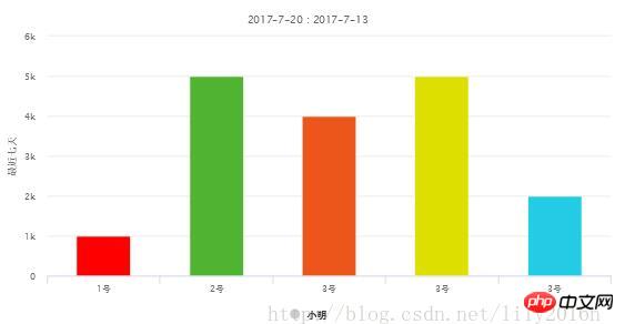
}3. Reference chart component
##
<template>
<p id="app">
<x-chart :id="id" :option="option"></x-chart>
</p>
</template>
<script>
// 导入chart组件
import XChart from 'components/chart.vue'
// 导入chart组件模拟数据
import options from './chart-options/options'
export default {
name: 'app',
data() {
let option = options.bar
return {
id: 'test',
option: option
}
},
components: {
XChart
}
}
</script>
<style>
#test {
width: 400px;
height: 400px;
margin: 40px auto;
}
</style>Effect As shown in the picture below
Vue uses mixins to implement compressed image code
Instance of vue2.0 simulation anchor point
Vue2.0 event broadcasting and reception (observer mode)
The above is the detailed content of What are the ways to introduce highcharts charts into vue projects?. For more information, please follow other related articles on the PHP Chinese website!

Hot AI Tools

Undresser.AI Undress
AI-powered app for creating realistic nude photos

AI Clothes Remover
Online AI tool for removing clothes from photos.

Undress AI Tool
Undress images for free

Clothoff.io
AI clothes remover

AI Hentai Generator
Generate AI Hentai for free.

Hot Article
Hot Tools

Notepad++7.3.1
Easy-to-use and free code editor

SublimeText3 Chinese version
Chinese version, very easy to use

Zend Studio 13.0.1
Powerful PHP integrated development environment

Dreamweaver CS6
Visual web development tools

SublimeText3 Mac version
God-level code editing software (SublimeText3)
Hot Topics
 1378
1378
 52
52

 How to add labels to legend in Google Sheet
Feb 19, 2024 am 11:03 AM
How to add labels to legend in Google Sheet
Feb 19, 2024 am 11:03 AM
This article will demonstrate how to add labels to legends in Google Sheet that focus on a single thing, providing a name or identity. A legend explains a system or group of things, giving you relevant contextual information. How to Add Labels to a Legend in GoogleSheet Sometimes, when working with charts, we want to make them easier to understand. This can be achieved by adding appropriate labels and legends. Next, we’ll show you how to add labels to legends in Google Sheets to make your data clearer. Create the chart Edit the text of the legend label Let's get started. 1] Create a chart To label the legend, first, we have to create a chart: First, enter in the columns or rows of GoogleSheets
 How to use PHP arrays to generate and display charts and statistical graphs
Jul 15, 2023 pm 12:24 PM
How to use PHP arrays to generate and display charts and statistical graphs
Jul 15, 2023 pm 12:24 PM
How to use PHP arrays to generate and display charts and statistical graphs. PHP is a widely used server-side scripting language with powerful data processing and graphic generation capabilities. In web development, we often need to display charts and statistical graphs of data. Through PHP arrays, we can easily implement these functions. This article will introduce how to use PHP arrays to generate and display charts and statistical graphs, and provide relevant code examples. Introducing the necessary library files and style sheets Before starting, we need to introduce some necessary library files into the PHP file
 How to use dynamic data in Highcharts to display real-time data
Dec 17, 2023 pm 06:57 PM
How to use dynamic data in Highcharts to display real-time data
Dec 17, 2023 pm 06:57 PM
How to use dynamic data in Highcharts to display real-time data. With the advent of the big data era, the display of real-time data has become more and more important. Highcharts, as a popular charting library, provides rich functions and customizability, allowing us to flexibly display real-time data. This article will introduce how to use dynamic data in Highcharts to display real-time data, and give specific code examples. First, we need to prepare a data source that can provide real-time data. In this article, I
 How to use Sankey chart to display data in Highcharts
Dec 17, 2023 pm 04:41 PM
How to use Sankey chart to display data in Highcharts
Dec 17, 2023 pm 04:41 PM
How to use Sankey diagram to display data in Highcharts Sankey diagram (SankeyDiagram) is a chart type used to visualize complex processes such as flow, energy, and funds. It can clearly display the relationship and flow between various nodes, and can help us better understand and analyze data. In this article, we will introduce how to use Highcharts to create and customize a Sankey chart, with specific code examples. First, we need to load the Highcharts library and Sank
 Implementation of linear and pie chart functions in Vue statistical charts
Aug 19, 2023 pm 06:13 PM
Implementation of linear and pie chart functions in Vue statistical charts
Aug 19, 2023 pm 06:13 PM
The linear and pie chart functions of Vue statistical charts are implemented in the field of data analysis and visualization. Statistical charts are a very commonly used tool. As a popular JavaScript framework, Vue provides convenient methods to implement various functions, including the display and interaction of statistical charts. This article will introduce how to use Vue to implement linear and pie chart functions, and provide corresponding code examples. Linear graph function implementation A linear graph is a type of chart used to display trends and changes in data. In Vue, we can use some excellent
 How to create a Gantt chart using Highcharts
Dec 17, 2023 pm 07:23 PM
How to create a Gantt chart using Highcharts
Dec 17, 2023 pm 07:23 PM
How to use Highcharts to create a Gantt chart requires specific code examples. Introduction: The Gantt chart is a chart form commonly used to display project progress and time management. It can visually display the start time, end time and progress of the task. Highcharts is a powerful JavaScript chart library that provides rich chart types and flexible configuration options. This article will introduce how to use Highcharts to create a Gantt chart and give specific code examples. 1. Highchart
 How to use stacked charts to display data in Highcharts
Dec 18, 2023 pm 05:56 PM
How to use stacked charts to display data in Highcharts
Dec 18, 2023 pm 05:56 PM
How to use stacked charts to display data in Highcharts Stacked charts are a common way of visualizing data, which can display the sum of multiple data series at the same time and display the contribution of each data series in the form of a bar chart. Highcharts is a powerful JavaScript library that provides a rich variety of charts and flexible configuration options to meet various data visualization needs. In this article, we will introduce how to use Highcharts to create a stacked chart and provide
 How to quickly build a statistical chart system under the Vue framework
Aug 21, 2023 pm 05:48 PM
How to quickly build a statistical chart system under the Vue framework
Aug 21, 2023 pm 05:48 PM
How to quickly build a statistical chart system under the Vue framework. In modern web applications, statistical charts are an essential component. As a popular front-end framework, Vue.js provides many convenient tools and components that can help us quickly build a statistical chart system. This article will introduce how to use the Vue framework and some plug-ins to build a simple statistical chart system. First, we need to prepare a Vue.js development environment, including installing Vue scaffolding and some related plug-ins. Execute the following command in the command line
