

How to use Vue to dynamically generate a form
This time I will show you how to use Vue to dynamically generate form forms, and what are the precautions for using Vue to dynamically generate form forms. The following is a practical case, let's take a look.
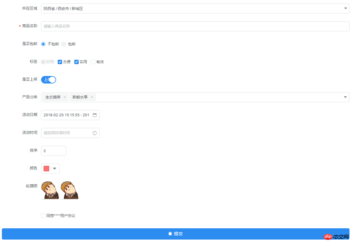
A form generator with data collection, verification and submission functions, including check boxes, radio boxes, input boxes, drop-down selection boxes and other elements, as well as three-level linkage of provinces and municipalities, time selection, date Selection, color selection, file/picture upload function, support event expansion.
Welcome everyone to star for learning and communication: github address
Example
Installation
npm install form-create
OR
git clone https://github.com/xaboy/form-create.git
cd form-create
npm install
Introduction
<!-- import Vue -->
<script src="node_modules/vue/dist/vue.min.js"></script>
<!-- import iview -->
<link rel="stylesheet" href="node_modules/iview/dist/styles/iview.css" rel="external nofollow" >
<script src="node_modules/iview/dist/iview.min.js"></script>
<!-- 省市区三级联动json数据 -->
<script src="/district/province_city_area.js"></script>
<!-- 模拟数据 -->
<script src="mock.js"></script>
<!-- import formCreate -->
<script src="dist/form-create.min.js"></script>
Use
let rules = window.mock;
new Vue({
 mounted:function(){
 let $f = this.$formCreate(mock,
   {
    onSubmit:function (formData) {
     console.log(formData);
     $f.submitStatus({loading:true});
   }
  });
  //动态添加表单元素
  $f.append($r,'goods_name');
 }
})- rules Form generation rules [inputRule,selectRule,...]
- options Initialization configuration parameters (see createOptions at the bottom for details)
- $f Instance method
- formData() Gets the value of the form
- getValue(field) Gets the value of the specified field
- changeField(field,value) Modify the value of the specified field ##resetFields() Reset the form
- destroy() Destroy the form
- removeField(field) Delete the specified field
- fields() Get all the field names of the form
- submit()
- Form verification##validate(successFn,errorFn) form verification, if If the verification passes, execute successFn, if it fails, execute errorFn
- validateField(field,callback) Form verification specifies the field
-
 $f.validateField(field,(errMsg)=>{
  if(errMsg){
   //TODO 验证未通过
  }else{
   //TODO 验证通过
  }
 });
Copy after login
-
$f.prepend({
  type:"input",
  title:"商品简介",
  field:"goods_info",
  value:"",
  props: {
   "type": "text",
   "placeholder": "请输入商品简介",
  },
  validate:[
   { required: true, message: '请输入商品简介', trigger: 'blur' },
  ],
 });
Copy after loginappend(rule,field = undefined) Enter the specified form element before the field. If the field is not passed in, the default is the last
$f.append({
  type:"input",
  title:"商品简介",
  field:"goods_info",
  value:"",
  props: {
   "type": "text",
   "placeholder": "请输入商品简介",
  },
  validate:[
   { required: true, message: '请输入商品简介', trigger: 'blur' },
  ],
});-
$f.submitStatus({
  //按钮类型,可选值为primary、ghost、dashed、text、info、success、warning、error或者不设置
  type:"primary",
  //按钮大小,可选值为large、small、default或者不设置
  size:"large",
  //按钮形状,可选值为circle或者不设置
  shape:undefined,
  //开启后,按钮的长度为 100%
  long:true,
  //设置button原生的type,可选值为button、submit、reset
  htmlType:"button",
  //设置按钮为禁用状态
  disabled:false,
  //设置按钮的图标类型
  icon:"ios-upload",
  //按钮文字提示
  innerText:"提交",
  //设置按钮为加载中状态
  loading:false
 })
Copy after login
- btn.finish() Let the form submit button return to the normal state
- rules form element rules
hidden hidden field
hiddenRule:
{
 type:"hidden",//必填!
 //字段名称
 field:"id", //必填!
 //input值
 value:"14" //必填!
}inputRule :
{
type:"input",//必填!
//label名称
title:"商品名称",//必填!
//字段名称
field:"goods_name",//必填!
//input值
value:"iphone 7",
props: {
//输入框类型,可选值为 text、password、textarea、url、email、date
"type": "text", //必填!
//是否显示清空按钮
"clearable":false,
//设置输入框为禁用状态
"disabled": false,
//设置输入框为只读
"readonly": false,
//文本域默认行数,仅在 textarea 类型下有效
"rows": 4,
//自适应内容高度,仅在 textarea 类型下有效,可传入对象,如 { minRows: 2, maxRows: 6 }
"autosize": false,
//将用户的输入转换为 Number 类型
"number": false,
//自动获取焦点
"autofocus": false,
//原生的自动完成功能,可选值为 off 和 on
"autocomplete": "off",
//占位文本
"placeholder": "请输入商品名称",
//输入框尺寸,可选值为large、small、default或者不设置
"size": "default",
//原生的 spellcheck 属性
"spellcheck": false,
},
event:{
//按下回车键时触发
enter:(event)=>{},
//设置 icon 属性后,点击图标时触发
click:(event)=>{},
//数据改变时触发
change:(event)=>{},
//输入框聚焦时触发
focus:(event)=>{},
//输入框失去焦点时触发
blur:(event)=>{},
//原生的 keyup 事件
keyup:(event)=>{},
//原生的 keydown 事件
keydown:(event)=>{},
//原生的 keypress 事件
keypress:(event)=>{},
},
validate:[
{ required: true, message: '请输入goods_name', trigger: 'blur' },
],
}radio radio button
radioRule :
{
  type:"radio",//必填!
  //label名称
  title:"是否包邮",//必填!
  //字段名称
  field:"is_postage",//必填!
  //input值
  value:"0",
  //可选参数
  options:[
   {value:"0",label:"不包邮",disabled:false},
   {value:"1",label:"包邮",disabled:true},
  ],//必填!
  props: {
   //可选值为 button 或不填,为 button 时使用按钮样式
   "type":undefined,
   //单选框的尺寸,可选值为 large、small、default 或者不设置
   "size":"default",
   //是否垂直排列,按钮样式下无效
   "vertical":false,
  },
  event:{
   //在选项状态发生改变时触发,返回当前状态。通过修改外部的数据改变时不会触发
   change:(...arg)=>{},
  },
  validate:[],
}checkboxRule :
{
type:"checkbox",//必填!
//label名称
title:"标签",//必填!
//字段名称
field:"label",//必填!
//input值
value:[
"1","2","3"
],
//可选参数
options:[
{value:"1",label:"好用",disabled:true},
{value:"2",label:"方便",disabled:false},
{value:"3",label:"实用",disabled:false},
{value:"4",label:"有效",disabled:false},
],//必填!
props: {
//多选框组的尺寸,可选值为 large、small、default 或者不设置
"size":"default",
},
event:{
//只在单独使用时有效。在选项状态发生改变时触发,通过修改外部的数据改变时不会触发
change:(...arg)=>{},
},
validate:[],
}selectRule :
{
type: "select",//必填!
field: "cate_id",//必填!
title: "产品分类",//必填!
//input值
value: ["104","105"],
//可选参数
options: [
{"value": "104", "label": "生态蔬菜", "disabled": false},
{"value": "105", "label": "新鲜水果", "disabled": false},
],//必填!
props: {
//是否支持多选
"multiple": true,
//是否可以清空选项,只在单选时有效
"clearable": false,
//是否支持搜索
"filterable": true,
// 暂不支持远程搜索
// "remote": false, //是否使用远程搜索
// "remote-method":Function, //远程搜索的方法
// "loading": false, //当前是否正在远程搜索
// "loading-text": "加载中", //远程搜索中的文字提示
//选择框大小,可选值为large、small、default或者不填
"size":"default",
//选择框默认文字
"placeholder": "请选择",
//当下拉列表为空时显示的内容
"not-found-text": "无匹配数据",
//弹窗的展开方向,可选值为 bottom 和 top
"placement": "bottom",
//是否禁用
"disabled": false,
},
event:{
//选中的Option变化时触发,返回 value
change:(checked)=>{},
//搜索词改变时触发
'query-change':(keyword)=>{},
},
validate:[],
}switchRule :
{
type:"switch",//必填!
//label名称
title:"是否上架",//必填!
//字段名称
field:"is_show",//必填!
//input值
value:"1",
props: {
//开关的尺寸,可选值为large、small、default或者不写。建议开关如果使用了2个汉字的文字,使用 large。
"size":"default",
//禁用开关
"disabled":false,
//选中时的值,当使用类似 1 和 0 来判断是否选中时会很有用
"trueValue":"1",
//没有选中时的值,当使用类似 1 和 0 来判断是否选中时会很有用
"falseValue":"0",
},
slot: {
//自定义显示打开时的内容
open:"上架",
//自定义显示关闭时的内容
close:"下架",
},
event:{
//开关变化时触发,返回当前的状态 0 | 1
change:(bool)=>{},
},
validate:[],
}
InputNumberRule :
{
  type: "InputNumber",//必填!
  field: "sort",//必填!
  title: "排序",//必填!
  //input值
  value: 1,
  props: {
   //最大值
   "max": undefined,
   //最小值
   "min": undefined,
   //每次改变的步伐,可以是小数
   "step": 1,
   //输入框尺寸,可选值为large、small、default或者不填
   "size":"default",
   //设置禁用状态
   "disabled":false,
   //是否设置为只读
   "readonly":false,
   //是否可编辑
   "editable":true,
   //数值精度
   "precision":0,
  },
  event:{
   //数值改变时的回调,返回当前值
   change:(value)=>{},
   //聚焦时触发
   focus:(event)=>{},
   //失焦时触发
   blur:(event)=>{},
  },
  validate:[],
}ColorPickerRule :
{
type: "ColorPicker",//必填!
field: "color",//必填!
title: "颜色",//必填!
//input值
value: '#ff7271',
props: {
//是否支持透明度选择
"alpha": false,
//是否支持色彩选择
"hue": true,
//是否显示推荐的颜色预设
"recommend": false,
//尺寸,可选值为large、small、default或者不设置
"size":"default",
//自定义颜色预设
"colors":[],
//颜色的格式,可选值为 hsl、hsv、hex、rgb,开启 alpha 时为 rgb,其它为 hex
"format":"hex",
},
event:{
//当绑定值变化时触发,返回当前值
change:(color)=>{},
//聚焦时触发 面板中当前显示的颜色发生改变时触发
'active-change':(color)=>{},
},
validate:[],
}CascaderRule:
{
type:"cascader",//必填!
title:"所在区域",//必填!
field:"address",//必填!
//input值
value:['陕西省','西安市','新城区'],
props:{
//可选项的数据源,格式参照示例说明
data:window.province || [],//必填!
//选择后展示的函数,用于自定义显示格式
renderFormat:label => label.join(' / '),
//是否禁用选择器
disabled:false,
//是否支持清除
clearable:true,
//输入框占位符
placeholder:'请选择',
//次级菜单展开方式,可选值为 click 或 hover
trigger:'click',
//当此项为 true 时,点选每级菜单选项值都会发生变化,具体见上面的示例
changeOnSelect:false,
//输入框大小,可选值为large和small或者不填
size:undefined,
//动态获取数据,数据源需标识 loading
loadData:()=>{},
//是否支持搜索
filterable:false,
//当搜索列表为空时显示的内容
notFoundText:'无匹配数据',
//是否将弹层放置于 body 内,在 Tabs、带有 fixed 的 Table 列内使用时,建议添加此属性,它将不受父级样式影响,从而达到更好的效果
transfer:false,
},
event:{
//选择完成后的回调,返回值 value 即已选值 value,selectedData 为已选项的具体数据
change:(value, selectedData)=>{},
//展开和关闭弹窗时触发
'visible-change':bool=>{}
},
validate:[],
}UploadRule :
{
type: "Upload",//必填!
field: "pic",//必填!
title: "轮播图",//必填!
//input值,当maxLength等与1时值为字符串,大于1时值为数组
value: ['http://img1.touxiang.cn/uploads/20131030/30-075657_191.jpg','http://img1.touxiang.cn/uploads/20131030/30-075657_191.jpg'], //input值
props: {
//上传控件的类型,可选值为 select(点击选择),drag(支持拖拽)
"type":"select", //必填!
//上传文件类型,可选值为 image(图片上传),file(文件上传)
"uploadType":"image", //必填!
//上传的地址
"action": "", //必填!
//上传的文件字段名
"name":"",
//上传时附带的额外参数
"data":{},
//设置上传的请求头部
"headers": {},
//是否支持多选文件
"multiple": true,
//支持发送 cookie 凭证信息
"withCredentials":false,
//不支持
// "showUploadList":false, //是否显示已上传文件列表
// "defaultFileList":[], // 默认已上传的文件列表
//接受上传的文件类型
"accept":"",
//支持的文件类型,与 accept 不同的是,format 是识别文件的后缀名,accept 为 input 标签原生的 accept 属性,会在选择文件时过滤,可以两者结合使用
"format":[],
//文件大小限制,单位 kb
"maxSize":undefined,
//可上传文件数量
"maxLength":1,
//上传文件之前的钩子,参数为上传的文件,若返回 false 或者 Promise 则停止上传
"beforeUpload":()=>{},
//文件上传时的钩子,返回字段为 event, file, fileList
"onProgress":()=>{},
//文件上传成功时的钩子,返回字段为 response, file, fileList,若需有把文件添加到文件列表中,在函数值返回即可
"onSuccess":function () {
return 'http://img1.touxiang.cn/uploads/20131030/30-075657_191.jpg';
}, //必填!
//文件上传失败时的钩子,返回字段为 error, file, fileList
"onError":(error, file, fileList)=>{},
//点击已上传的文件链接时的钩子,返回字段为 file, 可以通过 file.response 拿到服务端返回数据
"onPreview":()=>{},
//文件列表移除文件时的钩子,返回字段为 file, fileList
"onRemove":()=>{},
//文件格式验证失败时的钩子,返回字段为 file, fileList
"onFormatError":()=>{},
//文件超出指定大小限制时的钩子,返回字段为 file, fileList
"onExceededSize":()=>{},
//辅助操作按钮的图标 ,设置为false将不显示
handleIcon:'ionic',
//点击辅助操作按钮事件
onHandle:(src)=>{},
//是否可删除,设置为false是不显示删除按钮
allowRemove:true,
},
}{
//插入节点,默认document.body
el:null,
//form配置
form:{
//是否开启行内表单模式
inline:false,
//表单域标签的位置,可选值为 left、right、top
labelPosition:'right',
//表单域标签的宽度,所有的 FormItem 都会继承 Form 组件的 label-width 的值
labelWidth:125,
//是否显示校验错误信息
showMessage:true,
//原生的 autocomplete 属性,可选值为 off 或 on
autocomplete:'off',
},
//文件上传全局配置
upload:{
//上传文件之前的钩子,参数为上传的文件,若返回 false 或者 Promise 则停止上传
beforeUpload:()=>{},
//文件上传时的钩子,返回字段为 event, file, fileList
onProgress:(event, file, fileList)=>{},
//文件上传成功时的钩子,返回字段为 response, file, fileList,若需有把文件添加到文件列表中,在函数值返回即可
onSuccess:(response, file, fileList)=>{
// return 'filePath';
},
//文件上传失败时的钩子,返回字段为 error, file, fileList
onError:(error, file, fileList)=>{},
//点击已上传的文件链接时的钩子,返回字段为 file, 可以通过 file.response 拿到服务端返回数据
onPreview:(file)=>{},
//文件列表移除文件时的钩子,返回字段为 file, fileList
onRemove:(file, fileList)=>{},
//文件格式验证失败时的钩子,返回字段为 file, fileList
onFormatError:(file, fileList)=>{},
//文件超出指定大小限制时的钩子,返回字段为 file, fileList
onExceededSize:(file, fileList)=>{},
//辅助操作按钮的图标 ,设置为false将不显示
handleIcon:'ios-eye-outline',
//点击辅助操作按钮事件
onHandle:(src)=>{},
//是否可删除,设置为false是不显示删除按钮
allowRemove:true,
},
//表单提交事件
onSubmit:(formData)=>{},
//提交按钮配置,设置为false时不显示按钮
submitBtn:{
//按钮类型,可选值为primary、ghost、dashed、text、info、success、warning、error或者不设置
type:"primary",
//按钮大小,可选值为large、small、default或者不设置
size:"large",
//按钮形状,可选值为circle或者不设置
shape:undefined,
//开启后,按钮的长度为 100%
long:true,
//设置button原生的type,可选值为button、submit、reset
htmlType:"button",
//设置按钮为禁用状态
disabled:false,
//设置按钮的图标类型
icon:"ios-upload",
//按钮文字提示
innerText:"提交",
//设置按钮为加载中状态
loading:false,
}
}Node.js console output log file example analysis
How to use Vue to achieve drag and drop effects
The above is the detailed content of How to use Vue to dynamically generate a form. For more information, please follow other related articles on the PHP Chinese website!

Hot AI Tools

Undresser.AI Undress
AI-powered app for creating realistic nude photos

AI Clothes Remover
Online AI tool for removing clothes from photos.

Undress AI Tool
Undress images for free

Clothoff.io
AI clothes remover

Video Face Swap
Swap faces in any video effortlessly with our completely free AI face swap tool!

Hot Article
Hot Tools

Notepad++7.3.1
Easy-to-use and free code editor

SublimeText3 Chinese version
Chinese version, very easy to use

Zend Studio 13.0.1
Powerful PHP integrated development environment

Dreamweaver CS6
Visual web development tools

SublimeText3 Mac version
God-level code editing software (SublimeText3)
Hot Topics
 1386
1386
 52
52

 Fix: Windows 11's dynamic refresh rate doesn't work
Apr 13, 2023 pm 08:52 PM
Fix: Windows 11's dynamic refresh rate doesn't work
Apr 13, 2023 pm 08:52 PM
You can measure a screen's refresh rate by counting the number of times the image updates per second. DRR is a new feature included in Windows 11 that helps you save battery life while still providing a smoother display, but it's no surprise when it doesn't work properly. Screens with higher refresh rates are expected to become more common as more manufacturers announce plans to stop producing 60Hz monitors. This will result in smoother scrolling and better gaming, but it will come at the cost of reduced battery life. However, the dynamic refresh rate feature in this iteration of the OS is a nifty addition that can have a big impact on your overall experience. Read on as we discuss what to do if Windows 11’s dynamic refresh rate isn’t working
 How to Hide Dynamic Island and Red Indicator in iPhone Screen Recording
Apr 13, 2023 am 09:13 AM
How to Hide Dynamic Island and Red Indicator in iPhone Screen Recording
Apr 13, 2023 am 09:13 AM
On iPhone, Apple's screen recording feature records a video of what you're doing on the screen, which is useful if you want to capture gameplay, walk someone through a tutorial in an app, demonstrate a bug, or anything else. On older iPhones that have a notch at the top of the display, the notch is not visible in screen recording, as it should be. But on newer iPhones with the Dynamic Island cutout, such as the iPhone 14 Pro and iPhone 14 Pro Max, the Dynamic Island animation displays the red recording indicator, which causes the cutout to be visible in captured videos. this might
 Convert VirtualBox fixed disk to dynamic disk and vice versa
Mar 25, 2024 am 09:36 AM
Convert VirtualBox fixed disk to dynamic disk and vice versa
Mar 25, 2024 am 09:36 AM
When creating a virtual machine, you will be asked to select a disk type, you can select fixed disk or dynamic disk. What if you choose fixed disks and later realize you need dynamic disks, or vice versa? Good! You can convert one to the other. In this post, we will see how to convert VirtualBox fixed disk to dynamic disk and vice versa. A dynamic disk is a virtual hard disk that initially has a small size and grows in size as you store data in the virtual machine. Dynamic disks are very efficient at saving storage space because they only take up as much host storage space as needed. However, as disk capacity expands, your computer's performance may be slightly affected. Fixed disks and dynamic disks are commonly used in virtual machines
 How to convert dynamic disk to basic disk on Windows 11
Sep 23, 2023 pm 11:33 PM
How to convert dynamic disk to basic disk on Windows 11
Sep 23, 2023 pm 11:33 PM
If you want to convert a dynamic disk to a basic disk in Windows 11, you should create a backup first as the process will erase all data in it. Why should you convert dynamic disk to basic disk in Windows 11? According to Microsoft, dynamic disks have been deprecated from Windows and their use is no longer recommended. Additionally, Windows Home Edition does not support dynamic disks, so you will not be able to access these logical drives. If you want to combine more disks into a larger volume, it is recommended to use Basic Disks or Storage Spaces. In this article, we will show you how to convert dynamic disk to basic disk on Windows 11 How to convert dynamic disk to basic disk in Windows 11? In the beginning
 How to Get Live Tiles on the Desktop and Start Menu in Windows 11
Apr 14, 2023 pm 05:07 PM
How to Get Live Tiles on the Desktop and Start Menu in Windows 11
Apr 14, 2023 pm 05:07 PM
Imagine you are looking for something on your system but are not sure which application to open or select. This is where the Live Tiles feature comes into play. A live tile for any supported application can be added to the desktop or Windows system's Start menu, with its tiles changing frequently. LiveTiles make application widgets come alive in a very pleasing way. Not just for its appearance, but even for convenience. Suppose you are using whatsapp or facebook application on your system, wouldn't it be convenient if the number of notifications is displayed on the application icon? This is possible if any such supported app is added as a live tile. Let’s see how to do it in Windows
 How to generate k random dates between two dates using Python?
Sep 09, 2023 pm 08:17 PM
How to generate k random dates between two dates using Python?
Sep 09, 2023 pm 08:17 PM
Generating random data is very important in the field of data science. From building neural network predictions, stock market data, etc., date is usually used as one of the parameters. We may need to generate random numbers between two dates for statistical analysis. This article will show how to generate k random dates between two given dates using the random and datetime modules. Datetime is Python’s built-in library for handling time. On the other hand, the random module helps in generating random numbers. So we can combine random and datetime modules to generate a random date between two dates. Syntax random.randint (start, end, k) random here refers to the Python random library. The randint method uses three important
 How to generate refreshable image verification code using PHP
Sep 13, 2023 am 11:54 AM
How to generate refreshable image verification code using PHP
Sep 13, 2023 am 11:54 AM
How to use PHP to generate refreshable image verification codes. With the development of the Internet, in order to prevent malicious attacks and automatic machine operations, many websites use verification codes for user verification. One common type of verification code is the image verification code, which generates a picture containing random characters and requires the user to enter the correct characters before proceeding. This article will introduce how to use PHP to generate refreshable image verification codes and provide specific code examples. Step 1: Create a verification code image First, we need to create a verification code image
 How to disable dynamic display of folders and files to prevent quick access in Windows 10 and 11?
May 06, 2023 pm 04:58 PM
How to disable dynamic display of folders and files to prevent quick access in Windows 10 and 11?
May 06, 2023 pm 04:58 PM
Microsoft introduced Quick Access in Windows 10 and retained the feature in the recently released Windows 11 operating system. Quick Access replaces the Favorites system in File Explorer. One of the core differences between the two features is that Quick Access adds a dynamic component to its list. Some folders appear permanently, while others appear based on usage. Fixed folders are displayed with a pin icon, while dynamic folders do not have such an icon. You can see a comparison between My Favorites and Quick Access here for more details. Quick Access is more powerful than Favorites, but dynamic folder lists add an element of clutter to it. Files that are useless or should not be highlighted in File Explorer may be displayed
