
1: Flex layout
Flex layout is shown in Figure 1

Figure 1
1.1 Flex container properties
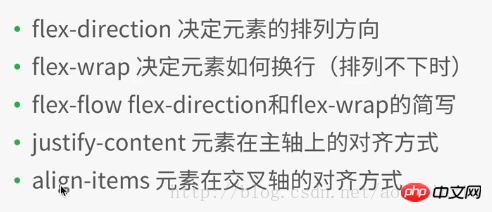
##1.2 Flex Element attributes in the container
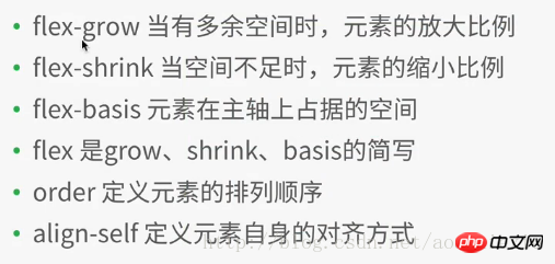
If aligned is defined, it will overwrite the attributes set by justify-content and align-items in the container attributes
In the WeChat applet development project, create a new file layout, and then create various files (named after layout),
in layout.wxml Add the following code:
<view class="container1">
 <view class="item1">
 1
 </view>
<view class="item1">
 2
 </view>
 <view class="item1">
 3
 </view>
 <view class="item1">
 4
 </view>
</view>
Add the following code to layout.wxss:
.container1{
    height: 100%;
    width:100%;
    background-color:beige;
}
.item1{
    height:100rpx;
    width:100rpx;
    background-color:cyan;
    border: 1px solid #fff
}Compile and run as shown in Figure 2
Note: In the above code, 4 sub-elements view(item1) are added to the container1 container. In the style file of item1, the width and height of each item1 are set to a fixed value: 100rpx, rpx is the same as the screen size. The relevant scaling unit is different from the fixed px. The side of each item1 is 1px, solid line (soliod), white (#fff)
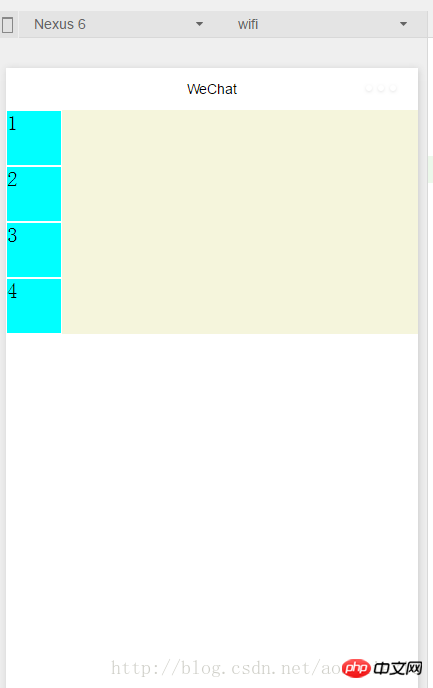
Figure 2
Modify .container1 as follows: (Add display:flex;) Compile and run as shown in Figure 3: It can be seen that the flex layout is the default horizontal arrangement of elements
.container1{
    height: 100%;
    width:100%;
    background-color:beige;
    display:flex;
}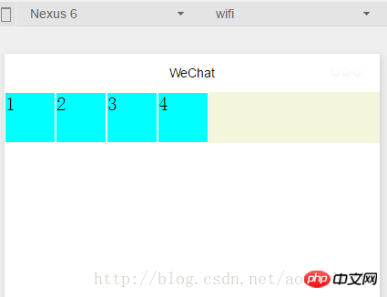
Figure 3
##1.1.1 Container properties: flex-direction
Add the following code to .container1: Set the flex layout to arrange the elements vertically (from left to right as the cross axis, from top to bottom as the main axis), as shown in Figure 2. (row: flex layout arranges elements horizontally --- from left to right as the main axis, from top to bottom as the cross axis) flex-direction:column
1.1.2 Container attributes: flex- wrap
Add the following code to .container1: At the same time, copy the element code in layout.wxml to the 8 element views, compile and run, the effect is shown in Figure 4, you can see The original height and width are 100rpx, and the square view has been transformed into a rectangle.flex-wrap:nowrap
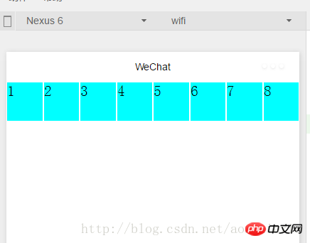
If modified to the following code: Compile and run as shown in Figure 5: Make sure that each subview is a square, and then put the 8th subview that cannot fit into the next row
flex-wrap:wrap
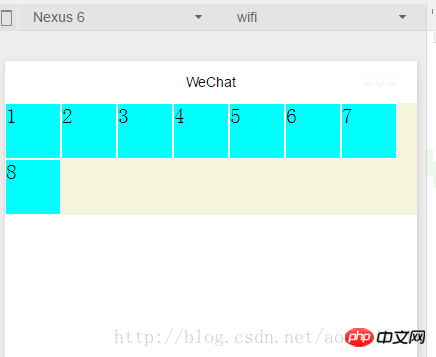 ##Figure 5
1.1.3容器属性:
flex-flow
Compile and run results: As shown in Figure 5, flex-flow is equivalent to flex-direction The combination of the two attributes with flex-wrap1.1.4容器属性:justify-content
in the above code, it is equivalent to the main axis being from left to right, so the 8th element that cannot be displayed on one line is displayed in the center of the next line. , and the first seven subviews are also displayed in the middle of a row, with blank margins on the left and right sidesjustify-content:center
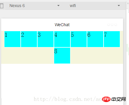 Figure 6
justify-content:flex-end (主轴为左到右情况下:右对齐)
编译运行效果如图7所示:
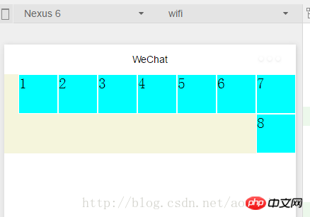
图7
justify-content:flex-start (主轴为左到右情况下:左对齐)不举例显示了
justify-content:space-around---效果如图8所示,每个子view左右都有留边
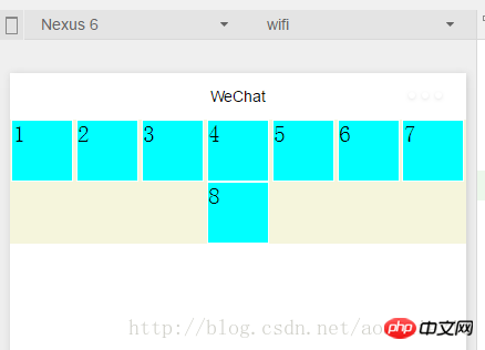
图8
justify-content:space-between---
效果如图9所示,每个子view左右都有留边,但是首尾两个view各自左右对齐不留边
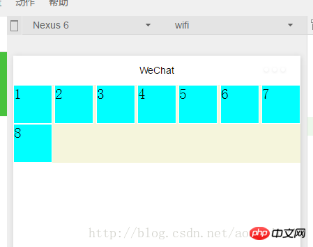
图9
1.1.5容器属性:align-items
上面已经很详细讲解主轴上的对齐方式,这里关于这个交叉轴上的对齐方式同理很简单,就不详细展开了。
1.2.1 容器内元素属性:flex-grow
layout.wxml中修改代码如下:增加i3
 <view class="item1 i3">
 3
 </view>
layout.wxss中修改代码如下:在item1中增加: flex-grow: 1,增加i3,表示在一行中如果有剩余空间的话,i3之外的子view占1份空间,而i3子view占2份空间,编译运行效果如图10所示:可以看出i3view所占据的空间比其余3个子view大,但是没有到2倍
.item1{
    height:100rpx;
    width:100rpx;
    background-color:cyan;
    border: 1px solid #fff;
    flex-grow: 1
}
.i3{
    flex-grow: 2
}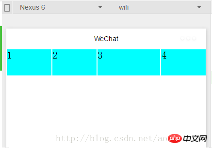
图10
1.2.2容器内元素属性:flex-shrink
layout.wxml再增加4个子view
layout.wxss中修改代码如下:i3的flex-shrink为0,其余子view为1,这表示当空间不足时所有子view都等比缩小,但是i3的view保持大小不变,编译运行,效果如图11所示
.item1{
    height:100rpx;
    width:100rpx;
    background-color:cyan;
    border: 1px solid #fff;
    flex-shrink: 1
}
.i3{
    flex-shrink: 0
}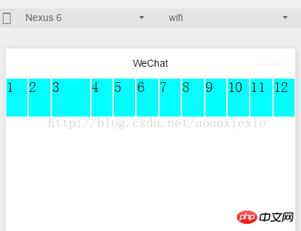
图11
1.2.3容器内元素属性:
flex-basis
layout.wxss中修改代码如下:其他代码保持不变不变,编译运行,效果如图12所示
.i3{    flex-shrink: 0;    flex-basis: 200rpx
}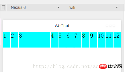
图12
1.2.4容器内元素属性:
flex
flex是grow,shink,basis几个属性的合并,layout.wxss中修改代码如下:其他代码保持不变不变,编译运行,效果和图12保持一样
.i3{    flex:0 0 200rpx}
1.2.5容器内元素属性:orderlayout.wxml中修改代码如下:设置每个view的order属性为其显示的顺序,编译运行
<view class="container1">
 <view class="item1" style="order:4">
 1
 </view>
<view class="item1" style="order:3">
 2
 </view>
 <view class="item1 i3" style="order:2">
 3
 </view>
 <view class="item1" style="order:1">
 4
 </view>
</view>
相信看了本文案例你已经掌握了方法,更多精彩请关注php中文网其它相关文章!
推荐阅读:
The above is the detailed content of How should WeChat mini programs be laid out?. For more information, please follow other related articles on the PHP Chinese website!


