Vue makes pop-up window function (with code)
This time I will bring you the pop-up function of Vue (with code). What are the precautions for making the pop-up function of Vue? The following is a practical case, let’s take a look.
Recently When using the element-ui framework, I used the Dialog dialog component. The effect achieved was roughly the same as a pop-up component I made in my previous mobile project. Then I thought about using this pop-up component Let me share with you the implementation method. The following article will guide you through the implementation of a pop-up window component.
The main content of this article will involve the implementation of the pop-up window mask, the use of slot slots, props, $emit passes the parameters, and the specific component code is also uploaded. If you like it, you can like/follow and support it. I hope everyone can gain something from reading this article.
Component last Achieved effect
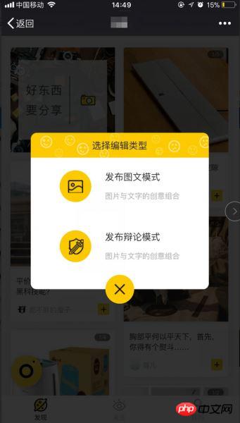
Implementation steps
First build the html and css style, mask layer and content layer.
Customized pop-up content: The pop-up component accepts the pop-up content passed from the parent component through the slot.
Customized pop-up window style: The pop-up window component receives the pop-up window width, up, down, left and right positions passed from the parent component through props.
Component switch: through the parent component The props passed in from the component control the display and hiding of the component. When the child component is closed, the event $emit triggers the parent component to change the value.
1. Build the html and css styles of the component.
html structure: a mask layer, a content layer, and the content layer has a header title, body content and a close button.
The following is the html structure in the component, inside There are some things that will be added later. If you don’t understand, you can skip it first.
<template>
<p class="dialog">
<!--外层的遮罩 点击事件用来关闭弹窗,isShow控制弹窗显示 隐藏的props-->
<p class="dialog-cover back" v-if="isShow" @click="closeMyself"></p>
<!-- transition 这里可以加一些简单的动画效果 -->
<transition name="drop">
<!--style 通过props 控制内容的样式 -->
<p class="dialog-content" :style="{top:topDistance+'%',width:widNum+'%',left:leftSite+'%'}" v-if="isShow">
<p class="dialog_head back">
<!--弹窗头部 title-->
<slot name="header">提示信息</slot>
</p>
<p class="dialog_main" :style="{paddingTop:pdt+'px',paddingBottom:pdb+'px'}">
<!--弹窗的内容-->
<slot name="main">弹窗内容</slot>
</p>
<!--弹窗关闭按钮-->
<p class="foot_close" @click="closeMyself">
<p class="close_img back"></p>
</p>
</p>
</transition>
</p>
</template>The following are the main css styles in the component, which are fully commented, mainly through z-index and background to achieve a masking effect. The css of the specific content can be set according to your own needs.
<style lang="scss" scoped>
 // 最外层 设置position定位
 .dialog {
 position: relative;
 color: #2e2c2d;
 font-size: 16px;
 }
 // 遮罩 设置背景层,z-index值要足够大确保能覆盖,高度 宽度设置满 做到全屏遮罩
 .dialog-cover {
 background: rgba(0,0,0, 0.8);
 position: fixed;
 z-index: 200;
 top: 0;
 left: 0;
 width: 100%;
 height: 100%;
 }
 // 内容层 z-index要比遮罩大,否则会被遮盖,
 .dialog-content{
 position: fixed;
 top: 35%;
 // 移动端使用felx布局
 display: flex;
 flex-direction: column;
 justify-content: center;
 align-items: center;
 z-index: 300;
 }
</style>2. Customize the pop-up content through slot
In this step, as long as you understand the role of slot and usage, there will be no problem.
Single slot:
The above is a single slot, also called the default slot. The correct posture for using the slot in the parent component:
<my-component>
 <!--在my-component里面的所有内容片段都将插入到slot所在的DOM位置,并且会替换掉slot标签-->
 <!--这两个p标签,将替换整个slot标签里面的内容-->
 <p>这是一些初始内容</p>
 <p>这是更多的初始内容</p>
</my-component>
ps: If the child component contains a slot slot, then the content of the p tag above will will be discarded.
Named slot:
The so-called named slot is to assign a name attribute to the slot tag. The named slot can place different content fragments in the parent component into the child component. Different places, named slots can still have a default slot. Below you can take a look at how the pop-up component slot is used:
<p class="dialog_head back ">
<!--弹窗头部 title-->
<slot name="header">提示信息</slot>
</p>
<p class="dialog_main " :style="{paddingTop:pdt+'px',paddingBottom:pdb+'px'}">
<!--弹窗的内容-->
<slot name="main">弹窗内容</slot>
</p>How to use it in the parent component:
Introduce the pop-up component into the component to be used, and register it through components components.
The method of using the pop-up component slot in the parent component is as follows.
<dialogComponent>
 <p slot="header">插入到name为header的slot标签里面</p>
  <p class="dialog_publish_main" slot="main">
  这里是内容插入到子组件的slot的name为main里面,可以在父组件中添加class定义样式,事件类型等各种操作
  </p>
</dialogComponent>
That’s it for the introduction of slots used in components. The application of slots in pop-up components is a typical example. You can see that the slots are quite powerful, and the slots themselves It is not difficult to use. Have students fallen in love with slots?
3. Use props to control pop-up window visibility && customize pop-up window style
psops is a way for parent components in Vue to transfer data to sub-components. Friends who are not familiar with it can check it out Check out the props document.
Because pop-up components are introduced into other components, in order to be suitable for pop-ups in different component scenarios, pop-up components must have a certain degree of customizability, otherwise such components will not be able to be used at all. Meaningless, let's introduce how to use props, taking the pop-up component as an example:
First, you need to define some characteristics of props in the passed-in component, such as verification.
Then bind the props data in the parent component.
<script>
export default {
 props: {
 isShow: {
 //弹窗组件是否显示 默认不显示
  type: Boolean,
  default: false,
  required:true, //必须
 },
 //下面这些属性会绑定到p上面 详情参照上面的html结构
 // 如: :style="{top:topDistance+'%',width:widNum+'%'}"
 widNum:{
 //内容宽度
  type: Number,
  default:86.5
 },
 leftSite:{
  // 左定位
  type: Number,
  default:6.5
 },
 topDistance: {
  //top上边距
  type: Number,
  default:35
 },
 pdt:{
  //上padding
  type: Number,
  default:22
 },
 pdb:{
  //下padding
  type: Number,
  default:47
 }
 },
}
</script>How to use it in the parent component:
<dialogComponent :is-show="status.isShowPublish" :top-distance="status.topNum">
</dialogComponent>
ps: The data passed by props is not two-way bound, but one-way data flow. When the data of the parent component changes, it will also be passed to the child. In components, this means that we should not modify props in child components. So when we close the pop-up window, we need to use $emit to modify the data of the parent component, and then the data will be automatically passed to the child component.
现在基本上弹窗组件都已实现的差不多了,还差一个弹窗的关闭事件,这里就涉及到子组件往父组件传参了。
4. $emit 触发父组件事件修改数据,关闭弹窗
Vue中在子组件往父组件传参,很多都是通过 $emit 来触发父组件的事件来修改数据。
在子组件中,在点击关闭,或者遮罩层的时候触发下面这个方法:
methods: {
 closeMyself() {
  this.$emit("on-close");
  //如果需要传参的话,可以在"on-close"后面再加参数,然后在父组件的函数里接收就可以了。
 }
}父组件中的写法:
<dialogComponent :is-show="status.isShowPublish" :top-distance="status.topNum" @on-close="closeDialog">
 </dialogComponent>
 //"on-close是监听子组件的时间有没有触发,触发的时候执行closeDialog函数
methods:{
 closeDialog(){
 // this.status.isShowPublish=false;
 //把绑定的弹窗数组 设为false即可关闭弹窗
 },
}可以用弹窗组件实现下列这种信息展示,或者事件交互:
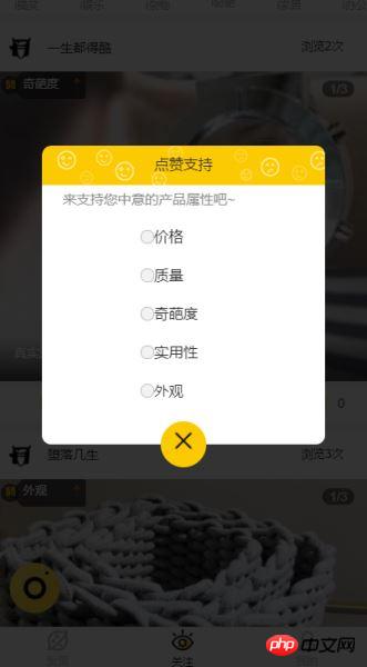
弹窗组件代码
上面是把弹窗的每个步骤拆分开来,一步步解析的,每一步都说的比较清楚了,具体连起来的话,可以看看 代码 ,再结合文章就能理的很清楚了。
相信看了本文案例你已经掌握了方法,更多精彩请关注php中文网其它相关文章!
推荐阅读:
The above is the detailed content of Vue makes pop-up window function (with code). For more information, please follow other related articles on the PHP Chinese website!

Hot AI Tools

Undresser.AI Undress
AI-powered app for creating realistic nude photos

AI Clothes Remover
Online AI tool for removing clothes from photos.

Undress AI Tool
Undress images for free

Clothoff.io
AI clothes remover

AI Hentai Generator
Generate AI Hentai for free.

Hot Article

Hot Tools

Notepad++7.3.1
Easy-to-use and free code editor

SublimeText3 Chinese version
Chinese version, very easy to use

Zend Studio 13.0.1
Powerful PHP integrated development environment

Dreamweaver CS6
Visual web development tools

SublimeText3 Mac version
God-level code editing software (SublimeText3)

Hot Topics
 How to use echarts in vue
May 09, 2024 pm 04:24 PM
Using ECharts in Vue makes it easy to add data visualization capabilities to your application. Specific steps include: installing ECharts and Vue ECharts packages, introducing ECharts, creating chart components, configuring options, using chart components, making charts responsive to Vue data, adding interactive features, and using advanced usage.
 The role of export default in vue
May 09, 2024 pm 06:48 PM
Question: What is the role of export default in Vue? Detailed description: export default defines the default export of the component. When importing, components are automatically imported. Simplify the import process, improve clarity and prevent conflicts. Commonly used for exporting individual components, using both named and default exports, and registering global components.
 How to use map function in vue
May 09, 2024 pm 06:54 PM
The Vue.js map function is a built-in higher-order function that creates a new array where each element is the transformed result of each element in the original array. The syntax is map(callbackFn), where callbackFn receives each element in the array as the first argument, optionally the index as the second argument, and returns a value. The map function does not change the original array.
 What are hooks in vue
May 09, 2024 pm 06:33 PM
Vue hooks are callback functions that perform actions on specific events or lifecycle stages. They include life cycle hooks (such as beforeCreate, mounted, beforeDestroy), event handling hooks (such as click, input, keydown) and custom hooks. Hooks enhance component control, respond to component life cycles, handle user interactions and improve component reusability. To use hooks, just define the hook function, execute the logic and return an optional value.
 validator method in vue
May 09, 2024 pm 04:09 PM
The Validator method is the built-in validation method of Vue.js and is used to write custom form validation rules. The usage steps include: importing the Validator library; creating validation rules; instantiating Validator; adding validation rules; validating input; and obtaining validation results.
 How to disable the change event in vue
May 09, 2024 pm 07:21 PM
In Vue, the change event can be disabled in the following five ways: use the .disabled modifier to set the disabled element attribute using the v-on directive and preventDefault using the methods attribute and disableChange using the v-bind directive and :disabled
 How to isolate styles in components in vue
May 09, 2024 pm 03:57 PM
Style isolation in Vue components can be achieved in four ways: Use scoped styles to create isolated scopes. Use CSS Modules to generate CSS files with unique class names. Organize class names using BEM conventions to maintain modularity and reusability. In rare cases, it is possible to inject styles directly into the component, but this is not recommended.
 How to introduce echarts in vue
May 09, 2024 pm 04:39 PM
There are three ways to introduce ECharts into Vue.js: Install through npm Introduce through CDN Use the Vue ECharts plug-in Detailed steps: Create a chart container Introduce ECharts Initialize the chart instance Set chart options and data destroy chart instance (optional)


