

How to use CSS3 linear gradient to create a border

This article mainly introduces how to use CSS3 linear gradient linear-gradient to make borders. It has a certain reference value. Now I share it with you. Friends in need can refer to
linear-gradient lines It is quite powerful for making borders, especially its strokes can be used to create some copied border effects. Here we will take a look at an example of using CSS3 linear-gradient to make borders
General app The border stroke lines were all smaller than one pixel, so I directly traced a 1px border as usual. Although it was 1px, the result was completely different and "thicker" than the stroke in the app, so I looked for it on the Internet. I'm looking to see if there is a solution, but I haven't found it after searching for a while. What should I do? If the demand side doesn't want to be so rough, then I have to solve it myself.
So I used the previous method to think of linear-gradient
CSS
.line li{  border: none;
  background-image: -webkit-linear-gradient(#222 50%,transparent 50%);
  background-image: -moz-linear-gradient(#222 50%,transparent 50%);
  background-image: -o-linear-gradient(#222 50%,transparent 50%);
  background-image: linear-gradient(#222 50%,transparent 50%);
  background-size:  100% 1px;
  background-repeat: no-repeat;
background-position: bottombottom;}XML/HTML
<ul class="line">
    <li>linear-gradient</li>
    <li>linear-gradient</li>
    <li>linear-gradient</li>
</ul>OK,又出来了,但还是有点瑕疵,那么问题来了,就是改变描边位置(left,top,right,bottom)需要修改参数If the left stroke needs to be changed:
CSS
background-image: -webkit-linear-gradient(left ,transparent 50%,#222 50%);
background-size:  1px 100%;
background-position: left;
The specifics are not listed one by one.
Use linear to create complex border effects
In addition, I saw a method on the Internet to use the linear-gradient attribute to create a gorgeous border effect. First, the code is given. You can check the effect on your computer:
CSS
<!DOCTYPE html>
<html lang="en" xmlns="http://www.w3.org/1999/xhtml">
<head>
<meta charset="utf-8" />
<title></title>
<style>
.box {
margin: 80px 30px;
width: 200px;
height: 200px;
position: relative;
background: #fff;
float: left;
}
.box:before {
content: '';
z-index: -1;
position: absolute;
width: 220px;
height: 220px;
top: -10px;
left: -10px;
}
.first:before {
background-image: linear-gradient(90deg, yellow, gold);
}
.second:before {
background-image: linear-gradient(0deg, orange, red);
}
.third:before {
background-image: repeating-linear-gradient(-45deg,#cc2a2d,#cc2a2d 30px,#f2f2f2 30px,#f2f2f2 40px,#0e71bb 40px,#0e71bb 70px,#f2f2f2 70px,#f2f2f2 80px);
}
</style>
</head>
<body>
<p class="box first"></p>
<p class="box second"></p>
<p class="box third"></p>
</body>
</html> 有代码可以看出,其实我们并没有使用border,那么这种边框效果是怎么实现的呢?The general idea is that we first define a white p, and then define a The white square is a larger circle with a colored p. Overlap the two and let the white p cover the colored p to achieve the effect of a border.
There are many css knowledge points used here.
1. :before pseudo-class
From the above code, we can see that we actually define a :before pseudo-class in the defined white p, and put all the styles of the colored squares here. This is because using the :before definition can make positioning more convenient. Just adjust top and left to the width of the border. At the same time, the two become a whole.
2. Linear-gradient
Many browsers now support this css method. This method has the following three usage modes:
①background:linear-gradient(top,#fff,#000)
This code means that it starts from white at the top and transitions to black at the bottom.
②background:linear-gradient(top,right,#fff,#000)
This code passes two parameters about the position, top and right, which means starting from the upper right and changing to the lower left. Other reasons Same as the first one.
③background:linear-gradient(30deg,#fff,#000)
The first parameter of this code passes the angle. In fact, the principle and position are the same, but it does not change from the standard position. . So what is the corresponding relationship between angle and position? According to experiments, 0 degrees corresponds to bottom, 90 degrees corresponds to left, 180 degrees corresponds to top, and 360 degrees corresponds to right.
The above is the code and explanation for using the linear method to achieve gorgeous borders. You can implement it locally to discover more novel combination implementation methods.
The above is the entire content of this article. I hope it will be helpful to everyone's study. For more related content, please pay attention to the PHP Chinese website!
Related recommendations:
How to use CSS3 to intercept strings
Examples of using pure CSS to achieve dynamic text effects
The above is the detailed content of How to use CSS3 linear gradient to create a border. For more information, please follow other related articles on the PHP Chinese website!

Hot AI Tools

Undresser.AI Undress
AI-powered app for creating realistic nude photos

AI Clothes Remover
Online AI tool for removing clothes from photos.

Undress AI Tool
Undress images for free

Clothoff.io
AI clothes remover

AI Hentai Generator
Generate AI Hentai for free.

Hot Article
Hot Tools

Notepad++7.3.1
Easy-to-use and free code editor

SublimeText3 Chinese version
Chinese version, very easy to use

Zend Studio 13.0.1
Powerful PHP integrated development environment

Dreamweaver CS6
Visual web development tools

SublimeText3 Mac version
God-level code editing software (SublimeText3)
Hot Topics
 1378
1378
 52
52

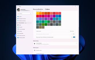 How to adjust window border settings on Windows 11: Change color and size
Sep 22, 2023 am 11:37 AM
How to adjust window border settings on Windows 11: Change color and size
Sep 22, 2023 am 11:37 AM
Windows 11 brings fresh and elegant design to the forefront; the modern interface allows you to personalize and change the finest details, such as window borders. In this guide, we'll discuss step-by-step instructions to help you create an environment that reflects your style in the Windows operating system. How to change window border settings? Press + to open the Settings app. WindowsI go to Personalization and click Color Settings. Color Change Window Borders Settings Window 11" Width="643" Height="500" > Find the Show accent color on title bar and window borders option, and toggle the switch next to it. To display accent colors on the Start menu and taskbar To display the theme color on the Start menu and taskbar, turn on Show theme on the Start menu and taskbar
 How to achieve wave effect with pure CSS3? (code example)
Jun 28, 2022 pm 01:39 PM
How to achieve wave effect with pure CSS3? (code example)
Jun 28, 2022 pm 01:39 PM
How to achieve wave effect with pure CSS3? This article will introduce to you how to use SVG and CSS animation to create wave effects. I hope it will be helpful to you!
 Use CSS skillfully to realize various strange-shaped buttons (with code)
Jul 19, 2022 am 11:28 AM
Use CSS skillfully to realize various strange-shaped buttons (with code)
Jul 19, 2022 am 11:28 AM
This article will show you how to use CSS to easily realize various weird-shaped buttons that appear frequently. I hope it will be helpful to you!
 How to hide elements in css without taking up space
Jun 01, 2022 pm 07:15 PM
How to hide elements in css without taking up space
Jun 01, 2022 pm 07:15 PM
Two methods: 1. Using the display attribute, just add the "display:none;" style to the element. 2. Use the position and top attributes to set the absolute positioning of the element to hide the element. Just add the "position:absolute;top:-9999px;" style to the element.
 How to make custom borders in Microsoft Word
Nov 18, 2023 pm 11:17 PM
How to make custom borders in Microsoft Word
Nov 18, 2023 pm 11:17 PM
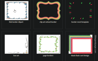
Want to make the front page of your school project look exciting? Nothing makes it stand out from other submissions like a nice, elegant border on the homepage of your workbook. However, the standard single-line borders in Microsoft Word have become very obvious and boring. Therefore, we show you the steps to create and use custom borders in Microsoft Word documents. How to Make Custom Borders in Microsoft Word Creating custom borders is very easy. However, you will need a boundary. Step 1 – Download Custom Borders There are tons of free borders on the internet. We have downloaded a border like this. Step 1 – Search the Internet for custom borders. Alternatively, you can go to clipping
 How to implement lace borders in css3
Sep 16, 2022 pm 07:11 PM
How to implement lace borders in css3
Sep 16, 2022 pm 07:11 PM
In CSS, you can use the border-image attribute to achieve a lace border. The border-image attribute can use images to create borders, that is, add a background image to the border. You only need to specify the background image as a lace style; the syntax "border-image: url (image path) offsets the image border width inward. Whether outset is repeated;".
 Popular science on how to set excel borders
Mar 20, 2024 am 10:30 AM
Popular science on how to set excel borders
Mar 20, 2024 am 10:30 AM
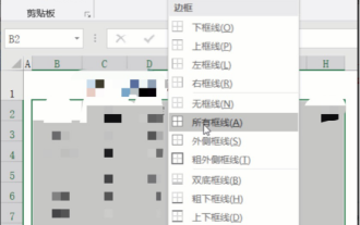
It is not uncommon for Excel to appear in our daily work and life. Whether it is the production of employee information, salary tables, or student enrollment information and transcripts, Excel is a relatively easy-to-use tool. When printing Excel, you need to set borders to meet printing requirements. In this article, the editor will introduce you to several ways to set Excel borders. Method 1. Use the function tab button. This should be a method often used by everyone. It is convenient and fast. The specific operation: select the cell area B2:H10 where you need to add a border, click the [Start] tab - [Border] drop-down on the right Button-[All Frames] to complete adding frames. Method 2. Select the cell area B2:H10 where you want to add a border.
 It turns out that text carousel and image carousel can also be realized using pure CSS!
Jun 10, 2022 pm 01:00 PM
It turns out that text carousel and image carousel can also be realized using pure CSS!
Jun 10, 2022 pm 01:00 PM
How to create text carousel and image carousel? The first thing everyone thinks of is whether to use js. In fact, text carousel and image carousel can also be realized using pure CSS. Let’s take a look at the implementation method. I hope it will be helpful to everyone!
