This article mainly introduces the detailed explanation of the actual use of HTML table layout. It is the basic knowledge for introductory learning of HTML. Friends who need it can refer to it
When will tables be used
Now , tables
are generally no longer used for the overall layout of web pages. However, when facing certain specific designs, such as form input and data presentation, tables may be the most appropriate choice.
The intuitive impression about the table is that it is an element composed of multiple cells (cells) neatly arranged, and the rows and columns can be clearly seen. This can be associated with Excel. Based on Excel's status in data processing and statistics, we can understand the meaning of the tables on the web page.
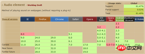
To put it simply, when you can intuitively feel that multiple elements are arranged in rows and columns, using a table will make it much easier for you. Such as the example of applying tables in caniuse.com:
Table layout calculation
Using tables is simple, but sometimes tables end up being The state of the grid may not be what you want. For example, if some grids have line breaks, the entire table will look very unsightly because of the line breaks. Especially for tables used for data presentation, width allocation is a very important topic. You may need to carefully calculate the total width of the table for the data that each column of grid may present.
This is because the table has its own characteristics in layout. It will follow certain principles and determine its actual layout through calculation. Next, this article uses an actual table test example to explore how the table calculates its own layout. Initial Statement
This article only focuses on the most common methods of applying tables, and does not list all situations. Different browsers have different interpretations of some table concepts, but the layout calculations are basically the same (if there are differences, they will be mentioned separately).
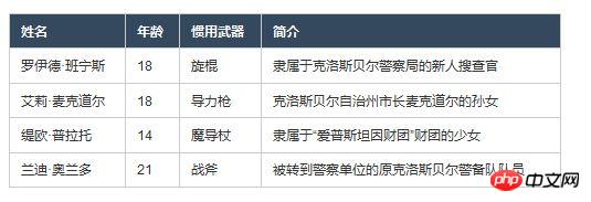
The test forms used next will appear like this (the content is taken from the track of zero):
At the same time, the tables will be set with border-collapse:collapse; and border-spacing:0;. This is also the most common way to apply tables. Normalize.css uses this part as the initialization definition. Two algorithms
The css attribute table-layout defined on the
element will determine the algorithm applied to the table in layout calculation. It has two values, auto and fixed. Under normal circumstances, the default value auto is used.
The difference between these two algorithms is whether the width layout of the table is related to the data content in the table. This article will discuss the layout calculation principle of the table in these two values. Automatic table layout-auto
The characteristic of automatic table layout is that the width layout of the table is related to all the data content in the table. It needs to obtain all the table content to determine the final width layout, and then displayed together.
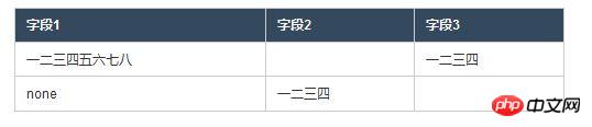
It seems that the key point is "content related". What happens if the table defines a fixed width (500px here), but all cells do not have a defined width (only CSS defined widths are discussed)? Let’s look at the results:
In the above table, the blank parts are written with spaces. After comparison, you can find the following points:
The 2nd and 3rd columns have the same width. The ratio of the width of the first column to the width of any subsequent column seems to be 2:1. Adding borders and padding, the total width of all columns is equal to the width defined by the table.
Each cell has no defined width, so the width layout is completely determined by the specific content data (text information). How to explain such results? You can intuitively speculate on this logic:
Step 1, select the text with the most text content from each column (understood as the widest width of the text without line breaks), as the "representative" . Step 2: Compare the widths of the "representatives" of each column, and then assign them the total width of the table, including borders and padding, according to their width proportions.
Referring to the above logic, let’s review the previous table. Doesn’t it make some sense? Note that it was said earlier that the width ratio "seems" to be 2:1. Could this be? Let’s take a look at the version with the padding removed:
Use the front-end debugging tool to look specifically at the width of the cells above. You will find that this table is different from before, and the ratio is very close to 2. :1 (Yes, this little bit is due to the border, but without the border there is no way to distinguish the columns).
It can be seen that when analyzing the width ratio relationship, the content width, padding, and borders will be taken into account. This also shows that it is not a measure of the number of characters, but a measure of the width that the characters can occupy without line breaks (the 2:1 here comes from the fact that Chinese characters are of equal width). Naturally, using padding is just to make a more beautiful table :).
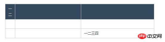
What happens when there is a width definition? The following is a table with width definitions for some cells:
The following points can be found in the above table:
The actual width of a cell with a width of 5px is 13px, which is exactly the width of a single Chinese character. Cells with Chinese characters in the same column arrange the text in the form of the minimum cell width (so, the lines are changed). The actual width of a cell whose width is set to 200px is 200px, although there is a definition of a width of 70px in the same column. The third column, which does not have an exact width definition, finally gets the remaining width of the table after allocating columns 1 and 2.
The inference of this is that when there are columns with width definitions and columns without width definitions:
If the cell definition width is less than the minimum arrangement width of its content (and no line wrapping On the contrary, when as many rows as possible are arranged in a cell (the required width of the cell), the content of the column where the cell is located will be displayed in the minimum arrangement. If the content width of the cell in the same column (without line wrapping, this word means this later) is smaller than the largest width definition in the column, then the actual width of the column is equal to the width definition. For columns without width definition, the table will first allocate width to columns with width definition, and then assign them to them (similarly, the ratio between them depends on the content width).
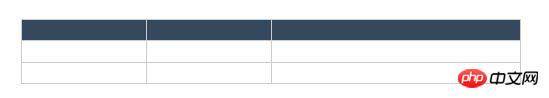
The first column without width definition can be regarded as case 1. Some columns here have width definitions, and some do not, which can be regarded as case 2. The following is case 3, that is, when all columns have width definitions:
In the above table, the padding is removed, so The value can be clearly defined by the width, and the width ratio of these three columns is 2:1:1. There is another condition here, that is, the width of the content in the cell does not exceed the width definition value. After testing, IE7 and below behave differently from other browsers when the content exceeds the width definition value.
You can know from this table example that if all columns have width definitions and the sum of the values of these width definitions is less than the width of the table, the table will allocate the width corresponding to their width definition values. , continue to allocate the remaining width to them in proportion to their width.
The above is the analysis of three situations when automatic table layout is defined and the table itself has a fixed width. If the table itself does not define the width, there will be more situations, and it will be related to the containing block (details) of the table. If there is a suitable opportunity in the future, we will discuss it (the so-called article space is limited...). Fixed table layout-fixed
The characteristic of fixed table layout is that the width layout of the table has nothing to do with the data content in the table. It only needs to receive the information of the first row of the table. The final width layout can be determined and displayed.
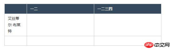
Fixed table layout is "content-independent" and it emphasizes the "first row". Please look at the following table example:
The logic of fixed table layout is much simpler and is expressed as follows:
Only take The information in the first row ignores the contents of all cells after the first row and the width definition In the first row, if the cells have width definitions, allocate their required width first, and then the remaining width Evenly distributed to cells without width definition The width distribution of the cells in the first row will determine the width layout of the table, and the content after the first row will not change the layout.
It is also important to note that when using fixed table layout, you must define the width of the table element. If its width is not defined (that is, the auto default value), the browser will use automatic table layout instead. Ending statement
In fact, there are elements related to the table such as
,
, ,
, etc., but they are the most common There is no need to use them in usage. In fact, they are also taken into account in the layout calculation of the table. Coupled with the situation of cell merging, you can probably imagine how complicated table layout calculation is.
The W3C document mentioned that table layout calculation (automatic table layout) has not yet become a specification. For W3C's description of table layout calculations, please refer to Table width algorithms. Conclusion
In fact, as far as the calculation principle of table layout is concerned, making such detailed inferences is not very practical. I'm just saying that it would be helpful to have this information as a reference when you need to work out the details, although there are not many opportunities like this.
However, we can draw a more meaningful conclusion based on the content of this article: the table defines the width, and all cells do not define the width, then the automatic layout table will try its best to make all your data Line breaks, and if you encounter a situation where line breaks affect the appearance, it means that you must streamline the data or reduce the margins instead of trying to redo the width allocation yourself.
This time I did this kind of actual measurement and inference, and I felt that it would be easier to understand after breaking down the specific situation and then explaining it, rather than giving a systematic and complete statement at once. Maybe it can be regarded as a Chinese practice?
The above is the entire content of this article. I hope it will be helpful to everyone's study. For more related content, please pay attention to the PHP Chinese website!
##The difference and priority between href and onclick usage in the a tag of Html level
The above is the detailed content of HTML table layout. For more information, please follow other related articles on the PHP Chinese website!
Statement of this Website
The content of this article is voluntarily contributed by netizens, and the copyright belongs to the original author. This site does not assume corresponding legal responsibility. If you find any content suspected of plagiarism or infringement, please contact admin@php.cn