

This article mainly introduces the use of CSS background and background-position. Friends who need it can refer to it.
Background (background) is an important part of css, and it is also what you need to know about css. One of the basic knowledge. This article will cover the basic usage of css background (background), including attributes such as background-attachment, etc., and also introduce some common techniques about background (background), as well as the background (background) in css3 (including 4 new the background property).
Background in css2
Overview
There are 5 main background properties in CSS2 , they are:
* background-color: Specifies the color to fill the background.
* background-image: Reference the image as the background.
* background-position: Specify the position of the element's background image.
* background-repeat: Determines whether to repeat the background image.
* background-attachment: Determines whether the background image scrolls with the page.
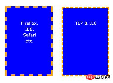
These properties can all be combined into one abbreviated property: background. One important point to note is that the background occupies all of the element's content area, including padding and border, but does not include the element's margin. It works fine in Firefox, Safari, Opera and IE8, but in IE6 and IE7, the background does not include the border.
Basic properties
Background-color
background- The color property fills the background with a solid color. There are many ways to specify this color, and the following methods all give the same result.
background-color: blue;
background-color: rgb(0, 0, 255);
background-color: #0000ff;
background-color can also be set to transparent, which makes elements underneath it visible.
Background-image
The background-image attribute allows specifying an image to be displayed in the background. Can be used in conjunction with background-color, so if the image does not repeat, the areas not covered by the image will be filled with the background color. The code is very simple, just remember that the path is relative to the style sheet, so in the following code, the image and style sheet are in the same directory.
background-image: url(image.jpg);
But if the image is in a subdirectory named images, it should be:
background-image: url(images/image.jpg);
Tangbantomatoes: Use ../ to represent the upper-level directory, such as background-image: url(../images/image.jpg); means that the image is located in the images subdirectory in the superior directory of the style sheet. It’s a bit convoluted, but everyone should already know this, so I won’t elaborate on it.
Background tiling (background-repeat)
When setting a background image, the image will be tiled horizontally and vertically to cover the entire element by default. This may be what you need, but sometimes you want the image to appear only once, or to be tiled in only one direction. The following are possible setting values and results:
background-repeat: repeat; /* 默认值,在水平和垂直方向平铺 */
background-repeat: no-repeat; /* 不平铺。图片只展示一次。 */
background-repeat: repeat-x; /* 水平方向平铺(沿 x 轴) */
background-repeat: repeat-y; /* 垂直方向平铺(沿 y 轴) */
background-repeat: inherit; /* 继承父元素的 background-repeat 属性*/
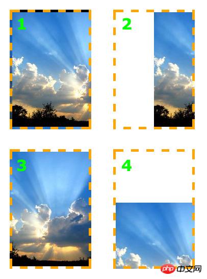
[Key points]Background positioning (background-position)
The background-position attribute is used to Controls the position of the background image within the element. The trick is that you actually specify the position of the upper left corner of the image relative to the upper left corner of the element.
In the following example, a background image is set and the background-position property is used to control its position. Background-repeat is also set to no-repeat. The unit of measurement is pixels. The first number represents the x-axis (horizontal) position, and the second is the y-axis (vertical) position.
/* 例 1: 默认值 */
background-position: 0 0; /* 元素的左上角 */
/* 例 2: 把图片向右移动 */
background-position: 75px 0;
/* 例 3: 把图片向左移动 */
background-position: -75px 0;
/* 例 4: 把图片向下移动 */
background-position: 0 100px;
The background-position property can be specified with other values, keywords and percentages, which is useful especially when the element size is not set in pixels.
Keywords need no explanation. On the x-axis:
* left* center* right
On the y-axis:
* top* center* bottom
The order is almost the same as when using pixel values, first the x-axis, then the y-axis, like this:
background-position: right top;
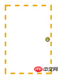
The same applies when using percentages. The important thing to note is that when using percentages, the browser sets the position of the image based on the percentage value of the element. It's easier to understand by looking at examples. Assume the settings are as follows:
background-position: 100% 50%;
This goes 100% of the way across the image (i.e. the very right-hand edge) and 100% of the way across the element (remember, the starting point is always the top-left corner), and the two line up there. It then goes 50% of the way down the image and 50% of the way down the element to line up there. The result is that the image is aligned to the right of the element and exactly half-way down it.
Sugar with tomatoes: I didn’t think of a suitable translation for this paragraph, so I kept the original text and translated it freely.
update: 感谢天涯的指教,这段搞明白了。使用百分数定位时,其实是将背景图片的百分比指定的位置和元素的百分比位置对齐。也就是说,百分数定位是改变了背景图和元素的对齐基点。不再像使用像素和关键词定位时,使用背景图和元素的左上角为对齐基点。例如上例的 background-position: 100% 50%; 就是将背景图片的 100%(right) 50%(center) 这个点,和元素的 100%(right) 50%(center) 这个点对齐。
这再一次说明了,我们一直认为已经掌握的简单的东西,其实还有我们有限的认知之外的知识。
注意原点总是左上角,最终的效果是笑脸图片被定位在元素的最右边,离元素顶部是元素的一半,效果和 background-position: right center; 一样。
背景附着
background-attachment 属性决定用户滚动页面时图片的状态。三个可用属性为 scroll(滚动),fixed(固定) 和 inherit(继承)。inherit 单纯地指定元素继承他的父元素的 background-attachment 属性。
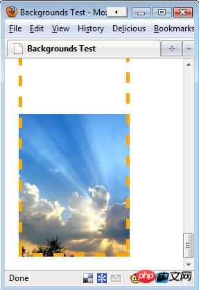
为了正确地理解 background-attachment,首先需要明白页面(page)和视口(view port)是如何协作地。视口(view port)是浏览器显示网页的部分(就是去掉工具栏的浏览器)。视口(view port)的位置固定,不变动。
当向下滚动网页时,视口(view port)是不动的,而页面的内容向上滚动。看起来貌似视口(view port)向页面下方滚动了。如果设置 background-attachment: scroll,就设置了当元素滚动时,元素背景也必需随着滚动。简而言之,背景是紧贴元素的。这是 background-attachment 默认值。
用一个例子来更清楚地描述下:
background-image: url(test-image.jpg);
background-position: 0 0;
background-repeat: no-repeat;
background-attachment: scroll;

当向下滚动页面时,背景向上滚动直至消失。
但是当设置 background-attachment 为 fixed 时,当页面向下滚动时,背景要待在它原来的位置(相对于浏览器来说)。也就是不随元素滚动。
用另一个例子描述下:
background-image: url(test-image.jpg);
background-position: 0 100%;
background-repeat: no-repeat;
background-attachment: fixed;
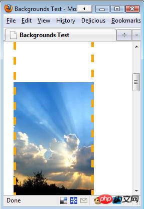
页面已经向下滚动了,但是图像仍然保持可见。
需要重视的一点是背景图只能出现在它父元素能达到的区域。即使图片是相对于视口(view port)定位地,如果它的父元素不可见,图片就会消失。参见下面的例子。此例中,图片位于视口(view port)的左下方,但是只有元素内的图片部分是可见的。
background-image: url(test-image.jpg);
background-position: 0 100%;
background-repeat: no-repeat;
background-attachment: fixed;
因为图片开始在元素之外,一部分图片被切除了。
以上就是本文的全部内容,希望对大家的学习有所帮助,更多相关内容请关注PHP中文网!
相关推荐:
The above is the detailed content of Analysis of CSS background and background-position. For more information, please follow other related articles on the PHP Chinese website!
 Commonly used permutation and combination formulas
 How to delete your own works on TikTok
 How to solve discuz database error
 How to solve the problem that win11 antivirus software cannot be opened
 How to solve server load incompatibility
 Usage of UpdatePanel
 linux packet capture command
 How to use append in python


![[Web front-end] Node.js quick start](https://img.php.cn/upload/course/000/000/067/662b5d34ba7c0227.png)


