

This article mainly introduces the style of CSS custom green check box button, which has certain reference value. Now I share it with you. Friends in need can refer to
HTML’s own complex The select box or radio button button styles are relatively simple. Sometimes these form controls may need to match their own theme styles. They need to beautify them. In the past, you may need to use JS to implement it. Now CSS can also be fully implemented The effect we want.
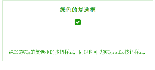
Rendering:
Let’s go straight to the topic. The first thing that comes to mind is that the check box needs a background color. Then there is a check box selected state. We use "check mark" to represent the selected state here. HTML can simply represent
<p class="i-check">
       <input type="checkbox" value="0" />
       <label></label>
</p>.i-check as a whole check box. Added CSS The code is also simple
.i-check {
    width: 20px;
    height: 20px;
    position: relative;
    margin: 20px auto;
}The size of the check box is determined according to your own needs. The margin is set here to display it in the middle of the browser.
Then the default state of the check box is set, here Use label to set, its height and width are the same as .i-check settings, then give it a background color and set its position.
.i-check label {
   width: 20px;
   height: 20px;
   cursor: pointer;
   position: absolute;
   top: 0;
   left: 0;
   background: #1A9909;
border-radius: 4px;We have already fixed the default state. Let's continue the analysis, What is needed at this time is a selected state. As mentioned above, the selected state is represented by a check mark. Here we use the pseudo-class after to set it, set its border, and rotate the after, so that it becomes a check mark. But the default state The check mark is hidden, so we used an opacity of 0.
.i-check  label:after {
    content: '';
    width: 9px;
    height: 5px;
    position: absolute;
    top: 4px;
    left: 4px;
    border: 3px solid #fff;
    border-top: none;
    border-right: none;
    background: transparent;
    opacity: 0;
    transform: rotate(-45deg);
}Okay, the entire state is set. Now we need to make the check mark appear when the check box is clicked. The following code will do it Complete
.i-check input[type=checkbox]:checked + label:after {
    opacity: 1;
}After writing this, don’t forget to let the Input check box set its style. In order to allow users to click on it, its height and width must be the same size as the whole box, so that it is at the top of the entire box. The top level. This way the user can click anywhere in this area. OK, the last step is to hide the input checkbox. To hide it, it is not to actually hide it and remove it. In this case, there will be no click effect. Hide here What is needed is to use opacity to set it to 0.
.i-check input[type=checkbox] {
    opacity: 0;
    position: absolute;
    z-index: 2;
    left: 0;
    top: 0;
    width: 100%;
    height: 100%;
    margin: 0;
}Okay, the entire effect is completed. In the same way, you can also set the effect of the radio button.
The above is the entire content of this article. I hope it will be helpful to everyone's study. For more related content, please pay attention to the PHP Chinese website!
Related recommendations:
How to set CSS
Text font color
#How to solve the problem of gaps under CSS images
The above is the detailed content of Use CSS to customize the style of the green checkbox button. For more information, please follow other related articles on the PHP Chinese website!


![[Web front-end] Node.js quick start](https://img.php.cn/upload/course/000/000/067/662b5d34ba7c0227.png)


