

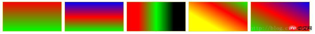
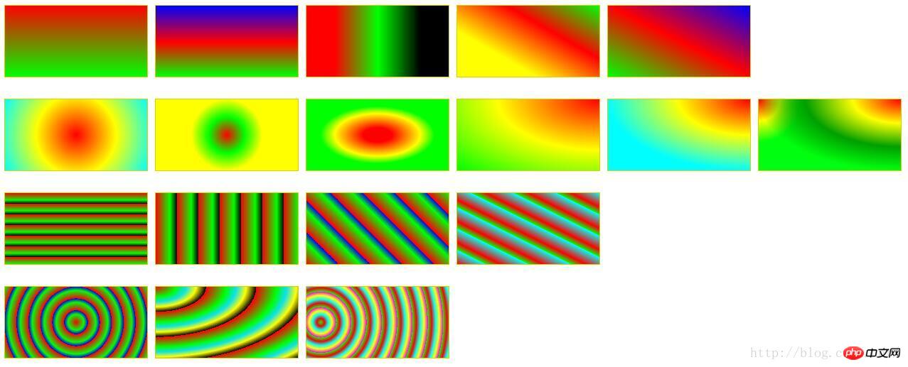
Several color gradient modes commonly used in CSS3

Now html5 css3 has become more and more popular. It is not difficult to implement p gradient with CSS3. This article has sorted out three commonly used color gradient modes, including linear gradient, radial gradient and repeated linear. Gradient is introduced in detail through sample code in this article. Friends in need can refer to it. Let’s take a look together.
1. Linear gradient: linear-gradient
## Syntax:
  <linear-gradient> = linear-gradient([ [ <angle> | to <side-or-corner] ,]? <color-start>[, <color-end>]+)
        <side-or-corner> = [left | right] || [top | bottom]
<color-start|end> = <color>[ <length>|<percentage>]?The following values are used to represent the direction of the gradient, which can be set using angles or keywords:
Example:
##
p {
    width: 200px;
    height: 100px;
    margin: 10px 5px;
    border: 1px solid #ddd000;
}
#LinearStartToEnd {
  float:left;
  background: linear-gradient(#ff0000, #00ff00);
}
#LinearPercentage {
  float:left;
  background: linear-gradient(#0000ff, #ff0000 52%, #00ff00);
}
#LinearAnglePercentage {
  float:left;
  background: linear-gradient(90deg, #ff0000 20%, #00ff00 50%, #000000 80%);
}
#LinearAngle {
  float:left;
  background: linear-gradient(30deg, #ffff00 30%, #ff0000, #00ff00);
}
#LinearTopRight {
  float:left;
  background: linear-gradient(to right top, #00ff00, #ff0000 50%, #0000ff);
}
Syntax:
  <position> = [ <length>① | <percentage>① | left | center① | right ]? [ <length>② | <percentage>② | top | center② | bottom ]?
     <shape> = circle | ellipse
     <size> = <extent-keyword>|[<circle-size>||<ellipse-size>]
     <extent-keyword> = closest-side | closest-corner | farthest-side | farthest-corner
     <circle-size> = <length>
     <ellipse-size> = [ <length>| <percentage> ]{2}
     <shape-size> = <length>| <percentage>
<radial-gradient> = radial-gradient([ [ <shape>|| <size> ] [ at <position> ]? , | at <position> , ]?<color-start>[[ , <color-end>]]+) Location. If two parameters are provided, the first represents the abscissa and the second represents the ordinate; if only one is provided, the second value defaults to 50%, that is, center
Use the length value to specify the abscissa value of the center of the radial gradient circle. Can be negative.
# & LT; Percentage & GT; ①: Specify the horizontal coordinate value of the radial gradient center with a percentage. Can be negative.
Can be negative.
# & LT; Percentage & GT; ②: Specify the vertical coordinate value of the radial gradient center with percentage. Can be negative.
# : ①: Set the middle coordinate value of radial gradient heart.
# ② ②: Set the medium marking value of the radial gradient heart.
# LEFT: Set the horizontal coordinate value of the radial gradient center.
Right: Set the horizontal coordinate value of the radial gradient center.
Top: The top of the top is the longitudinal coordinate value of the radial gradient.
## Bottom: Set the bottom of the radial gradient heart.
## & LT; Shape & GT; Determine the type of circular
Circle: Specify the round radial gradient
# Ellipse: Specify the oval shape Radial gradient.
# & LT; Extens-Keyword & GT; Circle | Ellipse accepts this value as size.
closest-side: Specify the radius length of the radial gradient from the center of the circle to the side closest to the center of the circle.
closest-corner: Specify the radius length of the radial gradient from the center of the circle to the angle closest to the center of the circle.
but farthest-side: specifies the radius length of the radial gradient from the center of the circle to the side farthest from the center of the circle.
completely, FARTHEST-CORNER: Specify the radius length of the radial gradient is the farthest angle from the center of the circle to the farthest.
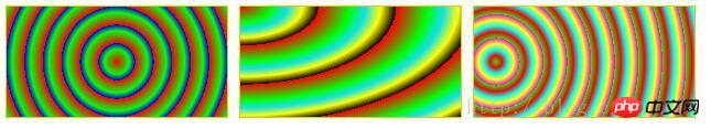
示例:

#RadialCenterCircle {
  float:left;
    background: radial-gradient(circle at center, #ff0000, #ffff00, #00ffff);
}
#RadialClosestSide {
  float:left;
    background: radial-gradient(circle closest-side, #ff0000, #00ff00, #ffff00);
}
#RadialFarthestSide {
  float:left;
    background: radial-gradient(farthest-side, #ff0000 20%, #ffff00 60%, #00ff00 80%);
}
#RadialRightTop {
  float:left;
    background: radial-gradient(at right top, #ff0000, #ffff00, #00ff00);
}
#RadialRadiusCenter {
  float:left;
    background: radial-gradient(farthest-side at top right, #ff0000, #ffff00, #01fefe);
}
#RadialGroup {
  float:left;
    background:
        radial-gradient(farthest-side at top right, #ff0000, #ffff00, #009f00, transparent),
        radial-gradient(60px at top left, #ff0000, #ffff00, #00ff0e);
}三、重复的线性渐变:repeating-linear-gradient
语法和参数类似线性渐变,这里不在赘述。详情请参考CSS手册。
示例:
#RepeatingLinearPercentage{
  float:left;
    background: repeating-linear-gradient(#ff0000, #00ff00 10%, #000000 15%);
}
#RepeatingLinearRight {
  float:left;
    background: repeating-linear-gradient(to right, #ff0000, #00ff00 10%, #000000 15%);
}
#RepeatingLinearAngle {
  float:left;
    background: repeating-linear-gradient(45deg, #ff0000, #00ff00 10%, #0000ff 15%);
}
#RepeatingLinearBottomLeft {
  float:left;
    background: repeating-linear-gradient(to bottom left, #00ffff, #ff0000 10%, #00ff00 15%);
}四、重复的径向渐变:repeating-radial-gradient
语法和参数类似径向渐变,这里不在赘述。详情请参考CSS手册。
示例:
#RepeatingRadialCircle {
  float:left;
    background: repeating-radial-gradient(circle, #ff0000 0, #00ff00 10%, #0000ff 15%);
}
#RepeatingRadialTopLeft {
  float:left;
    background: repeating-radial-gradient(at top left, #ff0000, #00ff00 10%, #0de0f0 15%, #ffff00 20%, #000000 25%);
}
#RepeatingRadialClosestCorner {
  float:left;
    background: repeating-radial-gradient(circle closest-corner at 20px 50px, #00ff00, #ff0000 10%, #00ffff 20%, #ffff00 30%, #ff00ff 40%);
}完整的例子:
<!DOCTYPE html>
<html>
<head>
<meta charset="utf-8" />
<title>ImageCSS3</title>
<style>
p {
    width: 200px;
    height: 100px;
    margin: 10px 5px;
    border: 1px solid #ddd000;
}
#LinearStartToEnd {
  float:left;
  background: linear-gradient(#ff0000, #00ff00);
}
#LinearPercentage {
  float:left;
  background: linear-gradient(#0000ff, #ff0000 52%, #00ff00);
}
#LinearAnglePercentage {
  float:left;
  background: linear-gradient(90deg, #ff0000 20%, #00ff00 50%, #000000 80%);
}
#LinearAngle {
  float:left;
  background: linear-gradient(30deg, #ffff00 30%, #ff0000, #00ff00);
}
#LinearTopRight {
  float:left;
  background: linear-gradient(to right top, #00ff00, #ff0000 50%, #0000ff);
}

#RadialCenterCircle {
  float:left;
    background: radial-gradient(circle at center, #ff0000, #ffff00, #00ffff);
}
#RadialClosestSide {
  float:left;
    background: radial-gradient(circle closest-side, #ff0000, #00ff00, #ffff00);
}
#RadialFarthestSide {
  float:left;
    background: radial-gradient(farthest-side, #ff0000 20%, #ffff00 60%, #00ff00 80%);
}
#RadialRightTop {
  float:left;
    background: radial-gradient(at right top, #ff0000, #ffff00, #00ff00);
}
#RadialRadiusCenter {
  float:left;
    background: radial-gradient(farthest-side at top right, #ff0000, #ffff00, #01fefe);
}
#RadialGroup {
  float:left;
    background:
                radial-gradient(farthest-side at top right, #ff0000, #ffff00, #009f00, transparent),
                radial-gradient(60px at top left, #ff0000, #ffff00, #00ff0e);
}

#RepeatingLinearPercentage{
  float:left;
    background: repeating-linear-gradient(#ff0000, #00ff00 10%, #000000 15%);
}
#RepeatingLinearRight {
  float:left;
    background: repeating-linear-gradient(to right, #ff0000, #00ff00 10%, #000000 15%);
}
#RepeatingLinearAngle {
  float:left;
    background: repeating-linear-gradient(45deg, #ff0000, #00ff00 10%, #0000ff 15%);
}
#RepeatingLinearBottomLeft {
  float:left;
    background: repeating-linear-gradient(to bottom left, #00ffff, #ff0000 10%, #00ff00 15%);
}

#RepeatingRadialCircle {
  float:left;
    background: repeating-radial-gradient(circle, #ff0000 0, #00ff00 10%, #0000ff 15%);
}
#RepeatingRadialTopLeft {
  float:left;
    background: repeating-radial-gradient(at top left, #ff0000, #00ff00 10%, #0de0f0 15%, #ffff00 20%, #000000 25%);
}
#RepeatingRadialClosestCorner {
  float:left;
    background: repeating-radial-gradient(circle closest-corner at 20px 50px, #00ff00, #ff0000 10%, #00ffff 20%, #ffff00 30%, #ff00ff 40%);
}

</style>
</head>
<body>
<!-- 指定线性渐变起止色 -->
<p id="LinearStartToEnd"></p>
<!-- 指定线性渐变起止色位置 -->
<p id="LinearPercentage"></p>
<!-- 指定线性渐变颜色渐变方向和起止色位置 -->
<p id="LinearAnglePercentage"></p>
<!-- 指定线性渐变颜色渐变方向 -->
<p id="LinearAngle"></p>
<!-- 设置渐变从右上到左下 -->
<p id="LinearTopRight"></p>

<!-- 浮动p换行,此处指定p宽高和边界,是为了覆盖前面定义的p统一CSS样式,
 可以尝试去掉指定的p宽高和边界,看看效果 -->
<p style="width:0; height:0; border:none; clear:both"></p>
<!-- 以中心点为圆心的圆形径向渐变 -->
<p id="RadialCenterCircle"></p>
<!-- 径向渐变半径长度:圆心到离圆心最近边的长度 -->
<p id="RadialClosestSide"></p>
<!-- 径向渐变半径长度:圆心到离圆心最远边的长度 -->
<p id="RadialFarthestSide"></p>
<!-- 左边为径向渐变圆心的横坐标值,顶边为径向渐变圆心的纵坐标值 -->
<p id="RadialRightTop"></p>
<!-- 同时指定径向渐变的圆心和半径 -->
<p id="RadialRadiusCenter"></p>
<!-- 径向渐变组合 -->
<p id="RadialGroup"></p>

<p style="width:0; height:0; border:none; clear:both"></p>
<!-- 指定颜色起止色位置的重复线性渐变 -->
<p id="RepeatingLinearPercentage"></p>
<!-- 从左到右渐变的重复线性渐变 -->
<p id="RepeatingLinearRight"></p>
<!-- 渐变角度为45度的重复线性渐变 -->
<p id="RepeatingLinearAngle"></p>
<!-- 从左下到右上的重复线性渐变 -->
<p id="RepeatingLinearBottomLeft"></p>

<p style="width:0; height:0; border:none; clear:both"></p>
<!-- 圆形重复径向渐变 -->
<p id="RepeatingRadialCircle"></p>
<!-- 渐变方向为左上到右下的重复径向渐变 -->
<p id="RepeatingRadialTopLeft"></p>
<!-- 重复径向渐变:渐变半径长度为从圆心到离圆心最近的角的距离 -->
<p id="RepeatingRadialClosestCorner"></p>

</body>
</html>以上就是本文的全部内容,希望对大家的学习有所帮助,更多相关内容请关注PHP中文网!
相关推荐:
The above is the detailed content of Several color gradient modes commonly used in CSS3. For more information, please follow other related articles on the PHP Chinese website!

Hot AI Tools

Undresser.AI Undress
AI-powered app for creating realistic nude photos

AI Clothes Remover
Online AI tool for removing clothes from photos.

Undress AI Tool
Undress images for free

Clothoff.io
AI clothes remover

Video Face Swap
Swap faces in any video effortlessly with our completely free AI face swap tool!

Hot Article
Hot Tools

Notepad++7.3.1
Easy-to-use and free code editor

SublimeText3 Chinese version
Chinese version, very easy to use

Zend Studio 13.0.1
Powerful PHP integrated development environment

Dreamweaver CS6
Visual web development tools

SublimeText3 Mac version
God-level code editing software (SublimeText3)
Hot Topics
 1386
1386
 52
52

 How to change title bar color on Windows 11?
Sep 14, 2023 pm 03:33 PM
How to change title bar color on Windows 11?
Sep 14, 2023 pm 03:33 PM
By default, the title bar color on Windows 11 depends on the dark/light theme you choose. However, you can change it to any color you want. In this guide, we'll discuss step-by-step instructions for three ways to change it and personalize your desktop experience to make it visually appealing. Is it possible to change the title bar color of active and inactive windows? Yes, you can change the title bar color of active windows using the Settings app, or you can change the title bar color of inactive windows using Registry Editor. To learn these steps, go to the next section. How to change title bar color in Windows 11? 1. Using the Settings app press + to open the settings window. WindowsI go to "Personalization" and then
 What does WeChat's Do Not Disturb mode do?
Feb 23, 2024 pm 10:48 PM
What does WeChat's Do Not Disturb mode do?
Feb 23, 2024 pm 10:48 PM
What does WeChat Do Not Disturb mode mean? Nowadays, with the popularity of smartphones and the rapid development of mobile Internet, social media platforms have become an indispensable part of people's daily lives. WeChat is one of the most popular social media platforms in China, and almost everyone has a WeChat account. We can communicate with friends, family, and colleagues in real time through WeChat, share moments in our lives, and understand each other’s current situation. However, in this era, we are also inevitably faced with the problems of information overload and privacy leakage, especially for those who need to focus or
![How to Invert Colors on Windows 11 [Using Shortcuts]](https://img.php.cn/upload/article/000/887/227/168145458732944.png?x-oss-process=image/resize,m_fill,h_207,w_330) How to Invert Colors on Windows 11 [Using Shortcuts]
Apr 14, 2023 pm 02:43 PM
How to Invert Colors on Windows 11 [Using Shortcuts]
Apr 14, 2023 pm 02:43 PM
When using a Windows computer, you may need to invert the computer's colors. This may be due to personal preference or a display driver error. If you want to invert the colors on your Windows 11 PC, this article provides you with all the necessary steps to invert the colors on your Windows PC. What does it mean to invert colors on an image in this article? Simply put, inverting the colors of an image means flipping the current color of the image to the opposite hue on the color wheel. You can also say this means changing the color of the image to a negative. For example, a blue image will be inverted to orange, black to white, green to magenta, etc. How to invert colors on Windows 11? 1. Use the Microsoft Paint button + and enter
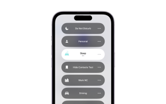 What is sleep mode used for on iPhone?
Nov 04, 2023 am 11:13 AM
What is sleep mode used for on iPhone?
Nov 04, 2023 am 11:13 AM
iOS devices have long been able to track your sleep patterns and more using the Health app. But isn’t it annoying when you’re disturbed by notifications while you’re sleeping? These notifications may be irrelevant and therefore disrupt your sleep patterns in the process. While Do Not Disturb mode is a great way to avoid distractions while sleeping, it can cause you to miss important calls and messages you receive during the night. Thankfully, this is where sleep mode comes in. Let’s learn more about it and how to use it on iPhone. What role does sleep mode play on the iPhone? Sleep mode is a dedicated focus mode in iOS that is automatically activated based on your sleep schedule in the "Health" App. It helps you set an alarm and then
 Natural Titanium: Revealing the True Color of iPhone 15 Pro
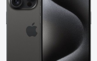
Sep 18, 2023 pm 02:13 PM
Natural Titanium: Revealing the True Color of iPhone 15 Pro
Sep 18, 2023 pm 02:13 PM
With its annual Wanderlust event over, Apple has finally put to rest months of rumors and speculation about its iPhone 15 lineup. As expected, its 2023 flagship "Pro" model sets itself apart in terms of raw power and new "Titanium" design and aesthetics. Here's a look at the different colors of the new iPhone 15 Pro models, and to determine the true colors and shades of the "natural titanium" variant. Apple iPhone 15 Pro Color Apple has chosen grade 5 titanium alloy as the material design for the latest iPhone 15 Pro model. The titanium alloy used on the iPhone 15 Pro is known for its strength-to-weight ratio, which not only makes it more durable and lightweight, but also gives the device an elegant "brush" texture that
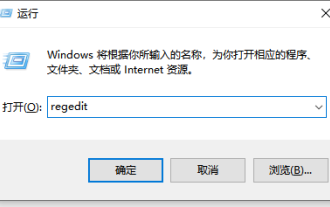 Detailed tutorial on how to set the eye protection color application on win10 computer
Jul 08, 2023 am 10:46 AM
Detailed tutorial on how to set the eye protection color application on win10 computer
Jul 08, 2023 am 10:46 AM
For office workers, working on the computer lasts all day, and the background color of most software is pure white. If you look at it for a long time, your eyes will feel dry and uncomfortable. In fact, we can customize the window eye protection color. The method introduced online is more troublesome to operate. In this article, the editor will share with you a method to adjust the window eye protection color in Win10. Let’s take a look at how to set the computer eye protection mode. 1. First, press the key combination [win] + [R] on the keyboard to open the run window, enter [regedit] and click OK to open. 2. Then expand the registry folder in sequence: [\HKEY_CURRENT_USER\ControlPanel\Colors] 3. Then in the Colors folder
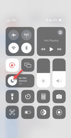 Do Not Disturb Mode Not Working in iPhone: Fix
Apr 24, 2024 pm 04:50 PM
Do Not Disturb Mode Not Working in iPhone: Fix
Apr 24, 2024 pm 04:50 PM
Even answering calls in Do Not Disturb mode can be a very annoying experience. As the name suggests, Do Not Disturb mode turns off all incoming call notifications and alerts from emails, messages, etc. You can follow these solution sets to fix it. Fix 1 – Enable Focus Mode Enable focus mode on your phone. Step 1 – Swipe down from the top to access Control Center. Step 2 – Next, enable “Focus Mode” on your phone. Focus Mode enables Do Not Disturb mode on your phone. It won't cause any incoming call alerts to appear on your phone. Fix 2 – Change Focus Mode Settings If there are some issues in the focus mode settings, you should fix them. Step 1 – Open your iPhone settings window. Step 2 – Next, turn on the Focus mode settings
 How to change the color of the Windows 10 taskbar
Jan 01, 2024 pm 09:05 PM
How to change the color of the Windows 10 taskbar
Jan 01, 2024 pm 09:05 PM
It is very simple to modify the taskbar color in Windows 10, but many users find that they cannot set it. In fact, it is very simple. Just choose your favorite color in the personalization of the computer. If you cannot change the color, pay attention to the detailed settings. How to change the color of the win10 taskbar Step 1: Right-click on the desktop - click Personalize Step 2: Customize the color area Step 3: Choose your favorite color PS: If you cannot change the color, you can click Color -> Select Color -> Customize->Default windows mode, select dark color.
