

Detailed interpretation of React Native Flexbox layout
This article mainly introduces a brief discussion of React Native Flexbox layout (summary). Now I will share it with you and give you a reference.
Flex is the abbreviation of Flexible Box, which means "flexible layout" and is used to provide maximum flexibility for the box model.
Basic concepts
Elements that adopt Flex layout are called Flex containers (flex containers), or "containers" for short. All its child elements automatically become container members, called Flex items (flex items), or "items" for short.
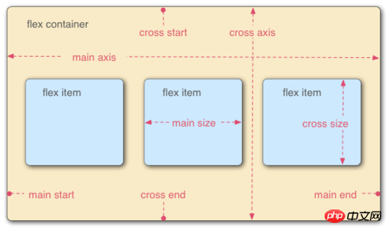
Containers have two axes by default: the horizontal main axis (main axis) and the vertical cross axis (cross axis). The starting position of the main axis (the intersection with the border) is called main start, and the ending position is called main end; the starting position of the cross axis is called cross start, and the ending position is called cross end.
Items are arranged along the main axis by default. The main axis space occupied by a single item is called main size, and the cross axis space occupied by a single item is called cross size.
Container properties
The following 6 properties are set on the container.
flex-direction
flex-wrap
flex-flow
justify-content
align-items
- ##align-content
flex-direction property
The flex-direction property determines the direction of the main axis (that is, the arrangement direction of items).
 {
 flex-direction: row | row-reverse | column | column-reverse;
}
- row (default value): The main axis is horizontal, and the starting point is on the left end
- row-reverse: The main axis is horizontal and the starting point is on the right end
- column: The main axis is vertical, the starting point is on the upper edge
- column-reverse: The main axis is vertical, the starting point is on the lower edge
flex-wrap property
By default, items are arranged on a line (also called the "axis"). The flex-wrap attribute defines how to wrap the line if one axis cannot fit.
{
 flex-wrap: nowrap | wrap | wrap-reverse;
}


flex-flow
The flex-flow property is the abbreviation of the flex-direction property and the flex-wrap property, with the default value for row nowrap.{
flex-flow: <flex-direction> || <flex-wrap>;
}justify-content property
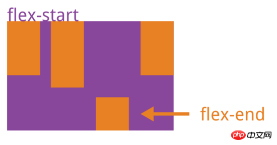
justify-content property defines the alignment of the item on the main axis.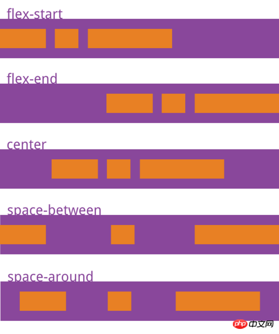
- flex-start (default value): left-aligned
- flex-end: right-aligned
- center: Center
- space-between: Align both ends, with equal spacing between items.
- space-around: Each item is equally spaced on both sides. Therefore, the spacing between items is twice as large as the spacing between the items and the border
align-items attribute
align-items attribute defines the item How to align on the cross axis.{
align-items: flex-start | flex-end | center | baseline | stretch;
}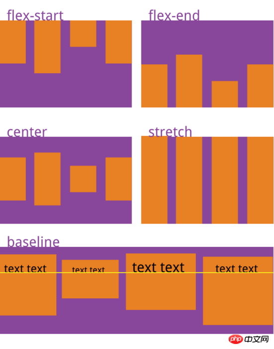
- flex-start: Alignment of the starting point of the cross axis
- flex-end: Alignment of the end point of the cross axis
- center: The midpoint alignment of the cross axis
- baseline: The baseline alignment of the first line of text of the item
- stretch (default Value): If the item does not set a height or is set to auto, it will occupy the height of the entire container
align-content attribute
align- The content attribute defines the alignment of multiple axes. This property has no effect if the project has only one axis.{
align-content: flex-start | flex-end | center | space-between | space-around | stretch;
}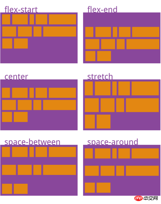
- flex-start: aligned with the starting point of the cross axis
- flex-end: aligned with the end point of the cross axis
- center: aligned with the midpoint of the cross axis
space-between:与交叉轴两端对齐,轴线之间的间隔平均分布
space-around:每根轴线两侧的间隔都相等。所以,轴线之间的间隔比轴线与边框的间隔大一倍
stretch(默认值):轴线占满整个交叉轴
项目的属性
以下6个属性设置在项目上。
order
flex-grow
flex-shrink
flex-basis
flex
align-self
order属性
order属性定义项目的排列顺序。数值越小,排列越靠前,默认为0。
{
 order: <integer>;
}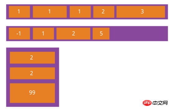
flex-grow属性
flex-grow属性定义项目的放大比例,默认为0,即如果存在剩余空间,也不放大
{
 flex-grow: <number>; /* default 0 */
}
如果所有项目的flex-grow属性都为1,则它们将等分剩余空间(如果有的话)。如果一个项目的flex-grow属性为2,其他项目都为1,则前者占据的剩余空间将比其他项多一倍。
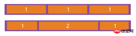
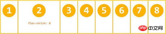
flex-shrink属性
flex-shrink属性定义了项目的缩小比例,默认为1,即如果空间不足,该项目将缩小。
{
 flex-shrink: <number>; /* default 1 */
}
如果所有项目的flex-shrink属性都为1,当空间不足时,都将等比例缩小。如果一个项目的flex-shrink属性为0,其他项目都为1,则空间不足时,前者不缩小。
负值对该属性无效。
flex-basis属性
flex-basis属性定义了在分配多余空间之前,项目占据的主轴空间(main size)。浏览器根据这个属性,计算主轴是否有多余空间。它的默认值为auto,即项目的本来大小。
{
 flex-basis: <length> | auto; /* default auto */
}它可以设为跟width或height属性一样的值(比如350px),则项目将占据固定空间。
flex属性
flex属性是flex-grow, flex-shrink 和 flex-basis的简写,默认值为0 1 auto。后两个属性可选。
{
flex: none | [ <'flex-grow'> <'flex-shrink'>? || <'flex-basis'> ]
}该属性有两个快捷值:auto (1 1 auto) 和 none (0 0 auto)。
align-self属性
align-self属性允许单个项目有与其他项目不一样的对齐方式,可覆盖align-items属性。默认值为auto,表示继承父元素的align-items属性,如果没有父元素,则等同于stretch。
 {
 align-self: auto | flex-start | flex-end | center | baseline | stretch;
}
上面是我整理给大家的,希望今后会对大家有帮助。
相关文章:
The above is the detailed content of Detailed interpretation of React Native Flexbox layout. For more information, please follow other related articles on the PHP Chinese website!

Hot AI Tools

Undresser.AI Undress
AI-powered app for creating realistic nude photos

AI Clothes Remover
Online AI tool for removing clothes from photos.

Undress AI Tool
Undress images for free

Clothoff.io
AI clothes remover

Video Face Swap
Swap faces in any video effortlessly with our completely free AI face swap tool!

Hot Article
Hot Tools

Notepad++7.3.1
Easy-to-use and free code editor

SublimeText3 Chinese version
Chinese version, very easy to use

Zend Studio 13.0.1
Powerful PHP integrated development environment

Dreamweaver CS6
Visual web development tools

SublimeText3 Mac version
God-level code editing software (SublimeText3)
Hot Topics
 1386
1386
 52
52

 How to build a real-time chat app with React and WebSocket
Sep 26, 2023 pm 07:46 PM
How to build a real-time chat app with React and WebSocket
Sep 26, 2023 pm 07:46 PM
How to build a real-time chat application using React and WebSocket Introduction: With the rapid development of the Internet, real-time communication has attracted more and more attention. Live chat apps have become an integral part of modern social and work life. This article will introduce how to build a simple real-time chat application using React and WebSocket, and provide specific code examples. 1. Technical preparation Before starting to build a real-time chat application, we need to prepare the following technologies and tools: React: one for building
 Guide to React front-end and back-end separation: How to achieve decoupling and independent deployment of front-end and back-end
Sep 28, 2023 am 10:48 AM
Guide to React front-end and back-end separation: How to achieve decoupling and independent deployment of front-end and back-end
Sep 28, 2023 am 10:48 AM
React front-end and back-end separation guide: How to achieve front-end and back-end decoupling and independent deployment, specific code examples are required In today's web development environment, front-end and back-end separation has become a trend. By separating front-end and back-end code, development work can be made more flexible, efficient, and facilitate team collaboration. This article will introduce how to use React to achieve front-end and back-end separation, thereby achieving the goals of decoupling and independent deployment. First, we need to understand what front-end and back-end separation is. In the traditional web development model, the front-end and back-end are coupled
 How to build simple and easy-to-use web applications with React and Flask
Sep 27, 2023 am 11:09 AM
How to build simple and easy-to-use web applications with React and Flask
Sep 27, 2023 am 11:09 AM
How to use React and Flask to build simple and easy-to-use web applications Introduction: With the development of the Internet, the needs of web applications are becoming more and more diverse and complex. In order to meet user requirements for ease of use and performance, it is becoming increasingly important to use modern technology stacks to build network applications. React and Flask are two very popular frameworks for front-end and back-end development, and they work well together to build simple and easy-to-use web applications. This article will detail how to leverage React and Flask
 How to build a reliable messaging app with React and RabbitMQ
Sep 28, 2023 pm 08:24 PM
How to build a reliable messaging app with React and RabbitMQ
Sep 28, 2023 pm 08:24 PM
How to build a reliable messaging application with React and RabbitMQ Introduction: Modern applications need to support reliable messaging to achieve features such as real-time updates and data synchronization. React is a popular JavaScript library for building user interfaces, while RabbitMQ is a reliable messaging middleware. This article will introduce how to combine React and RabbitMQ to build a reliable messaging application, and provide specific code examples. RabbitMQ overview:
 React code debugging guide: How to quickly locate and solve front-end bugs
Sep 26, 2023 pm 02:25 PM
React code debugging guide: How to quickly locate and solve front-end bugs
Sep 26, 2023 pm 02:25 PM
React code debugging guide: How to quickly locate and resolve front-end bugs Introduction: When developing React applications, you often encounter a variety of bugs that may crash the application or cause incorrect behavior. Therefore, mastering debugging skills is an essential ability for every React developer. This article will introduce some practical techniques for locating and solving front-end bugs, and provide specific code examples to help readers quickly locate and solve bugs in React applications. 1. Selection of debugging tools: In Re
 React Router User Guide: How to implement front-end routing control
Sep 29, 2023 pm 05:45 PM
React Router User Guide: How to implement front-end routing control
Sep 29, 2023 pm 05:45 PM
ReactRouter User Guide: How to Implement Front-End Routing Control With the popularity of single-page applications, front-end routing has become an important part that cannot be ignored. As the most popular routing library in the React ecosystem, ReactRouter provides rich functions and easy-to-use APIs, making the implementation of front-end routing very simple and flexible. This article will introduce how to use ReactRouter and provide some specific code examples. To install ReactRouter first, we need
 How to build a fast data analysis application using React and Google BigQuery
Sep 26, 2023 pm 06:12 PM
How to build a fast data analysis application using React and Google BigQuery
Sep 26, 2023 pm 06:12 PM
How to use React and Google BigQuery to build fast data analysis applications Introduction: In today's era of information explosion, data analysis has become an indispensable link in various industries. Among them, building fast and efficient data analysis applications has become the goal pursued by many companies and individuals. This article will introduce how to use React and Google BigQuery to build a fast data analysis application, and provide detailed code examples. 1. Overview React is a tool for building
 How to package and deploy front-end applications using React and Docker
Sep 26, 2023 pm 03:14 PM
How to package and deploy front-end applications using React and Docker
Sep 26, 2023 pm 03:14 PM
How to use React and Docker to package and deploy front-end applications. Packaging and deployment of front-end applications is a very important part of project development. With the rapid development of modern front-end frameworks, React has become the first choice for many front-end developers. As a containerization solution, Docker can greatly simplify the application deployment process. This article will introduce how to use React and Docker to package and deploy front-end applications, and provide specific code examples. 1. Preparation Before starting, we need to install
