
This time I will show you how to use the percentage unit in CSS, and what are the precautions for using the percentage unit in CSS. The following is a practical case, let's take a look.
Conclusion:
For elements in the standard stream, see if their attributes have inheritance. For width and margin-left, it is inheritable, and it will refer to the parent element or ancestor element (actually the containing block); for height, it has no inheritance, and the parent element or ancestor element will adapt to the height of all its child elements. and (this needs to be noted).
Absolute positioning refers to the nearest parent element or ancestor element. If there is no parent element or ancestor element, then it refers to the initial containing block (different browsers may be different , because W3C does not specify how browsers implement it). But in fact, most browsers treat the viewable area as an absolutely positioned containing block.
Fixed positioning reference visual area
width is set to percentage
General child elements usually inherit the calculated value of the parent element as a reference for percentage. For non-inheritable attributes and root elements, use the initial value as a reference.
For example, .box does not have a width set, but the default It inherits the calculated value of body, and because .box is the parent element of .item, .item inherits the calculated value of .box. When a block-level element does not set a width, its width defaults to full screen because it inherits the width of the containing block.
height is set to a percentage
Conclusion
When the height is set to a percentage, the height does not inherit the parent element like the width. Or ancestor elements. On the contrary, the parent element or ancestor element will adapt itself according to the actual height (height calculation value) of the child element, which is generally the sum of the heights of the contents of all child elements. The child element will set a specific height value based on the text line height (in the case where the height of the child element is not set to a specific value). For an element with absolute positioning, when its height is a percentage, it will refer to the height of the parent element or ancestor element. Absolute positioning will refer to the parent element or ancestor element closest to it. If there is no parent element or ancestor element, then it will refer to the initial element. Containing block (different browsers may be different, because W3C does not specify how browsers should implement it). But in fact, most browsers treat the viewable area as an absolutely positioned containing block.
We generally like to set the width as a percentage, but be careful when setting the height as a percentage.
 <style>
        body,p{
            margin:0;
            padding:0;
        }
        .box{
            width:100px;
            height:100%;
            background-color: #58d3e2;
        }
    </style>
<p class="box">height 100%</p>
html Why does height equal to 21? Is this 21 inherited from the ancestor element? When we set the height of the body to 100% the result is still the same. In fact, the height here is the height of the line height. That is to say, when the height is 0 or no height is set, the height is the line height of the text. When we add line-height:20px; to .box, the box , the height of body and html will become 20px; when we set the .box height to a specific value:
 <style>
        body,p{
            margin:0;
            padding:0;
        }
        .box{
            width:100px;
            height:100px;
            background-color: #58d3e2;
        }
    </style>
<p class="box">height 100%</p>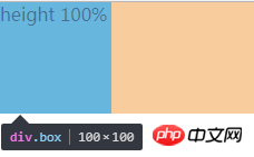
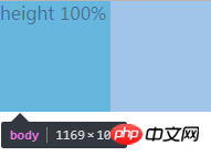

It can be found that the height of body and html is the same as .box, which is 100px. Therefore, it can be concluded that the parent element is adaptive to the height of the child element when the height is not set (when the height is not set) Below, the height of html and body is the combined height of all content). If the parent element sets the height, it is another situation:
 <style>
        body,p{
            margin:0;
            padding:0;
        }
        .d{
            height: 100px;
            width: 200px;
            background-color: #9d9d9d;
        }
        .box{
            width:100px;
            height:100px;
            background-color: #58d3e2;
        }
    </style>
<p class="d">
<p class="box">height</p>
</p>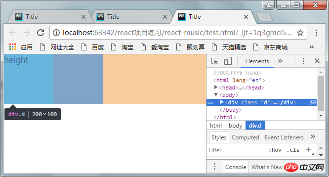
You can find d The height of body and html has become 100px (it should be 200px), which means that the parent element or ancestor element passively adapts the height of the child element, and their height value will not be inherited from the element.
When there is absolute positioning
#1. Absolutely positioned ancestor elements without positioning
At this time, absolute positioning refers to the height of a viewport. Pay attention to the concept of viewport.
 <style>
        body,p{
            margin:0;
            padding:0;
        }
        .box{
            position:absolute;
            width:100px;
            height:100%;//改变百分比为50%
            background-color: #58d3e2;
        }
    </style>
<p class="box">height 100%</p>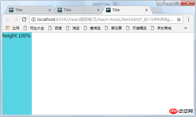
改变height分别为100%和50%,可以发现html的高度为0,并没有自适应p的高度,因为p已经彻底脱离标准流了,我们说过,如果绝对定位没有定位的祖先元素,则包含块为初始包含块,这里的初始包含块即为可视区,所以这里的百分比是参照可视区的大小来计算的。所以为50%时占视口的一半。注意这只是一个视口的高度,把滚动条往下拉拉就知道了。
2.绝对定位的元素在另外一个定位元素里面(除static外)
这时百分比参照的是父元素生成的包含块计算出来的值
所以想让定位元素的高度占满整个屏幕,可以:
body{
  position:relative;
}margin-left设置成百分比
  <style>
        body,p{
            margin:0;
            padding:0;
        }
        .box{
            position:absolute;
            width:100px;
            height:100px;
            margin-left: 100%;
            background-color: #58d3e2;
        }
    </style>
<p class="box">margin-left</p>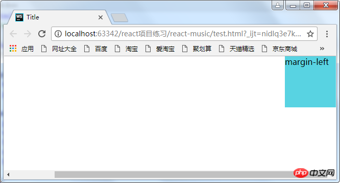
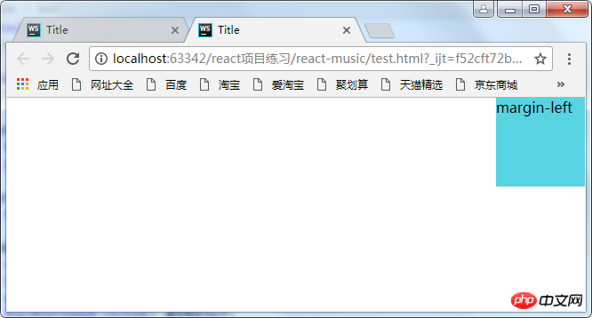
这时出现了滚动条,这是因为将p的margin-left设置成了100%,而百分比是参照其包含块body的宽度,body又是参照的html(某些浏览器将它当作初始包含块)。而html的初始包含块是可视区,所以可视区的宽度再加上元素的100%,自然就超出了屏幕了。
解决方法:
(1)利用calc函数
<style>
        body,p{
            margin:0;
            padding:0;
        }
        .box{
            position:absolute;
            width:100px;
            height:100px;
            margin-left: calc(100%-100px);
            background-color: #58d3e2;
        }
    </style>
<p class="box">margin-left</p>(2)让body的宽度减去100px,因为p的百分比是参照其父元素的宽度计算的,因此这里将它的父元素的宽度减小,那么它的margin-left的100%自然就小了
<style>
        body,p{
            margin:0;
            padding:0;
        }
         body{
             margin-right;100px;
        }
        .box{
            position:absolute;
            width:100px;
            height:100px;
            margin-left: 100%;
            background-color: #58d3e2;
        }
    </style>
<p class="box">margin-left</p>相信看了本文案例你已经掌握了方法,更多精彩请关注php中文网其它相关文章!
推荐阅读:
The above is the detailed content of How to use percentage units in CSS. For more information, please follow other related articles on the PHP Chinese website!


