

About the method of drawing triangle icon in Html and CSS

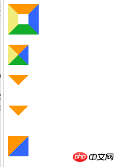
This article mainly introduces in detail the code related to drawing triangle icons in Html CSS. Many web pages have triangular icons, usually cut pictures. Here you can use css3 html to write triangles. For those who are interested, You can refer to
and take a look at the renderings first:
<!doctype html>
<html lang="en">
<head>
    <meta charset="UTF-8">
    <title>Document</title>
    <style type="text/css">
        #test1 {
            height:20px;
            width:20px;
            border-color:#FF9600 #3366ff #12ad2a #f0eb7a;
            border-style:solid;
            border-width:20px;
        }
        #test2 {
            height:0;
            width:0;
            overflow: hidden; /* 这里设置overflow, font-size, line-height */
            font-size: 0;     /*是因为, 虽然宽高度为0, 但在IE6下会具有默认的 */
            line-height: 0;  /* 字体大小和行高, 导致盒子呈现被撑开的长矩形 */
            border-color:#FF9600 #3366ff #12ad2a #f0eb7a;
            border-style:solid;
            border-width:20px;
        }
        #test3 {
            height:0;
            width:0;
            overflow: hidden;
            font-size: 0;
            line-height: 0;
            border-color:#FF9600 transparent transparent transparent;
            border-style:solid;
            border-width:20px;
        }
        #test4 {
            height:0;
            width:0;
            overflow: hidden;
            font-size: 0;
            line-height: 0;
            border-color:#FF9600 transparent transparent transparent;
            border-style:solid dashed dashed dashed;
            border-width:20px;
        }/*兼容IE6*/
        #test5 {
            height:0;
            width:0;
            overflow: hidden;
            font-size: 0;
            line-height: 0;
            border-color:#FF9600 #3366ff transparent transparent;
            border-style:solid solid dashed dashed;
            border-width:40px 40px 0 0 ;
        }
    </style>
</head>
<body>
    <p id="test1"></p><br>
    <p id="test2"></p><br>
    <p id="test3"></p><br>
    <p id="test4"></p><br>
    <p id="test5"></p><br>
</body>
</html>The above is the entire content of this article. I hope it will be helpful to everyone’s study. More related Please pay attention to the PHP Chinese website for content!
Related recommendations:
Use HTML5
How to draw polygons such as triangles and rectangles using Canvas
Using HTML5 and CSS3 to make birthday cakes
The above is the detailed content of About the method of drawing triangle icon in Html and CSS. For more information, please follow other related articles on the PHP Chinese website!

Hot AI Tools

Undresser.AI Undress
AI-powered app for creating realistic nude photos

AI Clothes Remover
Online AI tool for removing clothes from photos.

Undress AI Tool
Undress images for free

Clothoff.io
AI clothes remover

AI Hentai Generator
Generate AI Hentai for free.

Hot Article
Hot Tools

Notepad++7.3.1
Easy-to-use and free code editor

SublimeText3 Chinese version
Chinese version, very easy to use

Zend Studio 13.0.1
Powerful PHP integrated development environment

Dreamweaver CS6
Visual web development tools

SublimeText3 Mac version
God-level code editing software (SublimeText3)
Hot Topics
 1368
1368
 52
52

 How to remove the default style in Bootstrap list?
Apr 07, 2025 am 10:18 AM
How to remove the default style in Bootstrap list?
Apr 07, 2025 am 10:18 AM
The default style of the Bootstrap list can be removed with CSS override. Use more specific CSS rules and selectors, follow the "proximity principle" and "weight principle", overriding the Bootstrap default style. To avoid style conflicts, more targeted selectors can be used. If the override is unsuccessful, adjust the weight of the custom CSS. At the same time, pay attention to performance optimization, avoid overuse of !important, and write concise and efficient CSS code.
 How to resize bootstrap
Apr 07, 2025 pm 03:18 PM
How to resize bootstrap
Apr 07, 2025 pm 03:18 PM
To adjust the size of elements in Bootstrap, you can use the dimension class, which includes: adjusting width: .col-, .w-, .mw-adjust height: .h-, .min-h-, .max-h-
 How to use bootstrap button
Apr 07, 2025 pm 03:09 PM
How to use bootstrap button
Apr 07, 2025 pm 03:09 PM
How to use the Bootstrap button? Introduce Bootstrap CSS to create button elements and add Bootstrap button class to add button text
 How to upload files on bootstrap
Apr 07, 2025 pm 01:09 PM
How to upload files on bootstrap
Apr 07, 2025 pm 01:09 PM
The file upload function can be implemented through Bootstrap. The steps are as follows: introduce Bootstrap CSS and JavaScript files; create file input fields; create file upload buttons; handle file uploads (using FormData to collect data and then send to the server); custom style (optional).
 How to change the size of a Bootstrap list?
Apr 07, 2025 am 10:45 AM
How to change the size of a Bootstrap list?
Apr 07, 2025 am 10:45 AM
The size of a Bootstrap list depends on the size of the container that contains the list, not the list itself. Using Bootstrap's grid system or Flexbox can control the size of the container, thereby indirectly resizing the list items.
 How to insert pictures on bootstrap
Apr 07, 2025 pm 03:30 PM
How to insert pictures on bootstrap
Apr 07, 2025 pm 03:30 PM
There are several ways to insert images in Bootstrap: insert images directly, using the HTML img tag. With the Bootstrap image component, you can provide responsive images and more styles. Set the image size, use the img-fluid class to make the image adaptable. Set the border, using the img-bordered class. Set the rounded corners and use the img-rounded class. Set the shadow, use the shadow class. Resize and position the image, using CSS style. Using the background image, use the background-image CSS property.
 How to layout bootstrap
Apr 07, 2025 pm 02:24 PM
How to layout bootstrap
Apr 07, 2025 pm 02:24 PM
To use Bootstrap to layout a website, you need to use a grid system to divide the page into containers, rows, and columns. First add the container, then add the rows in it, add the columns within the row, and finally add the content in the column. Bootstrap's responsive layout function automatically adjusts the layout according to breakpoints (xs, sm, md, lg, xl). Different layouts under different screen sizes can be achieved by using responsive classes.
 How to implement nesting of Bootstrap lists?
Apr 07, 2025 am 10:27 AM
How to implement nesting of Bootstrap lists?
Apr 07, 2025 am 10:27 AM
Nested lists in Bootstrap require the use of Bootstrap's grid system to control the style. First, use the outer layer <ul> and <li> to create a list, then wrap the inner layer list in <div class="row> and add <div class="col-md-6"> to the inner layer list to specify that the inner layer list occupies half the width of a row. In this way, the inner list can have the right one
