
 Web Front-end
CSS Tutorial
About the adaptive method of realizing fixed width on the right and width on the left in css
Web Front-end
CSS Tutorial
About the adaptive method of realizing fixed width on the right and width on the left in css
About the adaptive method of realizing fixed width on the right and width on the left in css

This article mainly introduces the adaptive method of CSS to achieve fixed width on the right and width on the left. It has a certain reference value. Now I share it with you. Friends in need can refer to this
This article mainly introduces the css implementation of fixed width on the right and adaptive width on the left. This layout is relatively common, and many default themes in the blog park are like this. Under normal circumstances, the fixed-width area in this layout is the sidebar, and the adaptive area is the main content area - I believe there are very few people who make the sidebar adaptive. Friends who need it can refer to the following
The reverse is also possible: the width on the left side is fixed and the right side is adaptive. Regardless of whether it is left or right, the width is fixed on one side and the width is adaptive on the other.
This layout is relatively common, and many default themes in blog parks are like this. Generally speaking, the fixed-width area in this layout is the sidebar, and the adaptive area is the main content area - I believe there are very few people who make the sidebar adaptive, right?
To achieve this layout, it is relatively simple. We first give the html structure:
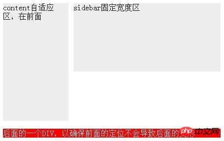
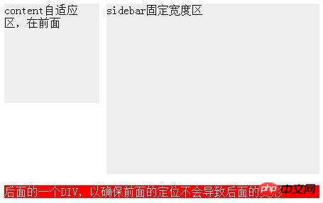
<p id="wrap">
  <p id="sidebar" style="height:240px;">固定宽度区</p>
  <p id="content" style="height:340px;">自适应区</p>
</p>
<p id="footer">后面的一个p,以确保前面的定位不会导致后面的变形</p>
The p of #wrap in the code is used to wrap the two areas we want to locate; behind it There is also a #footer, which is used to test whether the previous positioning will cause the subsequent p to be misaligned - if it is misaligned, it proves that our positioning method must be improved.
Here are a few common methods:
1. The fixed-width area floats, and the adaptive area does not set a width but sets margin
Let’s use the fixed width on the right side and the adaptive left side as a demonstration. The CSS code is as follows:
#wrap {
    overflow: hidden; *zoom: 1;
  }
  #content ,#sidebar {
    background-color: #eee;
  }
  #sidebar {
    float: right; width: 300px;
  }
  #content {
    margin-right: 310px;
  }
#footer {background-color: #f00;color:#fff; margin-top: 1em}Among them, the sidebar is made to float and a Width; content has no width set.
Everyone should pay attention to the fact that p tags must be used in html, and do not try to use any p tags to achieve the purpose. Because p has a default attribute, that is, if the width is not set, it will automatically fill the width of its parent tag. The content here is an example.
Of course we can't let it fill up. Once filled up, it can't stay on the same line as the sidebar. We set a margin for him. Since the sidebar is on the right, we set the margin-right value of the content to a value slightly larger than the width of the sidebar - in order to distinguish their ranges. In the example, it is 310.
Assume that the default width of the content is 100%, then after setting the margin, its width becomes 100%-310. At this time, the content finds that its width can be squeezed into the sidebar. We were in the same row, so he came up.
The width of 100% is relative to its parent tag. If we change the width of its parent tag, the width of the content will also change - for example, if we shrink the browser window, then wrap The width will become smaller, and the width of the content will also become smaller - but its actual width of 100%-310 will never change.
This method seems perfect. As long as we remember to clear the float (I used the simplest method here), the footer will not be misaligned. And no matter which content or sidebar is longer, it will not affect the layout.
But in fact, this method has a very old Fire restriction - sidebar must be before content in html!
But I need the sidebar after the content! Because my content is the main content of the web page, I don’t want the main content to be ranked behind the secondary content.
But if the sidebar is after the content, everything above will be in vain.
Some people may not understand, why do you have to have the sidebar at the back? This question is a long story. Anyway, the question is - the content must be before the sidebar, but the content width must be adaptive. What should I do?
There are two methods below, but let’s first change the html structure to what we want:
<p id="wrap">
  <p id="content" style="height:340px;">自适应区,在前面</p>
  <p id="sidebar" style="height:240px;">固定宽度区</p>
</p>
2, The fixed-width area uses absolute positioning, and the adaptive area sets margin as usual
We throw away the sidebar and only set margin for the content, then we will find that the width of the content has become adaptive—— So the content said to the sidebar, my width has nothing to do with you.
The content is easily solved. Now let’s take a look at the sidebar. It has no choice but to abandon float. Let's take a look at the characteristics of the sidebar: on the right, the width is 300, and its positioning has no effect on the content - obviously, an absolutist was born.
So our css is as follows:
#wrap {
    *zoom: 1; position: relative;
  }
  #sidebar {
    width: 300px; position: absolute; right: 0; top: 0;
  }
  #content {
    margin-right: 310px;
}In this css, we should pay attention to adding relative positioning to wrap to prevent the sidebar from being too absolute. Go to the upper right corner of the entire web page instead of the upper right corner of wrap.
It seems completed? I was very relieved when I didn't see the performance of the footer. Let's make the sidebar longer - by 100px! Not a year, just a pair of underwear! Oh,,, just one line of code.
But, why is the footer still there? Why didn't it go down automatically? Footer said - I will not give way to the absolutists!
其实这与footer无关,而是因为wrap对sidebar的无视造成的——你再长,我还是没感觉。
看来这种定位方式只能满足sidebar自己,但对他的兄弟们却毫无益处。
3,float与margin齐上阵
经过前面的教训,我们重新确立了这个自适应宽度布局必须要达成的条件:
sidebar宽度固定,content宽度自适应
content要在sidebar之前
后面的元素要能正常定位,不能受影响
由于绝对定位会让其他元素无视他的存在,所以绝对定位的方式必须抛弃。
如果content和sidebar一样,都用float,那content的自适应宽度就没戏了;如果不给content加float,那sidebar又会跑到下一行去。
所以,最终我决定:float与margin都用。
我打算把content的宽度设为100%,然后设置float:left,最后把他向左移动310,以便于sidebar能挤上来。
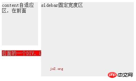
但这么一来content里面的内容也会跟着左移310,导致被遮住了,所以我们要把他重新挤出来。为了好挤,我用了一个额外的p包裹住内容,所以html结构变成了这种样子:
<p id="wrap">
  <p id="content" style="height:140px;">
    <p id="contentb">
      content自适应区,在前面
    </p>
  </p>
  <p id="sidebar" style="height:240px;">sidebar固定宽度区</p>
</p>css则变成这样:
#sidebar {
    width: 300px; float: right;
  }
  #content {
    margin-left: -310px; float: left; width: 100%;
  }
  #contentb {
    margin-left: 310px;
}这样一改,真正的“content”就变成了contentb,他的宽度跟以前的content一样,是100%-310.
大家可能注意到了代码中的两个margin-left,一个-310px一个310px,最后结合起来相当于什么都没干,着实蛋疼。但他确实解决了content与sidebar的顺序问题。
这个方法的缺点就是:太怪异,以及额外多了一层p。
4,标准浏览器的方法
当然,以不折腾人为标准的w3c标准早就为我们提供了制作这种自适应宽度的标准方法。那就简单了:把wrap设为display:table并指定宽度100%,然后把content+sidebar设为display:table-cell;然后只给sidebar指定一个宽度,那么content的宽度就变成自适应了。
代码很少,而且不会有额外标签。不过这是IE7都无效的方法。
———————割尾巴————————-
如果不考虑ie7及以下版本,则使用标准方法;如果不在意sidebar与content的顺序,则用第一种方法;否则用第3种方法。
以上代码都没在IE6测试,有问题不负责解释。个人觉得,让IE6寿终正寝的办法就是——从此不再理他。
以上就是本文的全部内容,希望对大家的学习有所帮助,更多相关内容请关注PHP中文网!
相关推荐:
css(word-wrap/break)使纯英文数字自动换行
The above is the detailed content of About the adaptive method of realizing fixed width on the right and width on the left in css. For more information, please follow other related articles on the PHP Chinese website!

Hot AI Tools

Undresser.AI Undress
AI-powered app for creating realistic nude photos

AI Clothes Remover
Online AI tool for removing clothes from photos.

Undress AI Tool
Undress images for free

Clothoff.io
AI clothes remover

Video Face Swap
Swap faces in any video effortlessly with our completely free AI face swap tool!

Hot Article
Hot Tools

Notepad++7.3.1
Easy-to-use and free code editor

SublimeText3 Chinese version
Chinese version, very easy to use

Zend Studio 13.0.1
Powerful PHP integrated development environment

Dreamweaver CS6
Visual web development tools

SublimeText3 Mac version
God-level code editing software (SublimeText3)
Hot Topics
 1386
1386
 52
52

 How to use bootstrap in vue
Apr 07, 2025 pm 11:33 PM
How to use bootstrap in vue
Apr 07, 2025 pm 11:33 PM
Using Bootstrap in Vue.js is divided into five steps: Install Bootstrap. Import Bootstrap in main.js. Use the Bootstrap component directly in the template. Optional: Custom style. Optional: Use plug-ins.
 The Roles of HTML, CSS, and JavaScript: Core Responsibilities
Apr 08, 2025 pm 07:05 PM
The Roles of HTML, CSS, and JavaScript: Core Responsibilities
Apr 08, 2025 pm 07:05 PM
HTML defines the web structure, CSS is responsible for style and layout, and JavaScript gives dynamic interaction. The three perform their duties in web development and jointly build a colorful website.
 How to write split lines on bootstrap
Apr 07, 2025 pm 03:12 PM
How to write split lines on bootstrap
Apr 07, 2025 pm 03:12 PM
There are two ways to create a Bootstrap split line: using the tag, which creates a horizontal split line. Use the CSS border property to create custom style split lines.
 Understanding HTML, CSS, and JavaScript: A Beginner's Guide
Apr 12, 2025 am 12:02 AM
Understanding HTML, CSS, and JavaScript: A Beginner's Guide
Apr 12, 2025 am 12:02 AM
WebdevelopmentreliesonHTML,CSS,andJavaScript:1)HTMLstructurescontent,2)CSSstylesit,and3)JavaScriptaddsinteractivity,formingthebasisofmodernwebexperiences.
 How to resize bootstrap
Apr 07, 2025 pm 03:18 PM
How to resize bootstrap
Apr 07, 2025 pm 03:18 PM
To adjust the size of elements in Bootstrap, you can use the dimension class, which includes: adjusting width: .col-, .w-, .mw-adjust height: .h-, .min-h-, .max-h-
 How to set up the framework for bootstrap
Apr 07, 2025 pm 03:27 PM
How to set up the framework for bootstrap
Apr 07, 2025 pm 03:27 PM
To set up the Bootstrap framework, you need to follow these steps: 1. Reference the Bootstrap file via CDN; 2. Download and host the file on your own server; 3. Include the Bootstrap file in HTML; 4. Compile Sass/Less as needed; 5. Import a custom file (optional). Once setup is complete, you can use Bootstrap's grid systems, components, and styles to create responsive websites and applications.
 How to insert pictures on bootstrap
Apr 07, 2025 pm 03:30 PM
How to insert pictures on bootstrap
Apr 07, 2025 pm 03:30 PM
There are several ways to insert images in Bootstrap: insert images directly, using the HTML img tag. With the Bootstrap image component, you can provide responsive images and more styles. Set the image size, use the img-fluid class to make the image adaptable. Set the border, using the img-bordered class. Set the rounded corners and use the img-rounded class. Set the shadow, use the shadow class. Resize and position the image, using CSS style. Using the background image, use the background-image CSS property.
 How to use bootstrap button
Apr 07, 2025 pm 03:09 PM
How to use bootstrap button
Apr 07, 2025 pm 03:09 PM
How to use the Bootstrap button? Introduce Bootstrap CSS to create button elements and add Bootstrap button class to add button text
