

How to maintain the aspect ratio of page content using CSS

This article mainly introduces how to use CSS to maintain the aspect ratio of page content. The author gives examples of different methods such as pseudo elements and vw units. Friends in need can refer to the following
Requirement description : The mobile terminal implements a semicircle across the page. (Similar problem, implementing a 4x4 square grid)
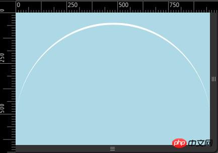
# Simplifying the problem, we can understand it as implementing a block with a height and width ratio of 1:2.
Problems need to be solved:
1. The height and width are in a certain proportion.
2. The height and width of the outer container are uncertain.
3. Try not to use pictures and scripts instead.
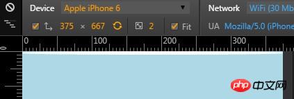
4. Compatible with mobile terminals.
Writing html
<p class = "semicircle"></p>
Think one, use height: 100%,
body{
    margin:0;
    width: 100%;
    background: lightblue;
}
.semicircle {
    width: 100%;
    height: 100%;
    border-top:5px solid #fff;
    border-radius: 100%;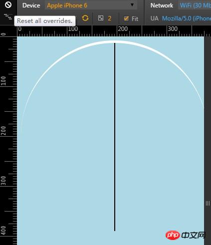
}There is a problem, the percentage of height is calculated based on the parent container, It is not the current container and cannot meet our needs at all. The effect is as follows:
The height percentage of the parent container body is related to the height filled by its child container. Even if the body height is set to 100%, because the child container is the semicircle The actual height of the padding is 5 of the border, and the parent container cannot be "fully expanded". Therefore, it is impossible to specify a container with a certain proportion of width and height by setting the height of the parent container as a percentage.
Thinking 2, set padding-top or padding-bottom to 100%
The percentage is calculated with respect to the width of the generated box's containing block [...] (source: w3.org, emphasis mine)
The calculation of the percentage width is related to the width of the containing block of the generated box. The percentages of padding-top and padding-bottom are calculated based on the width of the parent container, not the height. Other ratio implementation comparison table
| aspect ratio | padding-bottom value |
|---|---|
| 16:9 | 56.25% |
| 4:3 | 75% |
| 3:2 | 66.66 % |
| 62.5% |
Thinking three, using vw unit
Use the vw unit to set the height and width of the element. The size of the vm is set by the width of the viewport, so this method can be used to keep the container displayed at a certain proportion. One unit of vw is equal to one percent of the viewport width, that is, 100vw is equal to 100% viewport width.
body{
    margin:0;
    width: 100%;
    background: lightblue;
}
.semicircle {
     width: 100vw;
      height:100vw;
    border-top:5px solid #fff;
    border-radius: 100%;
}| multiply width by | |
|---|---|
| 1 | |
| 3 | |
| 0.75 | |
| 0.5625 |
body {
    width: 100%;
    font-size: 0;
    text-align: center;
    background: lightblue;
}
.semicircle {
    border-top:5px solid #fff;
    border-radius: 100%;
}
.semicircle:before {
    content:"";
    display: inline-block;
    padding-bottom: 100%;
} Thinking five, use pictures, compatible with low-end mobile devices.
.semicircler img {
  width: 100%;
  background-repeat: no-repeat;
  background-size: 100% 100%;
  background-image: url(../img/autoresized-picture.jpg);
}p.style.height=p.offsetWidth+"px";
*------main code-------*/
body {
width: 100%;
margin:0;
text-align: center;
}
p{
display: inline-block;
width: 50%;
background: lightblue;
font-size: 12px;
position: relative;
vertical-align: middle;
}
p:before {
content:"";
display: inline-block;
padding-bottom: 100%;
vertical-align: middle;
}
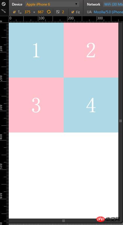
/*------other code-------*/
p:nth-child(2),p:nth-child(3){
background: pink;
}
span {
display: inline-block;
vertical-align: middle;
font-size: 6em;
color: #fff;
}The above is the entire content of this article. I hope it will be helpful to everyone's learning. Please pay attention to more related content. PHP Chinese website!
The above is the detailed content of How to maintain the aspect ratio of page content using CSS. For more information, please follow other related articles on the PHP Chinese website!

Hot AI Tools

Undresser.AI Undress
AI-powered app for creating realistic nude photos

AI Clothes Remover
Online AI tool for removing clothes from photos.

Undress AI Tool
Undress images for free

Clothoff.io
AI clothes remover

Video Face Swap
Swap faces in any video effortlessly with our completely free AI face swap tool!

Hot Article
Hot Tools

Notepad++7.3.1
Easy-to-use and free code editor

SublimeText3 Chinese version
Chinese version, very easy to use

Zend Studio 13.0.1
Powerful PHP integrated development environment

Dreamweaver CS6
Visual web development tools

SublimeText3 Mac version
God-level code editing software (SublimeText3)
Hot Topics


 How to use bootstrap in vue
Apr 07, 2025 pm 11:33 PM
How to use bootstrap in vue
Apr 07, 2025 pm 11:33 PM
Using Bootstrap in Vue.js is divided into five steps: Install Bootstrap. Import Bootstrap in main.js. Use the Bootstrap component directly in the template. Optional: Custom style. Optional: Use plug-ins.
 The Roles of HTML, CSS, and JavaScript: Core Responsibilities
Apr 08, 2025 pm 07:05 PM
The Roles of HTML, CSS, and JavaScript: Core Responsibilities
Apr 08, 2025 pm 07:05 PM
HTML defines the web structure, CSS is responsible for style and layout, and JavaScript gives dynamic interaction. The three perform their duties in web development and jointly build a colorful website.
 Understanding HTML, CSS, and JavaScript: A Beginner's Guide
Apr 12, 2025 am 12:02 AM
Understanding HTML, CSS, and JavaScript: A Beginner's Guide
Apr 12, 2025 am 12:02 AM
WebdevelopmentreliesonHTML,CSS,andJavaScript:1)HTMLstructurescontent,2)CSSstylesit,and3)JavaScriptaddsinteractivity,formingthebasisofmodernwebexperiences.
 How to write split lines on bootstrap
Apr 07, 2025 pm 03:12 PM
How to write split lines on bootstrap
Apr 07, 2025 pm 03:12 PM
There are two ways to create a Bootstrap split line: using the tag, which creates a horizontal split line. Use the CSS border property to create custom style split lines.
 How to insert pictures on bootstrap
Apr 07, 2025 pm 03:30 PM
How to insert pictures on bootstrap
Apr 07, 2025 pm 03:30 PM
There are several ways to insert images in Bootstrap: insert images directly, using the HTML img tag. With the Bootstrap image component, you can provide responsive images and more styles. Set the image size, use the img-fluid class to make the image adaptable. Set the border, using the img-bordered class. Set the rounded corners and use the img-rounded class. Set the shadow, use the shadow class. Resize and position the image, using CSS style. Using the background image, use the background-image CSS property.
 How to use bootstrap button
Apr 07, 2025 pm 03:09 PM
How to use bootstrap button
Apr 07, 2025 pm 03:09 PM
How to use the Bootstrap button? Introduce Bootstrap CSS to create button elements and add Bootstrap button class to add button text
 How to set up the framework for bootstrap
Apr 07, 2025 pm 03:27 PM
How to set up the framework for bootstrap
Apr 07, 2025 pm 03:27 PM
To set up the Bootstrap framework, you need to follow these steps: 1. Reference the Bootstrap file via CDN; 2. Download and host the file on your own server; 3. Include the Bootstrap file in HTML; 4. Compile Sass/Less as needed; 5. Import a custom file (optional). Once setup is complete, you can use Bootstrap's grid systems, components, and styles to create responsive websites and applications.
 How to resize bootstrap
Apr 07, 2025 pm 03:18 PM
How to resize bootstrap
Apr 07, 2025 pm 03:18 PM
To adjust the size of elements in Bootstrap, you can use the dimension class, which includes: adjusting width: .col-, .w-, .mw-adjust height: .h-, .min-h-, .max-h-
