
CSS3 can achieve many effects that previously required the use of images and scripts with just a few lines of code. Next, through this article, I will introduce to you which new features of CSS3 are worthy of praise. If you are interested in knowledge about the new features of CSS3 Friends, let’s learn together
What new features does CSS3 bring us? What new features of CSS3 are worthy of our praise? Simply put, CSS3 can achieve many effects that previously required the use of images and scripts in just a few lines of code.
First of all, let everyone take a look at a few renderings. I believe that when you see these renderings, you will definitely ask how these effects are achieved using only CSS?
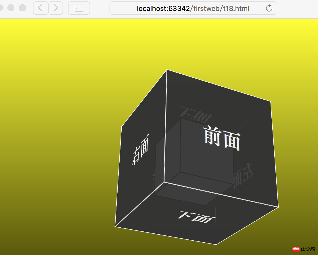
1. 3D square and animation (If you have used webpack, you must have seen webpack’s animated logo. My wife said that the popular animated logos are no longer static:》.)
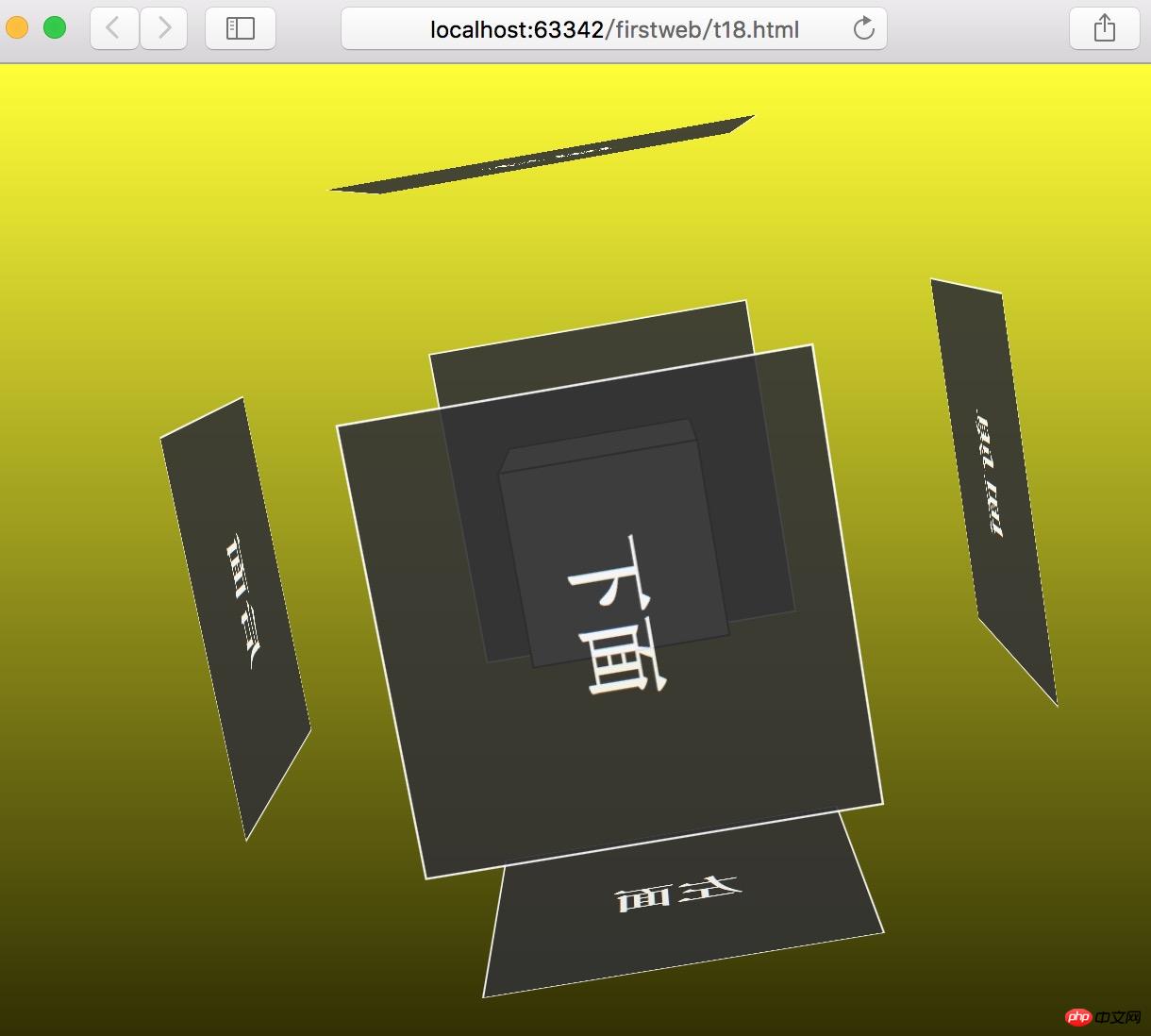
2. 3D square border movement
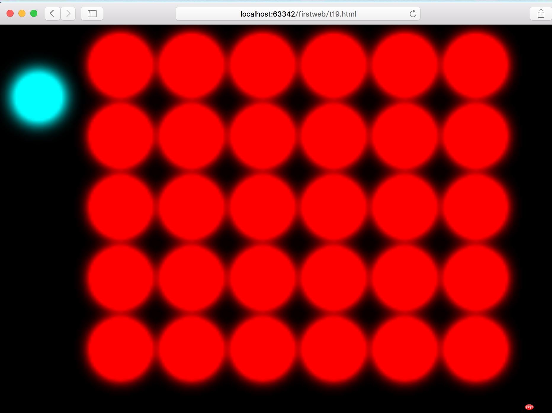
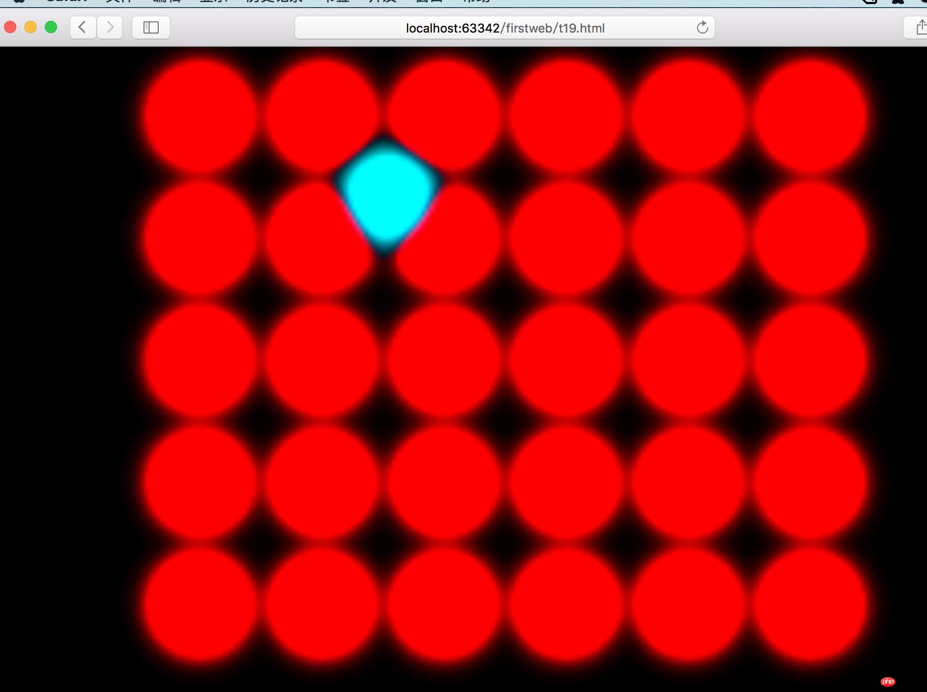
3. CSS extrusion effect
The features worth mentioning among the above effects are:
1. CSS sets the gradient background and adds a linear-gradient linear gradient to the background,
background: linear-gradient(yellow 0%, #000 80%); /*Gradient from 0% yellow to 80% black* /
2, CSS 3D
Perspective: View the position of the view, such as the position of the lens when taking a photo.
Preserve-3d in transform-style, when this attribute is set, wraps the child elements in a 3D view.
3. CSS animation
When it comes to animation, we have to talk about jQuery animation. But with CSS3, JS is no longer needed for animation.
Keyframes defines frame animation, which can be set according to percentages or using from and to.
Use animation to reference the defined keyframes frame animation. animation:rotate 20s infinite linear; /*Set the referenced animation, animation time, animation timing-function, animation method*/
@keyframes rotate {
0% {
transform: rotateX(0deg) rotateY(0deg);
}
100% {
transform: rotateX(360deg) rotateY(360deg);
}
} 4. CSS filter
The filer is not IE The filter is a newly added attribute in CSS3.
Including effects include: grayscale, sepia, saturate, hue-rotate, invert, opacity, brightness, contrast, blur, drop-shadow.
Extrusion The effect is a mixture of blur and saturate in the filter.
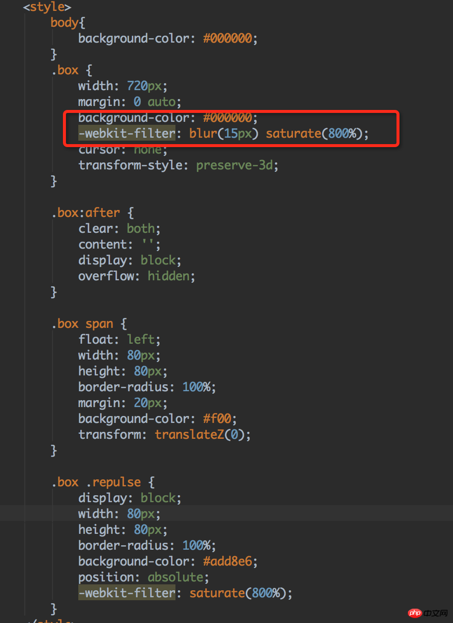
The above is the entire content of this article. I hope it will be helpful to everyone’s study. For more related content, please pay attention to the PHP Chinese website!
Related recommendations:
About the use of matrices in css3
About the simple implementation of css transition and 3D effects
The above is the detailed content of New features added in CSS3. For more information, please follow other related articles on the PHP Chinese website!


