

How to implement multi-row and multi-column layout using CSS

This article mainly introduces the example code of CSS to implement multi-row and multi-column layout. Friends who need it can refer to it
1. Two columns and multiple rows:
HTML:
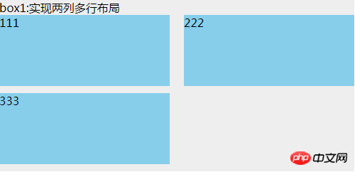
<p class="box1">
    box1:实现两列多行布局
    <ul>
        <li>111</li>
        <li>222</li>
        <li>333</li>
    </ul>
</p>CSS:
.box1 {
  width: 500px;
  background: #EEEEEE;
}
.box1 ul {
  clear: both;
  overflow: hidden;
}
.box1 ul li {
  width: 48%;
  height: 100px;
  margin-bottom: 10px;
  background: skyblue;
  float: left;
}
.box1 ul li:nth-child(even) {
  margin-left: 4%;
}This uses nth-child(), which is compatible with browsers ie9 and above. There are two gaps in the middle. The sum of the side-by-side p widths, the remaining width after subtracting 100%;
Since nth-child() is mentioned, then we need to talk about nth-of-type (), which is also only compatible with browsers ie9 and above. The difference between it and nth-child is:
<p class="box">
    <h1></h1>
    <h1></h1>
    <p></p>
    <p></p>
    <p></p>
</p>If you want the background of the second p tag to be red, then, p: nth-child(4) can achieve the effect; and p:nth-of-type(2) can achieve the effect. Therefore, nth-of-type only recognizes the second element of p no matter how much content is in front of the p tag. But nth-child is to find the first element of its parent. In this case, the advantages of nth-of-type are reflected.
2. Multiple rows and multiple columns
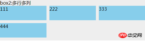
<p class="box2">
    box2:多行多列
    <ul>
        <li>
            <p class="com">
                111
            </p>
        </li>
        <li>
            <p class="com">
                222
            </p>
        </li>
        <li>
            <p class="com">
                333
            </p>
        </li>
        <li>
            <p class="com">
                444
            </p>
        </li>
    </ul>
</p>.box2 {
background: #EEEEEE;
margin-top: 20px;
width: 500px;
}
.box2 ul {
overflow: hidden;
margin-left: -10px;
background: #EEEEEE;
}
.box2 ul li {
width: 33.3333%;
height: 50px;
float: left;
padding-left: 10px;
box-sizing: border-box;
margin-bottom: 10px;
}
.box2 ul li .com {
height: inherit;
background: skyblue;
}box-sizing:border-box, and the parent uses a negative margin-left value. This value is the same as the child's padding-left of. Adding p in li is just to make the effect obvious. Otherwise, if you add a background to li, due to the existence of box-sizing: border-box, li will seem to have no effect and are all connected together.
##HTML:
<p class="box3">
    <p class="header">圣杯布局(使用浮动)顶部</p>
    <p class="container">
        <p class="center">
            中间自适应宽度,注意这个center是在left的p前面
        </p>
        <p class="left">
            左部固定宽度
        </p>
        <p class="right">
            右部固定宽度
        </p>
    </p>
    <p class="footer">圣杯布局底部</p>
</p>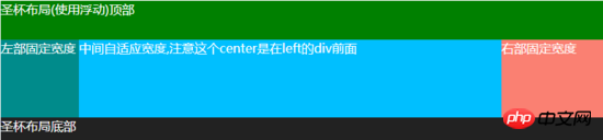 CSS:
CSS:
.box3 {
  background: #EEEEEE;
  color: white;
  margin-top: 20px;
}
.box3 .header {
  width: 100%;
  background: #008000;
  height: 50px;
}
.box3 .container {
  clear: both;
  overflow: hidden;
  padding: 0 130px 0 100px;
}
.box3 .container .left {
  width: 100px;
  float: left;
  background: #008B8B;
  height: 100px;
  margin-left: -100%;
  position: relative;
  left: -100px;
}
.box3 .container .center {
  background: #00BFFF;
  height: 100px;
  float: left;
  width: 100%;
}
.box3 .container .right {
  width: 130px;
  float: left;
  background: #FA8072;
  height: 100px;
  margin-left: -130px;
  position: relative;
  right: -130px;
}
.box3 .footer {
  width: 100%;
  background: #222222;
  height: 30px;
}## HTML:
<p class="box4">
    <p class="header">圣杯布局2(使用定位)顶部</p>
    <p class="container">
        <p class="left">
            左部固定宽度
        </p>
        <p class="center">
            中间自适应宽度,无需考虑顺序
        </p>
        <p class="right">
            右部固定宽度
        </p>
    </p>
    <p class="footer">圣杯布局2底部</p>
</p>CSS: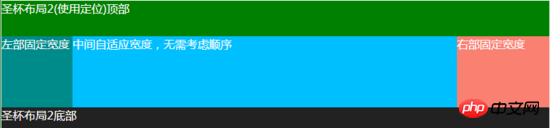
.box4 {
  background: #EEEEEE;
  color: white;
  margin-top: 20px;
}
.box4 .header {
  width: 100%;
  background: #008000;
  height: 50px;
}
.box4 .container {
  clear: both;
  overflow: hidden;
  padding: 0 130px 0 100px;
  position: relative;
}
.box4 .container .left {
  width: 100px;
  background: #008B8B;
  height: 100px;
  position: absolute;
  top: 0px;
  left: 0px;
}
.box4 .container .center {
  background: #00BFFF;
  height: 100px;
  width: 100%;
}
.box4 .container .right {
  width: 130px;
  background: #FA8072;
  height: 100px;
  position: absolute;
  top: 0px;
  right: 0px;
}
.box4 .footer {
  width: 100%;
  background: #222222;
  height: 30px;
}
The idea of this method is: The same effect can be achieved by positioning the left and right sides absolutely, and then setting padding on the p in the middle. Don’t worry about the layout order of the three p’s in the middle, I always use this method.
Also compatible with ie7, ie6 has not been tested
5. Double flying wing layout
##HTML:<p class="box5">
<p class="header">双飞翼布局顶部</p>
<p class="container">
<p class="center">
<p class="center-in">
中间自适应宽度,注意这个center是在left的p前面
</p>
</p>
<p class="left">
左部固定宽度
</p>
<p class="right">
右部固定宽度
</p>
</p>
<p class="footer">双飞翼布局底部</p>
</p>
CSS: The double-flying wing layout and the holy grail layout look similar, but the biggest difference is: in the double-flying wing layout, there is a p inside the middle p in the center. The purpose of layout is mainly achieved through the margin value of this p. Then there is no need to set relative positioning for the two p's left and right. Everything else is basically the same Compatible with ie7, ie6 has not been tested. There are also many multi-row and multi-column layout methods, such as CSS3's flex, inline-block, etc. . As long as you have ideas, no matter how difficult the layout is, you can achieve it. The above is the entire content of this article. I hope it will be helpful to everyone's study. For more related content, please pay attention to the PHP Chinese website! Related recommendations: About how to use matrices in css3 How to use CSS to rotate the icon by moving the mouse up Effect The above is the detailed content of How to implement multi-row and multi-column layout using CSS. For more information, please follow other related articles on the PHP Chinese website!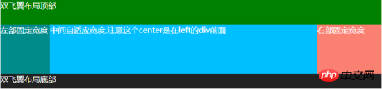
.box5 {
  background: #EEEEEE;
  color: white;
  margin-top: 20px;
}
.box5 .header {
  width: 100%;
  background: #008000;
  height: 50px;
}
.box5 .container {
  clear: both;
  overflow: hidden;
}
.box5 .container .left {
  width: 100px;
  float: left;
  background: #008B8B;
  height: 100px;
  margin-left: -100%;
}
.box5 .container .center {
  background: #00BFFF;
  height: 100px;
  float: left;
  width: 100%;
}
.box5 .container .center .center-in {
  margin: 0 130px 0 100px;
}
.box5 .container .right {
  width: 130px;
  float: left;
  background: #FA8072;
  height: 100px;
  margin-left: -130px;
}
.box5 .footer {
  width: 100%;
  background: #222222;
  height: 30px;
}

Hot AI Tools

Undresser.AI Undress
AI-powered app for creating realistic nude photos

AI Clothes Remover
Online AI tool for removing clothes from photos.

Undress AI Tool
Undress images for free

Clothoff.io
AI clothes remover

AI Hentai Generator
Generate AI Hentai for free.

Hot Article
Hot Tools

Notepad++7.3.1
Easy-to-use and free code editor

SublimeText3 Chinese version
Chinese version, very easy to use

Zend Studio 13.0.1
Powerful PHP integrated development environment

Dreamweaver CS6
Visual web development tools

SublimeText3 Mac version
God-level code editing software (SublimeText3)
Hot Topics
 1379
1379
 52
52

 How to use bootstrap in vue
Apr 07, 2025 pm 11:33 PM
How to use bootstrap in vue
Apr 07, 2025 pm 11:33 PM
Using Bootstrap in Vue.js is divided into five steps: Install Bootstrap. Import Bootstrap in main.js. Use the Bootstrap component directly in the template. Optional: Custom style. Optional: Use plug-ins.
 The Roles of HTML, CSS, and JavaScript: Core Responsibilities
Apr 08, 2025 pm 07:05 PM
The Roles of HTML, CSS, and JavaScript: Core Responsibilities
Apr 08, 2025 pm 07:05 PM
HTML defines the web structure, CSS is responsible for style and layout, and JavaScript gives dynamic interaction. The three perform their duties in web development and jointly build a colorful website.
 How to write split lines on bootstrap
Apr 07, 2025 pm 03:12 PM
How to write split lines on bootstrap
Apr 07, 2025 pm 03:12 PM
There are two ways to create a Bootstrap split line: using the tag, which creates a horizontal split line. Use the CSS border property to create custom style split lines.
 How to insert pictures on bootstrap
Apr 07, 2025 pm 03:30 PM
How to insert pictures on bootstrap
Apr 07, 2025 pm 03:30 PM
There are several ways to insert images in Bootstrap: insert images directly, using the HTML img tag. With the Bootstrap image component, you can provide responsive images and more styles. Set the image size, use the img-fluid class to make the image adaptable. Set the border, using the img-bordered class. Set the rounded corners and use the img-rounded class. Set the shadow, use the shadow class. Resize and position the image, using CSS style. Using the background image, use the background-image CSS property.
 How to resize bootstrap
Apr 07, 2025 pm 03:18 PM
How to resize bootstrap
Apr 07, 2025 pm 03:18 PM
To adjust the size of elements in Bootstrap, you can use the dimension class, which includes: adjusting width: .col-, .w-, .mw-adjust height: .h-, .min-h-, .max-h-
 How to set up the framework for bootstrap
Apr 07, 2025 pm 03:27 PM
How to set up the framework for bootstrap
Apr 07, 2025 pm 03:27 PM
To set up the Bootstrap framework, you need to follow these steps: 1. Reference the Bootstrap file via CDN; 2. Download and host the file on your own server; 3. Include the Bootstrap file in HTML; 4. Compile Sass/Less as needed; 5. Import a custom file (optional). Once setup is complete, you can use Bootstrap's grid systems, components, and styles to create responsive websites and applications.
 How to use bootstrap button
Apr 07, 2025 pm 03:09 PM
How to use bootstrap button
Apr 07, 2025 pm 03:09 PM
How to use the Bootstrap button? Introduce Bootstrap CSS to create button elements and add Bootstrap button class to add button text
 How to view the date of bootstrap
Apr 07, 2025 pm 03:03 PM
How to view the date of bootstrap
Apr 07, 2025 pm 03:03 PM
Answer: You can use the date picker component of Bootstrap to view dates in the page. Steps: Introduce the Bootstrap framework. Create a date selector input box in HTML. Bootstrap will automatically add styles to the selector. Use JavaScript to get the selected date.
