

This article mainly introduces some methods of using CSS3 with IE filters to achieve gradient and shadow effects. Although IE is about to withdraw from the stage of history, it can also accumulate experience for the related development of the EDGE browser. Friends in need can refer to it. Next
Implementation of linear gradient in CSS3 and IE filters
For perfectionists, using an image for a gradient is a painful thing, just It’s as painful as having boogers and not picking them out = =. So for ordinary gradients, if it can be solved with CSS, don’t use pictures.
CSS3 provides us with the linear-gradient method, which can directly set gradients on the background.
<!DOCTYPE>
<style>
p {
width:100px;height:100px;text-align:center;
font:16px/100px '微软雅黑';color:#FFF;
/*以下是CSS3的线性渐变*/
background:-webkit-linear-gradient(top,#FD0,#C30);
background:-moz-linear-gradient(top,#FD0,#C30);
background:-o-linear-gradient(top,#FD0,#C30);
}
</style>
<p>次碳酸钴</p>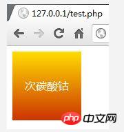
But CSS3 is also a pain in the ass. It needs a browser prefix. As a result, I had to write three lines for this thing. This method usually uses three parameters (you can also use more parameters to adjust more colors, which will be discussed later). The first parameter is the direction of the gradient. Top is from top to bottom. As for the effects of left, right, and bottom, it is easy to push them out from top. I won’t go into details. CSS3 also supports gradients at specific angles. The first parameter can be a degree, such as 45deg, which is an oblique gradient. However, this is very difficult to implement on IE, so I won’t go into details here. The second and third parameters are the color of the gradient, which is clear from the code. CSS3 colors can be made transparent using rgba, such as 50% transparent red: rgba(255,0,0,0.5). Note that the value range of the transparent channel is between 0 and 1.
Next, let’s talk about the cheating IE. IE needs to use gradients to achieve it. I can’t complain about IE9’s half-baked CSS3. It’s better to use filters honestly.
<!DOCTYPE>
<style>
p {
width:100px;height:100px;text-align:center;
font:16px/100px '微软雅黑';color:#FFF;
/*以下是IE的线性渐变*/
filter:progid:DXImageTransform.Microsoft.Gradient(
StartColorStr=#FFDD00,EndColorStr=#CC3300
);
}
</style>
<p>次碳酸钴</p>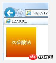
Look, IE can easily implement such a simple gradient, although the code is a bit longer. What should be noted here is that the color in the filter cannot be defined with a simple #HHH, it must be written in a complete six-digit hexadecimal number. If you need the same brightness, add two digits in front as transparency, such as 50% transparent red: #80FF0000. In terms of gradient direction, IE does not have as many directions as CSS3 that can be rotated, but the most basic vertical and horizontal can still be achieved. The default is a gradient from top to bottom. You can add GradientType=1 to make the gradient change from left to right.
p {
  filter:progid:DXImageTransform.Microsoft.Gradient(
    StartColorStr=#FFDD00,EndColorStr=#CC3300,GradientType=1
  );
}
Since filters and CSS3 can be compatible, then to make it fully compatible is just to merge the above methods. .
<!DOCTYPE>
<style>
p {
width:100px;height:100px;text-align:center;
font:16px/100px '微软雅黑';color:#FFF;
/*全兼容线性渐变*/
background:-webkit-linear-gradient(top,#FD0,#C30);
background:-moz-linear-gradient(top,#FD0,#C30);
background:-o-linear-gradient(top,#FD0,#C30);
filter:progid:DXImageTransform.Microsoft.Gradient(
StartColorStr=#FFDD00,EndColorStr=#CC3300
);
}
</style>
<p>次碳酸钴</p>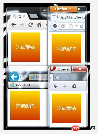
Implementation of element projection effect in CSS3 and IE filters
As usual, first Let’s talk about the shadow effect of CSS3.
<!DOCTYPE>
<style>
p {
  width:100px;height:100px;text-align:center;
  font:14px/100px 微软雅黑;
  border:1px solid #CCC;
  /*CSS3投影效果*/
  box-shadow:0px 0px 10px #CCC;
}
</style>
<p>次碳酸钴</p>
This box-shadow does not require browser compatibility headers. I like this CS3 best! Although IE9 also supports CSS3, it has too many cheating bugs. I don’t like to use IE9’s CSS3. As far as this shadow effect is concerned, IE9 will have no effect on using shadow on TABLE elements with collapse set. In short, IE has all kinds of bugs, but it needs to be compatible with IE6 anyway, so just ignore the half-baked CSS3 of IE9.
It is quite troublesome to achieve the shadow effect on IE. Although IE has a Shadow filter, it is no different from a linear gradient and cannot achieve the effect of CSS3. I won’t demonstrate it. If you want to know what the effect of that thing is, just try it yourself. Among a lot of filters in IE, only the Blur filter can achieve similar effects. However, if Blur is used directly on an element, the content will be blurred, so we need to create a new element to Blur it, and then use it to blur the content. This new element is placed underneath the original element as the background. This involves a bunch of coordinate calculations, if the centered element uses a drop shadow effect, and also involves calculations of the displacement of the element when the browser resizes it. Therefore, it is best to write it in JS for IE. I have written the comments in great detail. You should be able to understand it by looking at this code.
<!DOCTYPE>
<style>
.shadow {
  width:100px;height:100px;text-align:center;
  font:14px/100px 微软雅黑;
  border:1px solid #CCC;
  background:#FFF;
  position:relative;
}
.shadow-IE {
  display:block;
  position:absolute;background:#CCC;
  filter:progid:DXImageTransform.Microsoft.Blur(pixelRadius=5);
}
</style>
<p class="shadow">次碳酸钴</p>
<script>
//判断IE
var isIE=/MSIE/i.test(navigator.userAgent);
if(isIE){
  //获取全部元素,其实可以用document.all的,不过习惯这样写
  var all=document.getElementsByTagName("*"),s=[],i=0;
  //把class为shadow的元素全放进s这个数组中
  while(o=all[i++])if(o.className=="shadow")s.push(o);
  //遍历s数组
  for(i in s){
    //创建一个元素,我习惯用u,其实用什么都可以
    var o=s[i],u=document.createElement("u");
    //把父元素设置成相对定位
    o.parentNode.style.position="relative";
    //对IE6、7要加个hasLayout,不然坐标计算会出错
    o.parentNode.style.zoom=1;
    //把创建的元素放到shadow元素的上方
    //一定要是上方,因为下面的元素会挡住上面的元素
    o.parentNode.insertBefore(u,o);
    //给创建的元素应用个样式
    u.className="shadow-IE";
    //把宽度和高度设置到创建的元素上
    u.style.width=o.offsetWidth+"px";
    u.style.height=o.offsetHeight+"px";
  };
  //当窗口改变大小时触发
  window.resize=function(){
    //遍历s数组
    for(i in s){
      //我们在上面创建的元素移动到需要的位置
      var o=s[i],p=o.previousSibling;
      p.style.top=o.offsetTop-5+"px",
      p.style.left=o.offsetLeft-5+"px";
    };
  };
  //主动触发一次这个事件,让里面的代码在加载时执行一次
  window.resize();
};
</script>
Don’t be scared when you see a bunch of JS. In fact, there are only a few lines if you remove the comments, and even less if you use jQuery to write it. . This code is just written casually. If you really want to use it, don't leave it in the global scope. You should let DOMReady call it. This reduces the probability of variable conflicts. There are also events that I write directly to the DOM. Of course, if necessary, you can use attachEvent to bind to avoid conflicts. You can ignore this when using jQuery. In short, the code is just a reference. Please enjoy it when you actually use it~
The above is the entire content of this article. I hope it will be helpful to everyone's learning. Please pay attention to more related content. PHP Chinese website!
Related recommendations:
About how to implement multi-row and multi-column layout with CSS
About the simple implementation of css transition and 3D effects
How to use CSS3 pseudo-elements to achieve a gradually glowing grid border
The above is the detailed content of How to use CSS3 with IE filters to achieve gradient and drop shadow effects. For more information, please follow other related articles on the PHP Chinese website!


![[Web front-end] Node.js quick start](https://img.php.cn/upload/course/000/000/067/662b5d34ba7c0227.png)


