

How to use CSS3 box-reflect to create a reflection effect

In the past, to achieve this effect, we could only find a designer to make it, and then insert a picture on the page. However, with the emergence of CSS3, we can achieve it in pure code. How to achieve it? That is through the box-reflect property of CSS3. The following article will share with you how to use CSS3 to create a reflection effect. Friends in need can refer to it.
Compatibility
Since it is a property of CSS3, of course we have to take a look at the compatibility: Click to view
Next, let’s learn how to use box-reflect?
The syntax is as follows:
  -webkit-box-reflect:none | <direction> <offset>? <mask-box-image>?
  box-reflect:none | <direction> <offset>? <mask-box-image>?
Attributes Description:
none: This value is the default value, indicating no reflection;
direction: The direction in which reflection is generated
above: Specify the reflection to be above the object below: Specify the reflection to be below the object left: Specify the reflection to be on the left side of the object right: Specify the reflection to be on the right side of the object
offset: The interval between the picture and the reflection
length: Use the length value to define the distance between the reflection and the object. Can be a negative value percentage: Use percentage to define the interval between the reflection and the object. Can be a negative value
mask-box-image: used to set the mask effect of reflection;
The value can be:
none: No mask image url: Specify the mask image using an absolute or relative address. linear-gradient: Create a mask image using a linear gradient. radial-gradient: Create a mask image using a radial (radial) gradient. repeating-linear-gradient: Use a repeating linear gradient to create a backmask image. repeating-radial-gradient: Creates a mask image using a repeating radial (radial) gradient.
Just talking on paper is not enough, we still have to see the effect through examples.
The direction of the reflection
In this example, I made three img:
<p class="box1">
  <img src="http://7s1r1c.com1.z0.glb.clouddn.com/t_sdfsdfs123.jpg" alt="" />
</p>
<p class="box2">
  <img src="http://7s1r1c.com1.z0.glb.clouddn.com/t_sdfsdfs123.jpg" alt="" />
</p>
<p class="box3">
  <img src="http://7s1r1c.com1.z0.glb.clouddn.com/t_sdfsdfs123.jpg" alt="" />
</p>
css is as follows:
.box1,.box2,.box3{
  width:120px;
  float:left;
  margin-right:180px;
}
img{
  width:100%;
}
.box1 img{
  -webkit-box-reflect:right;
  box-reflect:right;
}
.box2 img,.box3 img{
  -webkit-box-reflect: above;
  box-reflect:above;
}
.box3{
  padding-top:200px;
}The rendering is as follows:
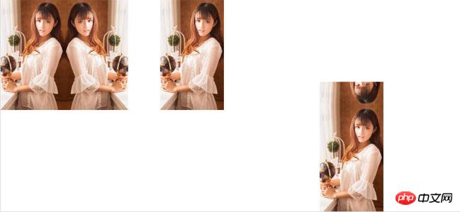
I have a question here. The pictures in box2 and box3 are both set with box-reflect:above, which generates projection at the top. Why can’t box2 see the effect? The reason is that I set padding-top:200px for box3, but not for box2. It is initially estimated that it is because there is no space for it to display the generated reflection.
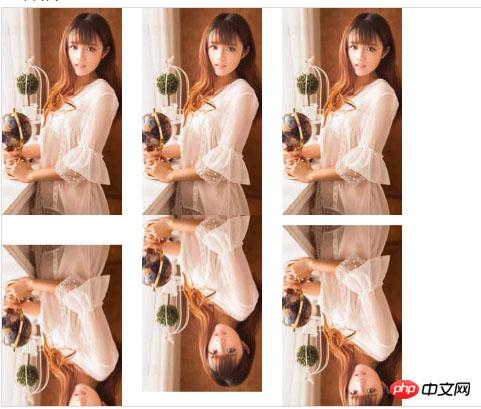
The distance between the reflection and the object
After understanding the direction of generating the reflection, let’s look at the second attribute, Let’s look at the example:
Still use three pictures, but change the style:
.box1 img{
  -webkit-box-reflect:below 30px;
  box-reflect:below 30px;
}
.box2 img{
  -webkit-box-reflect:below -30px;
  box-reflect:below -30px;
}
.box3 img{
  -webkit-box-reflect:below 5%;
  box-reflect:below 5%;
}The effect is as follows:
Next we learn the last attribute.
Mask effect
(1) Use gradient to add a mask effect to the reflection
  .box1 img{
  -webkit-box-reflect:below 0 -webkit-linear-gradient(top,rgba(250,250,250,0),rgba(250,250,250,.0) 30%,rgba(250,250,250,.3));
  box-reflect:below 0 linear-gradient(top,rgba(250,250,250,0),rgba(250,250,250,.0) 30%,rgba(250,250,250,.3));
}The effect is as follows:

Use the background image to add a mask effect to the reflection
First we need a A png picture of a five-pointed star:

##
.box2 img{
  -webkit-box-reflect:below 0 url(http://7s1r1c.com1.z0.glb.clouddn.com/t_star.png);
  box-reflect:below 0 url(http://7s1r1c.com1.z0.glb.clouddn.com/t_star.png);
}
How to use CSS3 with IE filters to achieve gradient and shadow effects
How to use CSS to achieve it The effect of icon rotation when the mouse is moved up
The above is the detailed content of How to use CSS3 box-reflect to create a reflection effect. For more information, please follow other related articles on the PHP Chinese website!

Hot AI Tools

Undresser.AI Undress
AI-powered app for creating realistic nude photos

AI Clothes Remover
Online AI tool for removing clothes from photos.

Undress AI Tool
Undress images for free

Clothoff.io
AI clothes remover

AI Hentai Generator
Generate AI Hentai for free.

Hot Article
Hot Tools

Notepad++7.3.1
Easy-to-use and free code editor

SublimeText3 Chinese version
Chinese version, very easy to use

Zend Studio 13.0.1
Powerful PHP integrated development environment

Dreamweaver CS6
Visual web development tools

SublimeText3 Mac version
God-level code editing software (SublimeText3)
Hot Topics
 1384
1384
 52
52

 How to achieve wave effect with pure CSS3? (code example)
Jun 28, 2022 pm 01:39 PM
How to achieve wave effect with pure CSS3? (code example)
Jun 28, 2022 pm 01:39 PM
How to achieve wave effect with pure CSS3? This article will introduce to you how to use SVG and CSS animation to create wave effects. I hope it will be helpful to you!
 Use CSS skillfully to realize various strange-shaped buttons (with code)
Jul 19, 2022 am 11:28 AM
Use CSS skillfully to realize various strange-shaped buttons (with code)
Jul 19, 2022 am 11:28 AM
This article will show you how to use CSS to easily realize various weird-shaped buttons that appear frequently. I hope it will be helpful to you!
 How to hide elements in css without taking up space
Jun 01, 2022 pm 07:15 PM
How to hide elements in css without taking up space
Jun 01, 2022 pm 07:15 PM
Two methods: 1. Using the display attribute, just add the "display:none;" style to the element. 2. Use the position and top attributes to set the absolute positioning of the element to hide the element. Just add the "position:absolute;top:-9999px;" style to the element.
 How to implement lace borders in css3
Sep 16, 2022 pm 07:11 PM
How to implement lace borders in css3
Sep 16, 2022 pm 07:11 PM
In CSS, you can use the border-image attribute to achieve a lace border. The border-image attribute can use images to create borders, that is, add a background image to the border. You only need to specify the background image as a lace style; the syntax "border-image: url (image path) offsets the image border width inward. Whether outset is repeated;".
 It turns out that text carousel and image carousel can also be realized using pure CSS!
Jun 10, 2022 pm 01:00 PM
It turns out that text carousel and image carousel can also be realized using pure CSS!
Jun 10, 2022 pm 01:00 PM
How to create text carousel and image carousel? The first thing everyone thinks of is whether to use js. In fact, text carousel and image carousel can also be realized using pure CSS. Let’s take a look at the implementation method. I hope it will be helpful to everyone!
 How to enlarge the image by clicking the mouse in css3
Apr 25, 2022 pm 04:52 PM
How to enlarge the image by clicking the mouse in css3
Apr 25, 2022 pm 04:52 PM
Implementation method: 1. Use the ":active" selector to select the state of the mouse click on the picture; 2. Use the transform attribute and scale() function to achieve the picture magnification effect, the syntax "img:active {transform: scale(x-axis magnification, y Axis magnification);}".
 How to set animation rotation speed in css3
Apr 28, 2022 pm 04:32 PM
How to set animation rotation speed in css3
Apr 28, 2022 pm 04:32 PM
In CSS3, you can use the "animation-timing-function" attribute to set the animation rotation speed. This attribute is used to specify how the animation will complete a cycle and set the speed curve of the animation. The syntax is "element {animation-timing-function: speed attribute value;}".
 Does css3 animation effect have deformation?
Apr 28, 2022 pm 02:20 PM
Does css3 animation effect have deformation?
Apr 28, 2022 pm 02:20 PM
The animation effect in css3 has deformation; you can use "animation: animation attribute @keyframes ..{..{transform: transformation attribute}}" to achieve deformation animation effect. The animation attribute is used to set the animation style, and the transform attribute is used to set the deformation style. .
