This article mainly introduces the detailed explanation of the use of border-image in CSS3. It is the basic knowledge for introductory learning of CSS3. Friends who need it can refer to it.
Recently, border-image has been used in the project. I only know its name but don't know its use.
The final effect is like this: and changes with the border width. The gray part with twill in the picture below is border
Look at the css first:
border-width: 40px;
border-style: solid;
border-image-source: url('http://das.alipay.net/shulaibao/img/repeat_padding_bg_400px.png');
border-image-slice: 40;
border-image-repeat: repeat;
background: #fff;
width: 800px;
First of all, it must be used with border. If border is none, it will be invalid.
It actually replaces border-style. When border-image-source or border-image is invalid, border-style will be effective.
Like background, border-image also has an abbreviation.
Abbreviated syntax:
border-image:<'border-image-source'> || <'border-image-slice'> [ / <'border-image-width'> | / <'border-image-width'>? / <'border-image-outset'> ]? || <'border-image-repeat'>
As shown above, it contains 5 attributes. The detailed breakdown is as follows:
Image address: border-image-source, which is easy to understand. Either there or not
border-image-source:url('') || none
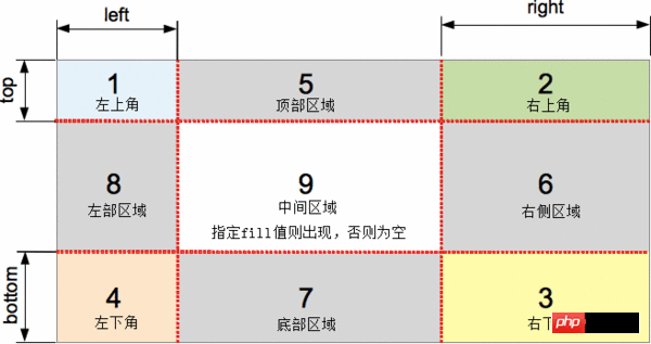
Picture slice: border-image-slice, not easy to understand, is the essence of achieving the effect. It cuts the border-image-source into 9 parts, commonly known as nine-square grid, with 4 corners. 4 borders, 1 middle area
Syntax:
[<number> | <percentage>]{1,4} && fill? border-image-slice: slice /* One-value syntax */ E.g. border-image-slice : 30%;
border-image-slice: horizontal vertical /* Two-value syntax */ E.g. border-image-slice: 10% 30%;
border-image-slice: top vertical bottom /* Three -value syntax */ E.g. border-image-slice: 30 30% 45;
border-image-slice: top right bottom left /* Four-value syntax */ E.g. border-image-slice: 7 12 14 5;
border-image-slice: … fill /* The fill value can be placed between any value */ E.g. border-image-slice: 10% fill 7 12;
border-image-slice: inherit
The value can only be written numerical value, percentage (relative to the width or height of the image), and the length (px, em, etc.) is not allowed and invalid
Image width: border-image-width instead of border width
Image convex: border-image-outset
Image repeat: border-image-repeat, whether the background is repeated, the default value is stretch
The above is the entire content of this article, I hope it will be helpful to everyone's learning. For more related content, please pay attention to the PHP Chinese website!
Related recommendations:
About the use of the display:inline-block attribute in CSS
About the animation attribute in CSS Usage method
CSS uses position:sticky to achieve sticky layout
The above is the detailed content of About the use of border-image attribute in CSS3. For more information, please follow other related articles on the PHP Chinese website!
 css3 tutorial
 What are the css3 gradient properties?
 How to modify the text on the picture
 Introduction to commonly used Windows registry commands
 What does Jingdong plus mean?
 svg to jpg
 The meaning of today's headline display volume
 How to cancel automatic renewal of Taobao Money Saving Card
 How to open a digital currency account


