
 Web Front-end
CSS Tutorial
How to use the appearance property in CSS3 to change the appearance of an element
Web Front-end
CSS Tutorial
How to use the appearance property in CSS3 to change the appearance of an element
How to use the appearance property in CSS3 to change the appearance of an element

This article mainly introduces how to use the appearance attribute in CSS3 to change the appearance of elements. It has a certain reference value. Now I share it with you. Friends in need can refer to it.
Everyone knows that every Browsers render HTML elements differently. For example, buttons have different rendering effects in Chrome and FF. In this way, we have today's idea. Using the browser's default rendering style for elements, we can use the appearance attribute to change the rendering style of any element.
Some time ago, in "Fixing the submit button bug on iPhone" It is introduced to use "-webkit-appearance: none;" to change the default style of the button on iPhone. In fact, we can reverse the idea and use the "appearance" attribute to change the browser default style of any element. Simply put, You can use the "appearance" attribute to render "paragraph p" into a button style, or into an "input box", "selection box" and other effects.
Everyone knows that each browser renders HTML elements differently. For example, "button" has different rendering effects in chrome and ff. This brings us to today's idea. Using the browser's default rendering style for elements, we can use the "appearance" attribute to change the rendering style of any element. In the simplest terms, I want to default the "a" link Displayed in "button" style, then we can use "appearance" set to "button".
The "appearance" function sounds quite great, but unfortunately, each browser manufacturer currently operates independently and cannot reach a unified standard. To date, only two core browsers can be used, one of which is "webkit". ", the second one is "ff", which means that when using "appearances", you need to add the prefix of each browser factory.
How to use appearance:
.elmClass{
   -webkit-appearance: value;
   -moz-appearance:    value;
   appearance:         value;
}Let’s take a look at a simple example:
<p class="lookLikeAButton">我是一个段落P元素 </p>
<p class="lookLikeAListbox">我是一个段落P元素 </p>
<p class="lookLikeAListitem">我是一个段落P元素 </p>
<p class="lookLikeASearchfield">我是一个段落P元素 </p>
<p class="lookLikeATextarea">我是一个段落P元素 </p>
<p class="lookLikeAMenulist">我是一个段落P元素</p>
Next, use the “appearance” attribute to change the style of the “P” element above:
/*看起来像个按钮,以按钮的风格渲染*/
.lookLikeAButton{
     -webkit-appearance:button;
     -moz-appearance:button;
}
/*看起来像个清单盒子,以listbox风格渲染*/
.lookLikeAListbox{
     -webkit-appearance:listbox;
     -moz-appearance:listbox;
}
/*看起来像个清单列表,以listitem风格渲染*/
.lookLikeAListitem{
     -webkit-appearance:listitem;
     -moz-appearance:listitem;
}
/*看起来像个搜索框,以searchfield风格渲染*/
.lookLikeASearchfield{
     -webkit-appearance:searchfield;
     -moz-appearance:searchfield;
}
/*看起来像个文本域,以textarea风格渲染*/
.lookLikeATextarea{
     -webkit-appearance:textarea;
     -moz-appearance:textarea;
}
/*看起来像个下接菜单,以menulist风格渲染*/
.lookLikeAMenulist{
     -webkit-appearance:menulist;
     -moz-appearance:menulist;
}After setting the attribute value of "appearance", the default style of paragraph P is changed, as shown in the figure: 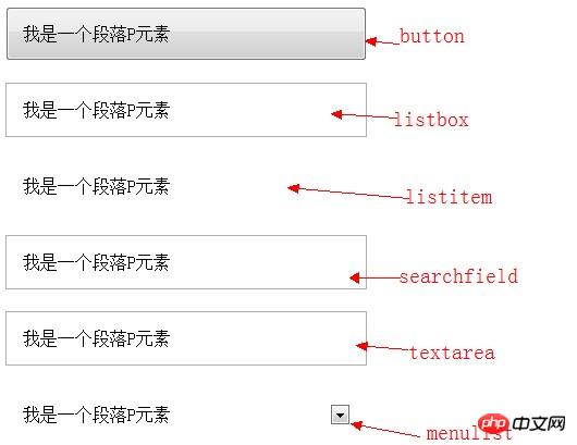
Of course the above attributes are just " Appearance", I collected the appearance under webkit and Mozilla for your reference:
Appearance attribute value under Webkit
checkbox
radio
push-button
square-button
button
button-bevel
listbox
listitem
menulist
menulist-button
menulist-text
menulist-textfield
scrollbarbutton-up
scrollbarbutton-down
scrollbarbutton-left
scrollbarbutton-right
scrollbartrack-horizontal
scrollbartrack-vertical
scrollbarthumb-horizontal
scrollbarthumb-vertical
scrollbargripper-horizontal
scrollbargripper-vertical
slider-horizontal
slider-vertical
sliderthumb-horizontal
sliderthumb-vertical
caret
searchfield
searchfield-decoration
searchfield-results-decoration
searchfield-results-button
searchfield-cancel-button
textfield
textarea
Appearance attribute value under Mozilla
none
button
checkbox
checkbox-container
checkbox-small
dialog
listbox
menuitem
menulist
menulist-button
menulist-textfield
menupopup
progressbar
radio
radio-container
radio-small
resizer
scrollbar
scrollbarbutton-down
scrollbarbutton-left
scrollbarbutton-right
scrollbarbutton-up
scrollbartrack-horizontal
scrollbartrack-vertical
separator
statusbar
tab
tab-left-edge Obsolete
tabpanels
textfield
textfield-multiline
toolbar
toolbarbutton
toolbox
-moz-mac-unified-toolbar
-moz-win-borderless-glass
-moz-win-browsertabbar-toolbox
-moz-win-communications-toolbox
-moz-win-glass
-moz-win-media-toolbox
tooltip
treeheadercell
treeheadersortarrow
treeitem
treetwisty
treetwistyopen
treeview
window
If you are interested, you can read the following introduction:
Mozilla Docs for -moz -appearance
Trent Walton on Webkit Appearance
Shaun Inman on Disabling Inner Text Shadow of Text Inputs on iPad
CSS3 Spec
CSS property: -webkit-appearance
Finally, I would like to remind everyone that currently in IE series and "Appearance" is not supported on the Opera browser, and Safari is only supported on versions 3.0 and above, but is better supported on Chrome, Firefox and mobile settings browsers. If you are interested in this, you can try the above attribute values one by one privately to see what effect it brings to everyone.
The above is the entire content of this article. I hope it will be helpful to everyone's study. For more related content, please pay attention to the PHP Chinese website!
Related recommendations:
About the usage of common transformation graphic changes in CSS3
About CSS3 animation to achieve frame-by-frame animation Effect
The above is the detailed content of How to use the appearance property in CSS3 to change the appearance of an element. For more information, please follow other related articles on the PHP Chinese website!

Hot AI Tools

Undresser.AI Undress
AI-powered app for creating realistic nude photos

AI Clothes Remover
Online AI tool for removing clothes from photos.

Undress AI Tool
Undress images for free

Clothoff.io
AI clothes remover

Video Face Swap
Swap faces in any video effortlessly with our completely free AI face swap tool!

Hot Article
Hot Tools

Notepad++7.3.1
Easy-to-use and free code editor

SublimeText3 Chinese version
Chinese version, very easy to use

Zend Studio 13.0.1
Powerful PHP integrated development environment

Dreamweaver CS6
Visual web development tools

SublimeText3 Mac version
God-level code editing software (SublimeText3)
Hot Topics
 1387
1387
 52
52

 How to achieve wave effect with pure CSS3? (code example)
Jun 28, 2022 pm 01:39 PM
How to achieve wave effect with pure CSS3? (code example)
Jun 28, 2022 pm 01:39 PM
How to achieve wave effect with pure CSS3? This article will introduce to you how to use SVG and CSS animation to create wave effects. I hope it will be helpful to you!
 Use CSS skillfully to realize various strange-shaped buttons (with code)
Jul 19, 2022 am 11:28 AM
Use CSS skillfully to realize various strange-shaped buttons (with code)
Jul 19, 2022 am 11:28 AM
This article will show you how to use CSS to easily realize various weird-shaped buttons that appear frequently. I hope it will be helpful to you!
 How to hide elements in css without taking up space
Jun 01, 2022 pm 07:15 PM
How to hide elements in css without taking up space
Jun 01, 2022 pm 07:15 PM
Two methods: 1. Using the display attribute, just add the "display:none;" style to the element. 2. Use the position and top attributes to set the absolute positioning of the element to hide the element. Just add the "position:absolute;top:-9999px;" style to the element.
 How to implement lace borders in css3
Sep 16, 2022 pm 07:11 PM
How to implement lace borders in css3
Sep 16, 2022 pm 07:11 PM
In CSS, you can use the border-image attribute to achieve a lace border. The border-image attribute can use images to create borders, that is, add a background image to the border. You only need to specify the background image as a lace style; the syntax "border-image: url (image path) offsets the image border width inward. Whether outset is repeated;".
 How to enlarge the image by clicking the mouse in css3
Apr 25, 2022 pm 04:52 PM
How to enlarge the image by clicking the mouse in css3
Apr 25, 2022 pm 04:52 PM
Implementation method: 1. Use the ":active" selector to select the state of the mouse click on the picture; 2. Use the transform attribute and scale() function to achieve the picture magnification effect, the syntax "img:active {transform: scale(x-axis magnification, y Axis magnification);}".
 It turns out that text carousel and image carousel can also be realized using pure CSS!
Jun 10, 2022 pm 01:00 PM
It turns out that text carousel and image carousel can also be realized using pure CSS!
Jun 10, 2022 pm 01:00 PM
How to create text carousel and image carousel? The first thing everyone thinks of is whether to use js. In fact, text carousel and image carousel can also be realized using pure CSS. Let’s take a look at the implementation method. I hope it will be helpful to everyone!
 How to set animation rotation speed in css3
Apr 28, 2022 pm 04:32 PM
How to set animation rotation speed in css3
Apr 28, 2022 pm 04:32 PM
In CSS3, you can use the "animation-timing-function" attribute to set the animation rotation speed. This attribute is used to specify how the animation will complete a cycle and set the speed curve of the animation. The syntax is "element {animation-timing-function: speed attribute value;}".
 Does css3 animation effect have deformation?
Apr 28, 2022 pm 02:20 PM
Does css3 animation effect have deformation?
Apr 28, 2022 pm 02:20 PM
The animation effect in css3 has deformation; you can use "animation: animation attribute @keyframes ..{..{transform: transformation attribute}}" to achieve deformation animation effect. The animation attribute is used to set the animation style, and the transform attribute is used to set the deformation style. .
