

How to create a colored progress bar style using CSS3

This article mainly introduces how to use CSS3 to create a color progress bar style. It has a certain reference value. Now I share it with you. Friends in need can refer to
Using CSS3's border-radius, Box-shadow, transition, -moz-linear-gradient, -webkit-gradient and other styles can complete a fashionable progress bar. Here we look at a few CSS3 code examples for making colored progress bar styles:
1. Create a static purple stripe progress bar
html code:
<body>
<p class="progress-bar purple"> <span style="width:40%;"></span> </p>
</body>
css code:
body {
 background-color:#333;
}
.progress-bar {
 background-color:#222;
 border-radius:3px;
 width:300px;
 height:24px;
 padding:5px;
 margin:50px;
 border-bottom:1px solid #444;
 box-shadow:inset 0 0 2px 0 #000;
}
.progress-bar span {
 display:inline-block;
 width:140px;
 height:24px;
        border-radius:2px;
 box-shadow:0 1px 0 rgba(255, 255, 255, 0.5) inset;
 -moz-box-shadow:0 1px 0 rgba(255, 255, 255, 0.5) inset;
 -webkit-box-shadow:rgba(255,255,255,0.5) 0 1px 0 inset;
}
.purple span{
 background-color:#F09;
 background-image:-moz-linear-gradient(45deg, rgba(255, 255, 255, 0.3) 25%, transparent 25%, transparent 50%, rgba(255, 255, 255, 0.3) 50%, rgba(255, 255, 255, 0.3) 75%, transparent 75%);
 background-image:-webkit-gradient(linear,0 100%,100% 0,color-stop(25%,rgba(255,255,255,0.3)),color-stop(25%,transparent),color-stop(50%,transparent),color-stop(50%,rgba(255,255,255,0.3)),color-stop(75%,rgba(255,255,255,0.3)),color-stop(75%,transparent));
 background-size:16px 16px;
} The final effect is as shown below: 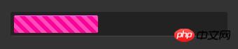
2. Create a static blue progress bar
html code:
<p class="progress-bar orange"> <span style="width:60%;"></span> </p>
css code:
.orange span{
 background-image:-webkit-gradient(linear,0% 0%,0% 100%,from(#fecd22),to(#fd9415));
 background-image:-moz-linear-gradient(-90deg,#fecd22,#fd9415);
}The final effect is as shown below: 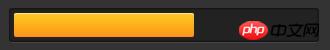
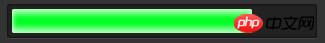
##3. Production Static green progress bar
html code:
<p> <span style="width:80%;"></span> </p>
.green span{
 background-color:#00ff24;
 box-shadow:rgba(255,255,255,0.7)0 5px 5px inser,rgba(255,255,255,0.7)0 -5px 5px inset;
 -webkit-box-shadow:rgba(255, 255, 255, 0.7) 0 5px 5px inset, rgba(255, 255, 255, 0.7) 0 -5px 5px inset;
 -moz-box-shadow:rgba(255, 255, 255, 0.7) 0 5px 5px inset, rgba(255, 255, 255, 0.7) 0 -5px 5px inset;
}
4. Add dynamic effects to the purple stripes
css code:
.purple span:hover{
 -webkit-animation:animate-stripes 3s linear infinite;
 -moz-animation:3s linear 0s normal none infinite animate-stripes;
}
@-webkit-keyframes animate-stripes {
0% {background-position: 0 0;} 100% {background-position: 60px 0;}
}
@-moz-keyframes animate-stripes {
0% {background-position: 0 0;} 100% {background-position: 60px 0;}
}Use CSS3 to simulate the IOS sliding switch effect
Implementation of CSS3 and HTML5 web page loading progress bar
The above is the detailed content of How to create a colored progress bar style using CSS3. For more information, please follow other related articles on the PHP Chinese website!

Hot AI Tools

Undresser.AI Undress
AI-powered app for creating realistic nude photos

AI Clothes Remover
Online AI tool for removing clothes from photos.

Undress AI Tool
Undress images for free

Clothoff.io
AI clothes remover

AI Hentai Generator
Generate AI Hentai for free.

Hot Article
Hot Tools

Notepad++7.3.1
Easy-to-use and free code editor

SublimeText3 Chinese version
Chinese version, very easy to use

Zend Studio 13.0.1
Powerful PHP integrated development environment

Dreamweaver CS6
Visual web development tools

SublimeText3 Mac version
God-level code editing software (SublimeText3)
Hot Topics
 1378
1378
 52
52

 How to achieve wave effect with pure CSS3? (code example)
Jun 28, 2022 pm 01:39 PM
How to achieve wave effect with pure CSS3? (code example)
Jun 28, 2022 pm 01:39 PM
How to achieve wave effect with pure CSS3? This article will introduce to you how to use SVG and CSS animation to create wave effects. I hope it will be helpful to you!
 Use CSS skillfully to realize various strange-shaped buttons (with code)
Jul 19, 2022 am 11:28 AM
Use CSS skillfully to realize various strange-shaped buttons (with code)
Jul 19, 2022 am 11:28 AM
This article will show you how to use CSS to easily realize various weird-shaped buttons that appear frequently. I hope it will be helpful to you!
 How to hide elements in css without taking up space
Jun 01, 2022 pm 07:15 PM
How to hide elements in css without taking up space
Jun 01, 2022 pm 07:15 PM
Two methods: 1. Using the display attribute, just add the "display:none;" style to the element. 2. Use the position and top attributes to set the absolute positioning of the element to hide the element. Just add the "position:absolute;top:-9999px;" style to the element.
 How to set the color of a progress bar using HTML and CSS?
Sep 19, 2023 pm 08:25 PM
How to set the color of a progress bar using HTML and CSS?
Sep 19, 2023 pm 08:25 PM
In website development, progress bars are an important part of the website. The progress bar shows the progress of the process. With the help of it, users can see the status of the work being done on the website, including load times, file uploads, file downloads, and other similar tasks. By default, it is gray. However, to make progress bars stand out and be visually appealing, you can use HTML and CSS to change their color. What is a progress bar? A progress bar is used to show the progress of a task. It is a graphical user interface element. It basically consists of a horizontal bar that gradually fills in as the task progresses, accompanied by a percentage value or other completion indicator. Progress bars are used in web applications to provide users with information about completing a process such as file upload, file download, or software installation.
 How to implement page loading progress bar function in JavaScript?
Oct 27, 2023 am 08:57 AM
How to implement page loading progress bar function in JavaScript?
Oct 27, 2023 am 08:57 AM
How does JavaScript implement the page loading progress bar function? In modern Internet applications, page loading speed is one of the key factors of user experience. To show users the loading process, many websites and applications use loading progress bars. JavaScript provides a simple and effective way to implement the page loading progress bar function. The specific implementation process is as follows: Create an HTML structure. First, create an HTML structure of a progress bar at a suitable location on the page. It is common to place the progress bar in
 How to use Vue to implement progress bar effects
Sep 19, 2023 am 09:22 AM
How to use Vue to implement progress bar effects
Sep 19, 2023 am 09:22 AM
How to use Vue to implement progress bar effects The progress bar is a common interface element that can be used to display the completion of a task or operation. In the Vue framework, we can implement special effects of the progress bar through some simple code. This article will introduce how to use Vue to implement progress bar effects and provide specific code examples. Create a Vue component First, we need to create a Vue component to implement the progress bar function. In Vue, components are reusable and can be used in multiple places. Create a file called Pro
 How to implement lace borders in css3
Sep 16, 2022 pm 07:11 PM
How to implement lace borders in css3
Sep 16, 2022 pm 07:11 PM
In CSS, you can use the border-image attribute to achieve a lace border. The border-image attribute can use images to create borders, that is, add a background image to the border. You only need to specify the background image as a lace style; the syntax "border-image: url (image path) offsets the image border width inward. Whether outset is repeated;".
 It turns out that text carousel and image carousel can also be realized using pure CSS!
Jun 10, 2022 pm 01:00 PM
It turns out that text carousel and image carousel can also be realized using pure CSS!
Jun 10, 2022 pm 01:00 PM
How to create text carousel and image carousel? The first thing everyone thinks of is whether to use js. In fact, text carousel and image carousel can also be realized using pure CSS. Let’s take a look at the implementation method. I hope it will be helpful to everyone!
