

How to use CSS3 to achieve ever-changing text-shadow effects

This article mainly introduces the relevant information on the design of the ever-changing text shadow text-shadow effect in CSS3. Interested friends can refer to it.
The example of this article shares the ever-changing text shadow of CSS3 with everyone. Text-shadow effect example for your reference, the specific content is as follows
Syntax:
##none|
or
none|
represents the color;
represents the length value consisting of a floating point number and a unit identifier, which can be a negative value and specifies the horizontal extension distance of the shadow;
represents a length value composed of a floating point number and a unit identifier. It cannot be a negative value and specifies the distance of the blur effect. If you only need a blur effect, set the first two lengths to 0.
Example:
<style type="text/css">
p{
    text-align:center;
    margin:0;
    font-family:helvetica,arial,sans-serif;
    color:#999;
    font-size:80px;
    font-weight:bold;
    text-shadow:0.1em 0.1em #333;//右下角阴影
    text-shadow:-0.1em -0.1em #333;//左上角阴影
    text-shadow:-0.1em 0.1em #333;//左下角阴影
    text-shadow:0.1em 0.1em 0.3em #333;//增加模糊效果的阴影
    text-shadow:0.1em 0.1em 0.3em black;//定义文本阴影效果
}
</style>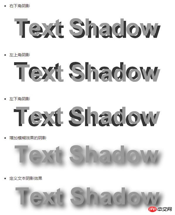
**Simple summary:**The first value of the text-shadow attribute represents horizontal displacement; the second The value represents the vertical displacement, positive values are shifted to the right or downward; negative values are shifted to the upper or left side; the third value represents the blur radius, this value is optional; the fourth value represents the color of the shadow, this value is optional.
Increase the contrast between foreground and background colors through shadowsp{
text-align:center;
margin:150px auto;
font-family:helvetica,arial,sans-serif;
font-size:80px;
font-weight:bold;
color:#fff;//设置文字颜色
text-shadow:0.1em 0.1em 0.3em black;//通过阴影增加前景色和背景色的对比
}

##Summary:
The shadow offset is specified by two
Example:
Simulate complex text effectsp{
text-align:center;
margin:0;
padding:24px;
font-family:helvetica,arial,sans-serif;
font-size:80px;
font-weight:bold;
color:#000;//设置文字颜色
background:#000;//设置背景颜色
text-shadow:0 0 4px white,
0 -5px 4px #ff3,
2px -10px 6px #fd3,
-2px -15px 11px #f80,
2px -25px 18px #f20;//使用阴影叠加出燃烧的文字特效
}p{
text-align:center;
margin:0;
padding:24px;
font-family:helvetica,arial,sans-serif;
font-size:80px;
font-weight:bold;
color:#D1D1D1;
background:#CCC;
text-shadow:-1px -1px white,
-1px -1px #333;//使用阴影叠加出立体的文字特效
1px 1px white,
-1px -1px #444;//使用阴影叠加出凹体文字特效
-1px 0 black,
0 1px black,
1px 0 black,
0 -1px black;//使用阴影叠加出文本描边特效
0 0 0.2em #F87,
0 0 0.2em #F87;//使用阴影叠加出文本外发光特
}
The above is the entire content of this article. I hope it will be helpful to everyone’s study. For more related content, please pay attention to the PHP Chinese website! 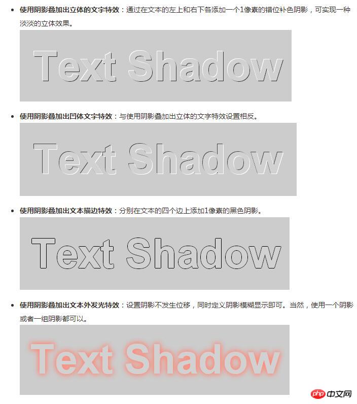
Related recommendations:
The above is the detailed content of How to use CSS3 to achieve ever-changing text-shadow effects. For more information, please follow other related articles on the PHP Chinese website!

Hot AI Tools

Undresser.AI Undress
AI-powered app for creating realistic nude photos

AI Clothes Remover
Online AI tool for removing clothes from photos.

Undress AI Tool
Undress images for free

Clothoff.io
AI clothes remover

Video Face Swap
Swap faces in any video effortlessly with our completely free AI face swap tool!

Hot Article
Hot Tools

Notepad++7.3.1
Easy-to-use and free code editor

SublimeText3 Chinese version
Chinese version, very easy to use

Zend Studio 13.0.1
Powerful PHP integrated development environment

Dreamweaver CS6
Visual web development tools

SublimeText3 Mac version
God-level code editing software (SublimeText3)
Hot Topics
 1386
1386
 52
52

 How to achieve wave effect with pure CSS3? (code example)
Jun 28, 2022 pm 01:39 PM
How to achieve wave effect with pure CSS3? (code example)
Jun 28, 2022 pm 01:39 PM
How to achieve wave effect with pure CSS3? This article will introduce to you how to use SVG and CSS animation to create wave effects. I hope it will be helpful to you!
 Use CSS skillfully to realize various strange-shaped buttons (with code)
Jul 19, 2022 am 11:28 AM
Use CSS skillfully to realize various strange-shaped buttons (with code)
Jul 19, 2022 am 11:28 AM
This article will show you how to use CSS to easily realize various weird-shaped buttons that appear frequently. I hope it will be helpful to you!
 How to hide elements in css without taking up space
Jun 01, 2022 pm 07:15 PM
How to hide elements in css without taking up space
Jun 01, 2022 pm 07:15 PM
Two methods: 1. Using the display attribute, just add the "display:none;" style to the element. 2. Use the position and top attributes to set the absolute positioning of the element to hide the element. Just add the "position:absolute;top:-9999px;" style to the element.
 How to implement lace borders in css3
Sep 16, 2022 pm 07:11 PM
How to implement lace borders in css3
Sep 16, 2022 pm 07:11 PM
In CSS, you can use the border-image attribute to achieve a lace border. The border-image attribute can use images to create borders, that is, add a background image to the border. You only need to specify the background image as a lace style; the syntax "border-image: url (image path) offsets the image border width inward. Whether outset is repeated;".
 How to enlarge the image by clicking the mouse in css3
Apr 25, 2022 pm 04:52 PM
How to enlarge the image by clicking the mouse in css3
Apr 25, 2022 pm 04:52 PM
Implementation method: 1. Use the ":active" selector to select the state of the mouse click on the picture; 2. Use the transform attribute and scale() function to achieve the picture magnification effect, the syntax "img:active {transform: scale(x-axis magnification, y Axis magnification);}".
 It turns out that text carousel and image carousel can also be realized using pure CSS!
Jun 10, 2022 pm 01:00 PM
It turns out that text carousel and image carousel can also be realized using pure CSS!
Jun 10, 2022 pm 01:00 PM
How to create text carousel and image carousel? The first thing everyone thinks of is whether to use js. In fact, text carousel and image carousel can also be realized using pure CSS. Let’s take a look at the implementation method. I hope it will be helpful to everyone!
 How to set animation rotation speed in css3
Apr 28, 2022 pm 04:32 PM
How to set animation rotation speed in css3
Apr 28, 2022 pm 04:32 PM
In CSS3, you can use the "animation-timing-function" attribute to set the animation rotation speed. This attribute is used to specify how the animation will complete a cycle and set the speed curve of the animation. The syntax is "element {animation-timing-function: speed attribute value;}".
 Does css3 animation effect have deformation?
Apr 28, 2022 pm 02:20 PM
Does css3 animation effect have deformation?
Apr 28, 2022 pm 02:20 PM
The animation effect in css3 has deformation; you can use "animation: animation attribute @keyframes ..{..{transform: transformation attribute}}" to achieve deformation animation effect. The animation attribute is used to set the animation style, and the transform attribute is used to set the deformation style. .
