

Analysis of CSS3 grid

In this article, we will look at some new CSS3 properties to make working with grids easier with HTML and CSS. But first let’s discuss a little history of HTML and CSS grids, and understand why it was so difficult before.
1. A brief history of grids
Once upon a time, our layouts were a mess. Tables and frames are the primary tools for creating multi-column layouts. While they get the job done (and are actually pretty bad at it).
Set your sights to today. HTML and CSS have become very complex, and web design is growing in popularity and sophistication every day. The old layout methods we used to use are clearly out. However, a legacy issue surfaced: multi-column layout.
To complicate things further, our page width is no longer static. Responsiveness is all the rage, so we tend to favor percentage-based column widths. A simple grid based on a fixed 960 pixel width no longer works – we need a fluid grid.
There is a problem with the method of using floats to solve columns in the CSS2 specification. To prevent parent elements from breaking your layout, we need to add a clearfix. Through this method, the height collapse problem of the parent element is corrected (the floating element breaks away from the standard flow, and the parent element will think that the floating resource does not exist). We mostly accept this approach, but many still consider it a hack.
The method via inline-box is less common, but still exists. Inline elements will remain on one line, in their natural order. When a row is full, subsequent elements are naturally folded to the next row. But because it behaves like text, it behaves like text. This means you have to avoid whitespace elements (spaces, tabs, newlines...) between HTML elements. Inline-block is not designed for this, and it does not work very well.
Of these two methods, the floating method is more reliable. That's why it's more popular and ranked first. However, after creating multiple columns, we find that we need to compress the content again because we need some padding distance. This leads to the final question: What is the box model? To put it simply, the actual size of an element includes: height/width, padding, and side width. The outer border does not make the box larger, it just adds space between itself and other elements. So when you set the width to, say, 25%, the actual width of the box is much larger than that, which means there isn't enough room for four elements in one row.
There are different solutions to this annoying problem: negative margins, nested elements – that’s all I know. They all require additional CSS or DOM elements and count as hacks. Let's face it, there is no good way to solve grids in CSS2.
Today, however, CSS3 provides good support, and the specification has added several new features specifically for grids. What are these characteristics? How do we use them? Let's take a look.
2. box-sizing: border-box
One of the problems that has been solved is the nature of the extended box model. This problem can be solved by setting the value of box-sizing to border-box. By reducing the width of the content, the distance between the sides and the padding is also calculated into the width attribute.
HTML
<p class="row">
  <p class="column">Col one</p>
  <p class="column">Col two</p>
  <p class="column">Col three</p>
  <p class="column">Col four</p>
</p>
CSS
.row:after {
  clear: both;
  content: '';
  display: block;
}
.column {
  -webkit-box-sizing: border-box;
  -moz-box-sizing: border-box;
  box-sizing: border-box;
  float: left;
  min-height: 8em;
  overflow: hidden;
  padding: 2em;
  width: 25%;
}
.column:nth-child(1) { background-color: #9df5ba; }
.column:nth-child(2) { background-color: #9df5d7; }
.column:nth-child(3) { background-color: #9df5f5; }
.column:nth-child(4) { background-color: #9dd7f5; }Effect
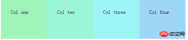 While this works great, we still need to use Float, we still need to clear the float. Furthermore, we can only use padding as space for the element, margins no longer play a role. This means there is no actual space between the fast elements, but rather its contents. While this is very useful for many designs, it still feels like a small mistake.
1.Firefox 1
2.Chrome 13.IE 8
4.Opera 7
5.Safari 3
3. width: calc( Percent – Distance)
Another great option is to use the calc() function. It allows us to calculate the true width of an element - in different units - without relying on JavaScript!
HTML
<p class="row">
  <p class="column">Col one</p>
  <p class="column">Col two</p>
  <p class="column">Col three</p>
  <p class="column">Col four</p>
</p>
CSS
.row { margin-left: -1em; }</p> <p>.row:after {
clear: both;
content: '';
display: block;
}
.column {
float: left;
margin-left: 1em;
min-height: 8em;
padding: 1em;
width: -webkit-calc(25% - 3em);
width: -moz-calc(25% - 3em);
width: calc(25% - 3em);
}
.column:nth-child(1) { background-color: #9df5ba; }
.column:nth-child(2) { background-color: #9df5d7; }
.column:nth-child(3) { background-color: #9df5f5; }
.column:nth-child(4) { background-color: #9dd7f5; }Effect:
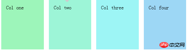 The ability to recalculate the actual size is a Great option, but unfortunately we still need floats and we also need negative margins for the column's container. Ditto, a great choice, but still somewhat flawed.
1.Firefox 4
2.Chrome 193.IE 9
4.Opera ?
5.Safari 6 (appears to be a little buggy)
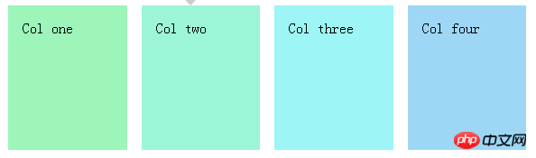
4. Flexbox
The flex layout box is an element with specific configuration behavior-a bit like a table. is this real? Yes, that's right. The behavior of the table is actually quite nice, as its display changes based on its content. But table layouts are no longer used, so table tags are not an option.
At first, the telescoping box looked complicated. There are many attributes that are difficult to understand, especially for someone like me who is not good at speaking in English. Luckily, Chris Coyier wrote a great guide on retractable boxes that I have to mention.HTML
<p class="row">
  <p class="column">Col one</p>
  <p class="column">Col two</p>
  <p class="column">Col three</p>
  <p class="column">Col four</p>
</p>
CSS
.row {
    display: -webkit-flex;
    -webkit-flex-direction: row;
    -webkit-flex-wrap: nowrap;
    -webkit-justify-content: space-between;</p>
<p>    display: flex;
    flex-direction: row;
    flex-wrap: nowrap;
    justify-content: space-between;
}
.column {
    margin: 0.5em;
    min-height: 8em;
    padding: 1em;
    width: 25%;
}
.column:nth-child(1) { background-color: #9df5ba; }
.column:nth-child(2) { background-color: #9df5d7; }
.column:nth-child(3) { background-color: #9df5f5; }
.column:nth-child(4) { background-color: #9dd7f5; }Effect:
 5. Conclusion
Although CSS3 brings many new features and fixes some historical issues, in my opinion, flex box layout is the only non-hack way to create a flexible grid with CSS. Unfortunately, however, browser support is mediocre. Nonetheless, other methods enrich the presentation, so they are an improvement, and they have good browser support.
The above is the entire content of this article. I hope it will be helpful to everyone's study. For more related content, please pay attention to the PHP Chinese website!
Related recommendations:
The beautification and function of div imitation checkbox form style
CSS page has left, middle and right columns Implementation of layout
The above is the detailed content of Analysis of CSS3 grid. For more information, please follow other related articles on the PHP Chinese website!

Hot AI Tools

Undresser.AI Undress
AI-powered app for creating realistic nude photos

AI Clothes Remover
Online AI tool for removing clothes from photos.

Undress AI Tool
Undress images for free

Clothoff.io
AI clothes remover

AI Hentai Generator
Generate AI Hentai for free.

Hot Article
Hot Tools

Notepad++7.3.1
Easy-to-use and free code editor

SublimeText3 Chinese version
Chinese version, very easy to use

Zend Studio 13.0.1
Powerful PHP integrated development environment

Dreamweaver CS6
Visual web development tools

SublimeText3 Mac version
God-level code editing software (SublimeText3)
Hot Topics
 1386
1386
 52
52

 How to achieve wave effect with pure CSS3? (code example)
Jun 28, 2022 pm 01:39 PM
How to achieve wave effect with pure CSS3? (code example)
Jun 28, 2022 pm 01:39 PM
How to achieve wave effect with pure CSS3? This article will introduce to you how to use SVG and CSS animation to create wave effects. I hope it will be helpful to you!
 Multi-grid redundant bounding box annotation for accurate object detection
Jun 01, 2024 pm 09:46 PM
Multi-grid redundant bounding box annotation for accurate object detection
Jun 01, 2024 pm 09:46 PM
1. Introduction Currently, the leading object detectors are two-stage or single-stage networks based on the repurposed backbone classifier network of deep CNN. YOLOv3 is one such well-known state-of-the-art single-stage detector that receives an input image and divides it into an equal-sized grid matrix. Grid cells with target centers are responsible for detecting specific targets. What I’m sharing today is a new mathematical method that allocates multiple grids to each target to achieve accurate tight-fit bounding box prediction. The researchers also proposed an effective offline copy-paste data enhancement for target detection. The newly proposed method significantly outperforms some current state-of-the-art object detectors and promises better performance. 2. The background target detection network is designed to use
 Use CSS skillfully to realize various strange-shaped buttons (with code)
Jul 19, 2022 am 11:28 AM
Use CSS skillfully to realize various strange-shaped buttons (with code)
Jul 19, 2022 am 11:28 AM
This article will show you how to use CSS to easily realize various weird-shaped buttons that appear frequently. I hope it will be helpful to you!
 How to implement lace borders in css3
Sep 16, 2022 pm 07:11 PM
How to implement lace borders in css3
Sep 16, 2022 pm 07:11 PM
In CSS, you can use the border-image attribute to achieve a lace border. The border-image attribute can use images to create borders, that is, add a background image to the border. You only need to specify the background image as a lace style; the syntax "border-image: url (image path) offsets the image border width inward. Whether outset is repeated;".
 Steps to set up camera grid on iPhone
Mar 26, 2024 pm 07:21 PM
Steps to set up camera grid on iPhone
Mar 26, 2024 pm 07:21 PM
1. Open the desktop of your iPhone, find and click to enter [Settings], 2. Click to enter [Camera] on the settings page. 3. Click to turn on the switch on the right side of [Grid].
 PHP 8.3 released: new features at a glance
Nov 27, 2023 pm 12:52 PM
PHP 8.3 released: new features at a glance
Nov 27, 2023 pm 12:52 PM
PHP8.3 released: Overview of new features As technology continues to develop and needs change, programming languages are constantly updated and improved. As a scripting language widely used in web development, PHP has been constantly improving to provide developers with more powerful and efficient tools. The recently released PHP 8.3 version brings many long-awaited new features and improvements. Let’s take a look at an overview of these new features. Initialization of non-null properties In past versions of PHP, if a class property was not explicitly assigned a value, its value
 A guide to learn the new features of PHP8 and gain an in-depth understanding of the latest technology
Dec 23, 2023 pm 01:16 PM
A guide to learn the new features of PHP8 and gain an in-depth understanding of the latest technology
Dec 23, 2023 pm 01:16 PM
An in-depth analysis of the new features of PHP8 to help you master the latest technology. As time goes by, the PHP programming language has been constantly evolving and improving. The recently released PHP8 version provides developers with many exciting new features and improvements, bringing more convenience and efficiency to our development work. In this article, we will analyze the new features of PHP8 in depth and provide specific code examples to help you better master these latest technologies. JIT compiler PHP8 introduces JIT (Just-In-Time) compilation
 CSS Layout Tips: Best Practices for Implementing Circular Grid Icon Layout
Oct 20, 2023 am 10:46 AM
CSS Layout Tips: Best Practices for Implementing Circular Grid Icon Layout
Oct 20, 2023 am 10:46 AM
CSS Layout Tips: Best Practices for Implementing Circular Grid Icon Layout Grid layout is a common and powerful layout technique in modern web design. The circular grid icon layout is a more unique and interesting design choice. This article will introduce some best practices and specific code examples to help you implement a circular grid icon layout. HTML structure First, we need to set up a container element and place the icon in this container. We can use an unordered list (<ul>) as a container, and the list items (<l
