
 Web Front-end
CSS Tutorial
Instructions for using css3 animation effect animate and introduction to browser compatibility
Web Front-end
CSS Tutorial
Instructions for using css3 animation effect animate and introduction to browser compatibility
Instructions for using css3 animation effect animate and introduction to browser compatibility

This article mainly introduces the usage instructions and browser compatibility of CSS3 animation effect animate. It has a certain reference value. Now I share it with you. Friends in need can refer to it
Yesterday Suddenly I saw jing.fm (this music website is very good, I like many of the effects. If you are interested, you can check it out). When the music is played, the album rotation effect is very good, so I am going to write it down myself. Reserve for later use. As a result, I encountered a cheating thing when I used animate for the first time. I am complaining that I haven’t updated my blog for a long time. It has been exactly a month since I last posted (November 8th), and during this period, there were many things on the project. I felt that time was tight and I didn't have time to update. This week has finally come to an end, and I will add a few technical articles. Well, the first article is about the use of css3 animation.
Yesterday I suddenly saw jing.fm (this music website is very good, I like many of the effects. If you are interested, you can check it out). When playing music, the album rotation effect is very good, so I am ready to do it myself. Write it down for later use. As a result, I encountered a cheating thing the first time I used animate, so I complained about it.
1. The final effect
As shown in the picture above, the ultimate goal is to make the album picture rotate to simulate the effect of record playback (you can go to jing Check out the real effect on .fm, it’s great, now many music websites have added this effect). 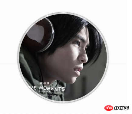
2. Structural code
<!DOCTYPE html> <html> <head> <meta charset='utf-8'> <title>音乐专辑播放模拟</title> <link rel="stylesheet" type="text/css" href="css/style.css"> </head> <body> <p id="bd"> <p id="musicBox"> <p class="cover rotateCD"></p> <p class="mask"></p> </p> </p> </body> </html>
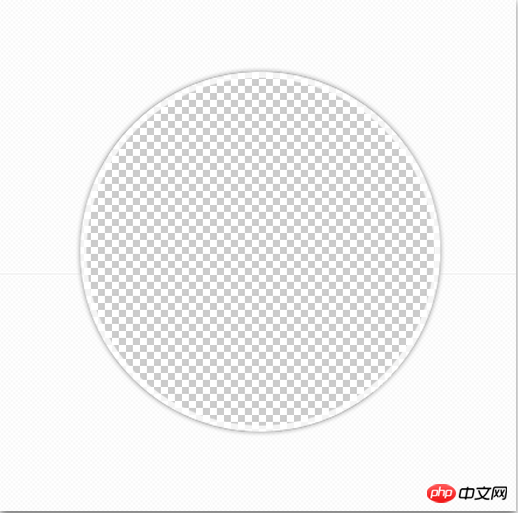
As can be seen from the above code, because it uses the powerful animation effect of css3, my structure definition is very simple (in Under the premise of conforming to the semantics), at the same time, it does not reference the javascript script file. musicBox is used to limit the size of the outer frame, and the internal cover is used to display the album cover picture. This picture is like the picture on the left of the picture below. It is boxy and not round, so I made a mask p at the back. , it does nothing else but is used to hold a mask (right picture below) to cover the part outside the circle of the picture.

 3. css3 style sheet
 @charset utf-8;
/* common: rotateCD */
@-webkit-keyframes myrotate{
0%{
-webkit-transform : rotate(0deg);
}
100%{
-webkit-transform : rotate(360deg);
}
}
@-moz-keyframes myrotate{
0%{
-moz-transform : rotate(0deg);
}
100%{
-moz-transform : rotate(360deg);
}
}
@-ms-keyframes myrotate{
0%{
-ms-transform : rotate(0deg);
}
100%{
-ms-transform : rotate(360deg);
}
}
@-o-keyframes myrotate{
0%{
-o-transform : rotate(0deg);
}
100%{
-o-transform : rotate(360deg);
}
}
@keyframes myrotate{
0%{
transform : rotate(0deg);
}
100%{
transform : rotate(360deg);
}
}
.rotateCD{
-webkit-animation: myrotate 9.5s infinite linear;
-moz-animation: myrotate 9.5s infinite linear;
-ms-animation: myrotate 9.5s infinite linear;
-o-animation: myrotate 9.5s infinite linear;
animation: myrotate 9.5s infinite linear;
-webkit-animation-play-state: running;
-moz-animation-play-state: running;
-ms-animation-play-state: running;
-o-animation-play-state: running;
animation-play-state: running;
}
/* module: bd */
#bd{width: 960px;margin: 200px auto 0;}
/* module: musicBox */
#musicBox{position: relative;width: 430px;height: 430px;margin: 0 auto;overflow: hidden;}
#musicBox .cover{width: 300px;height: 300px;margin: 65px;background: url(../img/music1.jpg) 0 0 no-repeat;}
#musicBox .mask{position: absolute;top: 0;left: 0;width: 100%;height: 100%;background: url(../img/playerMask.png) 0 0 no-repeat;}
@-webkit-keyframes myrotate{
0%{
-webkit-transform : rotate(0deg);
-moz-transform : rotate(0deg);
-ms-transform : rotate(0deg);
-o-transform : rotate(0deg);
transform : rotate(0deg);
}
....The result of this is that the animation is normal under chrome and safari, but there is no animation under FF, opera and IE. In fact, this part is easy to understand. The key frames of myrotate only provide special instructions for webkit. Other browsers simply ignore it, so there is no animation effect. Therefore, when we write the keyframe adaptation style, we must write it in the following form:
@-webkit-keyframes myrotate{
0%{
-webkit-transform : rotate(0deg);
}
...
@-moz-keyframes myrotate{
0%{
-moz-transform : rotate(0deg);
}
...
@-ms-keyframes myrotate{
0%{
-ms-transform : rotate(0deg);
}
...
@-o-keyframes myrotate{
0%{
-o-transform : rotate(0deg);
}
...
@keyframes myrotate{
0%{
transform : rotate(0deg);
}
...There is another weird thing about the opera browser. It prefers @keyframes myrotate{ ...}, but are not interested in @-o-keyframes myrotate{...}, so you find that when only one of the two is saved, the former can achieve animation, but the latter cannot achieve animation effects. I have always been puzzled by this, and then I found an introduction to opera, saying that it strictly implements W3C web standards. Thinking about it this way, you can understand why it prefers @keyframes myrotate{...} so much.
4. Summary
css3 looks very good, but there are still many uncertainties in actual use. If you can't see the implemented code template, it's difficult to be sure that your code format is correct. So you can go to some good websites to observe various animation effects, choose the animation you like and generate code, download it and then write the animation code according to your own needs. This will make your animation effects more efficient and effective (don’t worry if it doesn’t meet your requirements, there are many effects above, you can combine them yourself, as long as your imagination is rich enough). Okay, this article ends here.
PS
: The browsers used in this article are chrome (21.0.1180.15), safari5.1.7 (7534.57.2), opera (12.11), FF (17.0.1) and IE10 (10.0. 9200.16438). The above is the entire content of this article. I hope it will be helpful to everyone's study. For more related content, please pay attention to the PHP Chinese website!
Related recommendations:
How to use Flexbox to achieve the centering effect in CSSHow to use css3 to achieve the color gradient glow effect of the input input box
The above is the detailed content of Instructions for using css3 animation effect animate and introduction to browser compatibility. For more information, please follow other related articles on the PHP Chinese website!

Hot AI Tools

Undresser.AI Undress
AI-powered app for creating realistic nude photos

AI Clothes Remover
Online AI tool for removing clothes from photos.

Undress AI Tool
Undress images for free

Clothoff.io
AI clothes remover

AI Hentai Generator
Generate AI Hentai for free.

Hot Article
Hot Tools

Notepad++7.3.1
Easy-to-use and free code editor

SublimeText3 Chinese version
Chinese version, very easy to use

Zend Studio 13.0.1
Powerful PHP integrated development environment

Dreamweaver CS6
Visual web development tools

SublimeText3 Mac version
God-level code editing software (SublimeText3)
Hot Topics
 1378
1378
 52
52

 Making Your First Custom Svelte Transition
Mar 15, 2025 am 11:08 AM
Making Your First Custom Svelte Transition
Mar 15, 2025 am 11:08 AM
The Svelte transition API provides a way to animate components when they enter or leave the document, including custom Svelte transitions.
 Working With GraphQL Caching
Mar 19, 2025 am 09:36 AM
Working With GraphQL Caching
Mar 19, 2025 am 09:36 AM
If you’ve recently started working with GraphQL, or reviewed its pros and cons, you’ve no doubt heard things like “GraphQL doesn’t support caching” or
 Show, Don't Tell
Mar 16, 2025 am 11:49 AM
Show, Don't Tell
Mar 16, 2025 am 11:49 AM
How much time do you spend designing the content presentation for your websites? When you write a new blog post or create a new page, are you thinking about
 Building an Ethereum app using Redwood.js and Fauna
Mar 28, 2025 am 09:18 AM
Building an Ethereum app using Redwood.js and Fauna
Mar 28, 2025 am 09:18 AM
With the recent climb of Bitcoin’s price over 20k $USD, and to it recently breaking 30k, I thought it’s worth taking a deep dive back into creating Ethereum
 Creating Your Own Bragdoc With Eleventy
Mar 18, 2025 am 11:23 AM
Creating Your Own Bragdoc With Eleventy
Mar 18, 2025 am 11:23 AM
No matter what stage you’re at as a developer, the tasks we complete—whether big or small—make a huge impact in our personal and professional growth.
 Vue 3
Apr 02, 2025 pm 06:32 PM
Vue 3
Apr 02, 2025 pm 06:32 PM
It's out! Congrats to the Vue team for getting it done, I know it was a massive effort and a long time coming. All new docs, as well.
 A bit on ci/cd
Apr 02, 2025 pm 06:21 PM
A bit on ci/cd
Apr 02, 2025 pm 06:21 PM
I'd say "website" fits better than "mobile app" but I like this framing from Max Lynch:
 Let's use (X, X, X, X) for talking about specificity
Mar 24, 2025 am 10:37 AM
Let's use (X, X, X, X) for talking about specificity
Mar 24, 2025 am 10:37 AM
I was just chatting with Eric Meyer the other day and I remembered an Eric Meyer story from my formative years. I wrote a blog post about CSS specificity, and
