

Implementation of linear color gradient in CSS3

This article mainly introduces some implementation methods of linear color gradients in CSS3, including the webkit kernel of Safari and Chrome and the Gecko kernel of Firefox. Friends in need can refer to it
In order to display Dedicating a gradient to one image is inflexible and can quickly become a bad practice. But sadly, as of this writing, it may still have to be, but hopefully not for much longer. Thanks to Firefox and Safari/Chrome, we can now achieve powerful gradients with minimal effort. In this article, we will show a simple implementation of CSS gradients and how this property differs in Mozilla and webkit browsers.
Webkit
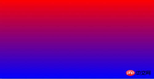
Although Mozilla and Webkit generally adopt the same syntax for CSS3 properties, they unfortunately cannot agree on gradients. Webkit is the first browser kernel to support gradients. It uses the following structure:
1 2 3 4 |
|

Don’t worry that these syntaxes will dazzle you, it’s the same for me. of! Just remember that we need to separate the parameter groups with a comma.
Type of gradient? (linear)
X and Y axis coordinates of the beginning of the gradient (0 0 – or left-top)
X and Y axis coordinates of the end of the gradient (0 100% or left-bottom)
Starting color? (from(red))
Ending color? (to(blue))
Mozilla
Firefox, only from version 3.6 Started supporting gradients, preferring a slightly different syntax from Webkit.
1 2 3 4 |
|
Please note that we put the gradient type - linear - in the attribute prefix
Where does the gradient start? (top - We can also use degrees , such as -45deg)
Starting color? (red)
Ending color? (blue)
Color-Stops
If you don’t need What about a 100% gradient from one color to another? This is when color stop comes into play. A common design technique is to use a short, subtle gradient, such as: 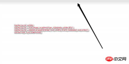
Note the subtle gradient from light gray to white at the top
In the past, the standard What you do is make an image, set it as the background image of an element, and then make it tile horizontally. With CSS3, however, this is a small case.
1 2 3 |
|
This time, we make the gradient end at 8% instead of the default 100%. Note that we also used a border on the header for contrast. This is very commonly used.
If we want to add one more (several) colors, we can do this:
1 |
|
For the -moz version, we define, starting from 20% of the height of the element It's red.
For -webkit, we use color-stop, which takes two parameters: where to start and which color to use.
The above is the entire content of this article. I hope it will be helpful to everyone's study. For more related content, please pay attention to the PHP Chinese website!
Related recommendations:
About CSS to achieve beautiful drop-down navigation effect
How to use CSS to achieve perspective effect
The above is the detailed content of Implementation of linear color gradient in CSS3. For more information, please follow other related articles on the PHP Chinese website!

Hot AI Tools

Undresser.AI Undress
AI-powered app for creating realistic nude photos

AI Clothes Remover
Online AI tool for removing clothes from photos.

Undress AI Tool
Undress images for free

Clothoff.io
AI clothes remover

Video Face Swap
Swap faces in any video effortlessly with our completely free AI face swap tool!
Hot Article
Hot Tools

Notepad++7.3.1
Easy-to-use and free code editor

SublimeText3 Chinese version
Chinese version, very easy to use

Zend Studio 13.0.1
Powerful PHP integrated development environment

Dreamweaver CS6
Visual web development tools

SublimeText3 Mac version
God-level code editing software (SublimeText3)
Hot Topics
 1393
1393
 52
1207
24
52
1207
24

 How to achieve wave effect with pure CSS3? (code example)
Jun 28, 2022 pm 01:39 PM
How to achieve wave effect with pure CSS3? (code example)
Jun 28, 2022 pm 01:39 PM
How to achieve wave effect with pure CSS3? This article will introduce to you how to use SVG and CSS animation to create wave effects. I hope it will be helpful to you!
 Golang image processing: how to perform color gradient and grayscale mapping of images
Aug 19, 2023 am 08:53 AM
Golang image processing: how to perform color gradient and grayscale mapping of images
Aug 19, 2023 am 08:53 AM
Golang image processing: How to perform color gradient and grayscale mapping of images Introduction: With the development of digital media, image processing has become an indispensable part of our daily life. In the Go language, we can use some libraries for image processing, such as github.com/disintegration/imaging. This article will introduce how to use this library to perform color gradient and grayscale mapping of images. 1. Introduce the library First, we need to introduce github.com/ in the Go project
 Use CSS skillfully to realize various strange-shaped buttons (with code)
Jul 19, 2022 am 11:28 AM
Use CSS skillfully to realize various strange-shaped buttons (with code)
Jul 19, 2022 am 11:28 AM
This article will show you how to use CSS to easily realize various weird-shaped buttons that appear frequently. I hope it will be helpful to you!
 How to hide elements in css without taking up space
Jun 01, 2022 pm 07:15 PM
How to hide elements in css without taking up space
Jun 01, 2022 pm 07:15 PM
Two methods: 1. Using the display attribute, just add the "display:none;" style to the element. 2. Use the position and top attributes to set the absolute positioning of the element to hide the element. Just add the "position:absolute;top:-9999px;" style to the element.
 How to implement lace borders in css3
Sep 16, 2022 pm 07:11 PM
How to implement lace borders in css3
Sep 16, 2022 pm 07:11 PM
In CSS, you can use the border-image attribute to achieve a lace border. The border-image attribute can use images to create borders, that is, add a background image to the border. You only need to specify the background image as a lace style; the syntax "border-image: url (image path) offsets the image border width inward. Whether outset is repeated;".
 How to enlarge the image by clicking the mouse in css3
Apr 25, 2022 pm 04:52 PM
How to enlarge the image by clicking the mouse in css3
Apr 25, 2022 pm 04:52 PM
Implementation method: 1. Use the ":active" selector to select the state of the mouse click on the picture; 2. Use the transform attribute and scale() function to achieve the picture magnification effect, the syntax "img:active {transform: scale(x-axis magnification, y Axis magnification);}".
 It turns out that text carousel and image carousel can also be realized using pure CSS!
Jun 10, 2022 pm 01:00 PM
It turns out that text carousel and image carousel can also be realized using pure CSS!
Jun 10, 2022 pm 01:00 PM
How to create text carousel and image carousel? The first thing everyone thinks of is whether to use js. In fact, text carousel and image carousel can also be realized using pure CSS. Let’s take a look at the implementation method. I hope it will be helpful to everyone!
 How to set animation rotation speed in css3
Apr 28, 2022 pm 04:32 PM
How to set animation rotation speed in css3
Apr 28, 2022 pm 04:32 PM
In CSS3, you can use the "animation-timing-function" attribute to set the animation rotation speed. This attribute is used to specify how the animation will complete a cycle and set the speed curve of the animation. The syntax is "element {animation-timing-function: speed attribute value;}".
