

Introduction to the use of CSS3 3D rotation rotate effect

This article mainly introduces CSS3 3D rotation rotate effect examples in detail. It has certain reference value. Interested friends can refer to it.
The examples in this article share CSS3 3D rotation rotate effect with everyone. Effect examples are for your reference. The specific contents are as follows
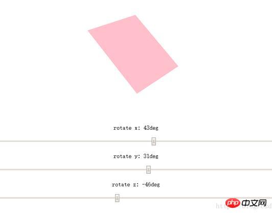
Effect pictures:
Example code
<!DOCTYPE html>
<html lang="en">
<head>
    <meta charset="UTF-8">
    <title>3D旋转的Demo</title>
    <style>
        #experiment {
            -webkit-perspective: 800;
            -webkit-perspective-origin: 50% 50%;
            -webkit-transform-style: -webkit-preserve-3d;
        }
        #block {
            width: 200px;
            height: 200px;
            background-color: pink;
            margin: 100px auto;
            -webkit-transition: background-color 3s;
        }
        #block:hover {
            background-color: purple;
        }
        #ep {
            text-align: center;
        }
        #ep input {
            width: 800px;
        }
    </style>
    <script>
        function rotate() {
            var x = document.getElementById("rotateX").value;
            var y = document.getElementById("rotateY").value;
            var z = document.getElementById("rotateZ").value;
            document.getElementById("block").style.webkitTransform = "rotateX(" + x + "deg) rotateY(" + y + "deg) rotateZ(" + z + "deg)";
            document.getElementById("degx-span").innerText = x;
            document.getElementById("degy-span").innerText = y;
            document.getElementById("degz-span").innerText = z;
        }
    </script>
</head>
<body>
    <p id="experiment">
        <p id="block"></p>
    </p>
    <p id="ep">
        <p>rotate x: <span id="degx-span">0</span>deg</p>
        <input type="range" min="-360" max="360" id="rotateX" value="0" class="range-control" onmousemove="rotate()"/><br/>
        <p>rotate y: <span id="degy-span">0</span>deg</p>
        <input type="range" min="-360" max="360" id="rotateY" value="0" class="range-control" onmousemove="rotate()"/><br/>
        <p>rotate z: <span id="degz-span">0</span>deg</p>
        <input type="range" min="-360" max="360" id="rotateZ" value="0" class="range-control" onmousemove="rotate()"/><br/>
    </p>
</body>
</html>The above is the entire content of this article. I hope it will be helpful to everyone's study. For more related content, please pay attention to the PHP Chinese website!
Related recommendations:
CSS3 realizes the effect of background transparent text opaque
realization of linear color gradient in CSS3
The above is the detailed content of Introduction to the use of CSS3 3D rotation rotate effect. For more information, please follow other related articles on the PHP Chinese website!

Hot AI Tools

Undresser.AI Undress
AI-powered app for creating realistic nude photos

AI Clothes Remover
Online AI tool for removing clothes from photos.

Undress AI Tool
Undress images for free

Clothoff.io
AI clothes remover

Video Face Swap
Swap faces in any video effortlessly with our completely free AI face swap tool!

Hot Article
Hot Tools

Notepad++7.3.1
Easy-to-use and free code editor

SublimeText3 Chinese version
Chinese version, very easy to use

Zend Studio 13.0.1
Powerful PHP integrated development environment

Dreamweaver CS6
Visual web development tools

SublimeText3 Mac version
God-level code editing software (SublimeText3)
Hot Topics
 1386
1386
 52
52

 Why is Gaussian Splatting so popular in autonomous driving that NeRF is starting to be abandoned?
Jan 17, 2024 pm 02:57 PM
Why is Gaussian Splatting so popular in autonomous driving that NeRF is starting to be abandoned?
Jan 17, 2024 pm 02:57 PM
Written above & the author’s personal understanding Three-dimensional Gaussiansplatting (3DGS) is a transformative technology that has emerged in the fields of explicit radiation fields and computer graphics in recent years. This innovative method is characterized by the use of millions of 3D Gaussians, which is very different from the neural radiation field (NeRF) method, which mainly uses an implicit coordinate-based model to map spatial coordinates to pixel values. With its explicit scene representation and differentiable rendering algorithms, 3DGS not only guarantees real-time rendering capabilities, but also introduces an unprecedented level of control and scene editing. This positions 3DGS as a potential game-changer for next-generation 3D reconstruction and representation. To this end, we provide a systematic overview of the latest developments and concerns in the field of 3DGS for the first time.
 Learn about 3D Fluent emojis in Microsoft Teams
Apr 24, 2023 pm 10:28 PM
Learn about 3D Fluent emojis in Microsoft Teams
Apr 24, 2023 pm 10:28 PM
You must remember, especially if you are a Teams user, that Microsoft added a new batch of 3DFluent emojis to its work-focused video conferencing app. After Microsoft announced 3D emojis for Teams and Windows last year, the process has actually seen more than 1,800 existing emojis updated for the platform. This big idea and the launch of the 3DFluent emoji update for Teams was first promoted via an official blog post. Latest Teams update brings FluentEmojis to the app Microsoft says the updated 1,800 emojis will be available to us every day
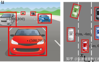
 Choose camera or lidar? A recent review on achieving robust 3D object detection
Jan 26, 2024 am 11:18 AM
Choose camera or lidar? A recent review on achieving robust 3D object detection
Jan 26, 2024 am 11:18 AM
0.Written in front&& Personal understanding that autonomous driving systems rely on advanced perception, decision-making and control technologies, by using various sensors (such as cameras, lidar, radar, etc.) to perceive the surrounding environment, and using algorithms and models for real-time analysis and decision-making. This enables vehicles to recognize road signs, detect and track other vehicles, predict pedestrian behavior, etc., thereby safely operating and adapting to complex traffic environments. This technology is currently attracting widespread attention and is considered an important development area in the future of transportation. one. But what makes autonomous driving difficult is figuring out how to make the car understand what's going on around it. This requires that the three-dimensional object detection algorithm in the autonomous driving system can accurately perceive and describe objects in the surrounding environment, including their locations,
 CLIP-BEVFormer: Explicitly supervise the BEVFormer structure to improve long-tail detection performance
Mar 26, 2024 pm 12:41 PM
CLIP-BEVFormer: Explicitly supervise the BEVFormer structure to improve long-tail detection performance
Mar 26, 2024 pm 12:41 PM
Written above & the author’s personal understanding: At present, in the entire autonomous driving system, the perception module plays a vital role. The autonomous vehicle driving on the road can only obtain accurate perception results through the perception module. The downstream regulation and control module in the autonomous driving system makes timely and correct judgments and behavioral decisions. Currently, cars with autonomous driving functions are usually equipped with a variety of data information sensors including surround-view camera sensors, lidar sensors, and millimeter-wave radar sensors to collect information in different modalities to achieve accurate perception tasks. The BEV perception algorithm based on pure vision is favored by the industry because of its low hardware cost and easy deployment, and its output results can be easily applied to various downstream tasks.
 Paint 3D in Windows 11: Download, Installation, and Usage Guide
Apr 26, 2023 am 11:28 AM
Paint 3D in Windows 11: Download, Installation, and Usage Guide
Apr 26, 2023 am 11:28 AM
When the gossip started spreading that the new Windows 11 was in development, every Microsoft user was curious about how the new operating system would look like and what it would bring. After speculation, Windows 11 is here. The operating system comes with new design and functional changes. In addition to some additions, it comes with feature deprecations and removals. One of the features that doesn't exist in Windows 11 is Paint3D. While it still offers classic Paint, which is good for drawers, doodlers, and doodlers, it abandons Paint3D, which offers extra features ideal for 3D creators. If you are looking for some extra features, we recommend Autodesk Maya as the best 3D design software. like
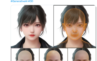 Get a virtual 3D wife in 30 seconds with a single card! Text to 3D generates a high-precision digital human with clear pore details, seamlessly connecting with Maya, Unity and other production tools
May 23, 2023 pm 02:34 PM
Get a virtual 3D wife in 30 seconds with a single card! Text to 3D generates a high-precision digital human with clear pore details, seamlessly connecting with Maya, Unity and other production tools
May 23, 2023 pm 02:34 PM
ChatGPT has injected a dose of chicken blood into the AI industry, and everything that was once unthinkable has become basic practice today. Text-to-3D, which continues to advance, is regarded as the next hotspot in the AIGC field after Diffusion (images) and GPT (text), and has received unprecedented attention. No, a product called ChatAvatar has been put into low-key public beta, quickly garnering over 700,000 views and attention, and was featured on Spacesoftheweek. △ChatAvatar will also support Imageto3D technology that generates 3D stylized characters from AI-generated single-perspective/multi-perspective original paintings. The 3D model generated by the current beta version has received widespread attention.
 An in-depth interpretation of the 3D visual perception algorithm for autonomous driving
Jun 02, 2023 pm 03:42 PM
An in-depth interpretation of the 3D visual perception algorithm for autonomous driving
Jun 02, 2023 pm 03:42 PM
For autonomous driving applications, it is ultimately necessary to perceive 3D scenes. The reason is simple. A vehicle cannot drive based on the perception results obtained from an image. Even a human driver cannot drive based on an image. Because the distance of objects and the depth information of the scene cannot be reflected in the 2D perception results, this information is the key for the autonomous driving system to make correct judgments on the surrounding environment. Generally speaking, the visual sensors (such as cameras) of autonomous vehicles are installed above the vehicle body or on the rearview mirror inside the vehicle. No matter where it is, what the camera gets is the projection of the real world in the perspective view (PerspectiveView) (world coordinate system to image coordinate system). This view is very similar to the human visual system,
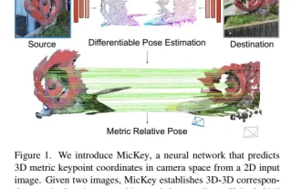 The latest from Oxford University! Mickey: 2D image matching in 3D SOTA! (CVPR\'24)
Apr 23, 2024 pm 01:20 PM
The latest from Oxford University! Mickey: 2D image matching in 3D SOTA! (CVPR\'24)
Apr 23, 2024 pm 01:20 PM
Project link written in front: https://nianticlabs.github.io/mickey/ Given two pictures, the camera pose between them can be estimated by establishing the correspondence between the pictures. Typically, these correspondences are 2D to 2D, and our estimated poses are scale-indeterminate. Some applications, such as instant augmented reality anytime, anywhere, require pose estimation of scale metrics, so they rely on external depth estimators to recover scale. This paper proposes MicKey, a keypoint matching process capable of predicting metric correspondences in 3D camera space. By learning 3D coordinate matching across images, we are able to infer metric relative
