CSS achieves the effect of text wrapping around images
This article mainly introduces in detail the problems and solutions encountered by CSS text wrapping images. Interested friends can refer to
CSS to achieve text wrapping image effects
Wrap text around the picture. In Word, just right-click and adjust the properties. But there are no direct attributes in HTML documents. So we can use CSS to achieve this effect.
We first set the float parameter. If the image needs to be left aligned, set it to left, if it needs to be right aligned, set it to: right. In addition, we can also set the space between pictures and text as needed, and CSS padding also applies.
Example:
<img style="float:left;padding:20px 20px 20px 20px;" src="/Upic.jpg">
Insert this image identification statement into the middle of the text on the page, and it’s OK!
(1) Example of text wrapping image
<head>
<meta http-equiv="Content-Type" content="text/html; charset=gb2312" />
<title>文字环绕</title>
<style>
p {
width:300px;
border:1px solid green
}
img {
float:left;
width:120px;
height:120px
}
</style>
</head>
<body>
<p>
<img src="img.gif" alt="图片" />
文字环绕文字环绕文字环绕文字环绕文字环绕文字环绕文字环绕文字环绕文字环绕文字环绕文字环绕文字环绕文字环绕文字环绕文字环绕文字环绕文字环绕文字环绕文字环绕文字环绕文字环绕文字环绕文字环绕文字环绕文字环绕文字环绕文字环绕文字环绕文字环绕文字环绕</p>
</body>
</html>Rendering:
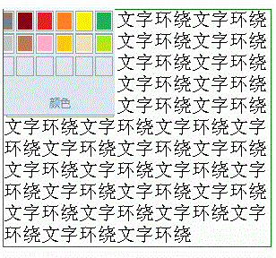
(2) Problems and solutions encountered with CSS text surrounding images:
1. Preface
I need to achieve the effect of text surrounding the picture, I thought it would be so easy.
1) Code part
<style> .img-left { border: 3px solid #005588; width:300px; } .img-left img { float:left; /* 对图片进行浮动就可以实现了 */ width:150px; } </style> <p> <img src="https://ss0.bdstatic.com/5aV1bjqh_Q23odCf/static/superman/img/logo/bd_logo1_31bdc765.png" alt="pic"/>This is a Chinese paragraph This is a Chinese paragraph This is a Chinese paragraph This is a Chinese paragraph This is a Chinese paragraph This is a Chinese paragraph This is a Chinese paragraph This is a Chinese paragraph This is a Chinese paragraph This is a Chinese paragraph This is a Chinese paragraph This is a Chinese paragraph This is a Chinese paragraph This is a Chinese paragraph This is a Chinese paragraph This is a Chinese paragraph This is a Chinese paragraph This is a Chinese paragraph This is a Chinese paragraph This is a Chinese paragraph This is a Chinese paragraph This is a Chinese paragraph This is a Chinese paragraph This is a Chinese paragraph This is a Chinese paragraph This is a Chinese paragraph This is a Chinese paragraph This is a Chinese paragraph
2) Rendering

It is easy to get the desired effect. The most critical code: just float the image to the left. Isn’t this quite simple?
2. Problems encountered
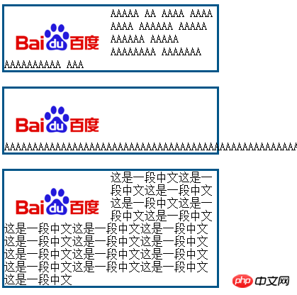
When replacing the middle text with consecutive English letters, a problem occurs, as shown in the figure

So I searched for relevant information, and after testing the results, I found:
When the browser parses English or numbers by default, it parses according to words.
In other words, each word is a whole, and when there is insufficient space, the word will not be split.
That’s why the above situation occurs.
Last comparison chart
3. Solution
Thinking: Are there any relevant attributes in CSS? , can the text be forced to wrap?
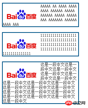
The answer is of course: word-break: break-all;
This will solve the problem.
##4. Postscript: word-wrap, word-break
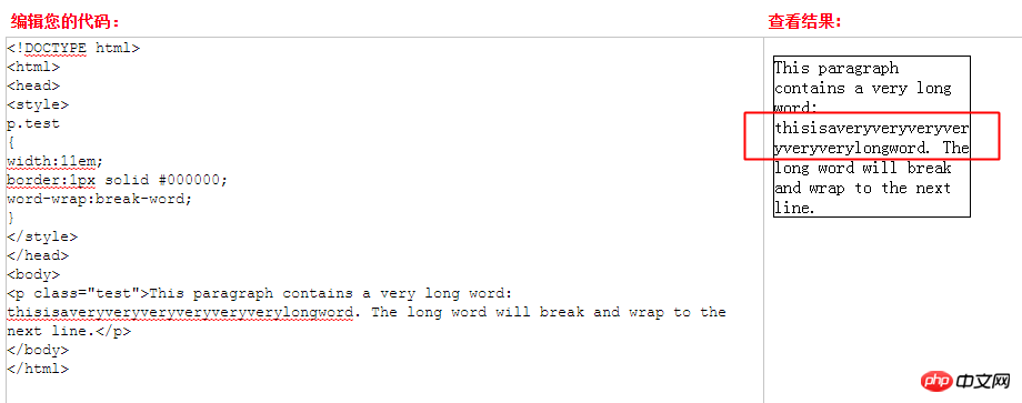
Looking for information When I checked, I found that there is another attribute: word-wrap: break-word; Why are there duplicate attributes? In fact, this is not the case. I searched for information again and found that there is still a difference between the two: 1) word-wrap: break-word;--long words are allowed Wrap to next line. When the length of a word exceeds the width of p, it will not wrap by default: as shown below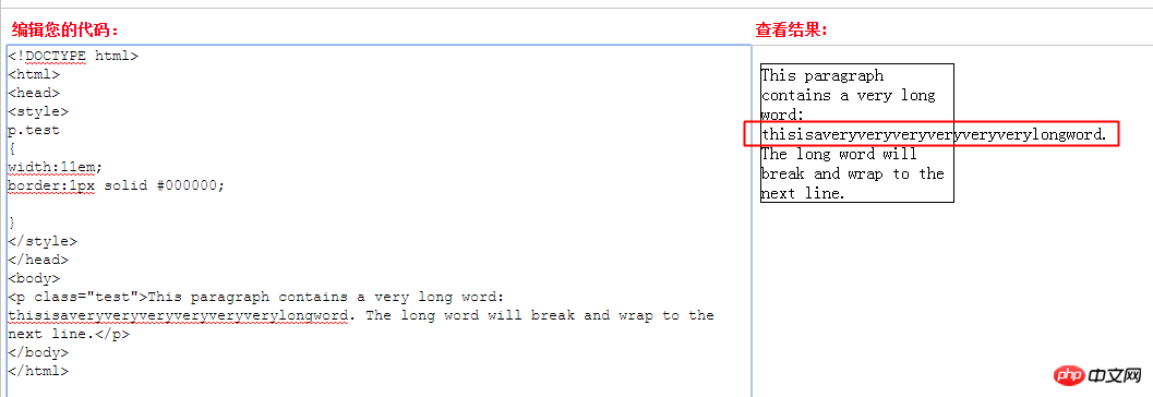
Use CSS3 to achieve Material Design effect
How to use RGBa to adjust transparency in CSS3
The above is the detailed content of CSS achieves the effect of text wrapping around images. For more information, please follow other related articles on the PHP Chinese website!

Hot AI Tools

Undresser.AI Undress
AI-powered app for creating realistic nude photos

AI Clothes Remover
Online AI tool for removing clothes from photos.

Undress AI Tool
Undress images for free

Clothoff.io
AI clothes remover

Video Face Swap
Swap faces in any video effortlessly with our completely free AI face swap tool!

Hot Article

Hot Tools

Notepad++7.3.1
Easy-to-use and free code editor

SublimeText3 Chinese version
Chinese version, very easy to use

Zend Studio 13.0.1
Powerful PHP integrated development environment

Dreamweaver CS6
Visual web development tools

SublimeText3 Mac version
God-level code editing software (SublimeText3)

Hot Topics
 1387
1387
 52
52
 Building an Ethereum app using Redwood.js and Fauna
Mar 28, 2025 am 09:18 AM
With the recent climb of Bitcoin’s price over 20k $USD, and to it recently breaking 30k, I thought it’s worth taking a deep dive back into creating Ethereum
 Vue 3
Apr 02, 2025 pm 06:32 PM
It's out! Congrats to the Vue team for getting it done, I know it was a massive effort and a long time coming. All new docs, as well.
 Can you get valid CSS property values from the browser?
Apr 02, 2025 pm 06:17 PM
I had someone write in with this very legit question. Lea just blogged about how you can get valid CSS properties themselves from the browser. That's like this.
 A bit on ci/cd
Apr 02, 2025 pm 06:21 PM
I'd say "website" fits better than "mobile app" but I like this framing from Max Lynch:
 Stacked Cards with Sticky Positioning and a Dash of Sass
Apr 03, 2025 am 10:30 AM
The other day, I spotted this particularly lovely bit from Corey Ginnivan’s website where a collection of cards stack on top of one another as you scroll.
 Using Markdown and Localization in the WordPress Block Editor
Apr 02, 2025 am 04:27 AM
If we need to show documentation to the user directly in the WordPress editor, what is the best way to do it?
 Comparing Browsers for Responsive Design
Apr 02, 2025 pm 06:25 PM
There are a number of these desktop apps where the goal is showing your site at different dimensions all at the same time. So you can, for example, be writing
 Let's use (X, X, X, X) for talking about specificity
Mar 24, 2025 am 10:37 AM
I was just chatting with Eric Meyer the other day and I remembered an Eric Meyer story from my formative years. I wrote a blog post about CSS specificity, and


