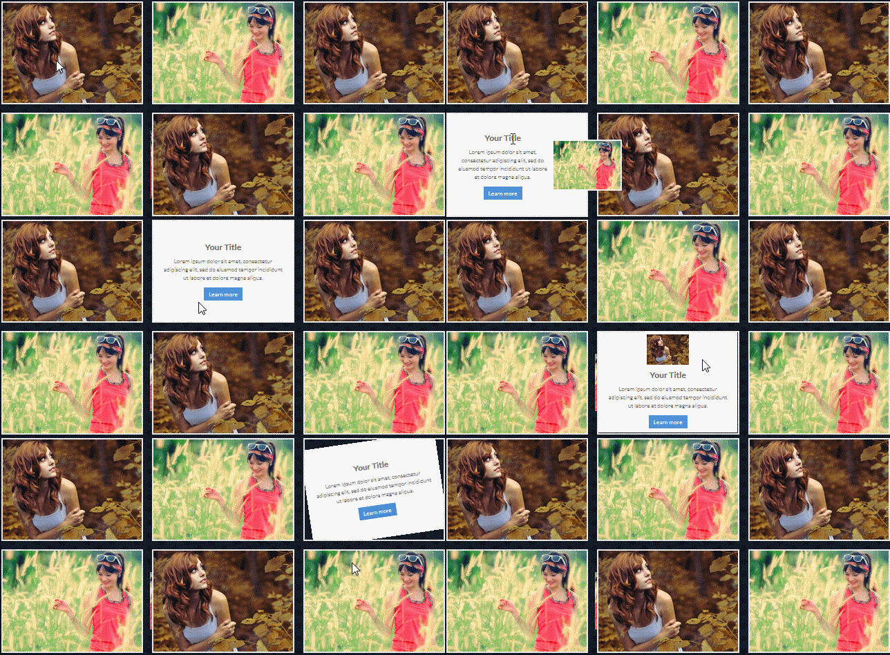
This article mainly shares with you 8 sets of super cool pure CSS3 mouse-over picture animation effects. Each animation effect is very exciting and worth learning from. Interested friends can refer to it
This is a super cool pure CSS3 mouse-over picture animation effect. It is divided into 8 different groups of effects. They display the mask layer and picture title in different ways when the mouse slides over the picture. . Each set of effects is divided into 3 different mouse-over picture effects.
These animation effects when the mouse slides over the picture are all completed using CSS3. They include: sliding effect, tilt effect, flip effect, rotation effect, etc. The following is a preview picture of a GIF.

Usage method
Introduce the hover-effects.css file into the page.
<link rel="stylesheet" href="css/hover-effects.css" />
HTML structure
Take one of the mouse-over-picture animation effects as an example. Its HTML structure is as follows:
<p class="effect-1">
   <p class="image-box">
      <img src="img-2.jpg" alt="Image-3">
   </p>
   <p class="text-desc">
      <h3>Your Title</h3>
      <p>......</p>
      <a href="#" class="btn">Learn more</a>
   </p>
</p>CSS Style
.effect-1{
  float: left;
  width: 340px;
  position: relative;
  overflow: hidden;
  text-align: center;
  border: 4px solid rgba(255, 255, 255, 0.9);
  overflow: visible;
}
.effect-1 img{
  transition: 0.5s;
}
.effect-1:hover img{
  transform: scale(0.3) translateY(-110%);
  position: relative;
  z-index: 9;
} .effect-1 .text-desc{
  transform: translateY(100%);
  opacity: 0;
  padding: 85px 20px 10px;
  transition: 0.5s;
} .effect-1:hover .text-desc{
  transform: translateY(0px);
  opacity: 1;
}The above is the entire content of this article. I hope it will be helpful to everyone’s study. For more related content, please pay attention to the PHP Chinese website!
Related recommendations:
Use SVG and CSS3 to implement cool border animation
CSS3 to implement mouse-over display of expanded content
CSS to achieve the effect of text surrounding images
The above is the detailed content of Using CSS3 to implement eight groups of super cool mouse-over picture animations. For more information, please follow other related articles on the PHP Chinese website!


