This article mainly introduces the detailed explanation of the mobile attributes of the CSS3 learning series. The content is quite good. I will share it with you now and give it as a reference.
transform function
Zoom
Use the sacle method to realize the scaling of text or images, specified in the parameters Zoom ratio, for example, sacle(0.5) means to reduce the size by 50%. The example is as follows:
<!DOCTYPE html>
<html lang="en">
<head>
    <meta charset="UTF-8">
    <title>scale方法使用示例</title>
    <style>
        p {
            width: 300px;
            margin: 150px auto;
            background-color: yellow;
            text-align: center;
            -webkit-transform: scale(0.5);
            -moz-transform: scale(0.5);
            -o-transform: scale(0.5);
        }
    </style>
</head>
<body>
<p>示例文字</p>
</body>
</html>In addition, you can specify the horizontal magnification and vertical magnification of the element separately. Magnification, examples are as follows:
<!DOCTYPE html>
<html lang="en">
<head>
    <meta charset="UTF-8">
    <title>scale方法使用示例</title>
    <style>
        p {
            width: 300px;
            margin: 150px auto;
            background-color: yellow;
            text-align: center;
            -webkit-transform: scale(0.5,2);
            -moz-transform: scale(0.5,2);
            -o-transform: scale(0.5,2);
        }
    </style>
</head>
<body>
<p>示例文字</p>
</body>
</html>Tilt
Use the skew method to implement text Or image tilt processing, specify the tilt angle in the horizontal direction and the tilt angle in the vertical direction respectively in the parameters. For example, "skew(30deg,30deg)" means tilting 30 degrees in the horizontal direction and tilting 30 degrees in the vertical direction. The example is as follows :
<!DOCTYPE html>
<html lang="en">
<head>
    <meta charset="UTF-8">
    <title>skew方法使用示例</title>
    <style>
        p {
            width: 300px;
            margin: 150px auto;
            background-color: yellow;
            text-align: center;
            -webkit-transform: skew(30deg, 30deg);
            -moz-transform: skew(30deg,30deg);
            -o-transform: skew(30deg,30deg);
        }
    </style>
</head>
<body>
<p>示例文字</p>
</body>
</html>Rotation
Use the rotate method to rotate the element, with one parameter. "Angle", the unit deg means degree, a positive number means clockwise rotation, and a negative number means counterclockwise rotation. Examples are as follows:
<!DOCTYPE html>
<html lang="en">
<head>
    <meta charset="UTF-8">
    <title>对元素使用多重变形的示例</title>
    <style>
        p {
            margin: 100px;
            width: 300px;
            background-color: yellow;
            text-align: center;
            -webkit-transform:rotate(30deg);
            -moz-transform:rotate(30deg);
            -o-transform:rotate(30deg);
        }
    </style>
</head>
<body>
<p>示例文字</p>
</body>
</html>Move
Use the translate method to translate text or images To move, specify the moving distance in the horizontal direction and the moving distance in the vertical direction in the parameters. For example:
<!DOCTYPE html>
<html lang="en">
<head>
    <meta charset="UTF-8">
    <title>translate方法使用示例</title>
    <style>
        p {
            width: 300px;
            margin: 150px auto;
            background-color: yellow;
            text-align: center;
            -webkit-transform: translate(50px,50px);
            -moz-transform: translate(50px,50px);
            -o-transform: translate(50px,50px);
        }
    </style>
</head>
<body>
<p>示例文字</p>
</body>
</html>Deformation example
Example 1:
<!DOCTYPE html>
<html lang="en">
<head>
    <meta charset="UTF-8">
    <title>对元素使用多重变形的示例</title>
    <style>
        p {
            width: 300px;
            background-color: yellow;
            text-align: center;
            -webkit-transform: translate(150px,200px) rotate(45deg) scale(1.5);
            -moz-transform: translate(50px,50px) rotate(45deg) scale(1.5);
            -o-transform: translate(50px,50px) rotate(45deg) scale(1.5);
        }
    </style>
</head>
<body>
<p>示例文字</p>
</body>
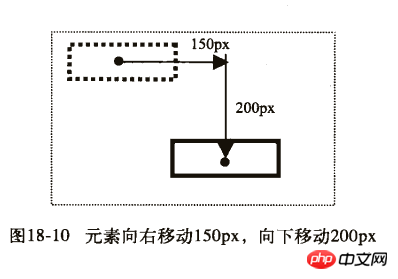
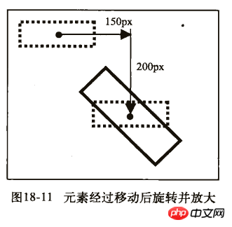
</html>This example is to move first, then rotate, and finally scale
Effect:

Example 2 :
<!DOCTYPE html>
<html lang="en">
<head>
    <meta charset="UTF-8">
    <title>对元素使用多重变形的示例</title>
    <style>
        p {
            width: 300px;
            background-color: yellow;
            text-align: center;
            -webkit-transform:rotate(45deg) scale(1.5) translate(150px,200px);
            -moz-transform:rotate(45deg) scale(1.5) translate(150px,200px);
            -o-transform: rotate(45deg) scale(1.5) translate(150px,200px);
        }
    </style>
</head>
<body>
<p>示例文字</p>
</body>
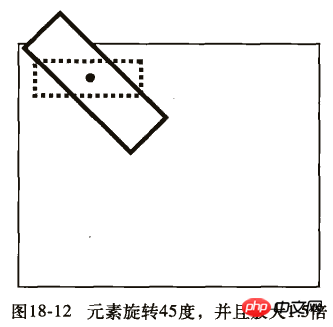
</html>First rotate, then scale, and finally move
Effect:

We can see from the running results of the two examples that the positions of the elements on the two pages are not the same. Let’s take a look at their detailed steps:
First example:
1) First move 150px to the right and 200px down.

2) Then rotate 45 degrees and magnify 1.5 times.

Second example:
1) First rotate 45 degrees and magnify 1.5 times.

2) Then move 150px to the right and 200px down.

The above is the entire content of this article. I hope it will be helpful to everyone’s study. For more related content, please pay attention to the PHP Chinese website!
Related recommendations:
How to use the table-layout attribute of CSS
About the use of the background-attachment attribute of css
The above is the detailed content of Analysis of mobile attributes in css3. For more information, please follow other related articles on the PHP Chinese website!
 css3 tutorial
 What are the css3 gradient properties?
 How to write triangle in css
 How to use the month function
 What does the rm-rf command mean in linux?
 oracle add trigger method
 Which platform is better for virtual currency trading?
 What are the new features of Hongmeng 3.0?
 How to use videos in java


