
 Web Front-end
CSS Tutorial
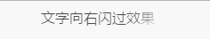
Use CSS3 to achieve the flashing effect of text looping to the right
Web Front-end
CSS Tutorial
Use CSS3 to achieve the flashing effect of text looping to the right
Use CSS3 to achieve the flashing effect of text looping to the right

This article mainly shares with you the relevant information on using pure CSS3 to achieve the effect of text looping to the right. Due to compatibility issues, it is often used on mobile terminals, and the effect achieved is very good. The article gives details For the introduction and sample code, friends who need it can take a look below.
This article introduces the relevant information on using pure CSS3 to achieve the effect of text looping to the right. I won’t say much below. Let’s take a look at the sample code first.
Sample code:
<!DOCTYPE html>
<html lang="en">
    <head>
        <meta charset="utf-8">
        <style>
            .shadow {
                text-align: center;
                /* 背景颜色线性渐变 */
                    /* 老式写法 */
                        /* linear为线性渐变,也可以用下面的那种写法。left top,right top指的是渐变方向,左上到右上 */
                        /* color-stop函数,第一个表示渐变的位置,0为起点,0.5为中点,1为结束点;第二个表示该点的颜色。所以本次渐变为两边灰色,中间渐白色 */
                background: -webkit-gradient(linear, left top, right top, color-stop(0, #4d4d4d), color-stop(.4, #4d4d4d), color-stop(.5, white), color-stop(.6, #4d4d4d), color-stop(1, #4d4d4d));
                    /* 新式写法 */
                /* background: -webkit-linear-gradient(left top, right top, color-stop(0, #4d4d4d), color-stop(.4, #4d4d4d), color-stop(.5, white), color-stop(.6, #4d4d4d), color-stop(1, #4d4d4d)); */

                /* 设置为text,意思是把文本内容之外的背景给裁剪掉 */
                -webkit-background-clip: text;
                /* 设置对象中的文字填充颜色 这里设置为透明 */
                -webkit-text-fill-color: transparent;
                /* 每隔2秒调用下面的CSS3动画 infinite属性为循环执行animate */
                -webkit-animation: animate 1.5s infinite;
            }
            /* 兼容写法,要放在@keyframes前面 */
            @-webkit-keyframes animate {
                /* 背景从-100px的水平位置,移动到+100px的水平位置。如果要移动Y轴的,设置第二个数值 */
                from {background-position: -100px;}
                to {background-position: 100px;}
            }
            @keyframes animate {
                from {background-position: -100px;}
                to {background-position: 100px;}
            }
        </style>
    </head>
    <body>
        <p class="shadow">文字向右闪过效果</p>
    </body>
</html>This is the effect below Picture:
This white gradient flash effect is very easy and convenient to make with CSS3. The only disadvantage is probably the compatibility issue. So now it is generally used on mobile terminals.
Come, come! (Knocking on the blackboard) I think the code comments are relatively clear, so just draw the key points! ! !
1. infinite
2. -webkit-text-fill-color: transparent; The text fill color is transparent. If it is not set, the white gradient effect will not be visible!
3. -webkit-background-clip: text; Cut out the background outside the text content. If you don’t add it, the text will not be displayed and only the gradient color will be displayed!
4. Color-stop() The color-stop function of the gradient represents the position and color of the gradient. It is it. We can make the gradient wherever we want, and then let it move, and a flash will appear. A flash of effect!
Finally, let’s talk about the idea:
First, set a gradient background color with white in the middle and gray on both sides;
Secondly, set the text fill color Be transparent (only the white background can be seen);
Then, crop out the background color outside the text (only display the text);
Finally, use @keyframes to make the background white The loop executes from left to right.
The above is the entire content of this article. I hope it will be helpful to everyone's study. For more related content, please pay attention to the PHP Chinese website!
Related recommendations:
Code to use css3 to achieve text lighting effects
Picture magnifying glass effect implemented using CSS3
Use SVG and CSS3 to achieve cool border animation
The above is the detailed content of Use CSS3 to achieve the flashing effect of text looping to the right. For more information, please follow other related articles on the PHP Chinese website!

Hot AI Tools

Undresser.AI Undress
AI-powered app for creating realistic nude photos

AI Clothes Remover
Online AI tool for removing clothes from photos.

Undress AI Tool
Undress images for free

Clothoff.io
AI clothes remover

Video Face Swap
Swap faces in any video effortlessly with our completely free AI face swap tool!

Hot Article
Hot Tools

Notepad++7.3.1
Easy-to-use and free code editor

SublimeText3 Chinese version
Chinese version, very easy to use

Zend Studio 13.0.1
Powerful PHP integrated development environment

Dreamweaver CS6
Visual web development tools

SublimeText3 Mac version
God-level code editing software (SublimeText3)
Hot Topics
 1386
1386
 52
52

 How to make round pictures and text in ppt
Mar 26, 2024 am 10:23 AM
How to make round pictures and text in ppt
Mar 26, 2024 am 10:23 AM
First, draw a circle in PPT, then insert a text box and enter text content. Finally, set the fill and outline of the text box to None to complete the production of circular pictures and text.
 How to add dots to text in word?
Mar 19, 2024 pm 08:04 PM
How to add dots to text in word?
Mar 19, 2024 pm 08:04 PM
When we create Word documents on a daily basis, we sometimes need to add dots under certain words in the document, especially when there are test questions. To highlight this part of the content, the editor will share with you the tips on how to add dots to text in Word. I hope it can help you. 1. Open a blank word document. 2. For example, add dots under the words "How to add dots to text". 3. We first select the words "How to add dots to text" with the left mouse button. Note that if you want to add dots to that word in the future, you must first use the left button of the mouse to select which word. Today we are adding dots to these words, so we have chosen several words. Select these words, right-click, and click Font in the pop-up function box. 4. Then something like this will appear
 Use CSS skillfully to realize various strange-shaped buttons (with code)
Jul 19, 2022 am 11:28 AM
Use CSS skillfully to realize various strange-shaped buttons (with code)
Jul 19, 2022 am 11:28 AM
This article will show you how to use CSS to easily realize various weird-shaped buttons that appear frequently. I hope it will be helpful to you!
 Golang Image Processing: Learn How to Add Watermarks and Text
Aug 17, 2023 am 08:41 AM
Golang Image Processing: Learn How to Add Watermarks and Text
Aug 17, 2023 am 08:41 AM
Golang Image Processing: Learn How to Add Watermarks and Text Quotes: In the modern era of digitalization and social media, image processing has become an important skill. Whether for personal use or business operations, adding watermarks and text are common needs. In this article, we will explore how to use Golang for image processing and learn how to add watermarks and text. Background: Golang is an open source programming language known for its concise syntax, efficient performance and powerful concurrency capabilities. it has become the subject of many developments
 How to use mobile gesture operations in Vue projects
Oct 08, 2023 pm 07:33 PM
How to use mobile gesture operations in Vue projects
Oct 08, 2023 pm 07:33 PM
How to use mobile gesture operations in Vue projects With the popularity of mobile devices, more and more applications need to provide a more friendly interactive experience on the mobile terminal. Gesture operation is one of the common interaction methods on mobile devices, which allows users to complete various operations by touching the screen, such as sliding, zooming, etc. In the Vue project, we can implement mobile gesture operations through third-party libraries. The following will introduce how to use gesture operations in the Vue project and provide specific code examples. First, we need to introduce a special
 How to modify text on pictures
Aug 29, 2023 am 10:29 AM
How to modify text on pictures
Aug 29, 2023 am 10:29 AM
Modifying the text on the image can be done by using image editing software, online tools or screenshot tools. The specific steps are: 1. Open the picture editing software and import the picture that needs to be modified; 2. Select the text tool; 3. Click the text area on the picture to create a text box; 4. Enter the text you want in the text box. 5. If you just want to delete the text on the picture, you can use the eraser tool or the selection tool to select and delete the text area.
 Solve the problem of multi-touch points on Vue mobile terminal
Jun 30, 2023 pm 01:06 PM
Solve the problem of multi-touch points on Vue mobile terminal
Jun 30, 2023 pm 01:06 PM
In mobile development, we often encounter the problem of multi-finger touch. When users use multiple fingers to swipe or zoom the screen on a mobile device, how to accurately recognize and respond to these gestures is an important development challenge. In Vue development, we can take some measures to solve the problem of multi-finger touch on the mobile terminal. 1. Use the vue-touch plug-in vue-touch is a gesture plug-in for Vue, which can easily handle multi-finger touch events on the mobile side. We can install vue-to via npm
 How to implement lace borders in css3
Sep 16, 2022 pm 07:11 PM
How to implement lace borders in css3
Sep 16, 2022 pm 07:11 PM
In CSS, you can use the border-image attribute to achieve a lace border. The border-image attribute can use images to create borders, that is, add a background image to the border. You only need to specify the background image as a lace style; the syntax "border-image: url (image path) offsets the image border width inward. Whether outset is repeated;".
