

About the use of window units and percentage units in CSS

This article mainly introduces the detailed use of window units and percentage units in CSS. It is the basic knowledge for introductory learning of CSS. Friends in need can refer to
Window (Viewport) Unit
Viewport units are relative units, meaning they have no objective size. Their size is determined by the viewport size. The following are four units related to the viewport. 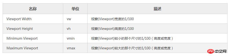
I will focus on the first two units since they are more likely to be used.
In many cases, viewport units (vh and vw) and percentage units overlap in terms of what they can accomplish. However, each of them has its distinct advantages and disadvantages. To summarize:
When dealing with width, the % unit is more appropriate. When dealing with heights, vh units are better.
Element that takes up full width: % > vw
As I mentioned, the vw unit determines its size based on the width of the viewport. However, the browser calculates the window size based on the browser window, including space for scroll bars. 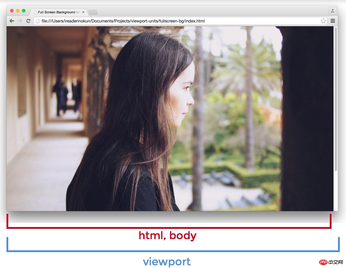
If the page extends beyond the height of the viewport - scroll bars appear - the width of the viewport will be larger than the width of the html element.
Viewport > html > body
So, if you set an element to 100vw, this element will extend beyond the scope of the html and body elements. In this example, I wrap the html element with a red border and then set the background color for the section element. 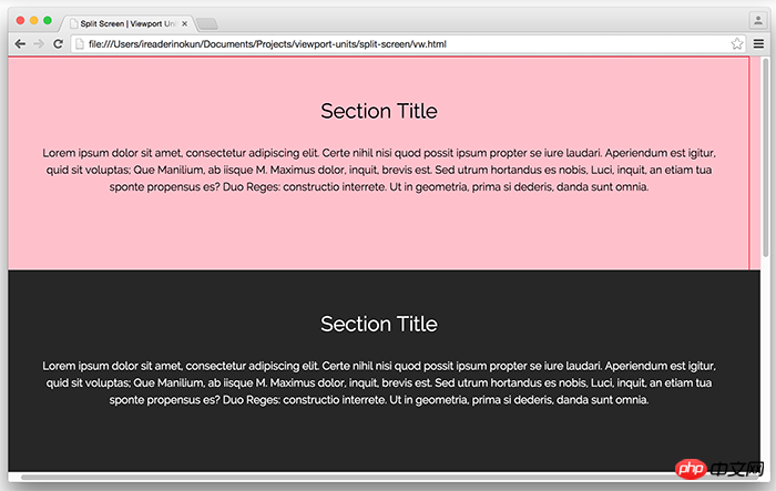
Because of this subtle difference, when making an element span the entire width of the page, it's better to use percentage units rather than the width of the viewport.
Full-height elements: vh > %
On the other hand, vh is far better than the percentage unit when making an element span the entire height of the page.
Because the size of an element defined in percentage is determined by its parent element, we can have an element that fills the entire height of the screen only if the parent element also fills the entire height of the screen. This usually means that we have to position the element to be fixed, in order to make the element's parent element an html element, or rely on some program.
However, with vh, it is as simple as writing:
.example {
  height: 100vh;
}No matter how nested the .example element is, it can still be sized relative to the window size . The issue of scroll bars isn't a problem either, since most pages these days don't usually have horizontal scroll bars.
Here are some examples of how we can use vh units to easily create some designs.
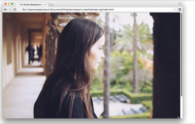
Full screen background image
A typical use of the vh unit is to create a background image that spans the entire height and width of the screen, regardless of the size of the device. This is easy to achieve with vh:
.bg {
  position: relative;
  background: url('bg.jpg') center/cover;
  width: 100%;
  height: 100vh;
}
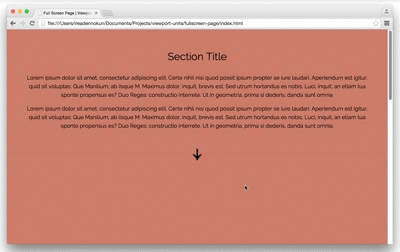
##The content block that takes up the full screen is like "multi-page"
Similarly, we can also achieve a "multi-page" effect by making each content block of the page span the entire height and width of the viewport.section {
width: 100%;
height: 100vh;
}
$('nav').on('click', function() {
  if ( $(this).hasClass('down') ) {
    var movePos = $(window).scrollTop() + $(window).height();
  }
  if ( $(this).hasClass('up') ) {
    var movePos = $(window).scrollTop() - $(window).height();
  }
  $('html, body').animate({
    scrollTop: movePos
  }, 1000);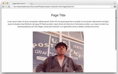
})Pictures in the area
img {
      width: auto; /* 图片宽度根据高度按比例调整*/
      max-width: 100%; /* 图片不超过父元素的宽度 */
      max-height: 90vh; /* 图片不超过视口的高度 */
      margin: 2rem auto;
    }
Browser support
Because these units are relatively new, there are still some issues when used in some browsers. Here is how to solve these problems -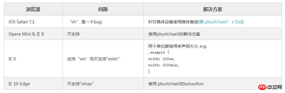
Analysis of weight, cascading and importance (!important) in CSS
Utilization CSS3 realizes the flashing effect of text looping to the right
How to implement a custom "W" shaped running trajectory in CSS3
The above is the detailed content of About the use of window units and percentage units in CSS. For more information, please follow other related articles on the PHP Chinese website!

Hot AI Tools

Undresser.AI Undress
AI-powered app for creating realistic nude photos

AI Clothes Remover
Online AI tool for removing clothes from photos.

Undress AI Tool
Undress images for free

Clothoff.io
AI clothes remover

Video Face Swap
Swap faces in any video effortlessly with our completely free AI face swap tool!

Hot Article
Hot Tools

Notepad++7.3.1
Easy-to-use and free code editor

SublimeText3 Chinese version
Chinese version, very easy to use

Zend Studio 13.0.1
Powerful PHP integrated development environment

Dreamweaver CS6
Visual web development tools

SublimeText3 Mac version
God-level code editing software (SublimeText3)
Hot Topics
 1393
1393
 52
1207
24
52
1207
24

 How to use bootstrap in vue
Apr 07, 2025 pm 11:33 PM
How to use bootstrap in vue
Apr 07, 2025 pm 11:33 PM
Using Bootstrap in Vue.js is divided into five steps: Install Bootstrap. Import Bootstrap in main.js. Use the Bootstrap component directly in the template. Optional: Custom style. Optional: Use plug-ins.
 The Roles of HTML, CSS, and JavaScript: Core Responsibilities
Apr 08, 2025 pm 07:05 PM
The Roles of HTML, CSS, and JavaScript: Core Responsibilities
Apr 08, 2025 pm 07:05 PM
HTML defines the web structure, CSS is responsible for style and layout, and JavaScript gives dynamic interaction. The three perform their duties in web development and jointly build a colorful website.
 How to write split lines on bootstrap
Apr 07, 2025 pm 03:12 PM
How to write split lines on bootstrap
Apr 07, 2025 pm 03:12 PM
There are two ways to create a Bootstrap split line: using the tag, which creates a horizontal split line. Use the CSS border property to create custom style split lines.
 Understanding HTML, CSS, and JavaScript: A Beginner's Guide
Apr 12, 2025 am 12:02 AM
Understanding HTML, CSS, and JavaScript: A Beginner's Guide
Apr 12, 2025 am 12:02 AM
WebdevelopmentreliesonHTML,CSS,andJavaScript:1)HTMLstructurescontent,2)CSSstylesit,and3)JavaScriptaddsinteractivity,formingthebasisofmodernwebexperiences.
 How to resize bootstrap
Apr 07, 2025 pm 03:18 PM
How to resize bootstrap
Apr 07, 2025 pm 03:18 PM
To adjust the size of elements in Bootstrap, you can use the dimension class, which includes: adjusting width: .col-, .w-, .mw-adjust height: .h-, .min-h-, .max-h-
 How to use bootstrap button
Apr 07, 2025 pm 03:09 PM
How to use bootstrap button
Apr 07, 2025 pm 03:09 PM
How to use the Bootstrap button? Introduce Bootstrap CSS to create button elements and add Bootstrap button class to add button text
 How to set up the framework for bootstrap
Apr 07, 2025 pm 03:27 PM
How to set up the framework for bootstrap
Apr 07, 2025 pm 03:27 PM
To set up the Bootstrap framework, you need to follow these steps: 1. Reference the Bootstrap file via CDN; 2. Download and host the file on your own server; 3. Include the Bootstrap file in HTML; 4. Compile Sass/Less as needed; 5. Import a custom file (optional). Once setup is complete, you can use Bootstrap's grid systems, components, and styles to create responsive websites and applications.
 How to insert pictures on bootstrap
Apr 07, 2025 pm 03:30 PM
How to insert pictures on bootstrap
Apr 07, 2025 pm 03:30 PM
There are several ways to insert images in Bootstrap: insert images directly, using the HTML img tag. With the Bootstrap image component, you can provide responsive images and more styles. Set the image size, use the img-fluid class to make the image adaptable. Set the border, using the img-bordered class. Set the rounded corners and use the img-rounded class. Set the shadow, use the shadow class. Resize and position the image, using CSS style. Using the background image, use the background-image CSS property.
