 WeChat Applet
 Mini Program Development
 Introduction to UI and container components in WeChat mini programs
Introduction to UI and container components in WeChat mini programs
This article mainly introduces the relevant information on the summary of WeChat Mini Program UI and container components. Friends in need can refer to the following
Summary of WeChat Mini Program UI and Container Components
1. Summary and overview
2. Container component
2.1 Component container (view)
2.2 Scroll-view container (scroll-view)
2.3 Slider view container (swiper)
1. Summary and overview
1.1 UI component summary diagram 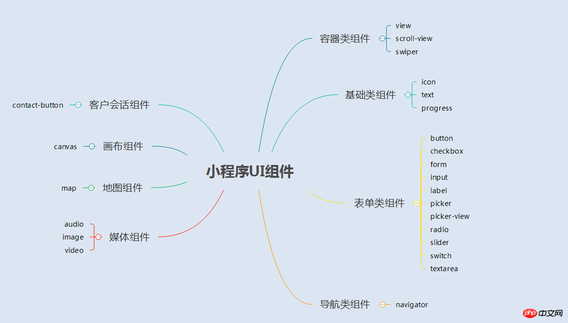
1.2 Overview
The UI component of the applet is a series of tags that define the user interface, similar to html tags. A complete user response process: event triggering——>UI component receives event——>trigger js function to respond to event——>update UI
2. Container component
2.1 Container component (view)
(1) Summary

(2) Example
Rendering

<view>
 <text class="row-view-title">水平布局:</text>
 <view class="flex-wrp-row">
  <view class="flex-item-red" hover="true" hover-class="hover-style"><text class="color-text">red</text></view>
  <view class="flex-item-green" hover="true" hover-class="hover-style"><text class="color-text">green</text></view>
  <view class="flex-item-blue" hover="true" hover-class="hover-style"><text class="color-text">blue</text></view>
 </view>
</view>
<view>
 <text class="column-view-title">垂直布局:</text>
 <view class="flex-wrp-column" >
  <view class="flex-item-red" hover="true" hover-class="hover-style"><text class="color-text" >red</text></view>
  <view class="flex-item-green" hover="true" hover-class="hover-style"><text class="color-text">green</text></view>
  <view class="flex-item-blue" hover="true" hover-class="hover-style"><text class="color-text">blue</text></view>
 </view>
</view>
.flex-item-red{
 background-color: red;
 height: 200rpx;
 width: 200rpx;
 text-align: center;
 line-height: 200rpx;
}
.flex-item-green{
 background-color: green;
 height: 200rpx;
 width: 200rpx;
 text-align: center;
 line-height: 200rpx
}
.flex-item-blue{
 background-color: blue;
 height: 200rpx;
 width: 200rpx;
 text-align: center;
 line-height: 200rpx
}
.flex-wrp-row{
 flex-direction: row;
 display: flex;
 margin-left: 10rpx;
 margin-top: 20rpx;
}
.flex-wrp-column{
 flex-direction: column;
 display: flex;
 margin-left: 10rpx;
  margin-top: 20rpx;
}
.color-text{
 color: snow;
 font-family: 'Times New Roman', Times, serif;
 font-weight: bold;
}
.hover-style{
 background-color: black;
}
.row-view-title,.column-view-title{
 margin-left: 20rpx;
 font-family: 'Times New Roman', Times, serif;
 font-weight: bold;
}
/*重要属性:
 display: flex; //与display:box;是类似,是flexbox的最新语法格式,有更好的适配效果
 flex-direction: column; //表示子布局垂直布局
 flex-direction: row; //表示子布局为水平布局
*/2.2 Scroll-view Container(scroll-view)
(1) Summary
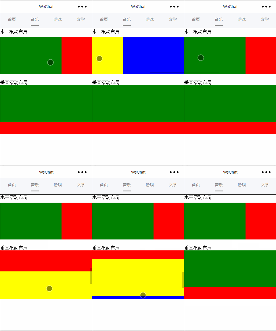
## page.wxml
<view>
<text>水平滚动布局</text>
</view>
<view class="x-view">
 <scroll-view class="scroll-view-x" scroll-x="true" bindscrolltoupper="scrollXToUpper" bindscrolltolower="scrollXToLower" bindscroll="scroll" scroll-left="0" scroll-into-view="{{green}}">
  <view id="green" class="x_green"></view>
  <view id="red" class="x_red"></view>
  <view id="yellow" class="x_yellow"></view>
  <view id="blue" class="x_blue"></view>
 </scroll-view>
</view>
<view>
<text>垂直滚动布局</text>
</view>
<view class="y-view">
 <scroll-view class="scroll-view-y" scroll-y="true" bindscrolltoupper="scrollYToUpper" bindscrolltolower="scrollYToLower" bindscroll="scroll" scroll-top="0" scroll-into-view="{{green}}">
  <view id="green" class="y_green"></view>
  <view id="red" class="y_red"></view>
  <view id="yellow" class="y_yellow"></view>
  <view id="blue" class="y_blue"></view>
 </scroll-view>
</view>page.wxss
.x_green{
 background-color: green;
 width: 500rpx;
 height: 300rpx;
 display: inline-flex;
}
.x_red{
 background-color: red;
 width: 500rpx;
 height: 300rpx;
 display: inline-flex;

}
.x_blue{
 background-color: blue;
 width: 500rpx;
 height: 300rpx;
 display: inline-flex;
}
.x_yellow{
 background-color: yellow;
 width: 500rpx;
 height: 300rpx;
 display: inline-flex;
}
.y_green{
 background-color: green;
 width: 100%;
 height: 300rpx;
}
.y_red{
 background-color: red;
 width: 100%;
 height: 300rpx;
}
.y_yellow{
 background-color: yellow;
 width: 100%;
 height: 300rpx;
}
.y_blue{
 background-color: blue;
 width: 100%;
 height: 300rpx;
}
.scroll-view-x{
 display: flex;
 white-space: nowrap;
 width: 100%;
 margin-bottom: 20px;
 margin-top: 10px;
 height: 300rpx;
}
.scroll-view-y{
 height: 400rpx;
}
/*重要属性:
 white-space: nowrap;//设置内部元素不换行显示,与display: inline-flex;属性联合使用才会有水平布局的效果
*/page.js
//index.js
//获取应用实例
var app = getApp()
//var color_index=['green','red','yellow','blue'];
Page({
 data:{
 toview:'red',
 },
/*滑动到左边触发*/
scrollXToUpper:function(){
 console.log('scrollXToUpper')
},
/*滑动到右边触发 */
scrollXToLower:function(){
 console.log('scrollXToLower')
},
/*滑动到顶部触发*/
scrollYToUpper:function(){
 console.log('scrollYToUpper')
},
/*滑动到左边触发 */
scrollYToLower:function(){
 console.log('scrollYToLower')
},
/*滑动触发 */
scroll:function(){
 console.log("scroll")
},
onLoad: function () {
 console.log('onLoad')
 var that = this
 },
})(1) Summary
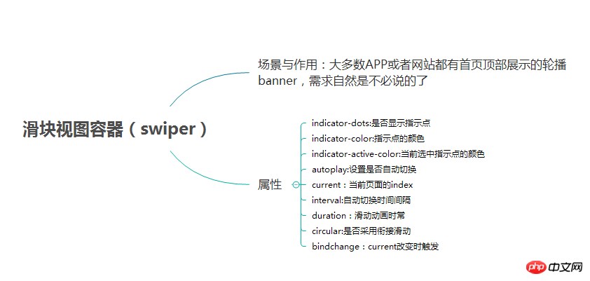
(2) Example
Rendering:
 ## page.wxml
<swiper data-current="0" current="0" bindchange="itemChangeFunc" circular="true" indicator-dots="{{indicatorDots}}"
 autoplay="{{autoplay}}" interval="{{interval}}" duration="{{duration}}">
 <block wx:for="{{imgUrls}}" wx:key="swiperkeys">
  <swiper-item>
  <image src="{{item}}" class="slide-image" width="355" height="150"/>
  </swiper-item>
 </block>
</swiper>//game.js
Page({
data: {
imgUrls: [
'/image/wechat.png',
'http://img02.tooopen.com/images/20150928/tooopen_sy_143912755726.jpg',
'http://img06.tooopen.com/images/20160818/tooopen_sy_175866434296.jpg',
'http://img06.tooopen.com/images/20160818/tooopen_sy_175833047715.jpg'
],
indicatorDots: true,
autoplay: true,
interval: 3000,
duration: 1000,
current:1,
},
durationChange: function(e) {
this.setData({
duration: e.detail.value
})
},
durationChange: function(e) {
this.setData({
duration: e.detail.value
})
},
itemChangeFunc:function(e){
// console.log(e.target.dataset.current)
console.log(e.detail)
}
})Introduction to the use of WeChat applet button component
How to use WeChat applet textarea
Introduction to WeChat applet chart plug-in (wx-charts)
The above is the detailed content of Introduction to UI and container components in WeChat mini programs. For more information, please follow other related articles on the PHP Chinese website!

Hot AI Tools

Undresser.AI Undress
AI-powered app for creating realistic nude photos

AI Clothes Remover
Online AI tool for removing clothes from photos.

Undress AI Tool
Undress images for free

Clothoff.io
AI clothes remover

AI Hentai Generator
Generate AI Hentai for free.

Hot Article

Hot Tools

Notepad++7.3.1
Easy-to-use and free code editor

SublimeText3 Chinese version
Chinese version, very easy to use

Zend Studio 13.0.1
Powerful PHP integrated development environment

Dreamweaver CS6
Visual web development tools

SublimeText3 Mac version
God-level code editing software (SublimeText3)

Hot Topics
 1377
1377
 52
52
 Xianyu WeChat mini program officially launched
Feb 10, 2024 pm 10:39 PM
Xianyu's official WeChat mini program has quietly been launched. In the mini program, you can post private messages to communicate with buyers/sellers, view personal information and orders, search for items, etc. If you are curious about what the Xianyu WeChat mini program is called, take a look now. What is the name of the Xianyu WeChat applet? Answer: Xianyu, idle transactions, second-hand sales, valuations and recycling. 1. In the mini program, you can post idle messages, communicate with buyers/sellers via private messages, view personal information and orders, search for specified items, etc.; 2. On the mini program page, there are homepage, nearby, post idle, messages, and mine. 5 functions; 3. If you want to use it, you must activate WeChat payment before you can purchase it;
 WeChat applet implements image upload function
Nov 21, 2023 am 09:08 AM
WeChat applet implements picture upload function With the development of mobile Internet, WeChat applet has become an indispensable part of people's lives. WeChat mini programs not only provide a wealth of application scenarios, but also support developer-defined functions, including image upload functions. This article will introduce how to implement the image upload function in the WeChat applet and provide specific code examples. 1. Preparatory work Before starting to write code, we need to download and install the WeChat developer tools and register as a WeChat developer. At the same time, you also need to understand WeChat
 Implement card flipping effects in WeChat mini programs
Nov 21, 2023 am 10:55 AM
Implementing card flipping effects in WeChat mini programs In WeChat mini programs, implementing card flipping effects is a common animation effect that can improve user experience and the attractiveness of interface interactions. The following will introduce in detail how to implement the special effect of card flipping in the WeChat applet and provide relevant code examples. First, you need to define two card elements in the page layout file of the mini program, one for displaying the front content and one for displaying the back content. The specific sample code is as follows: <!--index.wxml-->&l
 Alipay launched the 'Chinese Character Picking-Rare Characters' mini program to collect and supplement the rare character library
Oct 31, 2023 pm 09:25 PM
According to news from this site on October 31, on May 27 this year, Ant Group announced the launch of the "Chinese Character Picking Project", and recently ushered in new progress: Alipay launched the "Chinese Character Picking-Uncommon Characters" mini program to collect collections from the society Rare characters supplement the rare character library and provide different input experiences for rare characters to help improve the rare character input method in Alipay. Currently, users can enter the "Uncommon Characters" applet by searching for keywords such as "Chinese character pick-up" and "rare characters". In the mini program, users can submit pictures of rare characters that have not been recognized and entered by the system. After confirmation, Alipay engineers will make additional entries into the font library. This website noticed that users can also experience the latest word-splitting input method in the mini program. This input method is designed for rare words with unclear pronunciation. User dismantling
 Implement image filter effects in WeChat mini programs
Nov 21, 2023 pm 06:22 PM
Implementing picture filter effects in WeChat mini programs With the popularity of social media applications, people are increasingly fond of applying filter effects to photos to enhance the artistic effect and attractiveness of the photos. Picture filter effects can also be implemented in WeChat mini programs, providing users with more interesting and creative photo editing functions. This article will introduce how to implement image filter effects in WeChat mini programs and provide specific code examples. First, we need to use the canvas component in the WeChat applet to load and edit images. The canvas component can be used on the page
 Implement the drop-down menu effect in WeChat applet
Nov 21, 2023 pm 03:03 PM
To implement the drop-down menu effect in WeChat Mini Programs, specific code examples are required. With the popularity of mobile Internet, WeChat Mini Programs have become an important part of Internet development, and more and more people have begun to pay attention to and use WeChat Mini Programs. The development of WeChat mini programs is simpler and faster than traditional APP development, but it also requires mastering certain development skills. In the development of WeChat mini programs, drop-down menus are a common UI component, achieving a better user experience. This article will introduce in detail how to implement the drop-down menu effect in the WeChat applet and provide practical
 Use WeChat applet to achieve carousel switching effect
Nov 21, 2023 pm 05:59 PM
Use the WeChat applet to achieve the carousel switching effect. The WeChat applet is a lightweight application that is simple and efficient to develop and use. In WeChat mini programs, it is a common requirement to achieve carousel switching effects. This article will introduce how to use the WeChat applet to achieve the carousel switching effect, and give specific code examples. First, add a carousel component to the page file of the WeChat applet. For example, you can use the <swiper> tag to achieve the switching effect of the carousel. In this component, you can pass b
 What is the name of Xianyu WeChat applet?
Feb 27, 2024 pm 01:11 PM
The official WeChat mini program of Xianyu has been quietly launched. It provides users with a convenient platform that allows you to easily publish and trade idle items. In the mini program, you can communicate with buyers or sellers via private messages, view personal information and orders, and search for the items you want. So what exactly is Xianyu called in the WeChat mini program? This tutorial guide will introduce it to you in detail. Users who want to know, please follow this article and continue reading! What is the name of the Xianyu WeChat applet? Answer: Xianyu, idle transactions, second-hand sales, valuations and recycling. 1. In the mini program, you can post idle messages, communicate with buyers/sellers via private messages, view personal information and orders, search for specified items, etc.; 2. On the mini program page, there are homepage, nearby, post idle, messages, and mine. 5 functions; 3.


