 WeChat Applet
 Mini Program Development
 WeChat applet implements the effect of navigation bar tabs
WeChat applet implements the effect of navigation bar tabs
This article mainly introduces the WeChat mini program to realize the navigation bar tab effect in detail. It has a certain reference value. Interested friends can refer to it.
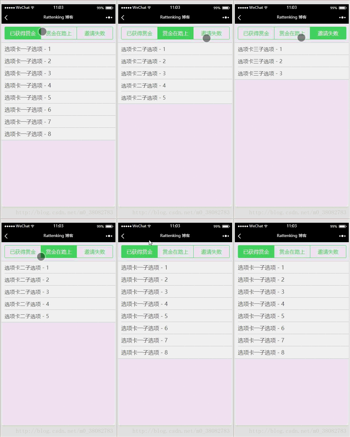
The example in this article is shared with everyone on WeChat. The specific code of the applet to implement the top tab of MUI is for your reference. The specific content is as follows
DEMO download
Rendering

<import src="../../template/list.wxml"/>
<view class="tui-tabbar-content">
<view class="tui-tabbar-group">
<text data-id="0" bindtap="changeTabbar" class="tui-tabbar-cell {{index == 0 ? 'tui-active' : ''}}">已获得赏金</text>
<text data-id="1" bindtap="changeTabbar" class="tui-tabbar-cell {{index == 1 ? 'tui-active' : ''}}">赏金在路上</text>
<text data-id="2" bindtap="changeTabbar" class="tui-tabbar-cell {{index == 2 ? 'tui-active' : ''}}">邀请失败</text>
</view>
</view>
<view class="tui-list-box {{index == 0 ? '' : 'tui-hide'}}">
<template wx:for="{{['选项卡一子选项 - 1','选项卡一子选项 - 2','选项卡一子选项 - 3','选项卡一子选项 - 4','选项卡一子选项 - 5','选项卡一子选项 - 6','选项卡一子选项 - 7','选项卡一子选项 - 8']}}" is="listNoneOnly" data="{{item}}"></template>
</view>
<view class="tui-list-box {{index == 1 ? '' : 'tui-hide'}}">
<template wx:for="{{['选项卡二子选项 - 1','选项卡二子选项 - 2','选项卡二子选项 - 3','选项卡二子选项 - 4','选项卡二子选项 - 5']}}" is="listNoneOnly" data="{{item}}"></template>
</view>
<view class="tui-list-box {{index == 2 ? '' : 'tui-hide'}}">
<template wx:for="{{['选项卡三子选项 - 1','选项卡三子选项 - 2','选项卡三子选项 - 3']}}" is="listNoneOnly" data="{{item}}"></template>
</view>page{background-color: #efeff4;}
.tui-tabbar-content{
padding: 10px;
}
.tui-tabbar-group{
border: 1px solid #4cd964;
border-radius: 3px;
overflow: hidden;
width: 100%;
display: table;
table-layout: fixed;
color: #4cd964;
}
.tui-tabbar-cell{
display: table-cell;
width: 100%;
height: 80rpx;
line-height: 80rpx;
font-size: 35rpx;
text-align: center;
}
.tui-tabbar-cell:not(:last-child){border-right: 1px solid #4cd964;}
.tui-tabbar-cell.tui-active{background-color: #4cd964;color: #fff;}
.tui-list-box{border-top:1px solid #c8c7cc;}Page({
data: {
index: 0
},
changeTabbar(e){
this.setData({ index: e.currentTarget.dataset.id})
}
})Summary
The switching of WeChat applet uses the judgment of a certain value to switch between the list and the tab bar! The above is the entire content of this article. I hope it will be helpful to everyone's study. For more related content, please pay attention to the PHP Chinese website! Related recommendations:About the implementation of the top navigation bar in the WeChat mini program
The loading component of the WeChat mini program displays the loading Introduction to the usage of input animation
Implementation of input input and dynamic setting buttons in WeChat applet
The above is the detailed content of WeChat applet implements the effect of navigation bar tabs. For more information, please follow other related articles on the PHP Chinese website!

Hot AI Tools

Undresser.AI Undress
AI-powered app for creating realistic nude photos

AI Clothes Remover
Online AI tool for removing clothes from photos.

Undress AI Tool
Undress images for free

Clothoff.io
AI clothes remover

AI Hentai Generator
Generate AI Hentai for free.

Hot Article

Hot Tools

Notepad++7.3.1
Easy-to-use and free code editor

SublimeText3 Chinese version
Chinese version, very easy to use

Zend Studio 13.0.1
Powerful PHP integrated development environment

Dreamweaver CS6
Visual web development tools

SublimeText3 Mac version
God-level code editing software (SublimeText3)

Hot Topics
 1382
1382
 52
52
 Xianyu WeChat mini program officially launched
Feb 10, 2024 pm 10:39 PM
Xianyu's official WeChat mini program has quietly been launched. In the mini program, you can post private messages to communicate with buyers/sellers, view personal information and orders, search for items, etc. If you are curious about what the Xianyu WeChat mini program is called, take a look now. What is the name of the Xianyu WeChat applet? Answer: Xianyu, idle transactions, second-hand sales, valuations and recycling. 1. In the mini program, you can post idle messages, communicate with buyers/sellers via private messages, view personal information and orders, search for specified items, etc.; 2. On the mini program page, there are homepage, nearby, post idle, messages, and mine. 5 functions; 3. If you want to use it, you must activate WeChat payment before you can purchase it;
 WeChat applet implements image upload function
Nov 21, 2023 am 09:08 AM
WeChat applet implements picture upload function With the development of mobile Internet, WeChat applet has become an indispensable part of people's lives. WeChat mini programs not only provide a wealth of application scenarios, but also support developer-defined functions, including image upload functions. This article will introduce how to implement the image upload function in the WeChat applet and provide specific code examples. 1. Preparatory work Before starting to write code, we need to download and install the WeChat developer tools and register as a WeChat developer. At the same time, you also need to understand WeChat
 How to adjust the navigation bar at the top of Douyin? Other navigation bar adjustment options
Mar 07, 2024 pm 02:50 PM
The navigation bar of the Douyin interface is located at the top and is an important channel for users to quickly access different functions and content. As Douyin continues to update, users may want to be able to customize and adjust the navigation bar according to their personal preferences and needs. 1. How to adjust the navigation bar at the top of Douyin? Usually, the top navigation bar of Douyin displays some popular channels, allowing users to quickly browse and view content of interest. If you want to adjust the settings for your top channel, just follow these steps: Open the TikTok app and log into your account. Find the navigation bar above the main interface, usually in the middle or top of the screen. Click the "+" symbol or similar button above the navigation bar to enter the channel editing interface. In the channel editing interface, you can see the default list of popular channels. You can pass
 Implement the drop-down menu effect in WeChat applet
Nov 21, 2023 pm 03:03 PM
To implement the drop-down menu effect in WeChat Mini Programs, specific code examples are required. With the popularity of mobile Internet, WeChat Mini Programs have become an important part of Internet development, and more and more people have begun to pay attention to and use WeChat Mini Programs. The development of WeChat mini programs is simpler and faster than traditional APP development, but it also requires mastering certain development skills. In the development of WeChat mini programs, drop-down menus are a common UI component, achieving a better user experience. This article will introduce in detail how to implement the drop-down menu effect in the WeChat applet and provide practical
 Implement image filter effects in WeChat mini programs
Nov 21, 2023 pm 06:22 PM
Implementing picture filter effects in WeChat mini programs With the popularity of social media applications, people are increasingly fond of applying filter effects to photos to enhance the artistic effect and attractiveness of the photos. Picture filter effects can also be implemented in WeChat mini programs, providing users with more interesting and creative photo editing functions. This article will introduce how to implement image filter effects in WeChat mini programs and provide specific code examples. First, we need to use the canvas component in the WeChat applet to load and edit images. The canvas component can be used on the page
 Use WeChat applet to achieve carousel switching effect
Nov 21, 2023 pm 05:59 PM
Use the WeChat applet to achieve the carousel switching effect. The WeChat applet is a lightweight application that is simple and efficient to develop and use. In WeChat mini programs, it is a common requirement to achieve carousel switching effects. This article will introduce how to use the WeChat applet to achieve the carousel switching effect, and give specific code examples. First, add a carousel component to the page file of the WeChat applet. For example, you can use the <swiper> tag to achieve the switching effect of the carousel. In this component, you can pass b
 Implement image rotation effect in WeChat applet
Nov 21, 2023 am 08:26 AM
To implement the picture rotation effect in WeChat Mini Program, specific code examples are required. WeChat Mini Program is a lightweight application that provides users with rich functions and a good user experience. In mini programs, developers can use various components and APIs to achieve various effects. Among them, the picture rotation effect is a common animation effect that can add interest and visual effects to the mini program. To achieve image rotation effects in WeChat mini programs, you need to use the animation API provided by the mini program. The following is a specific code example that shows how to
 Implement the sliding delete function in WeChat mini program
Nov 21, 2023 pm 06:22 PM
Implementing the sliding delete function in WeChat mini programs requires specific code examples. With the popularity of WeChat mini programs, developers often encounter problems in implementing some common functions during the development process. Among them, the sliding delete function is a common and commonly used functional requirement. This article will introduce in detail how to implement the sliding delete function in the WeChat applet and give specific code examples. 1. Requirements analysis In the WeChat mini program, the implementation of the sliding deletion function involves the following points: List display: To display a list that can be slid and deleted, each list item needs to include


