 WeChat Applet
 Mini Program Development
 About the development of the navigation bar at the bottom of the WeChat mini program
About the development of the navigation bar at the bottom of the WeChat mini program
This article mainly introduces the relevant information on the development of the navigation column at the bottom of the WeChat applet. I wanted to have a beautiful navigation column at the bottom of the WeChat applet, but I didn’t know how to make it, so Baidu found this article and shared it with everyone. , Friends in need can refer to
Development of the bottom navigation column of WeChat applet
Let’s take a look at the renderings first

Here, we have added three navigation icons, because we have three pages, and the WeChat applet can add up to 5.
Then how do they appear and how are they colored? Done in two steps!
1. Icon preparation
Alibaba icon library http://www.iconfont.cn/collections/show/29
We enter the website, slide the mouse over an icon you like and click the download button below
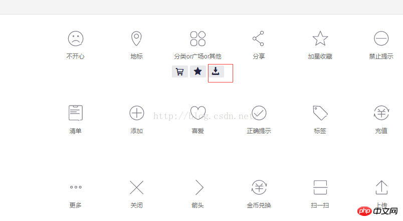
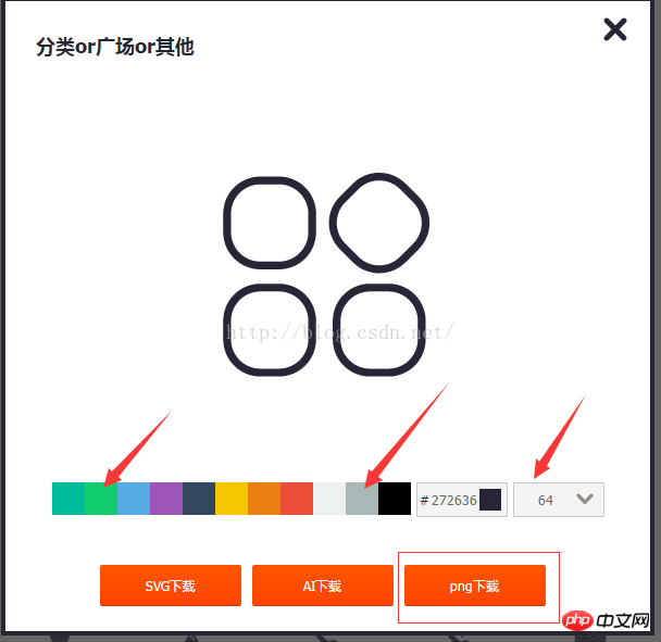
Select two icons of different colors in the pop-up box Just select the 64px size, I chose png and then download it and give it an alias
Save the icon with the above name to the mini program project directory. In the created images folder, preparations are done
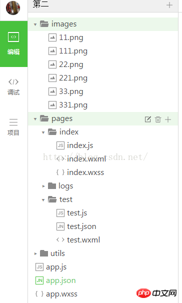
2. Change the configuration file
We found Add the following configuration information to the configuration file app.json in the project root directory
"tabBar": {
  "color": "#a9b7b7",
  "selectedColor": "#11cd6e",
  "borderStyle":"white",
  "list": [{
   "selectedIconPath": "images/111.png",
   "iconPath": "images/11.png",
   "pagePath": "pages/index/index",
   "text": "首页"
  }, {
   "selectedIconPath": "images/221.png",
   "iconPath": "images/22.png",
   "pagePath": "pages/logs/logs",
   "text": "日志"
  }, {
   "selectedIconPath": "images/331.png",
   "iconPath": "images/33.png",
   "pagePath": "pages/test/test",
   "text": "开心测试"
  }]
},Explain the corresponding attribute information
tabBar refers to the navigation at the bottom Configuration properties
color The color of the bottom navigation text when not selected
selectedColor The color of the bottom navigation text when selected
borderStyle The sample color of the bottom navigation border (note that if there is no writing here Entering the style will cause the default light gray line to appear on the upper border of the navigation box)
list Navigation configuration array
selectedIconPath Icon path when selected
iconPath Icon path when not selected
pagePath Page access address
text Text below the navigation icon
If you want to change the more detailed style, please refer to
https://mp.weixin.qq .com/debug/wxadoc/dev/framework/config.html#tabBar
The above is the entire content of this article. I hope it will be helpful to everyone’s study. For more related content, please pay attention to the PHP Chinese website !
Related recommendations:
WeChat applet implements MUI number input box effect
About WeChat applet implementing top tab Introduction to (swiper)
The use of input forms, redio and drop-down lists in WeChat mini programs
The above is the detailed content of About the development of the navigation bar at the bottom of the WeChat mini program. For more information, please follow other related articles on the PHP Chinese website!

Hot AI Tools

Undresser.AI Undress
AI-powered app for creating realistic nude photos

AI Clothes Remover
Online AI tool for removing clothes from photos.

Undress AI Tool
Undress images for free

Clothoff.io
AI clothes remover

Video Face Swap
Swap faces in any video effortlessly with our completely free AI face swap tool!

Hot Article

Hot Tools

Notepad++7.3.1
Easy-to-use and free code editor

SublimeText3 Chinese version
Chinese version, very easy to use

Zend Studio 13.0.1
Powerful PHP integrated development environment

Dreamweaver CS6
Visual web development tools

SublimeText3 Mac version
God-level code editing software (SublimeText3)

Hot Topics
 1390
1390
 52
52
 Xianyu WeChat mini program officially launched
Feb 10, 2024 pm 10:39 PM
Xianyu's official WeChat mini program has quietly been launched. In the mini program, you can post private messages to communicate with buyers/sellers, view personal information and orders, search for items, etc. If you are curious about what the Xianyu WeChat mini program is called, take a look now. What is the name of the Xianyu WeChat applet? Answer: Xianyu, idle transactions, second-hand sales, valuations and recycling. 1. In the mini program, you can post idle messages, communicate with buyers/sellers via private messages, view personal information and orders, search for specified items, etc.; 2. On the mini program page, there are homepage, nearby, post idle, messages, and mine. 5 functions; 3. If you want to use it, you must activate WeChat payment before you can purchase it;
 WeChat applet implements image upload function
Nov 21, 2023 am 09:08 AM
WeChat applet implements picture upload function With the development of mobile Internet, WeChat applet has become an indispensable part of people's lives. WeChat mini programs not only provide a wealth of application scenarios, but also support developer-defined functions, including image upload functions. This article will introduce how to implement the image upload function in the WeChat applet and provide specific code examples. 1. Preparatory work Before starting to write code, we need to download and install the WeChat developer tools and register as a WeChat developer. At the same time, you also need to understand WeChat
 Implement the drop-down menu effect in WeChat applet
Nov 21, 2023 pm 03:03 PM
To implement the drop-down menu effect in WeChat Mini Programs, specific code examples are required. With the popularity of mobile Internet, WeChat Mini Programs have become an important part of Internet development, and more and more people have begun to pay attention to and use WeChat Mini Programs. The development of WeChat mini programs is simpler and faster than traditional APP development, but it also requires mastering certain development skills. In the development of WeChat mini programs, drop-down menus are a common UI component, achieving a better user experience. This article will introduce in detail how to implement the drop-down menu effect in the WeChat applet and provide practical
 Implement image filter effects in WeChat mini programs
Nov 21, 2023 pm 06:22 PM
Implementing picture filter effects in WeChat mini programs With the popularity of social media applications, people are increasingly fond of applying filter effects to photos to enhance the artistic effect and attractiveness of the photos. Picture filter effects can also be implemented in WeChat mini programs, providing users with more interesting and creative photo editing functions. This article will introduce how to implement image filter effects in WeChat mini programs and provide specific code examples. First, we need to use the canvas component in the WeChat applet to load and edit images. The canvas component can be used on the page
 Use WeChat applet to achieve carousel switching effect
Nov 21, 2023 pm 05:59 PM
Use the WeChat applet to achieve the carousel switching effect. The WeChat applet is a lightweight application that is simple and efficient to develop and use. In WeChat mini programs, it is a common requirement to achieve carousel switching effects. This article will introduce how to use the WeChat applet to achieve the carousel switching effect, and give specific code examples. First, add a carousel component to the page file of the WeChat applet. For example, you can use the <swiper> tag to achieve the switching effect of the carousel. In this component, you can pass b
 What is the name of Xianyu WeChat applet?
Feb 27, 2024 pm 01:11 PM
The official WeChat mini program of Xianyu has been quietly launched. It provides users with a convenient platform that allows you to easily publish and trade idle items. In the mini program, you can communicate with buyers or sellers via private messages, view personal information and orders, and search for the items you want. So what exactly is Xianyu called in the WeChat mini program? This tutorial guide will introduce it to you in detail. Users who want to know, please follow this article and continue reading! What is the name of the Xianyu WeChat applet? Answer: Xianyu, idle transactions, second-hand sales, valuations and recycling. 1. In the mini program, you can post idle messages, communicate with buyers/sellers via private messages, view personal information and orders, search for specified items, etc.; 2. On the mini program page, there are homepage, nearby, post idle, messages, and mine. 5 functions; 3.
 Implement the sliding delete function in WeChat mini program
Nov 21, 2023 pm 06:22 PM
Implementing the sliding delete function in WeChat mini programs requires specific code examples. With the popularity of WeChat mini programs, developers often encounter problems in implementing some common functions during the development process. Among them, the sliding delete function is a common and commonly used functional requirement. This article will introduce in detail how to implement the sliding delete function in the WeChat applet and give specific code examples. 1. Requirements analysis In the WeChat mini program, the implementation of the sliding deletion function involves the following points: List display: To display a list that can be slid and deleted, each list item needs to include
 Implement image rotation effect in WeChat applet
Nov 21, 2023 am 08:26 AM
To implement the picture rotation effect in WeChat Mini Program, specific code examples are required. WeChat Mini Program is a lightweight application that provides users with rich functions and a good user experience. In mini programs, developers can use various components and APIs to achieve various effects. Among them, the picture rotation effect is a common animation effect that can add interest and visual effects to the mini program. To achieve image rotation effects in WeChat mini programs, you need to use the animation API provided by the mini program. The following is a specific code example that shows how to


