

About CSS3 controls for beautifying forms

This article mainly introduces in detail the techniques of beautifying form controls with CSS3, beautifying drop-down controls, radio buttons, and check boxes. Interested friends can refer to the default controls of
The styles are different in different browsers and the user experience is poor. CSS3 can be used to beautify form controls and provide a better user experience. The downside is browser compatibility issues.
1. Drop-down control
Rendering:
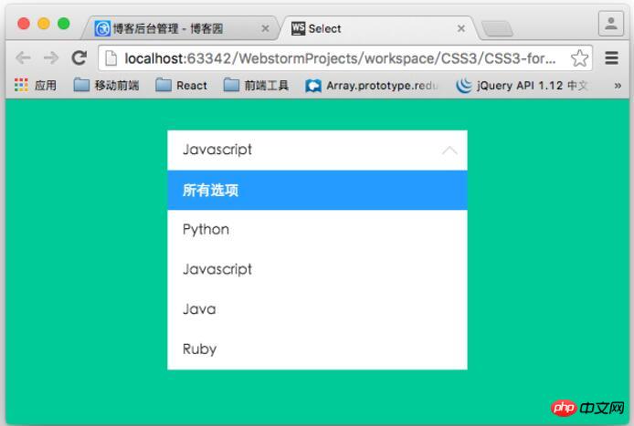
The layout structure of the drop-down control:
<p class="container">
        <p class="select">
            <p>所有选项</p>
            <ul>
                <li class="selected" data-value="所有选项">所有选项</li>
                <li data-value="Python">Python</li>
                <li data-value="Javascript">Javascript</li>
                <li data-value="Java">Java</li>
                <li data-value="Ruby">Ruby</li>
            </ul>
        </p>
</p>ul is used to simulate a drop-down list. During actual use, it can be dynamically generated based on the data returned from the background. The p element is used to render the selected option.
Core style:
.container .select{
    width: 300px;
    height: 40px;
    font-size: 14px;
    background-color:#fff;
    margin-left: auto;
    margin-right: auto;
    position: relative;
}
/*下拉箭头的样式*/
.container .select:after{
    content: "";
    display: block;
    width: 10px;
    height: 10px;
    position: absolute;
    top: 11px;
    rightright: 12px;
    border-left: 1px solid #ccc;
    border-bottom: 1px solid #ccc;
    -webkit-transform: rotate(-45deg);
    transform: rotate(-45deg);
    -webkit-transition: transform .2s ease-in, top .2s ease-in;
    transition: transform .2s ease-in, top .2s ease-in;
}
/*
    被选中的列表项显示的区域
*/
.container .select p{
    padding: 0 15px;
    line-height: 40px;
    cursor: pointer;
}
/*
    下拉列表的样式
    默认高度为0
*/
.container .select ul{
    list-style: none;
    background-color: #fff;
    width: 100%;
    overflow-y: auto;
    position: absolute;
    top: 40px;
    left: 0;
    max-height:0;
    -webkit-transition: max-height .3s ease-in;
    transition: max-height .3s ease-in;
}
.container .select ul li{
    padding: 0 15px;
    line-height: 40px;
    cursor: pointer;
}

.container .select ul li:hover{
    background-color: #e0e0e0;
}
.container .select ul li.selected{
    background-color: #39f;
    color: #fff;

}
/*下拉控件动画*/
@-webkit-keyframes slide-down{
    0%{
        -webkit-transform: scale(1, 0);
        transform: scale(1, 0);
    }
    25%{
        -webkit-transform: scale(1, 1.2);
        transform: scale(1, 1.2);
    }
    50%{
        -webkit-transform: scale(1, .85);
        transform: scale(1, .85);
    }
    75%{
        -webkit-transform: scale(1, 1.05);
        transform: scale(1, 1.05);
    }
    100%{
        -webkit-transform: scale(1, 1);
        transform: scale(1, 1);
    }
}
@keyframes slide-down{
    0%{
        -webkit-transform: scale(1, 0);
        transform: scale(1, 0);
    }
    25%{
        -webkit-transform: scale(1, 1.2);
        transform: scale(1, 1.2);
    }
    50%{
        -webkit-transform: scale(1, .85);
        transform: scale(1, .85);
    }
    75%{
        -webkit-transform: scale(1, 1.05);
        transform: scale(1, 1.05);
    }
    100%{
        -webkit-transform: scale(1, 1);
        transform: scale(1, 1);
    }
}
.container .select.on ul{
    /*
        默认情况下,ul的高度为0,当点击控控件的时候,
        设置下拉列表的高度。
    */
    max-height: 300px;
    -webkit-transform-origin: 50% 0;
    transform-origin: 50% 0;
    -webkit-animation: slide-down .5s ease-in;
    animation: slide-down .5s ease-in;
}
/*下拉选项被选中后控制箭头的方向*/
.container .select.on:after{
    -webkit-transform: rotate(-225deg);
    transform: rotate(-225deg);
    top: 18px;
}This is just a static style. If you want to implement the "selection" process, you need to use JavaScript to achieve it.
$(function(){
    var selected  = $('.select > p');
    //控制列表显隐
    selected.on('click', function(event){
        $(this).parent('.select').toggleClass('on');
        event.stopPropagation();
    });
    //点击列表项,将列表项的值添加到p标签中
    $('.select li').on('click', function(event){
        var self = $(this);
        selected.text(self.data('value'));
    });
    //点击文档其他区域隐藏列表
    $(document).on('click', function(){
        $('.select').removeClass('on');
    });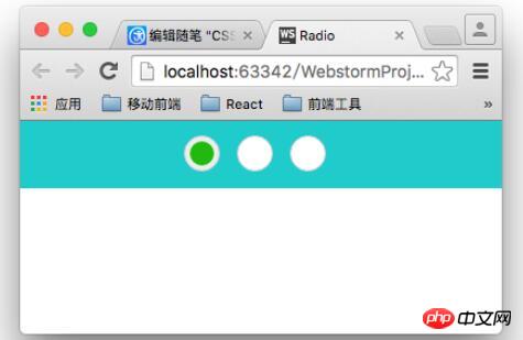
});2. Beautify the radio button box
lable tag can be linked with the radio button box through the for attribute. We use this feature to beautify the radio button, which is also the principle. Also, don’t forget to hide the real radio button (type="radio").
/*用过label标签来模拟radio 的样式*/
.radio-block label{
    display: inline-block;
    position: relative;
    width: 28px;
    height: 28px;
    border: 1px solid #cccccc;
    background-color: #fff;
    border-radius: 28px;
    cursor: pointer;
    margin-right:10px;
}

input[type="radio"]{
    display: none;
}
.radio-block label:after{
    content: '';
    display: block;
    position: absolute;
    width: 20px;
    height: 20px;
    left: 4px;
    top: 4px;
    background-color: #28bd12;
    border-radius: 20px;
    /*通过scale属性来控制中心点*/
    -webkit-transform: scale(0);
    transform: scale(0);
}
/*选中样式*/
input[type="radio"]:checked + label{
    background-color :#eee;
    -webkit-transition: background-color .3s ease-in;
    transition: background-color .3s ease-in;
}
/*选中之后的样式*/
input[type="radio"]:checked + label:after{
    -webkit-transform: scale(1);
    transform: scale(1);
    -webkit-transition: transform .2s ease-in;
    transition: transform .2s ease-in;
}Final effect:
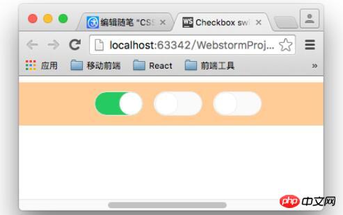
##3. Beautify the check box
.switch-block{
    width: 980px;
    padding: 3% 0;
    margin: 0 auto;
    text-align: center;
    background-color: #fc9;
}
.switch-block label{
    display: inline-block;
    width: 62px;
    height: 30px;
    background-color:#fafafa;
    border:1px solid #eee;
    border-radius: 16px;
    position: relative;
    margin-right: 10px;
    cursor: pointer;
    -webkit-transition: background .2s ease-in;
    transition :background .2s ease-in;
}
input[type="checkbox"]{
    display: none;
}
.switch-block label:after{
    content: '';
    position: absolute;
    width: 28px;
    height: 28px;
    border: 1px solid #eee;
    border-radius: 14px;
    left: 1px;
    background-color:#fff;
    -webkit-transition: left .2s ease-in;
    transition: left .2s ease-in;
}
.switch-block input[type="checkbox"]:checked + label{
    background-color:#3c6;
    -webkit-transition: background .2s ease-in;
    transition :background .2s ease-in;
}
.switch-block input[type="checkbox"]:checked + label:after{
    left: 32px;
    -webkit-transition: left .2s ease-in;
    transition: left .2s ease-in;
}Three ways to verify CSS control styles through priority comparison
About CSS banner image response Method for centered display
How to use negative margin values in CSS to adjust the center position
The above is the detailed content of About CSS3 controls for beautifying forms. For more information, please follow other related articles on the PHP Chinese website!

Hot AI Tools

Undresser.AI Undress
AI-powered app for creating realistic nude photos

AI Clothes Remover
Online AI tool for removing clothes from photos.

Undress AI Tool
Undress images for free

Clothoff.io
AI clothes remover

Video Face Swap
Swap faces in any video effortlessly with our completely free AI face swap tool!

Hot Article
Hot Tools

Notepad++7.3.1
Easy-to-use and free code editor

SublimeText3 Chinese version
Chinese version, very easy to use

Zend Studio 13.0.1
Powerful PHP integrated development environment

Dreamweaver CS6
Visual web development tools

SublimeText3 Mac version
God-level code editing software (SublimeText3)
Hot Topics
 1387
1387
 52
52

 Building an Ethereum app using Redwood.js and Fauna
Mar 28, 2025 am 09:18 AM
Building an Ethereum app using Redwood.js and Fauna
Mar 28, 2025 am 09:18 AM
With the recent climb of Bitcoin’s price over 20k $USD, and to it recently breaking 30k, I thought it’s worth taking a deep dive back into creating Ethereum
 Vue 3
Apr 02, 2025 pm 06:32 PM
Vue 3
Apr 02, 2025 pm 06:32 PM
It's out! Congrats to the Vue team for getting it done, I know it was a massive effort and a long time coming. All new docs, as well.
 Can you get valid CSS property values from the browser?
Apr 02, 2025 pm 06:17 PM
Can you get valid CSS property values from the browser?
Apr 02, 2025 pm 06:17 PM
I had someone write in with this very legit question. Lea just blogged about how you can get valid CSS properties themselves from the browser. That's like this.
 A bit on ci/cd
Apr 02, 2025 pm 06:21 PM
A bit on ci/cd
Apr 02, 2025 pm 06:21 PM
I'd say "website" fits better than "mobile app" but I like this framing from Max Lynch:
 Stacked Cards with Sticky Positioning and a Dash of Sass
Apr 03, 2025 am 10:30 AM
Stacked Cards with Sticky Positioning and a Dash of Sass
Apr 03, 2025 am 10:30 AM
The other day, I spotted this particularly lovely bit from Corey Ginnivan’s website where a collection of cards stack on top of one another as you scroll.
 Using Markdown and Localization in the WordPress Block Editor
Apr 02, 2025 am 04:27 AM
Using Markdown and Localization in the WordPress Block Editor
Apr 02, 2025 am 04:27 AM
If we need to show documentation to the user directly in the WordPress editor, what is the best way to do it?
 Comparing Browsers for Responsive Design
Apr 02, 2025 pm 06:25 PM
Comparing Browsers for Responsive Design
Apr 02, 2025 pm 06:25 PM
There are a number of these desktop apps where the goal is showing your site at different dimensions all at the same time. So you can, for example, be writing
 Let's use (X, X, X, X) for talking about specificity
Mar 24, 2025 am 10:37 AM
Let's use (X, X, X, X) for talking about specificity
Mar 24, 2025 am 10:37 AM
I was just chatting with Eric Meyer the other day and I remembered an Eric Meyer story from my formative years. I wrote a blog post about CSS specificity, and
