

This article mainly introduces the key points of using Transition and Animation animation properties in CSS3. Transition and Animation can be used to create basic page image dynamic effects. Of course, further control still requires the help of JavaScript. Friends in need can refer to Next
Transition (over)
Transition allows CSS property values to transition smoothly within a certain time interval. This effect can be triggered by a mouse click, focus, click, or any change to the element, and smoothly changes the CSS property value with an animation effect. Its syntax is as follows:
transition: property duration timing-function delay;
/*
property:执行过渡的属性
duration:执行过渡的持续时间
timing-function:执行过渡的速率模式
delay:延时多久执行
*/
transition -property
Possible values:
none
No properties will get the transition effect.
all
All properties will get the transition effect.
property
Define a list of CSS property names that apply transition effects. The list is separated by commas.
p{
transition-property:width;
-moz-transition-property: width;/* Firefox 4 */
-webkit-transition-property:width; /* Safari 和 Chrome */
-o-transition-property:width;
/* Opera */}transition-duration
The parameter is time, the unit is s (seconds) or ms (milliseconds), the default is 0, recall if there is only the transform attribute, is it a transformation? It was finished in no time.
p{
transition-duration: 5s;
-moz-transition-duration: 5s; /* Firefox 4 */
-webkit-transition-duration: 5s; /* Safari 和 Chrome */
-o-transition-duration: 5s; /* Opera */}transition-timing-function
Since it is an animation, there is an animation running rate. Different speeds will produce different results. The following are Possible values.
ease: (gradually slows down) default value, the ease function is equivalent to the Bezier curve (0.25, 0.1, 0.25, 1.0).
linear: (constant speed), the linear function is equivalent to the Bezier curve Curve (0.0, 0.0, 1.0, 1.0).
ease-in: (acceleration), the ease-in function is equivalent to the Bezier curve (0.42, 0, 1.0, 1.0).
ease-out: ( decelerate), the ease-out function is equivalent to the Bezier curve (0, 0, 0.58, 1.0).
ease-in-out: (accelerate and then decelerate), the ease-in-out function is equivalent to the Bezier curve (0.42, 0, 0.58, 1.0)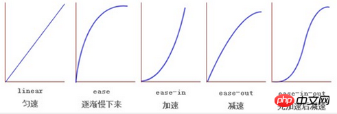
transition-delay
The parameter is time, the unit is s (seconds) or ms (milliseconds), the default It is 0, which means immediate execution. If there is a direct sequence in multiple animations, then it will come in handy.
Animation (animation)
Keyframe Keyframe
Implement custom animation through the setting of key frames, that is, stipulate from The animation style on specific nodes between the starting point (0%) and the end point (100%). It's like getting up alone, opening your eyes (0%), standing up (10%), putting on a shirt (40%), putting on pants (80%), and sorting out your face (100%). This way, each node is connected. It’s animation.
Let’s talk about animation
Animation, the key lies in moving words, so for the elements on the page, what can change is its style attribute, such as using animation to specify customization Animation, the content is that the font-size changes from 18px to 28px. This is animation. With its own attributes (it can specify the animation duration, movement form, etc.), it can present a dynamic effect, not just a moment. The change.
Usually, transition animation usually needs to be triggered by the hover pseudo-class. Otherwise, it will have finished moving when the page is loaded and will remain in the final state of movement. This is not what we want. Animation is different, it has more forms of expression, making it look like it is born and can move naturally.
Grammar
.area{
     width: 50px;
     height: 50px;
     margin-left: 100px;
     background: blue;
     -webkit-animation-name:'demo';/*动画属性名,也就是我们前面keyframes定义的动画名*/
     -webkit-animation-duration: 10s;/*动画持续时间*/
     -webkit-animation-timing-function: ease-in-out; /*动画频率,和transition-timing-function是一样的*/
     -webkit-animation-delay: 2s;/*动画延迟时间*/
     -webkit-animation-iteration-count: infinite;/*定义循环资料,infinite为无限次*/
     -webkit-animation-direction: alternate;/*定义动画方式*/
}Examples and abbreviations
It should be noted that the last attribute, direction, we can think of it this way, A starts from A Land arrives at Land B. This is an animation. When set to normal, the second playback will start from the beginning again, which seems very abrupt. At this time, you need to use alternate to make it look like A is moving back and forth between Land A and Land B. The code As follows:
/*
甲地和乙地这两个球都是absolutely定位方式,小球也是,只要控制left值即可
*/
.circle{
//我给这个小球球增加了一个名为demo1的动画
//你看,它就自己动起来了,回想一下,使用transform的时候,是不是还得用hover去触发
 -webkit-animation: 'demo1' 2s linear infinite alternate;
    -o-animation: 'demo1' 2s linear infinite alternate;
    animation: 'demo1' 2s linear infinite alternate;
}
//定义动画部分
//我只写了-webkit,真实中加上@-0-,@-moz-,@keyframes
@-webkit-keyframes demo1 {
    from {
        left:200px;
        background-color: lightcoral;
     }
     50%{
         left:290px;
         background-color: lightblue ;
     }
    to {
        left:380px;
        background-color: lightseagreen;
     }
}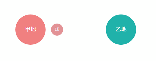
alternate method, play it backwards after playing it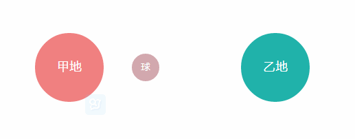
normal The method is to start over and then put
. The above is the entire content of this article. I hope it will be helpful to everyone's learning. For more related content, please pay attention to the PHP Chinese website!
Related recommendations:
Compatible with IE The implementation effect and test code of inner shadow and outer shadow
Using CSS3 to rotate the border when the mouse hovers
The above is the detailed content of Introduction to the use of Transition and Animation animation properties in CSS3. For more information, please follow other related articles on the PHP Chinese website!


![[Web front-end] Node.js quick start](https://img.php.cn/upload/course/000/000/067/662b5d34ba7c0227.png)


