
 Web Front-end
CSS Tutorial
CSS3 three-dimensional deformation to realize three-dimensional square
Web Front-end
CSS Tutorial
CSS3 three-dimensional deformation to realize three-dimensional square
CSS3 three-dimensional deformation to realize three-dimensional square

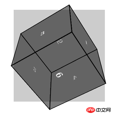
This article mainly introduces you to the CSS3 method of using three-dimensional deformation to realize three-dimensional blocks. The article gives a complete example code. Interested friends can run it themselves and see the effect. Only by doing it yourself can you get better. Let’s take a look at the learning below.
Preface
Three-dimensional transformations use the same properties based on two-dimensional transformations. If you are familiar with two-dimensional transformations, you will find that the functions of 3D transformations and 2D transforms function similarly. The biggest difference between 3D deformation and 2D deformation is that the reference coordinate axes are different. The coordinate axes of 2D deformation are planar, with only X and Y axes, while the coordinate axes of 3D deformation are composed of three axes: X, Y, and Z. In the three-dimensional space, the positive direction of the X-axis is toward the right, the positive direction of the Y-axis is downward, and the positive direction of the Z-axis is toward the outside of the screen.
The static rendering is as follows:
##Example code
<!DOCTYPE HTML>
<html>
    <head>
        <meta charset="utf-8">
        <meta name="apple-mobile-web-app-capable" content="yes" />
        <meta name="viewport" content="width=device-width, initial-scale=1.0, maximum-scale=1.0, user-scalable=0" />
        <title>CSS3三维变形</title>
        <!--  -->
        <style type="text/css">
         * {
          margin: 0;
          padding: 0;
         }

         .box {
          position:relative;
          top: 100px;
          width:300px;
          height: 300px;
          margin: 0 auto;
          background-color: #ccc;
          /*
           透视效果
           越大透视距离越平面,反之亦然
          */
          perspective:800px;
         }
         .content {
          /*3d视图*/
          transform-style: preserve-3d;
          /*过度动画*/
          transition: all 3s linear;
          width:200px;
          height: 200px;
          position: absolute;
          top: 50px;
       left: 50px;
         }
         /*
          经过顺时针旋转
         */
         .content:hover {
          transform: rotateX(180deg) rotateY(180deg);
         }
         /*
          方块公共样式
         */
         .side {
          position: absolute;
       height: 200px;
       width: 200px;
       border: 2px solid #000;
       background: rgba(0,0,0,0.3);
       color: #fff;
       line-height: 200px;
       font-size: 30px;
       font-weight: bold;
       text-align: center;
       text-shadow: 0 -1px 0 rgba(0,0,0,0.2);
         }
         /*
          前
         */
         .side1 {
           transform: translateZ(100px);
         }
         /*
          后
         */
         .side2 {
          transform: rotateX(180deg) translateZ(100px);
         }
         /*
          左
         */
         .side3 {
          transform: rotateY(-90deg) translateZ(100px);
         }
         /*
          右
         */
         .side4 {
          transform: rotateY(90deg) translateZ(100px);
         }
         /*
          上
         */
         .side5 {
          transform: rotateX(90deg) translateZ(100px);
         }
         /*
          下
         */
         .side6 {
          transform: rotateX(-90deg) translateZ(100px);
         }
        </style>
    </head>
    <body>
     <!-- begin -->
     <p class="box">
      <p class="content">
       <p class="side side1">1</p>
             <p class="side side2">2</p>
             <p class="side side3">3</p>
             <p class="side side4">4</p>
             <p class="side side5">5</p>
             <p class="side side6">6</p>
      </p>
     </p>
     <!-- end -->
    </body>
</html>About the usage of css3 image border border-image
About 20 loading animations produced by CSS3 Effect
About the method of drawing hexagons in CSS3
The above is the detailed content of CSS3 three-dimensional deformation to realize three-dimensional square. For more information, please follow other related articles on the PHP Chinese website!

Hot AI Tools

Undresser.AI Undress
AI-powered app for creating realistic nude photos

AI Clothes Remover
Online AI tool for removing clothes from photos.

Undress AI Tool
Undress images for free

Clothoff.io
AI clothes remover

Video Face Swap
Swap faces in any video effortlessly with our completely free AI face swap tool!

Hot Article
Hot Tools

Notepad++7.3.1
Easy-to-use and free code editor

SublimeText3 Chinese version
Chinese version, very easy to use

Zend Studio 13.0.1
Powerful PHP integrated development environment

Dreamweaver CS6
Visual web development tools

SublimeText3 Mac version
God-level code editing software (SublimeText3)
Hot Topics
 1386
1386
 52
52

 How to achieve wave effect with pure CSS3? (code example)
Jun 28, 2022 pm 01:39 PM
How to achieve wave effect with pure CSS3? (code example)
Jun 28, 2022 pm 01:39 PM
How to achieve wave effect with pure CSS3? This article will introduce to you how to use SVG and CSS animation to create wave effects. I hope it will be helpful to you!
 Use CSS skillfully to realize various strange-shaped buttons (with code)
Jul 19, 2022 am 11:28 AM
Use CSS skillfully to realize various strange-shaped buttons (with code)
Jul 19, 2022 am 11:28 AM
This article will show you how to use CSS to easily realize various weird-shaped buttons that appear frequently. I hope it will be helpful to you!
 How to hide elements in css without taking up space
Jun 01, 2022 pm 07:15 PM
How to hide elements in css without taking up space
Jun 01, 2022 pm 07:15 PM
Two methods: 1. Using the display attribute, just add the "display:none;" style to the element. 2. Use the position and top attributes to set the absolute positioning of the element to hide the element. Just add the "position:absolute;top:-9999px;" style to the element.
 How to implement lace borders in css3
Sep 16, 2022 pm 07:11 PM
How to implement lace borders in css3
Sep 16, 2022 pm 07:11 PM
In CSS, you can use the border-image attribute to achieve a lace border. The border-image attribute can use images to create borders, that is, add a background image to the border. You only need to specify the background image as a lace style; the syntax "border-image: url (image path) offsets the image border width inward. Whether outset is repeated;".
 How to enlarge the image by clicking the mouse in css3
Apr 25, 2022 pm 04:52 PM
How to enlarge the image by clicking the mouse in css3
Apr 25, 2022 pm 04:52 PM
Implementation method: 1. Use the ":active" selector to select the state of the mouse click on the picture; 2. Use the transform attribute and scale() function to achieve the picture magnification effect, the syntax "img:active {transform: scale(x-axis magnification, y Axis magnification);}".
 It turns out that text carousel and image carousel can also be realized using pure CSS!
Jun 10, 2022 pm 01:00 PM
It turns out that text carousel and image carousel can also be realized using pure CSS!
Jun 10, 2022 pm 01:00 PM
How to create text carousel and image carousel? The first thing everyone thinks of is whether to use js. In fact, text carousel and image carousel can also be realized using pure CSS. Let’s take a look at the implementation method. I hope it will be helpful to everyone!
 How to set animation rotation speed in css3
Apr 28, 2022 pm 04:32 PM
How to set animation rotation speed in css3
Apr 28, 2022 pm 04:32 PM
In CSS3, you can use the "animation-timing-function" attribute to set the animation rotation speed. This attribute is used to specify how the animation will complete a cycle and set the speed curve of the animation. The syntax is "element {animation-timing-function: speed attribute value;}".
 CSS transformation: how to achieve the rotation effect of elements
Nov 21, 2023 pm 06:36 PM
CSS transformation: how to achieve the rotation effect of elements
Nov 21, 2023 pm 06:36 PM
CSS transformation: How to achieve the rotation effect of elements requires specific code examples. In web design, animation effects are one of the important ways to improve user experience and attract user attention, and rotation animation is one of the more classic ones. In CSS, you can use the "transform" attribute to achieve various deformation effects of elements, including rotation. This article will introduce in detail how to use CSS "transform" to achieve the rotation effect of elements, and provide specific code examples. 1. How to use CSS’s “transf
