

Introduction to the usage of Transition animation property in CSS3

This article mainly introduces the usage of Transition animation attribute in CSS3 in detail and teaches you how to use Transition animation. Interested friends can refer to
W3C standard for CSS3 transition. This is This description: "CSS transition allows CSS property values to transition smoothly within a certain time interval. This effect can be triggered by mouse clicks, focus, being clicked, or any changes to the element, and smoothly animates The effect changes the property value of CSS."
The values of transition attribute include the following four:
•Transition-property: Specify which css attribute of the HTML element to transition Gradient processing, this attribute can be various standard CSS attributes such as color, width, height, etc.
•Transition-duration: Specify the duration of the attribute transition
•Transition-timing-function: Specify the speed of the gradient:
1. ease: (gradually slows down) default value, the ease function is equivalent to Besser Er curve (0.25, 0.1, 0.25, 1.0);
2, linear: (uniform speed), linear function is equivalent to Bezier curve (0.0, 0.0, 1.0, 1.0);
3, ease-in: (Accelerate), the ease-in function is equivalent to the Bezier curve (0.42, 0, 1.0, 1.0);
4. ease-out: (Decelerate), the ease-out function is equivalent to the Bezier curve (0, 0, 0.58, 1.0);
5. ease-in-out: (accelerate and then decelerate), the ease-in-out function is equivalent to the Bezier curve (0.42, 0, 0.58, 1.0);
6 , cubic-bezier: (This value allows you to customize a time curve), a specific cubic-bezier curve. The four values (x1, y1, x2, y2) are specific to points P1 and P2 on the curve. All values must be within the range [0, 1], otherwise they will be invalid.
•Transition-delay: Specify the delay time, that is, how long it takes to start the transition process.
Browser Compatibility
Internet Explorer 9 and earlier versions do not support the transition attribute.
Internet Explorer 10, Firefox, Opera and Chrome support the transition attribute. Chrome 25 and earlier and Safari require the prefix -webkit-.
The following is an example to illustrate the usage of transition
<!DOCTYPE html>
<html lang="en">
<head>
    <meta charset="UTF-8">
    <title>transition演示1</title>
    <style type="text/css">
        .animated_p {
            margin: 100px auto;
            width:100px;
            height:60px;
            background:#92B901;
            /*简写属性*/
            -webkit-transition:-webkit-transform 1s,opacity 1s,background 1s,width 1s,height 1s,font-size 1s; /* Safari */
            /*每个属性分开写*/
            transition-property:width,height,transform,background,opacity;
            transition-duration:1s,1s,1s,1s,1s,1s;
            -webkit-border-radius:5px;
            border-radius:5px;
            opacity:0.4;
        }
        .animated_p:hover {
            -moz-transform: rotate(360deg);
            -webkit-transform: rotate(360deg);
            -o-transform: rotate(360deg);
            transform: rotate(360deg);
            opacity:1;
            background:#1ec7e6;
            width:200px;
            height:120px;
        }
    </style>
</head>
<body>
<p class="animated_p"></p>
</body>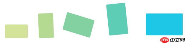
</html>In the above code, when the mouse moves to p, the CSS attributes: width, height, transform, background, opacity Gradient transition effects occur. In the end, the css style becomes the style defined in .animated_p. The transition process is roughly as follows:
Give me another online example of Chang'e flying to the moon. The requirement is: when the mouse When moving to the picture, Chang'e appears, and when moving away, Chang'e disappears
<!DOCTYPE html>
<html>
<head>
    <meta charset="utf-8">
    <title>transition演示2</title>
    <style type="text/css">
        body{
          color: #fff;
          background:#000;
        }
        .change{
          display:block;
          width:400px;
          height:400px;
          background:url(http://p3.qhimg.com/t0134c65e59012a1257.png) no-repeat center;
          background-size:cover;
          border:1em solid rgba(255,255,255,.8);
          margin:50px auto;
        }
        .change img{
          display:block;
          width:300px;
          height:284px;
          opacity:0;
          -webkit-transform:translate(-100px,-100px);
          transform:translate(-100px,-100px);
          -webkit-transition:opacity 1s ease-in-out 0.5s,-webkit-transform 1s ease-in-out;
          transition: opacity 1s ease-in-out 0.5s,transform 1s ease-in-out;
        }
        .change:hover img{
          -webkit-transform:translate(0px,0px);
          transform:translate(0px,0px);
          opacity:1;
        }
    </style>
</head>
<body>
    <a href="http://image.haosou.com/i?q=%E5%AB%A6%E5%A8%A5png&src=tab_www" class="change " target="_blank">
        <img src="http://p4.qhimg.com/t0160e6a92121691e22.png" alt="" />
    </a>
</body>
</html>In order to make Chang'e have the effect of floating in and out, the transform attribute is set, and the transition effect is added with the opacity attribute. The effect can be achieved:

The above is the entire content of this article. I hope it will be helpful to everyone’s learning. For more related content, please pay attention to the PHP Chinese website!
Related recommendations:
10 Loading effects implemented by CSS3
Transition transition and Animation animation properties in CSS3 Introduction to use
The above is the detailed content of Introduction to the usage of Transition animation property in CSS3. For more information, please follow other related articles on the PHP Chinese website!

Hot AI Tools

Undresser.AI Undress
AI-powered app for creating realistic nude photos

AI Clothes Remover
Online AI tool for removing clothes from photos.

Undress AI Tool
Undress images for free

Clothoff.io
AI clothes remover

Video Face Swap
Swap faces in any video effortlessly with our completely free AI face swap tool!

Hot Article
Hot Tools

Notepad++7.3.1
Easy-to-use and free code editor

SublimeText3 Chinese version
Chinese version, very easy to use

Zend Studio 13.0.1
Powerful PHP integrated development environment

Dreamweaver CS6
Visual web development tools

SublimeText3 Mac version
God-level code editing software (SublimeText3)
Hot Topics
 1389
1389
 52
52

 How to achieve wave effect with pure CSS3? (code example)
Jun 28, 2022 pm 01:39 PM
How to achieve wave effect with pure CSS3? (code example)
Jun 28, 2022 pm 01:39 PM
How to achieve wave effect with pure CSS3? This article will introduce to you how to use SVG and CSS animation to create wave effects. I hope it will be helpful to you!
 CSS tip: Use transition to retain hover state
Sep 27, 2022 pm 02:01 PM
CSS tip: Use transition to retain hover state
Sep 27, 2022 pm 02:01 PM
How to preserve hover state? The following article will introduce to you how to retain the hover state without using JavaScript. I hope it will be helpful to you!
 Use CSS skillfully to realize various strange-shaped buttons (with code)
Jul 19, 2022 am 11:28 AM
Use CSS skillfully to realize various strange-shaped buttons (with code)
Jul 19, 2022 am 11:28 AM
This article will show you how to use CSS to easily realize various weird-shaped buttons that appear frequently. I hope it will be helpful to you!
 How to hide elements in css without taking up space
Jun 01, 2022 pm 07:15 PM
How to hide elements in css without taking up space
Jun 01, 2022 pm 07:15 PM
Two methods: 1. Using the display attribute, just add the "display:none;" style to the element. 2. Use the position and top attributes to set the absolute positioning of the element to hide the element. Just add the "position:absolute;top:-9999px;" style to the element.
 How to implement lace borders in css3
Sep 16, 2022 pm 07:11 PM
How to implement lace borders in css3
Sep 16, 2022 pm 07:11 PM
In CSS, you can use the border-image attribute to achieve a lace border. The border-image attribute can use images to create borders, that is, add a background image to the border. You only need to specify the background image as a lace style; the syntax "border-image: url (image path) offsets the image border width inward. Whether outset is repeated;".
 How to enlarge the image by clicking the mouse in css3
Apr 25, 2022 pm 04:52 PM
How to enlarge the image by clicking the mouse in css3
Apr 25, 2022 pm 04:52 PM
Implementation method: 1. Use the ":active" selector to select the state of the mouse click on the picture; 2. Use the transform attribute and scale() function to achieve the picture magnification effect, the syntax "img:active {transform: scale(x-axis magnification, y Axis magnification);}".
 It turns out that text carousel and image carousel can also be realized using pure CSS!
Jun 10, 2022 pm 01:00 PM
It turns out that text carousel and image carousel can also be realized using pure CSS!
Jun 10, 2022 pm 01:00 PM
How to create text carousel and image carousel? The first thing everyone thinks of is whether to use js. In fact, text carousel and image carousel can also be realized using pure CSS. Let’s take a look at the implementation method. I hope it will be helpful to everyone!
 How to set animation rotation speed in css3
Apr 28, 2022 pm 04:32 PM
How to set animation rotation speed in css3
Apr 28, 2022 pm 04:32 PM
In CSS3, you can use the "animation-timing-function" attribute to set the animation rotation speed. This attribute is used to specify how the animation will complete a cycle and set the speed curve of the animation. The syntax is "element {animation-timing-function: speed attribute value;}".
