css3 realizes the effect of 3D fonts with shadow
This article mainly introduces the effect of css3 to achieve 3D fonts with shadows. It has a certain reference value. Now I share it with you. Friends in need can refer to it
3D fonts with shadows , you must think that this effect can only be achieved by some advanced drawing tools. The emergence of CSS3 makes all this seemingly impossible realization possible. Next, I will introduce to you the steps to realize the shadow effect of 3D fonts. If you are interested, don’t miss it.
The rendering is as follows: 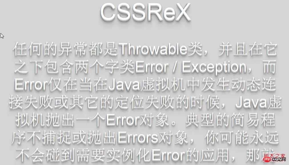
The source code is as follows:
<!DOCTYPE html PUBLIC "-//W3C//DTD XHTML 1.0 Transitional//EN" "http://www.w3.org/TR/xhtml1/DTD/xhtml1-transitional.dtd">
<html xmlns="http://www.w3.org/1999/xhtml">
<head>
<meta http-equiv="Content-Type" content="text/html; charset=utf-8" />
<title> CSSReX | Drop Shadow with CSS3 </title>
<link rel="stylesheet" type="text/css" href="style.css" media="screen" />
</head>
<body>
<p id="wrapper">
<h1>CSSReX</h1>
<p>任何的异常都是Throwable类,并且在它之下包含两个字类Error / Exception,而Error仅在当在Java虚拟机中发生动态连接失败或其它的定位失败的时候,Java虚拟机抛出一个Error对象。典型的简易程序不捕捉或抛出Errors对象,你可能永远不会碰到需要实例化Error的应用,那就让我们关心一下Exception。
Unchecked Exception.:包括 Error与RuntimeException. 这类异常都是RuntimeException的子类。
Checked Exception:除了Error与RuntimeException,其他剩下的异常. 这类异常都是Exception的子类 。在编译时在语法上必须处理的异常,因此必须在语法上以try..catch加以处理;</p>
</p><!-- /wrapper -->
</body>
</html>
style.css:
body{
background:#d5d5d5;
}
#wrapper{
width:960px;
min-height:500px;
padding:50px 10px 0 10px;
margin:0 auto;
text-align:center;
}
#wrapper h1{
font:normal 60pt Arial;
color:#FFFFFF;
text-shadow: 0 1px 0 #ccc,
0 2px 0 #c9c9c9,
0 3px 0 #bbb,
0 4px 0 #b9b9b9,
0 5px 0 #aaa,
0 6px 1px rgba(0,0,0,.1),
0 0 5px rgba(0,0,0,.1),
0 1px 3px rgba(0,0,0,.3),
0 3px 5px rgba(0,0,0,.2),
0 5px 10px rgba(0,0,0,.25),
0 10px 10px rgba(0,0,0,.2),
0 20px 20px rgba(0,0,0,.15);
}
#wrapper p{
font:normal 40pt Arial;
color:#FFFFFF;
text-shadow: 0 1px 0 #ccc,
0 2px 0 #c9c9c9,
0 3px 0 #bbb,
0 4px 0 #b9b9b9,
0 5px 0 #aaa,
0 6px 1px rgba(0,0,0,.1),
0 0 5px rgba(0,0,0,.1),
0 1px 3px rgba(0,0,0,.3),
0 3px 5px rgba(0,0,0,.2),
0 5px 10px rgba(0,0,0,.25),
0 10px 10px rgba(0,0,0,.2),
0 20px 20px rgba(0,0,0,.15);
}The above is the entire content of this article. I hope it will be helpful to everyone's study. For more related content, please pay attention to the PHP Chinese website!
Related recommendations:
How to solve the problem of CSS filters filtering text at the same time
CSS3 three-dimensional deformation to achieve three-dimensional blocks
The above is the detailed content of css3 realizes the effect of 3D fonts with shadow. For more information, please follow other related articles on the PHP Chinese website!

Hot AI Tools

Undresser.AI Undress
AI-powered app for creating realistic nude photos

AI Clothes Remover
Online AI tool for removing clothes from photos.

Undress AI Tool
Undress images for free

Clothoff.io
AI clothes remover

Video Face Swap
Swap faces in any video effortlessly with our completely free AI face swap tool!

Hot Article

Hot Tools

Notepad++7.3.1
Easy-to-use and free code editor

SublimeText3 Chinese version
Chinese version, very easy to use

Zend Studio 13.0.1
Powerful PHP integrated development environment

Dreamweaver CS6
Visual web development tools

SublimeText3 Mac version
God-level code editing software (SublimeText3)

Hot Topics
 win10 font folder path details
Jan 03, 2024 pm 08:37 PM
When inputting text, many friends like to add their favorite personalized fonts, but they do not know where the font folder path of the win10 system is and cannot add fonts. The following will introduce the specific folder path to you. Win10 font folder path: 1. Click "This PC" on the desktop. 2. Enter the system disk C drive. 3. Click the “windows” folder. 4. Pull down to find the "Fonts" folder. 5. You can enter the font library. Friends who have other questions can take a look to learn more about common problems with win10 fonts~
 How to change the font in Outlook on Apple mobile phone
Mar 08, 2024 pm 04:46 PM
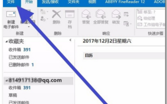
How to change the font in Outlook on Apple mobile phone? First open the Outlook software and click on the file in the upper left corner of the interface. You can set the font according to your own preferences. After the settings are completed, click the OK button. Let’s take a look! How to change the font in Outlook on Apple mobile phone 1. Open the Outlook software and click the "File" option in the upper left corner of the interface. 2. In the list that appears, find "Options" and click to enter. 3. On the left side of the option list, click "Mail". 4. Next, select “Letter and Fonts”. 5. If you want to set the font for new emails, reply emails, or composing, click the corresponding option to enter the settings. 6. Set the font according to personal preference. After the setting is completed, click OK
 How to achieve wave effect with pure CSS3? (code example)
Jun 28, 2022 pm 01:39 PM
How to achieve wave effect with pure CSS3? This article will introduce to you how to use SVG and CSS animation to create wave effects. I hope it will be helpful to you!
 How to solve win11 font blur problem
Jan 13, 2024 pm 09:00 PM
After updating the win11 system, some friends found that their win11 fonts were blurred and very uncomfortable to use. This may be due to a bug in the system version, or it may be that we have turned on special effects. Let’s follow the editor. Let’s see how to solve it. Win11 fonts are blurred: Method 1: 1. First, right-click this computer and open "Properties" 2. Then enter "Advanced System Settings" in the related link 3. Then click "Settings" in Performance to open it. 4. Under "Visual Effects" check "Adjust for Best Performance" and click "OK" to save. Method 2: 1. Right-click a blank space on the desktop and open "Display Settings" 2. Click "Zoom" under Zoom and Layout 3. Then click "Text Size" under relevant settings
 How to adjust the font, style, and size of Notepad in Windows 11
Sep 23, 2023 pm 11:25 PM
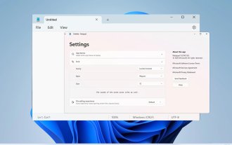
Many users want to change the font in Notepad on Windows 11 because the default font is too small or difficult to read for them. Changing fonts is quick and easy, and in this guide, we'll show you how to customize Notepad and change the font to suit your needs. What font does Windows 11 Notepad use by default? As for the default font options, Notepad uses the Consolas font and the default font size is set to 11 pixels. How to change Notepad font size and style in Windows 11? Use the Edit menu in Notepad to click the search button and type notepad. Select Notepad from the list of results. In Notepad, click the Edit menu and select Fonts. You should now see the settings in the left pane
 How to change the font of Xiaomi 11_How to change the font of Xiaomi 11
Mar 25, 2024 pm 07:26 PM
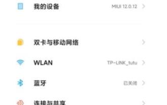
1. Open the phone settings and click [Display]. 2. Click [Font]. 3. Select the font you like or click [More Fonts] to download the application.
 How to make vivo mobile phone font larger and where to set it
Feb 24, 2024 pm 06:16 PM
How to make the font size of vivo mobile phone larger? Where can I set it? In vivo mobile phone, you can make the font size larger, but most users don’t know how to set the font size of vivo mobile phone. Next, the editor brings you the settings of how to make the font size of vivo mobile phone larger. Method graphic tutorials, interested users come and take a look! Vivo mobile phone usage tutorial How to make the font size of vivo mobile phone larger Where to set it 1. First open the [Settings] function in the vivo mobile phone and click on it; 2. Then jump to the settings interface and find the [Display and Brightness] function; 3. Then Reach the page in the picture below and click the [Font Size and Thickness] service; 4. Finally, slide the horizontal line in the picture below to adjust the font size.
 Detailed explanation of Win11 font installation method
Dec 27, 2023 pm 05:16 PM
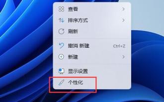
Some friends cannot find where their fonts are installed after installing win11 fonts, so they raise the issue of the installation location of win11 fonts. In fact, we can enter the font management in personalization to find the location where the fonts are installed. Let’s take a look below. Win11 font installation location: 1. First, right-click a blank space on the desktop and open "Personalization" settings. 2. Then enter the "Font" installation management settings. 3. Find the font you want and enter it. 4. If you can’t find it, you can also search directly above. 5. After entering the font, you can see the installation location of the win11 font in "Font File" under metadata. 6. If we want to uninstall the font, click Uninstall here.


