 Web Front-end
 JS Tutorial
 Introduction to encapsulation of Vue2.0 multi-Tab switching component
Introduction to encapsulation of Vue2.0 multi-Tab switching component
This article mainly introduces the encapsulation example of the Vue2.0 multi-Tab switching component. The content is quite good. I will share it with you now and give it as a reference.
Vue2.0 multi-Tab switching component is simply encapsulated to meet its own simple functions and can be used directly!
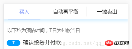
First of all, the renderings:

A brief introduction to the function:
1. Support tab switching
2. Support tab positioning
3. Support tab automation
Imitate React multi-Tab implementation. In short, it can be used normally to meet daily needs.
1. Usage:
==index.vue file==
<TabItems>
  <p name="买入" class="first">
    <Content :isContTab = "0" />
  </p>
  <p name="自动再平衡" class="second">
    <Content :isContTab = "1" />
  </p>
  <p name="一键卖出" class="three">
    <Content :isContTab = "2" />
  </p>
</TabItems>PS: TabItems is my TabSwitch component, tab page The title is the name value in p, and the two sides are the content, which can also be a subcomponent.
Next show the TabItems component
2, component
index.less file
body,html {margin: 0;}

* {
  opacity: 1;
  -webkit-backface-visibility: hidden;
}

.tabItems {
  .Tab_tittle_wrap {
    position: absolute;
    width: 100%;
    top: 0;
    z-index: 2;
    background: @ffffff;
    display: -webkit-box;
    height: 80px;
    line-height: 80px;
    text-align: center;
    color: @222222;
    border-bottom: 1px solid rgba(46, 177, 255, 0.08);
    box-shadow: 0px 0px 25px 6px rgba(46, 177, 255, 0.21);
    span {
      display: block;
      text-align: center;
      width: 26%;
      margin: 0 24px;
      font-size: 26px;
      position: relative;
      i {
        display: inline-block;
        position: absolute;
        width: 1px;
        height: 50px;
        top: 15px;
        right: -24px;
        background: @dddddd;
      }
      &:last-child {
        i {
          display: none;
        }
      }
    }
    .router-link-active {
      color: #8097f9;
      border-bottom: 1px solid #8097f9;
    }
  }
  .Tab_item_wrap {
    position: absolute;
    top: 82px;
    width: 100%;
    z-index: 0;
    background: @ffffff;
    bottom: 0;
    overflow-x: hidden;
    -webkit-overflow-scrolling: touch;
  }
  .showAnminous {
    opacity: 1;
    -webkit-backface-visibility: hidden;
    -webkit-animation-name: "rightMove";
    /*动画名称,需要跟@keyframes定义的名称一致*/
    -webkit-animation-duration: .3s;
    /*动画持续的时间长*/
    -webkit-animation-iteration-count: 1;
    /*动画循环播放的次数为1 infinite为无限次*/
  }
}

@-webkit-keyframes rightMove {
  0% {
    -webkit-transform: translate(110%, 0);
  }
  100% {
    -webkit-transform: translate(0, 0);
  }
}

@-ms-keyframes rightMove {
  0% {
    -ms-transform: translate(110%, 0);
  }
  100% {
    -ms-transform: translate(0, 0);
  }
}

@keyframes rightMove {
  0% {
    -webkit-transform: translate(110%, 0);
    -ms-transform: translate(110%, 0);
    transform: translate(110%, 0);
  }
  100% {
    -webkit-transform: translate(0, 0);
    -ms-transform: translate(0, 0);
    transform: translate(0, 0);
  }
}TabItems.vue
<template>
<p class="tabItems">
<p class="Tab_tittle_wrap" @click="tabswitch">
<span v-for="(v,i) in tabTitle" :style="{width:(100/tabTitle.length-7.5)+'%'}" :class="isShowTab==i?'router-link-active':''">{{v}}<i></i></span>
</p>
<p class="Tab_item_wrap">
<slot></slot>
</p>
</p>
</template>
<style lang="less">
@import "./less/index";
</style>
<script>
export default {
data() {
return {
tabTitle: [],
isShowTab: 0,
}
},
created: function() {
let is = sessionStorage.getItem("isTabShow");
if(is) {
this.isShowTab = is;
} else {
let URL = libUtils.GetURLParamObj();
this.isShowTab = URL.isShowTab ? URL.isShowTab : "0";
}
setTimeout(function() {
this.tabswitch(document.querySelector(".Tab_tittle_wrap").children[this.isShowTab].click());
}.bind(this), 0);
},
mounted() {
let slot = this.$slots.default;
for(let i = 0; i < slot.length; i++) {
if(slot[i].tag == "p") {
this.tabTitle.push(slot[i].data.attrs.name);
if(slot[i].elm) {
slot[i].elm.className = "hide";
if(this.isShowTab == i) {
slot[i].elm.className = "";
}
};
}
}
},
methods: {
tabswitch() {
if(!event) return;
let target = event.target;
if(target.nodeName.toLowerCase() !== 'span') {
return;
}
let len = target.parentNode.children;
for(let i = 0; i < len.length; i++) {
len[i].index = i;
len[i].removeAttribute('class');
}
target.setAttribute('class', 'router-link-active');
this.isShowTab = target.index;
//tabItems
let child = this.$el.children[1].children;
for(let k = 0; k < child.length; k++) {
child[k].className = "hide";
if(k == target.index) {
child[k].className = "showAnminous";
}
}
try {
sessionStorage.setItem("isTabShow", target.index);
} catch(err) {
console.log(err);
}
}
}
}
</script>PS:
created and mounted are not required for these two methods Too much introduction, Vue life cycle
1, introduction to created method.
Get the browser link address: libUtils.GetURLParamObj(); Get the browser link address
createdThis method is mainly used to locate which page the tab specifically displays
2. Introduction to mounted method
Mainly used to hide content containers
3. Tabswitch method
The page used to switch the display of the component container!
The above is the entire content of this article. I hope it will be helpful to everyone's study. For more related content, please pay attention to the PHP Chinese website!
Related recommendations:
Introduction to the development of Vue drag and drop components
Vue adds request interceptor and vue-resource Use of interceptors
The above is the detailed content of Introduction to encapsulation of Vue2.0 multi-Tab switching component. For more information, please follow other related articles on the PHP Chinese website!

Hot AI Tools

Undresser.AI Undress
AI-powered app for creating realistic nude photos

AI Clothes Remover
Online AI tool for removing clothes from photos.

Undress AI Tool
Undress images for free

Clothoff.io
AI clothes remover

AI Hentai Generator
Generate AI Hentai for free.

Hot Article

Hot Tools

Notepad++7.3.1
Easy-to-use and free code editor

SublimeText3 Chinese version
Chinese version, very easy to use

Zend Studio 13.0.1
Powerful PHP integrated development environment

Dreamweaver CS6
Visual web development tools

SublimeText3 Mac version
God-level code editing software (SublimeText3)

Hot Topics
 How to disable the change event in vue
May 09, 2024 pm 07:21 PM
In Vue, the change event can be disabled in the following five ways: use the .disabled modifier to set the disabled element attribute using the v-on directive and preventDefault using the methods attribute and disableChange using the v-bind directive and :disabled
 Adaptation of Java framework and front-end Vue framework
Jun 01, 2024 pm 09:55 PM
The Java framework and Vue front-end adaptation implement communication through the middle layer (such as SpringBoot), and convert the back-end API into a JSON format that Vue can recognize. Adaptation methods include: using the Axios library to send requests to the backend and using the VueResource plug-in to send simplified API requests.
 How to use v-show in vue
May 09, 2024 pm 07:18 PM
The v-show directive is used to dynamically hide or show elements in Vue.js. Its usage is as follows: The syntax of the v-show directive: v-show="booleanExpression", booleanExpression is a Boolean expression that determines whether the element is displayed. The difference with v-if: v-show only hides/shows elements through the CSS display property, which optimizes performance; while v-if conditionally renders elements and recreates them after destruction.
 Nuxt.js: a practical guide
Oct 09, 2024 am 10:13 AM
Nuxt is an opinionated Vue framework that makes it easier to build high-performance full-stack applications. It handles most of the complex configuration involved in routing, handling asynchronous data, middleware, and others. An opinionated director
 From PHP to Go or Front-end? The suggestions and confusions of reality from experienced people
Apr 01, 2025 pm 02:12 PM
Confusion and the cause of choosing from PHP to Go Recently, I accidentally learned about the salary of colleagues in other positions such as Android and Embedded C in the company, and found that they are more...
 What are the AI tools for mock interviews?
Nov 28, 2024 pm 09:52 PM
Mock interview AI tools are valuable tools for efficient candidate screening, saving recruiters time and effort. These tools include HireVue, Talview, Interviewed, iCIMS Video, and Eightfold AI. They provide automated, session-based assessments with benefits including efficiency, consistency, objectivity and scalability. When choosing a tool, recruiters should consider integrations, user-friendliness, accuracy, pricing, and support. Mock interviewing AI tools improve hiring speed, decision quality, and candidate experience.
 How to declare functions in setup in vue
May 09, 2024 pm 07:12 PM
There are 4 ways to declare functions in setup: Declare the function directly Use Vue.reactive to create a mutable reactive object Use Vue.computed to create a computed property Use Vue.watch to create a listener
 How to find the right training program for programmers' entry-level skills?
Apr 01, 2025 am 11:30 AM
Programmers' "tickling" needs: From leisure to practice, this programmer friend has been a little idle recently and wants to improve his skills and achieve success through some small projects...


