This article mainly introduces relevant information about the powerful filter (filter) attribute in CSS3. Friends who need it can refer to it
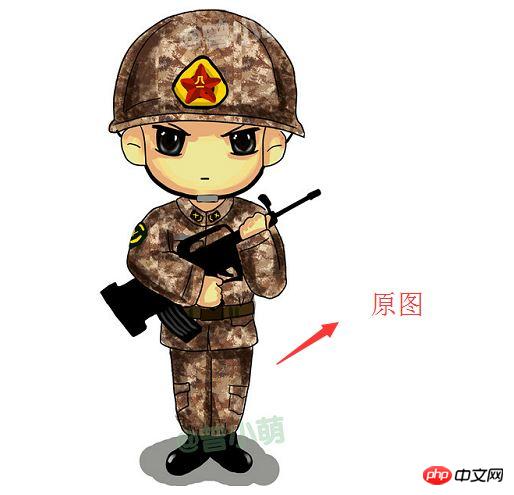
The blogger recently discovered a very powerful feature in the process of building a website. The CSS3 attribute is the filter attribute. Friends who like p-pictures should know what kind of artifact this is by looking at the name. Of course, the effect of this attribute cannot be compared with that of PS, but if used well, one picture can be made into the effect of two pictures while saving a lot of space.
1. Definition
Filter literally means filter. The official filter attribute defines an element (usually < img>) visual effects (such as blur and saturation); for example:
<style>
    img{
      /*灰度100%*/
        -webkit-filter:grayscale(100%);
    }
</style>
<img src="img/boke.png" alt="">
 ##
##
2. Syntax
filter: none | blur() | brightness() | contrast() | drop-shadow() | grayscale () | hue-rotate() | invert() | opacity() | saturate() | sepia() | url();As you can see, the attribute has many optional values, what are they? What does it mean?For example:
Use sepia to adjust here <head>
<meta charset="UTF-8">
<title>Title</title>
<style>
.img{
-webkit-filter:sepia(70%);
}
</style>
</head>
<body>
<img src="img/boke.png" alt="">
<img class="img" src="img/boke.png" alt="">
</body> 
3. Example
The following is an example of several values of the filter attribute. Others Fun things need to be discovered by fellow bloggers. If you have any fun things, you can share them with me.(1)hue-rotate(color rotation)
See the effect Picture bar, the specific use effect depends on everyone to discover: <style>
.img{
-webkit-filter:hue-rotate(330deg);
}
</style>
</head>
<body>
<img src="img/boke.png" alt="">
<img class="img" src="img/boke.png" alt="">
</body> 
(2)blur(blur)
blur (blur effect, unit px) <style>
.img{
-webkit-filter:blur(1px);
}
</style>
<body>
<img src="img/boke.png" alt="">
<img class="img" src="img/boke.png" alt="">
</body> 
(3)invert reverse color
 <style>
        .img{
            -webkit-filter:invert(100%);
        }
    </style>
<body>
<img src="img/boke.png" alt="">
<img class="img" src="img/boke.png" alt="">
</body>
Analysis on the difference between animation properties transform and transition and animation properties in CSS3
Move property in css3 Analysis
How to use the position:fixed attribute to center the DIV
The above is the detailed content of Introduction to the filter attribute in CSS3. For more information, please follow other related articles on the PHP Chinese website!


