Create menu navigation effect based on css3 attribute transition
This article mainly introduces the creation of menu navigation effects based on css3 attribute transition, which can realize the function of dynamically changing the background slider when the mouse slides over menu items. The implementation of attribute transition based on css3 is of great practical value and is needed. Friends can refer to
. This article describes the example of creating a menu navigation effect based on css3 attribute transition. Share it with everyone for your reference. The details are as follows:
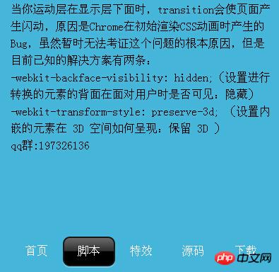
CSS3 navigation menu, when your motion layer is below the display layer, the transition will cause the page to flicker. The reason is a bug generated by Chrome when it initially renders the CSS animation. Although this problem cannot be verified for the time being. The root cause, but there are currently two known solutions:
-webkit-backface-visibility: hidden; (Set whether the back side of the converted element is visible when facing the user: hidden)
-webkit-transform-style: preserve-3d; (Set how embedded elements are rendered in 3D space: preserve 3D).
The screenshot of the running effect is as follows:

The specific code is as follows:
<!DOCTYPE HTML>
<html lang=zh-cn>
<head>
<title>css3的属性transition制作菜单导航</title>
<style>
*{margin:0px;padding:0px;}
body{background:#45B5DA;margin:0px;padding:0px;}
.tips{width:370px;margin:0 auto;line-height:24px;padding-top:10px;}
.bredcolor{color:#fff;}
#nav{position:absolute;top:50%;left:50%;margin-top:-20px;margin-left:-185px;}
li{
width:74px;height:40px;text-align:center;float:left;line-height:40px;color:#fff;text-decoration:none;list-style:none;cursor : pointer;
}
li#chage{
width:70px;height:38px;display:block;position:absolute;left:0px;z-index:-1;border:2px solid #191919;
border-radius:10px;
background:-webkit-gradient(linear, 0 100%, 0 0, from(black), color-stop(0.5, black), color-stop(0.52,#313131), to(#6A6A6A));
box-shadow:0px 2px 0px rgba(255, 255, 255, .3);
-webkit-transform: translate(0px,0px);
-webkit-transition:-webkit-transform .2s ease-out;
}
</style>
</head>
<body>
<section class="tips">
当你运动层在显示层下面时,transition会使页面产生闪动,原因是Chrome在初始渲染CSS动画时产生的Bug,虽然暂时无法考证这个问题的根本原因,但是目前已知的解决方案有两条:
-webkit-backface-visibility: hidden;(设置进行转换的元素的背面在面对用户时是否可见:隐藏)
-webkit-transform-style: preserve-3d; (设置内嵌的元素在 3D 空间如何呈现:保留 3D )
qq群:197326136
</section>
<section id="nav">
<li href="#" title="css3菜单,css3菜单导航">首页</li>
<li href="#" class="nav_2" onmouseover = "zhj.slide(1);" onmouseout = "zhj.slide(0);">脚本</li>
<li href="#" onmouseover = "zhj.slide(2);" onmouseout = "zhj.slide(0);">特效</li>
<li href="#" onmouseover = "zhj.slide(3);" onmouseout = "zhj.slide(0);">源码</li>
<li href="#" onmouseover = "zhj.slide(4);" onmouseout = "zhj.slide(0);">下载</li>
<li href="javascript:void(0);" id="chage"></li>
</section>
</body>
<script type="text/javascript">
function $(id){
return typeof id === "string" ? document.getElementById(id) : id;
}
var zhj = {};
zhj.slide = function(index){
var transX = 74*index;
$('chage').style['-webkit-transform'] = 'translate('+transX+'px,0px)';
}
</script>
</html>The above is the entire content of this article, I hope it will be useful for everyone's learning For help, please pay attention to the PHP Chinese website for more related content!
Related recommendations:
Analysis of transform transformation model rendering in CSS3
css gradient color omission mark embedded font text shadow A comprehensive introduction to
The above is the detailed content of Create menu navigation effect based on css3 attribute transition. For more information, please follow other related articles on the PHP Chinese website!

Hot AI Tools

Undresser.AI Undress
AI-powered app for creating realistic nude photos

AI Clothes Remover
Online AI tool for removing clothes from photos.

Undress AI Tool
Undress images for free

Clothoff.io
AI clothes remover

AI Hentai Generator
Generate AI Hentai for free.

Hot Article

Hot Tools

Notepad++7.3.1
Easy-to-use and free code editor

SublimeText3 Chinese version
Chinese version, very easy to use

Zend Studio 13.0.1
Powerful PHP integrated development environment

Dreamweaver CS6
Visual web development tools

SublimeText3 Mac version
God-level code editing software (SublimeText3)

Hot Topics
 1378
1378
 52
52
 Windows 11: The easy way to import and export start layouts
Aug 22, 2023 am 10:13 AM
In Windows 11, the Start menu has been redesigned and features a simplified set of apps arranged in a grid of pages, unlike its predecessor, which had folders, apps, and apps on the Start menu. Group. You can customize the Start menu layout and import and export it to other Windows devices to personalize it to your liking. In this guide, we’ll discuss step-by-step instructions for importing Start Layout to customize the default layout on Windows 11. What is Import-StartLayout in Windows 11? Import Start Layout is a cmdlet used in Windows 10 and earlier versions to import customizations for the Start menu into
 How to achieve wave effect with pure CSS3? (code example)
Jun 28, 2022 pm 01:39 PM
How to achieve wave effect with pure CSS3? This article will introduce to you how to use SVG and CSS animation to create wave effects. I hope it will be helpful to you!
 CSS tip: Use transition to retain hover state
Sep 27, 2022 pm 02:01 PM
How to preserve hover state? The following article will introduce to you how to retain the hover state without using JavaScript. I hope it will be helpful to you!
 How to Default 'Show More Options' in Windows 11's Right-Click Menu
Jul 10, 2023 pm 12:33 PM
One of the most annoying changes that we users never want is the inclusion of "Show more options" in the right-click context menu. However, you can remove it and get back the classic context menu in Windows 11. No more multiple clicks and looking for these ZIP shortcuts in context menus. Follow this guide to return to a full-blown right-click context menu on Windows 11. Fix 1 – Manually adjust the CLSID This is the only manual method on our list. You will adjust specific keys or values in Registry Editor to resolve this issue. NOTE – Registry edits like this are very safe and will work without any issues. Therefore, you should create a registry backup before trying this on your system. Step 1 – Try it
 Use CSS skillfully to realize various strange-shaped buttons (with code)
Jul 19, 2022 am 11:28 AM
This article will show you how to use CSS to easily realize various weird-shaped buttons that appear frequently. I hope it will be helpful to you!
 What is the horizontal figure 8 on the navigation map?
Jun 27, 2023 am 11:43 AM
The horizontal figure 8 on the navigation map means haze, moderate is a yellow 8 warning signal, and severe is an orange 8 warning signal.
 Baidu Maps App latest version 18.8.0 released, introducing traffic light radar function for the first time and adding real-time parking recommendation function
Aug 06, 2023 pm 06:05 PM
Both Android and iOS versions of Baidu Map App have released version 18.8.0, which introduces the traffic light radar function for the first time, leading the industry. According to the official introduction, after turning on the traffic light radar, it supports automatic detection of traffic lights while driving without having to enter a destination. Beidou High-Precision can position in real time. , 1 million+ traffic lights across the country automatically trigger green wave reminders. In addition, the new function also provides full silent navigation, making the map area more concise, key information clear at a glance, and no voice broadcast, allowing the driver to focus more on driving. Baidu Maps will launch a traffic light countdown function in October 2020, supporting real-time countdown prediction. Judgment, the navigation will automatically display the remaining seconds of the countdown when approaching a traffic light intersection, allowing users to always grasp the road conditions ahead. Traffic light countdown to December 31, 2022
 How to remove the 'Open in Windows Terminal' option from the right-click context menu in Windows 11
Apr 13, 2023 pm 06:28 PM
By default, the Windows 11 right-click context menu has an option called Open in Windows Terminal. This is a very useful feature that allows users to open Windows Terminal at a specific location. For example, if you right-click on a folder and select the "Open in Windows Terminal" option, Windows Terminal will launch and set that specific location as its current working directory. Although this is an awesome feature, not everyone finds a use for this feature. Some users may simply not want this option in their right-click context menu and want to remove it to tidy up their right-click context menu.


